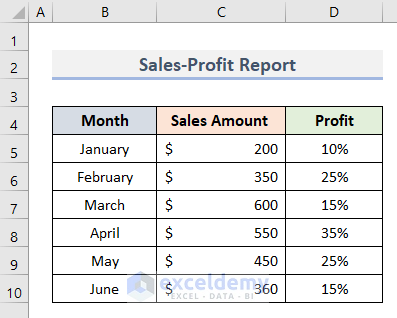
Dataset Overview
Combination charts are powerful tools that allow you to display multiple data series on a single chart, making it easier to compare and analyze different trends. To describe the examples, we’ll use the following dataset that is showing the information of Sales Amount and Profit for the months January-June.
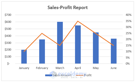
Example 1 – Create a Combination Chart with Clustered Column
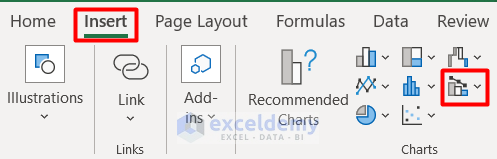
- Select the cell range containing your data (for example, B4:D10).
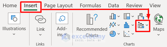
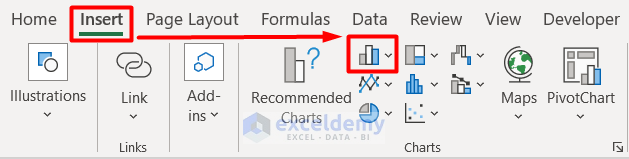
- Go to the Insert tab and choose Combo Chart from the Charts section.
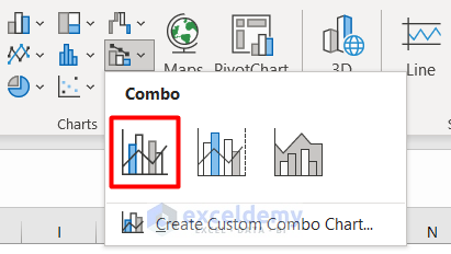
- Select the Clustered Column-Line type from the options.
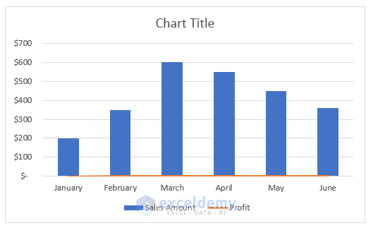
- Initially, the chart will show both columns and lines.
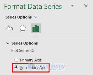
- Double-click on the Profit line in the chart.
- Make it a Secondary Axis from the Format Data Series panel.
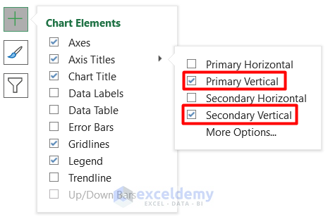
- Mark the options for Primary Vertical and Secondary Vertical in the Chart Elements.
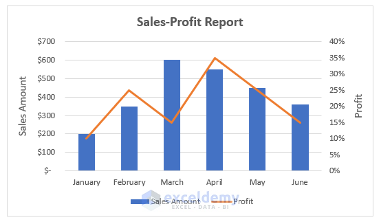
- You’ve created a combination chart based on your dataset.
Read More: How to Combine Two Graphs in Excel
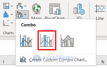
Example 2 – Make a Combo Chart with Automatic Secondary Axis
- Follow the same steps as above to select your data range.
- Insert a combo chart and choose Clustered Column – Line on Secondary Axis.
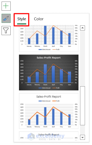
- Format the chart using a style of your choice.
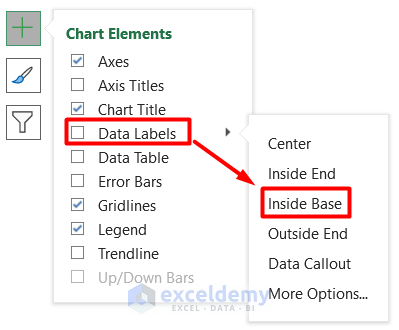
- Add and format Data Labels (e.g., Inside Base) for clarity.
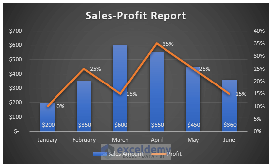
- Now you have your desired combination chart.
Read More: How to Create Column and Line Chart Combo in Excel
Example 3 – Create a Customized Combination Chart in Excel
- Select your data range (B4:D10).
- Click on Insert Combo Chart in the Insert tab.
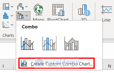
- Choose Create Custom Combo Chart.
- Select Custom Combination from the Custom section in the Insert Chart dialog box.
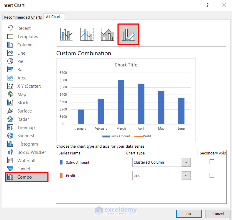
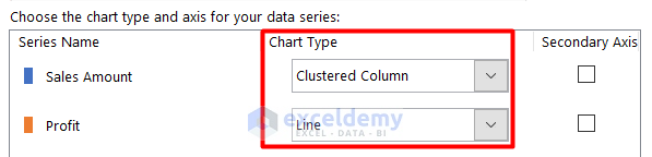
- Define the Chart Type for each Series Name (e.g., Sales Amount as columns and Profit as lines).
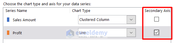
- Mark Profit as the Secondary Axis.
- Press OK, and your customized Combination Chart is ready.
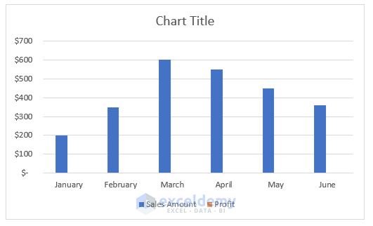
Example 4 – Convert a 2D Bar Chart into a Combo Chart
- Select your data range (B4:D10).
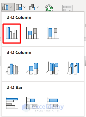
- Choose Insert Column or Bar Chart from the Chart group under the Insert tab.
- Select 2D Clustered Column.
- By default, the chart will show only the Sales Amount series.
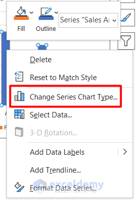
- To include Profit, right-click on the Sales Amount series and choose Change Series Chart Type from the Context Menu.
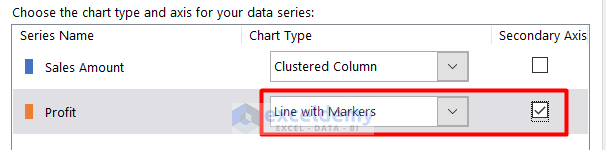
- Define the Profit Chart Type as Line with Markers.
- Make it a Secondary Axis.
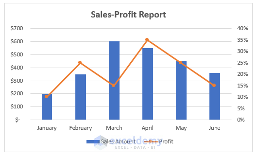
- You’ve successfully converted the 2D Bar Chart into a Combination Chart.
Things to Remember
- Limit Data Series to Two:
- It’s best to use combination charts with a maximum of two data series. Otherwise, they can become cluttered, making it difficult to differentiate between the different series and identify the relevant axis for each.
- Varying Units:
- Combination charts are particularly useful when you have data series with vastly different units. For example, combining sales revenue (in dollars) with customer satisfaction scores (on a scale of 1 to 10).
- Chart Type Selection:
- Be mindful of choosing the right chart type for each data series. Avoid using a line chart for data that actually requires an XY scatter plot. Consider the nature of your data before making a selection.
- Handling Different Data Scales:
- If your data scales vary significantly (e.g., one series ranges from 0 to 100 while another goes up to 10,000), consider adding data labels to the chart. This ensures clarity and helps viewers understand the context.
Download Practice Workbook
You can download the practice workbook from here:
Related Article
- How to Draw Target Line in Excel Graph
- How to Draw a Horizontal Line in Excel Graph
- How to Add a Marker Line in Excel Graph
- How to Shade Area Between Two Lines in a Chart in Excel
- How to Make a Forest Plot in Excel

