What Is a Forest Plot?
A Forest plot, also known as a blobbogram, is a graphical representation that displays the results of multiple studies in a single plot. It is commonly used in medical research to represent the meta-analysis of clinical trial results and is also applicable in epidemiological studies.
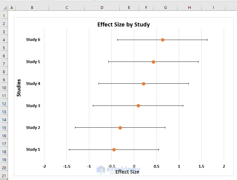
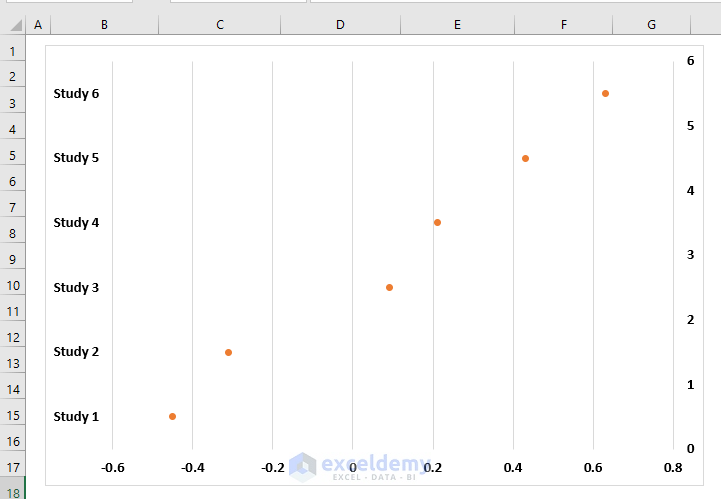
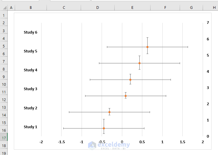
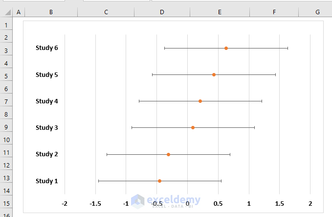
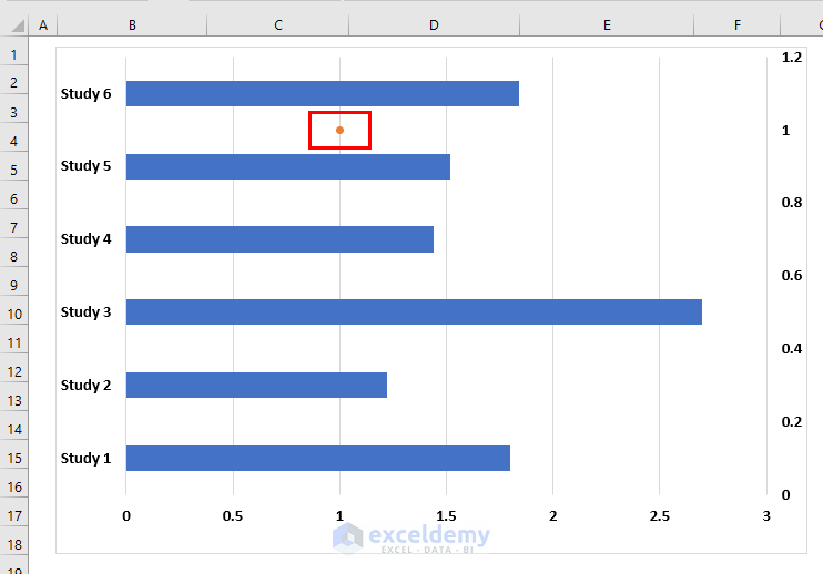
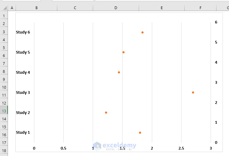
In the following picture, you can see the overview of a Forest plot.
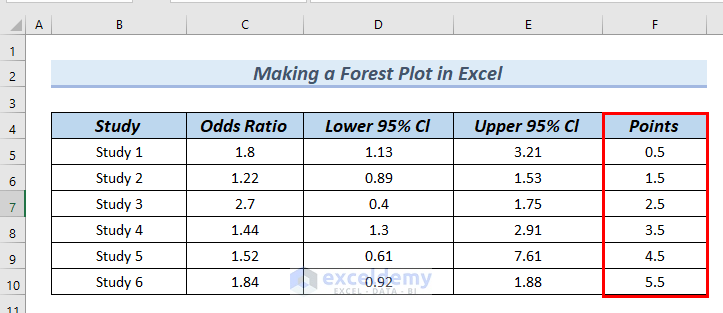
Dataset Overview
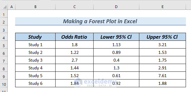
Before we proceed, let’s familiarize ourselves with the dataset we’ll be working with.
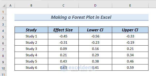
The dataset contains the following columns:
- Study Column: This column lists several studies conducted for a meta-analysis. Typically, in forest plots, study names are represented in chronological order.
- Effect Size Column: The effect size indicates the weight of each study. Forest plots use various effect size metrics, with the odds ratio (also known as the mean difference) being the most common.
- Lower Cl Column: The lower confidence interval (CI) represents the lower bound of the 95% confidence interval for each individual effect size.
- Upper Cl Column: The upper confidence interval (CI) represents the upper bound of the 95% confidence interval for each individual effect size.
Method 1 – Creating a Forest Plot with Effect Size
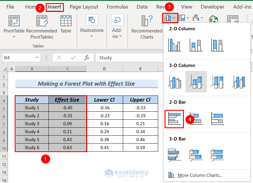
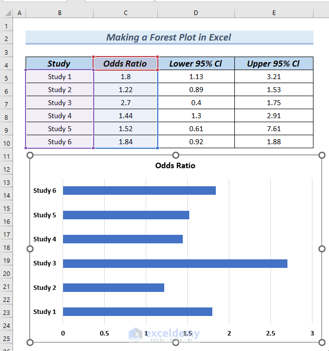
Step 1 – Inserting a Bar Chart
-
- Select both the Study and Effect Size columns.
- Go to the Insert tab.
- From the Column or Bar Chart group, choose 2D Clustered Bar Chart.
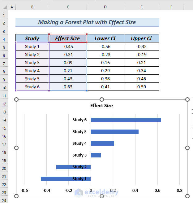
- The resulting chart will display bars, with negative effect sizes shifting to the left side. The vertical axis will be positioned in the middle of the bars.
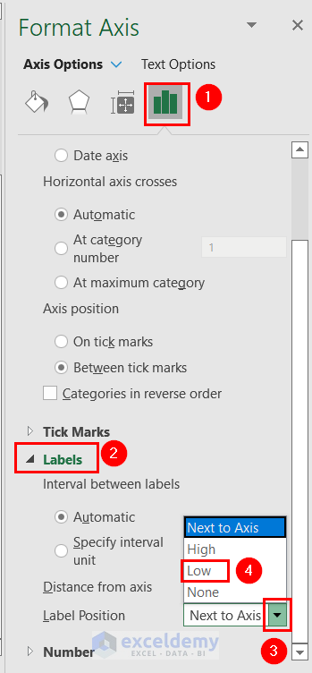
Step 2 – Moving Vertical Axis to the Left Side
- Right-click on the vertical axis.
- Select Format Axis from the Context Menu.
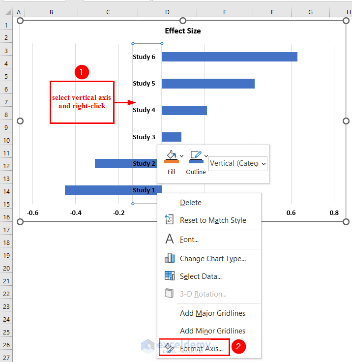
- In the Format Axis dialog box, navigate to Labels.
- Choose the Low label position to shift the vertical axis to the left side of the chart.
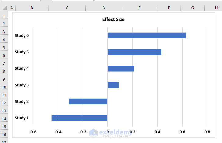
The Vertical Axis has shifted towards the left position of the chart.
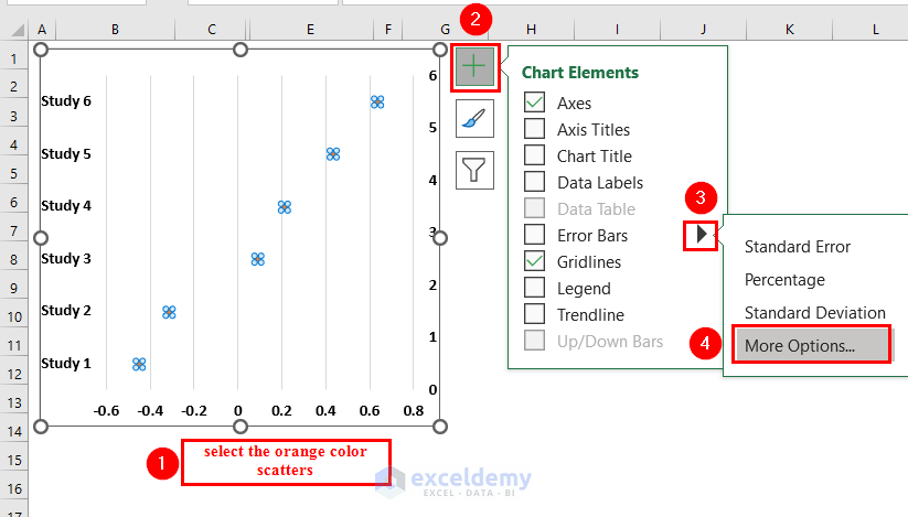
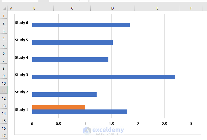
Step 3 – Adding an Orange Bar
- Click on any bar to select all bars.
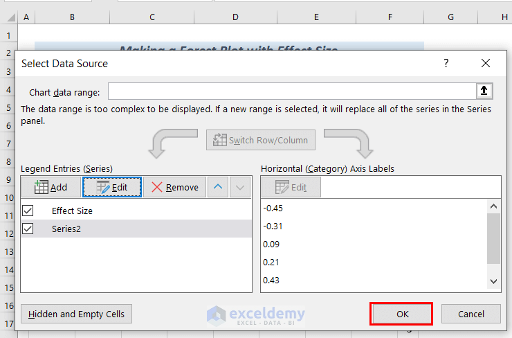
- Right-click and choose Select Data from the Context Menu.
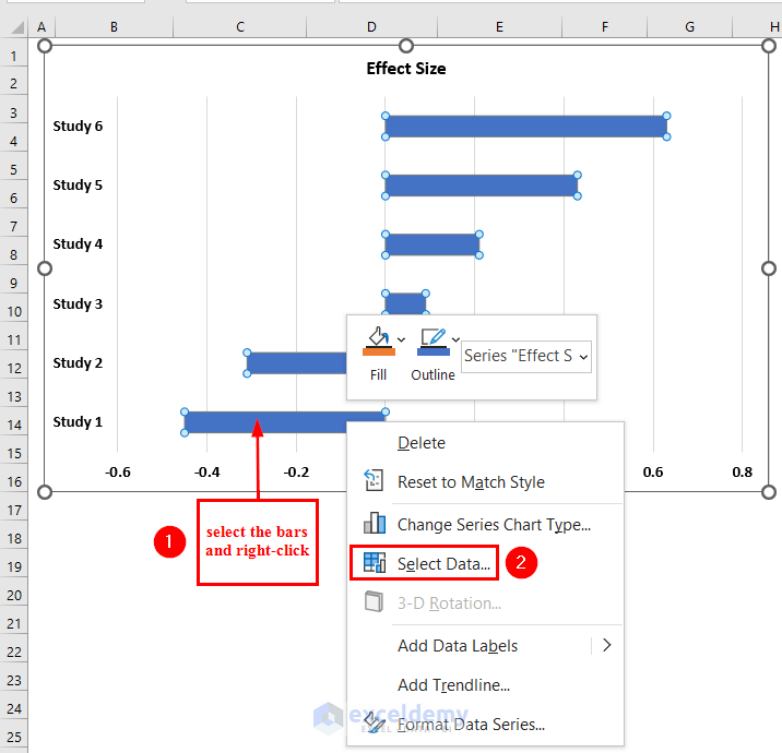
- In the Select Data Source dialog box, click Add under Legend Entries (Series).
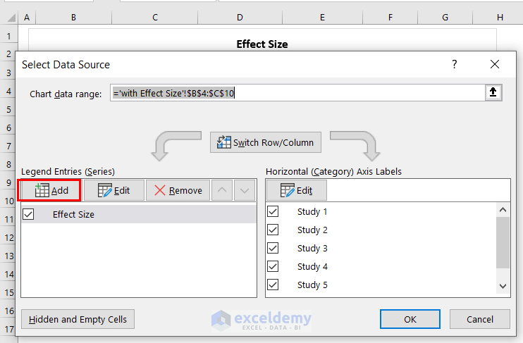
- An Edit Series dialog box will appear; click OK without making any changes.
- Confirm by clicking OK in the Select Data Source dialog box.
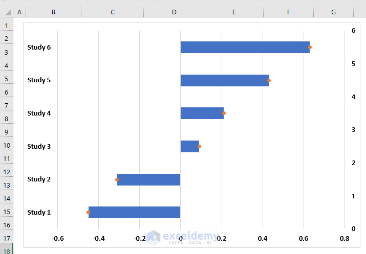
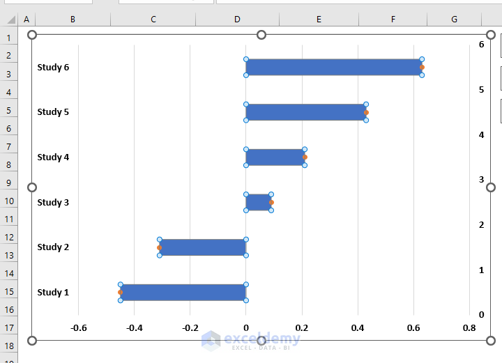
- An orange bar will now appear in the chart.
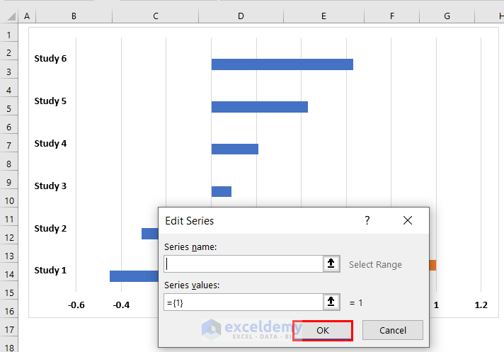
Step 4 – Replacing Orange Bar with Orange Scatter Point
- Right-click on the orange bar.
- Select Change Series Chart Type from the Context Menu.
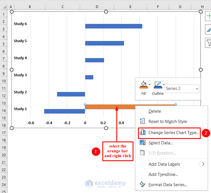
- In the Change Chart Type dialog box, choose Scatter chart for Series 2.
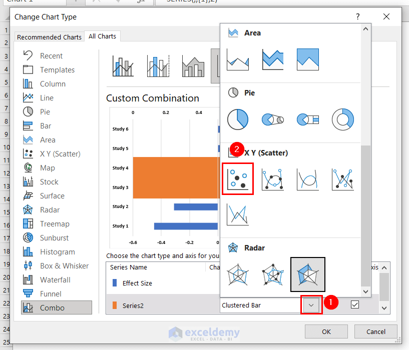
- Click OK.
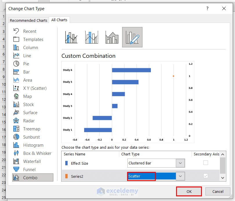
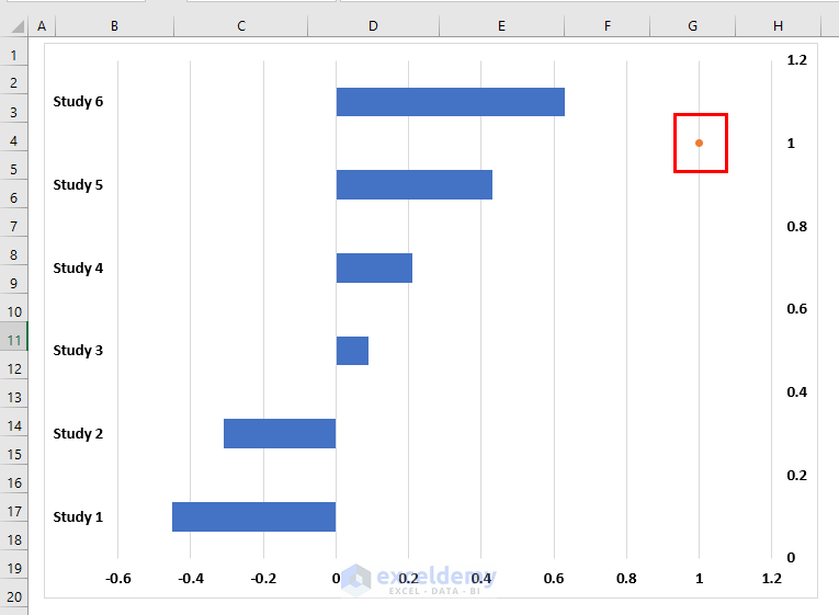
- The chart will now display an orange scatter point instead of the bar.
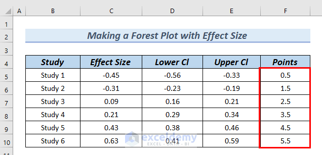
Step 5 – Adding Points to the Chart
- Create a new column called Points in your dataset.
- Assign a value of 0.5 to the Points column for Study 1 and set it to 1 for the other studies.
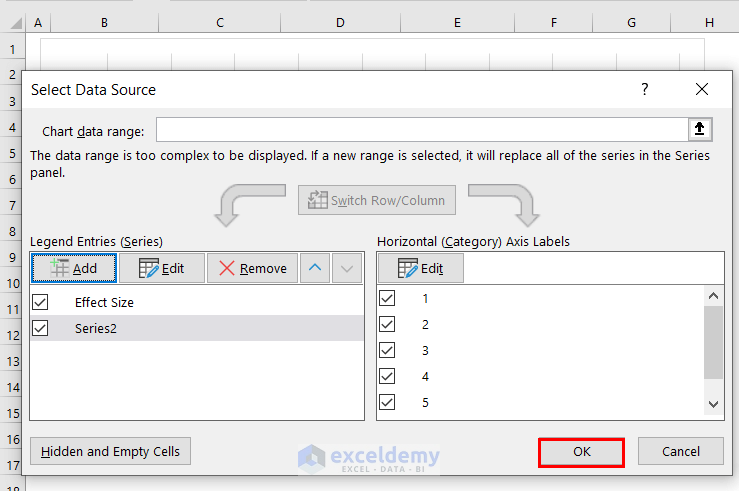
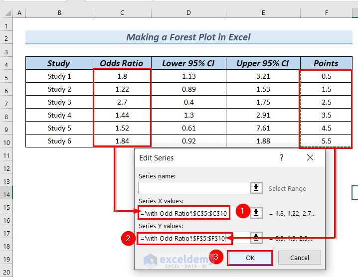
- Right-click on the orange scatter point in your chart.
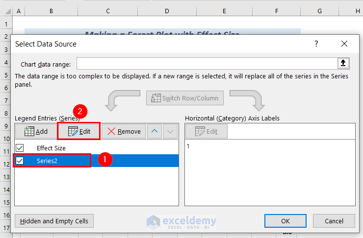
- Choose Select Data from the Context Menu.
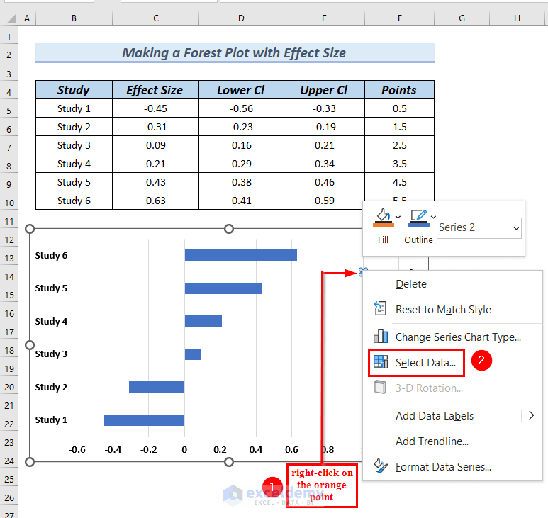
- In the Select Data Source dialog box, choose Series 2 (under Legend Entries (Series)).
- Click Edit.
- In the Edit Series dialog box:
- Set the X values to cells C5:C10 (from the Effect Size column).
- Set the Y values to cells F5:F10 (from the Points column).
- Click OK to confirm.
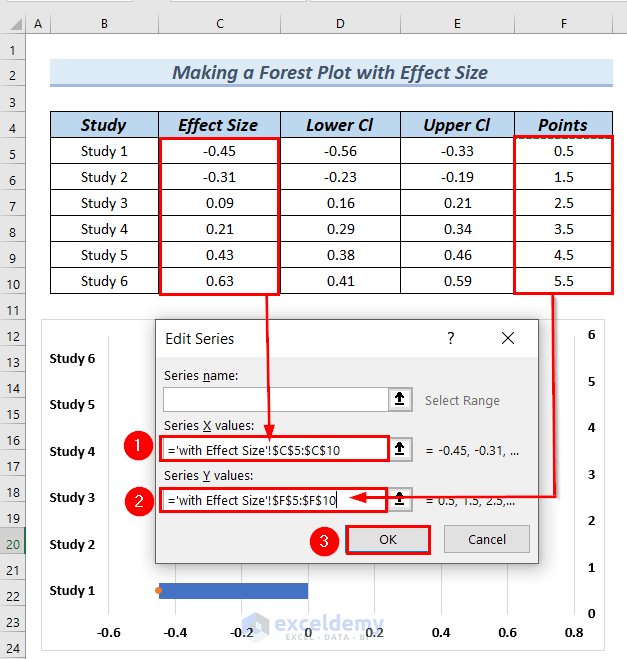
- Click OK in the Select Data Source box.
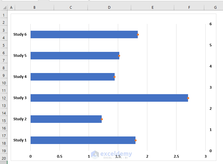
- You can see the points in the chart.
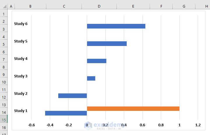
Step 6 – Hiding Bars from the Chart
- Select the bars in your chart.
- A Format Data Series dialog box will appear on the right side of the worksheet.
- From the Fill & Line group, click on Fill, and then select No Fill.
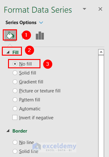
- Now your chart will display only the orange scatter points.
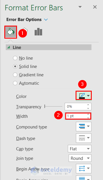
Step 7 – Adding Error Bars
- Select the orange scatter points.
- Click on the Chart Elements (the plus sign marked with a red color box).
- From Chart Elements, click on the rightward arrow next to Error Bars, and choose More Options.
- In the Format Error Bars dialog box:
- Click on Custom under Error Bar Options.
- Select Specify Value.
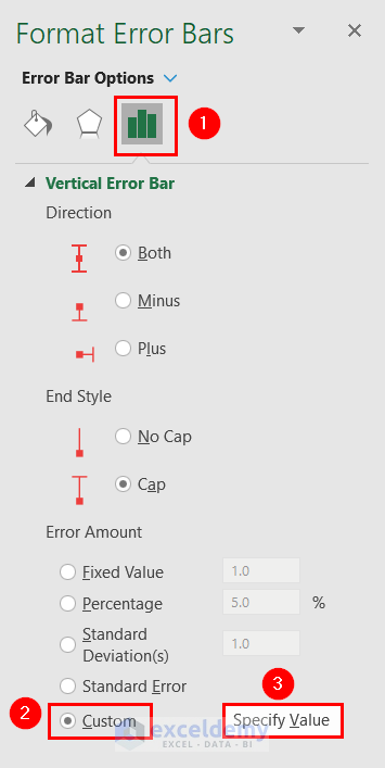
-
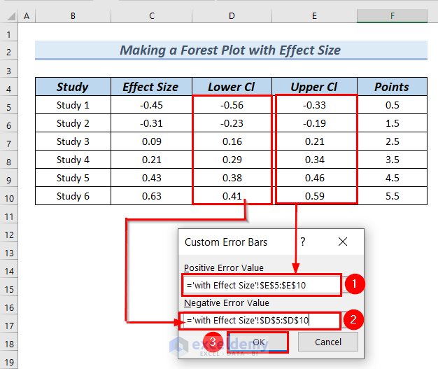
- Set the positive error value to cells E5:E10 (from the Upper Cl column).
- Set the negative error value to cells D5:D10 (from the Lower Cl column).
- Click OK to apply the error bars.
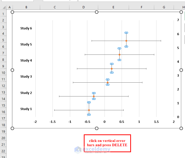
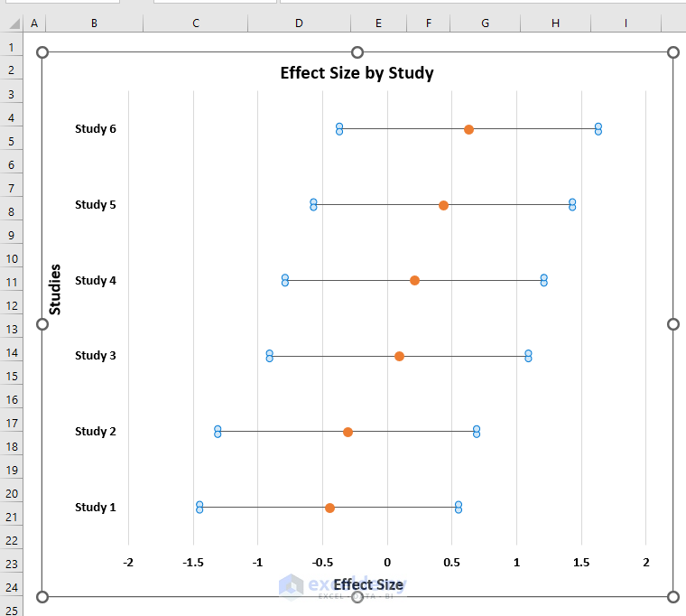
You can see Error bars in the chart.
- Select the Vertical Error bars >> press the Delete button.
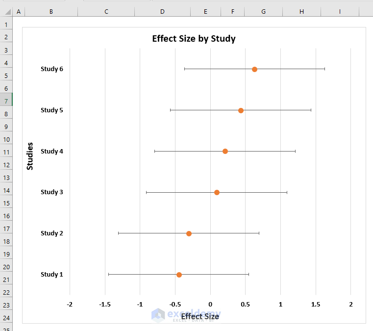
You can see the chart looks like a forest plot.
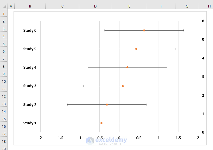
- Select the Y axis >> press the Delete button.
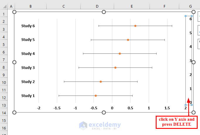
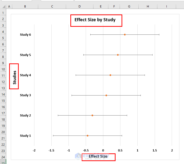
The chart now looks more presentable.
Step 8 – Final Touches – Adding Chart Axis and Title
- Click on the chart.
- From Chart Elements, add both Axis Titles and Chart Title.
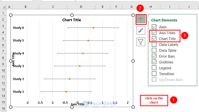
- Edit the titles as follows:
- Chart Title: Effect Size by Study
- Horizontal Axis Title: Effect Size
- Vertical Axis Title: Study
Step 9 – Formatting the Forest Plot
- Select the scatter points in the chart.
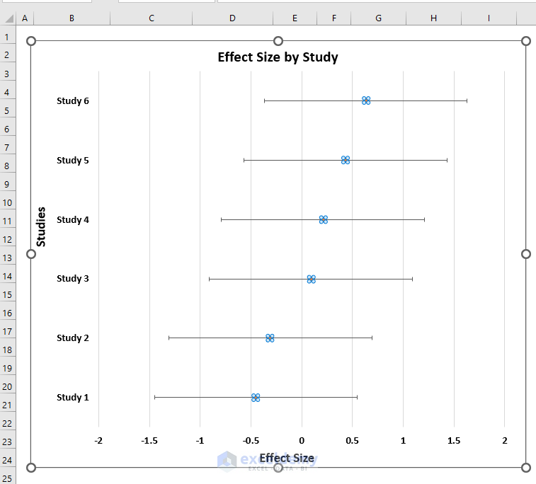
- In the Format Data Series dialog box:
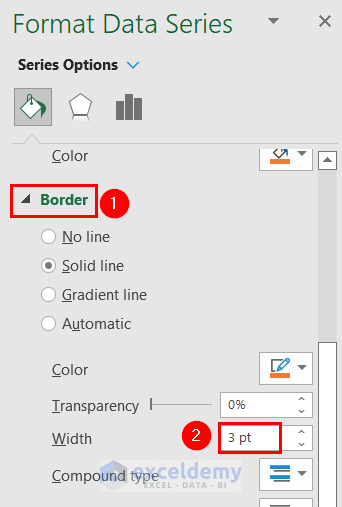
- From the Fill & Line group, click on Marker.
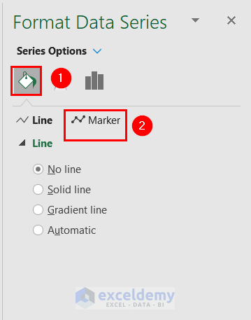
- In the Marker group, select Border, and set the width to 3 pt (adjust as desired).
The scatter points of the Forest plot are looking more visible.
- Format the error bars:
- Select the error bars.
-
- Set the width to 1 pt (customize as needed).
- Choose a black color for the error bars.
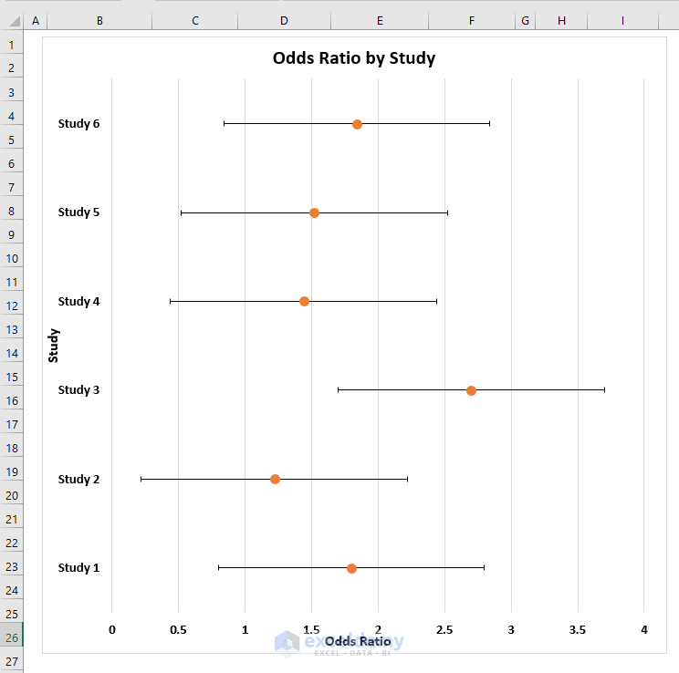
You can see the Forest plot made in Excel.

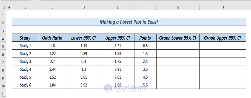
Method 2 – Creating a Forest Plot with Odds Ratio
Step 1 – Inserting a Scatter Point Chart
- Insert a 2D Clustered Bar chart using the Study and Odds Ratio columns from your dataset.
- Follow the same steps as in Method 1 to create the bar chart.
- Add an orange bar to the chart (Step 3 from Method 1).
- Replace the orange bar with a scatter point (Step 4 from Method 1).
- Add a new column called Points to your dataset.
- Assign a value of 0.5 to the Points column for Study 1 and set it to 1 for the other studies.
- Add these points to the chart (Step 5 from Method 1). Note that in the Edit Series dialog box, use the Odds Ratio values as the X values and the Points as the Y values.
The chart looks like the following:
- Hide the Bars from the chart by following Step 6-6 of Method 1.
As a result, the chart now has Scatter points in it.
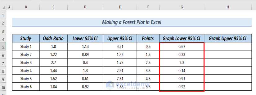
Step 2 – Modifying Dataset
- Create two new columns: Graph Lower 95% Cl and Graph Upper 95% Cl.
- In cell G5, subtract the Lower 95% Cl from the Odds Ratio:
=C5-D5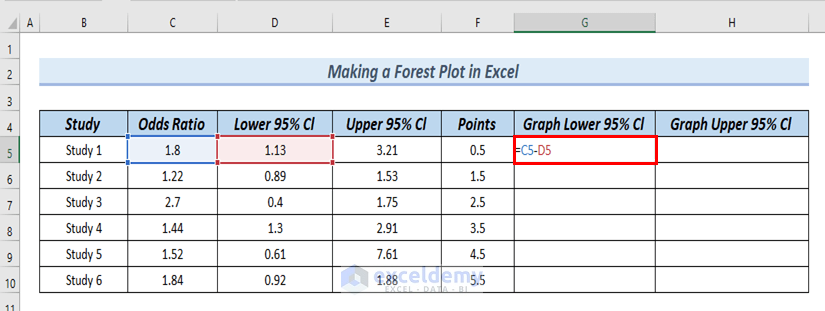
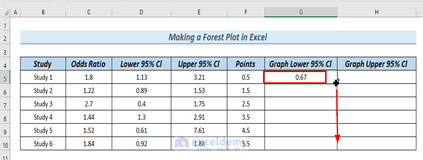
- Press Enter.
- Drag down the formula with the Fill Handle tool to fill the entire Graph Lower 95% Cl column.
- In cell H5, subtract the Odds Ratio from the Upper 95% Cl:
=E5-C5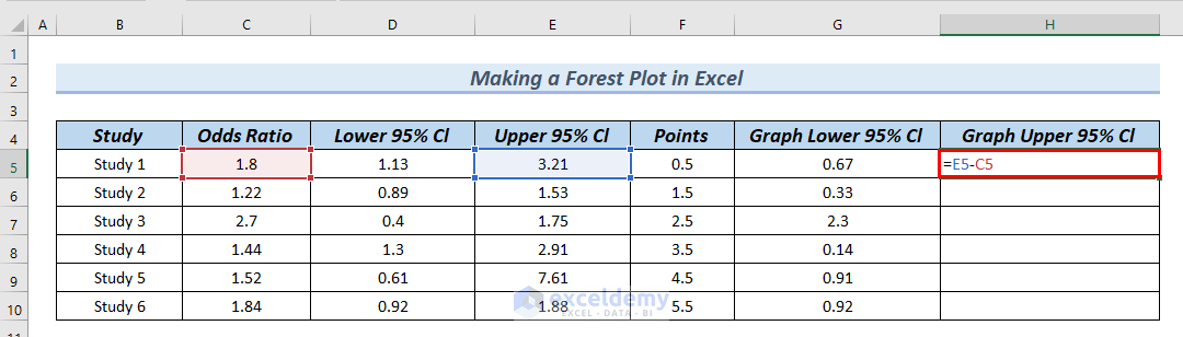
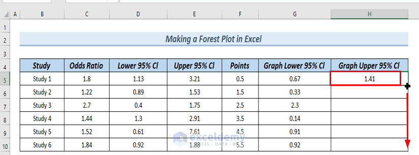
- Press Enter.
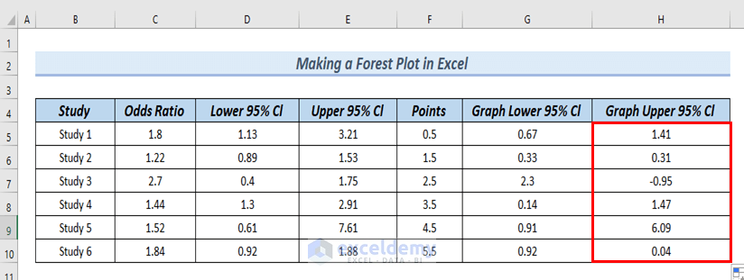
- Drag down the formula with the Fill Handle tool to fill the entire Graph Upper 95% Cl column.
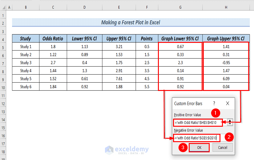
Step 3 – Adding Error Bars to the Chart
- Follow Step 7 from Method 1 to add error bars to the chart.
- In the Custom Error Bars dialog box, enter the following:
- Positive Error Value: Select cells H5:H10 from the Graph Upper 95% Cl column.
- Negative Error Value: Select cells G5:G10 from the Graph Lower 95% Cl column.
- Click OK to apply the error bars.
You can see Error bars in the chart.
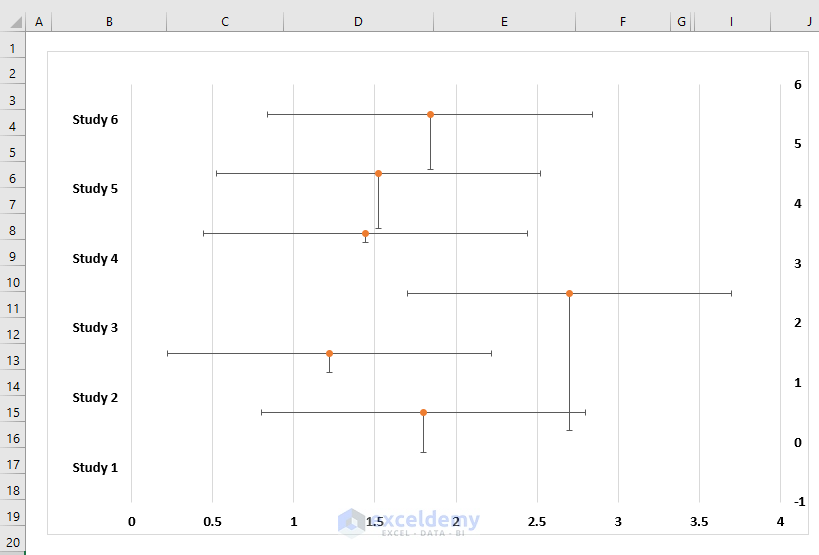
- Delete the vertical error bars (press Delete).
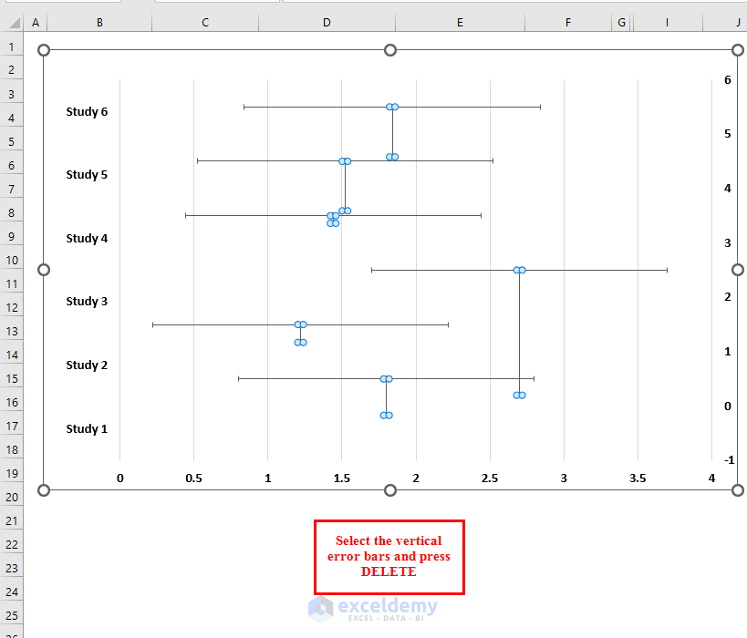
The chart looks like a Forest plot.
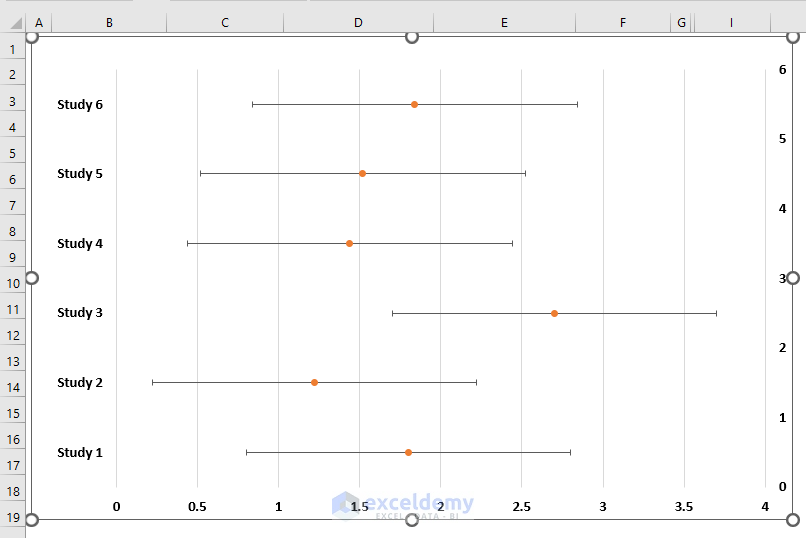
- Delete the Y axis from the chart (Step 8 from Method 1).
- Add chart titles and axis titles (Step 9 from Method 1).
- Format the Forest plot as desired.
Read More: How to Shade Area Between Two Lines in a Chart in Excel
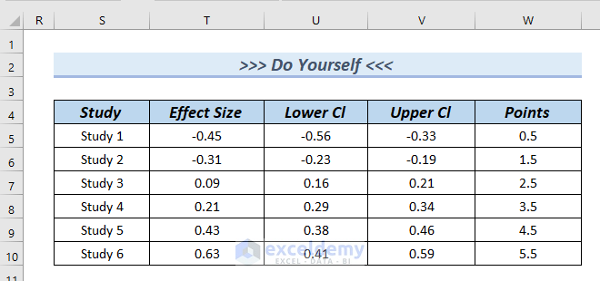
Practice Section
You can download the above Excel file to practice the explained methods.
Download Practice Workbook
You can download the practice workbook from here:
Related Articles
- How to Draw Target Line in Excel Graph
- How to Draw a Horizontal Line in Excel Graph
- How to Add a Marker Line in Excel Graph
- How to Create a Combination Chart in Excel
- How to Create Column and Line Chart Combo in Excel
- How to Combine Two Graphs in Excel
<< Go Back to Excel Charts | Learn Excel
Get FREE Advanced Excel Exercises with Solutions!

Your error bars aren’t showing up at the value for Lower/Upper CI. Just look at study 6. The upper error bar is 1.88… it should be right next to the plotted point (OR = 1.84), but it isn’t.
Dear CONCERNEDEXCELUSER,
Thank you for your comment.
Please have a look at the graph, the error bar for Study 6 is at the topmost position. And point 1.88 is right next to point 1.84.
Thank you.
Regard,
Afia Aziz Kona
Content Developer
Exceldemy
Dear Dr. Afia Kona,
Thank you very much. I would like to ask one question: How can we create a forest plot for categories with subcategories or clustered ones? For instance, as shown in Figure 1 of the article by Avila LJ, Vrdoljak JE, Medina CD, Massini JG, Perez CH, and Morando MA, titled “A new species of Liolaemus (Reptilia: Squamata) of the Liolaemus capillitas clade (Squamata, Liolaemini, Liolaemus elongatus-kriegi group) from Sierra de Velasco, La Rioja province, Argentina” published in Zootaxa on January 7, 2021 (volume 4903, issue 2, pages 194-216).
Hello Ebsa,
You are most welcome. To create a forest plot for categories and sub categories follow the steps given below.
Create your dataset with the following columns.
Category: The main category.
Subcategory: The subcategories under each main category.
Estimate: The effect estimate or mean value for each subcategory.
Lower CI: The lower bound of the confidence interval for each estimate.
Upper CI: The upper bound of the confidence interval for each estimate.
First, insert a Scatter Plot:
1. Select the columns for the subcategories and the estimates.
2. Go to Insert > Chart > Scatter > Scatter with Straight Lines and Markers.
Next, add Error Bars:
1. Click on the chart to activate the Chart Tools.
2. Go to Chart Tools > Layout > Error Bars > More Error Bar Options.
3. Select Both for direction and specify Custom for the error amount.
4. Use your Lower CI and Upper CI values for the custom error amount. Enter these values manually.
Next, Customize the Chart:
1. Add titles, labels, and adjust the axes as needed.
2. To add a vertical line at the point of no effect (usually zero or one), draw a line using the Shapes tool and place it at the appropriate point on the X-axis.
Next, Format the Chart:
1. Adjust the colors, line styles, and marker shapes to differentiate between categories and subcategories.
2. Add data labels if necessary for clarity.
Finally, Group Categories and Subcategories:
1. If you have multiple main categories, use different colors or shapes to represent each main category.
2. Add a legend to help differentiate between the categories.
By following these steps, you can create a clear and informative forest plot in Excel that displays categories with their respective subcategories, including confidence intervals for each estimate.
Regards
ExcelDemy
Dear Dr. Afia Kona
Thank you so much for a great guide to present a forest plot in excel.
Unfortunately I have a challenge with the orange dots in the plot which do not appear at the same level as the blue bars and therefore they are not aligned with the left y-axis labels.
Do you have any idea what I can do to fix this?
Thank you in advance for your help.
Malene Landauro
Hello Malene,
Thank you for your kind words!
The alignment issue with the orange dots may be due to differences in axis scales or alignment settings. Try adjusting the primary and secondary axis settings to ensure they match, or use error bars to manually position the dots to align with the blue bars. You could also double-check the formatting options in the “Format Data Series” menu. Let me know if this helps!
Regards
ExcelDemy
Dear Dr. Kona,
Thanky you for your tutorial!
I was wondering why the horizontal line is wider than the confidence interval is supposed to be. It encompasses a more comprehensive range. Does the horizontal line not represent the range of the lower and upper confidence intervals?
Thank you
Nina
Hello Nina,
Thank you for your appreciation and feedback. It’s a thoughtful question! The horizontal line in the forest plot indeed represents the range of the confidence interval (CI). If it appears wider than expected, it could be due to formatting settings or incorrect data input for the lower and upper CI values. Ensure the data accurately reflects the desired CI limits, and double-check the chart settings.
Feel free to provide more details or screenshots if the issue persists—happy to help!
Best regards,
ExcelDemy