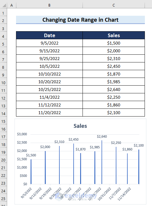
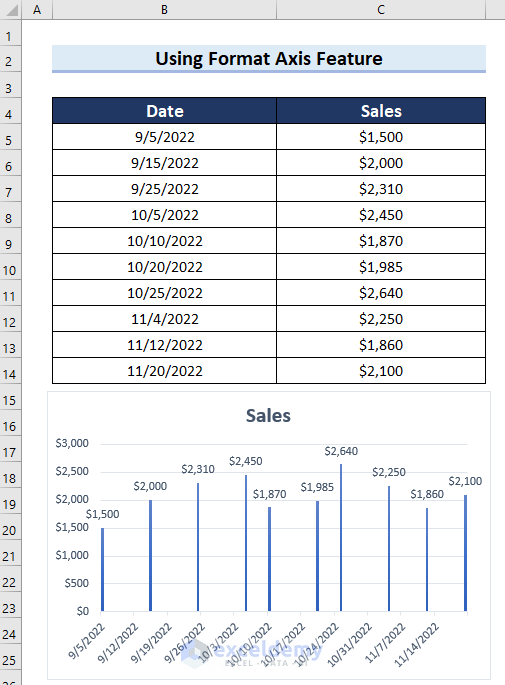
Dataset Overview
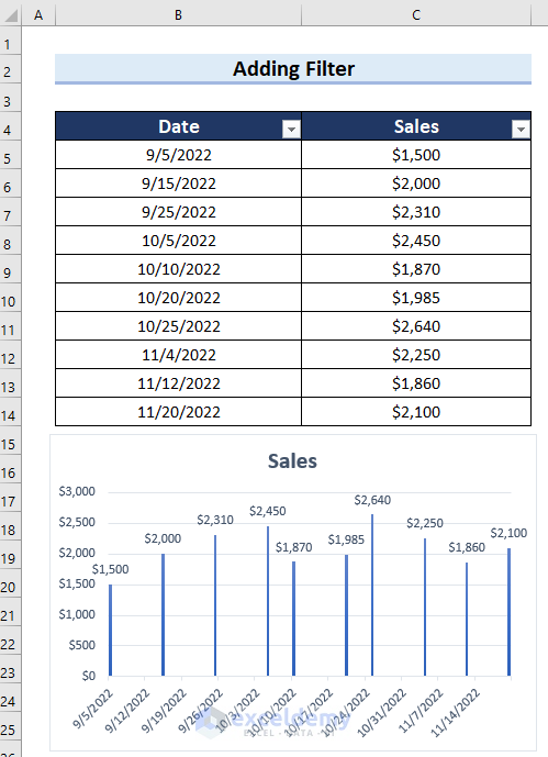
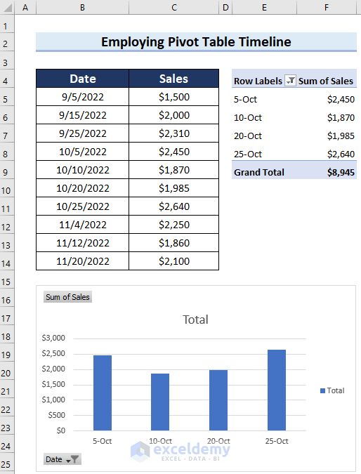
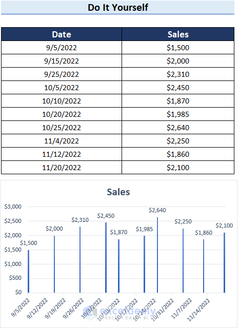
Let’s take a closer look at our dataset. It includes two columns: “Date” and “Sales.” This data is visualized using a column chart. We’ll use this dataset to illustrate the various methods.
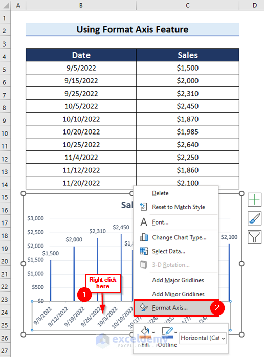
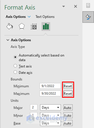
Method 1 – Use Format Axis Feature
- Right-click on the axis that contains the dates in your chart.
- Select Format Axis.
- The Format Axis task pane will appear on the right side of the screen.
- In the Minimum section, enter the start date of the desired date range.
- In the Maximum section, enter the end date of the desired date range.
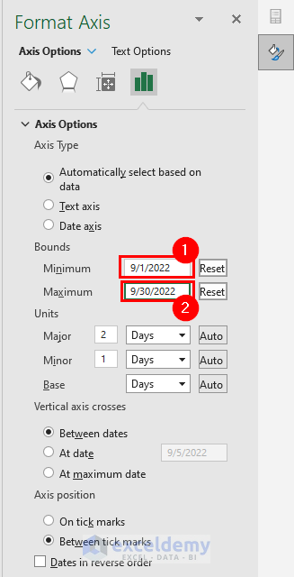
- The date range in your Excel chart will be adjusted according to your preference.
- To revert to the original date range, click the Reset button.
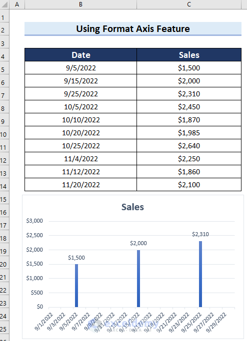
- Below you can see the chart as it was before changing the date range.
Read More: How to Show Only Dates with Data in Excel Chart
Method 2 – Add a Filter
- Select the cell where you want to add the filter (e.g., the Date column).
- Go to the Data tab.
- Click on Filter.
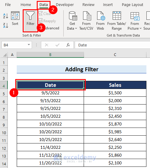
- A filter icon will appear next to the Date column.
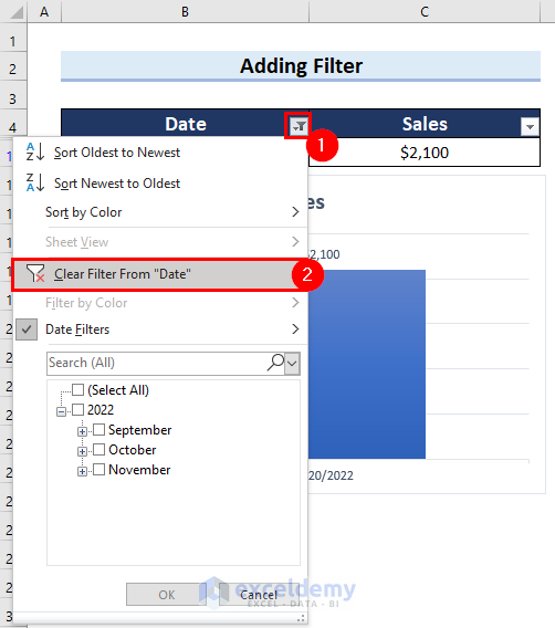
- Click the filter button.
- Choose Date Filters from the drop-down menu.
- Select the specific option (e.g., This Week) to adjust the date range.
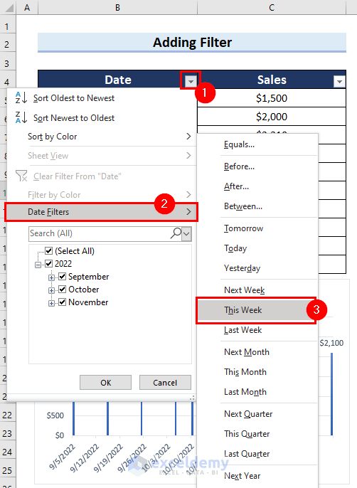
- Your chart will display data from the chosen date range.
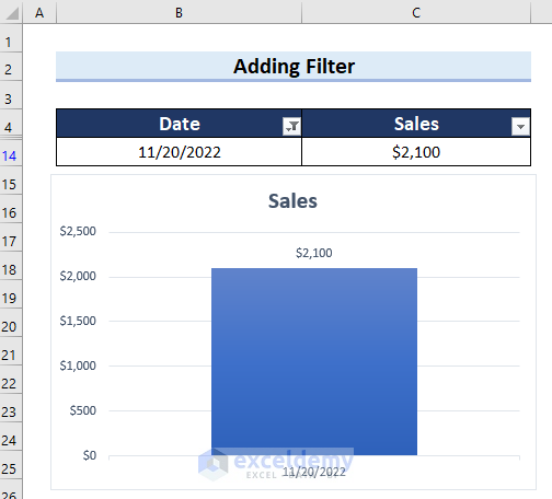
- To remove the filter and revert to the original date range, click the filter button again and choose Clear Filter From ‘Date’.
- Below you can see that the filter is removed from the date range in Excel.
Read More: How to Create Graph from List of Dates in Excel
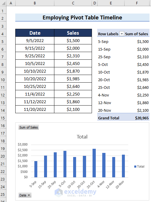
Method 3 – Use a Pivot Chart Timeline
Step 1 – Create a Pivot Chart in Excel
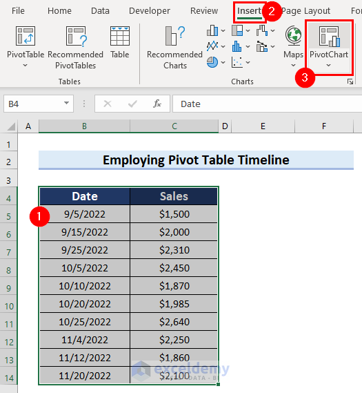
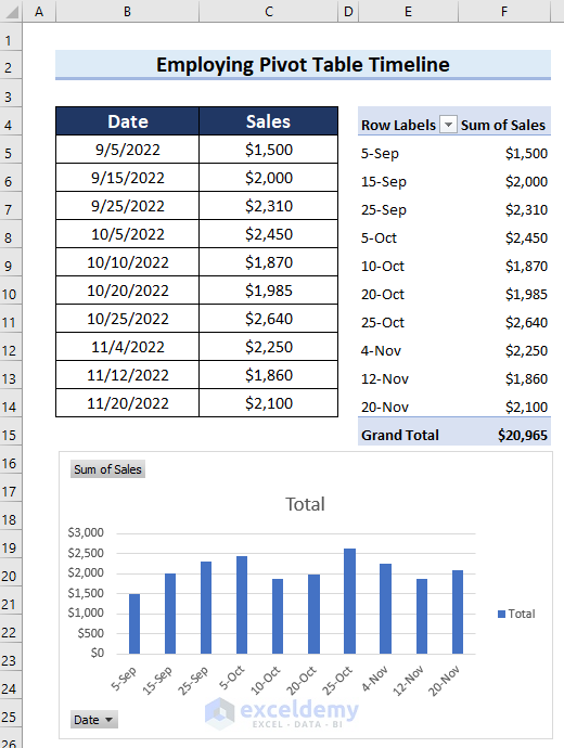
- First, select the cell range (e.g., B4:C14) that you want to use for the Pivot Chart.
- Go to the Insert tab on the Ribbon.
- Choose PivotChart.
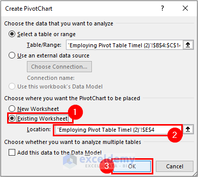
- In the Create PivotChart dialog box, select Existing Workbook.
- Specify the location where you want the Pivot table.
- Click OK.
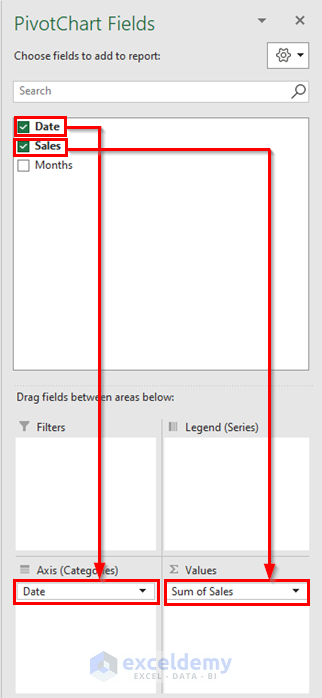
- The PivotChart Fields task pane will appear on the right side of the screen.
- Drag the desired fields into the Axis area (e.g., Date) and the Values area (e.g., Sales).
- You’ve inserted the Pivot Chart into your Excel sheet.
Read More: How to Change Chart Data Range in Excel
Step 2 – Add a Timeline to the Pivot Chart
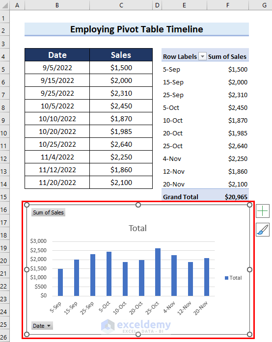
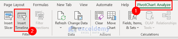
- Select the Pivot Chart.
- Go to the PivotChart Analyze tab.
- Click Insert Timeline.
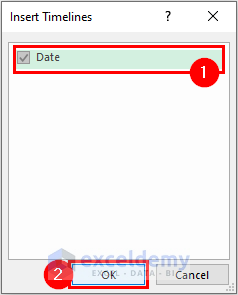
- In the Insert Timelines dialog box, check the Date option.
- Click OK.
- The Timeline will appear.
- Choose the month you want to view data for (e.g., OCT for October Sales).
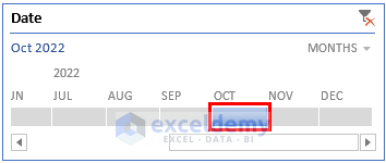
- You can see the changed date range below:
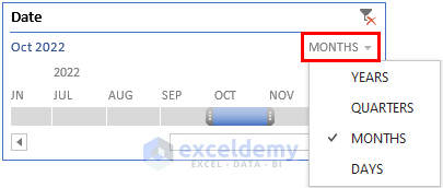
- You can also explore data by Days, Years, or Quarters.
- To do that, click on the marked button and then select the option as per your need.
- To clear the filter, click the marked button (as shown in the image).
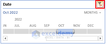
- Below you can see that the filter has been removed successfully.
Practice Section
A practice sheet has been provided for you to practice.
Download Practice Workbook
You can download the practice workbook from here:
Related Articles
<< Go Back to Edit Chart Data | Excel Chart Data | Excel Charts | Learn Excel
Get FREE Advanced Excel Exercises with Solutions!
