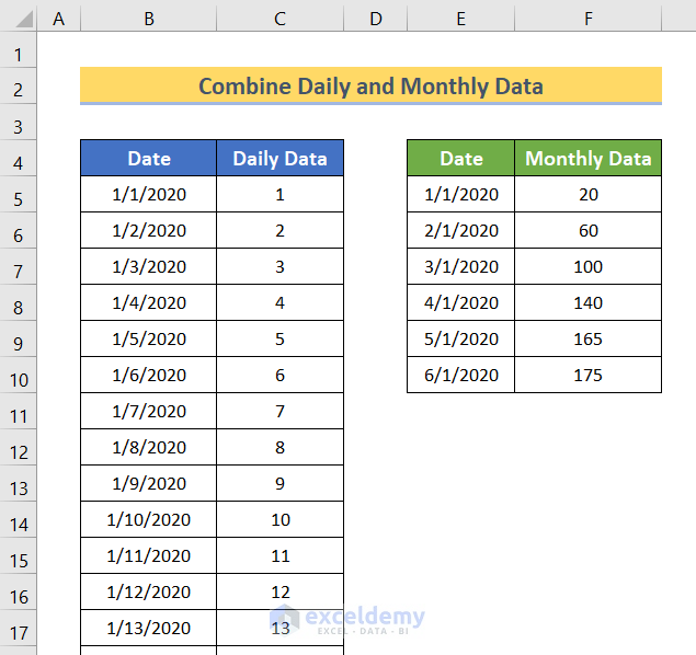
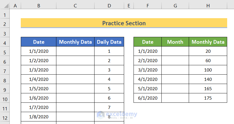
There are two datasets below. The first one showcases daily data and the second monthly data.
Step 1 – Extract the Month from the Date
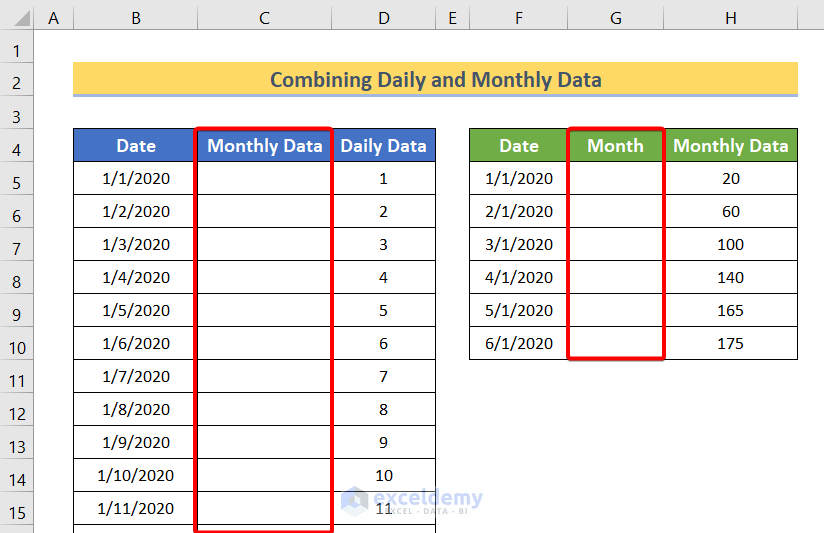
Create two blank columns: Monthly Data and Month.
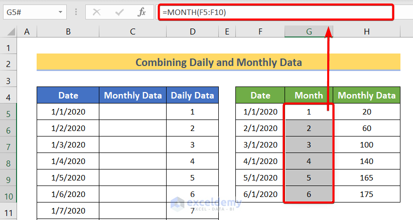
- Enter the following formula in G5.
=MONTH(F5:F10)- Press ENTER.
The MONTH function will extract the months from the dates in F5:F10. As it’s an array formula, the output will automatically be displayed in G5:G10.
Read More: How to Create Graph from List of Dates in Excel
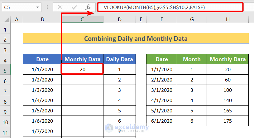
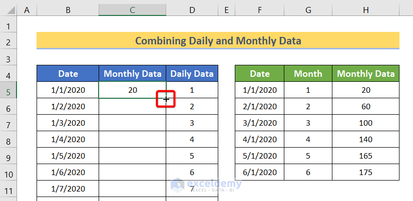
Step 2 – Using VLOOKUP Monthly Data into Daily Data
To extract monthly data from column H into column C:
- Enter the following formula in C5.
=VLOOKUP(MONTH(B5),$G$5:$H$10,2,FALSE)- Press ENTER.
Formula Breakdown
- MONTH(B5) extracts months from the data in B5.
- $G$5:$H$10 is the lookup array.
- 2 refers to the second column in $G$5:$H$10.
- FALSE refers to the exact match between the output of MONTH(B5) and $G$5:$G$10.
- VLOOKUP(MONTH(B5),$G$5:$H$10,2,FALSE) extracts monthly data from column H.
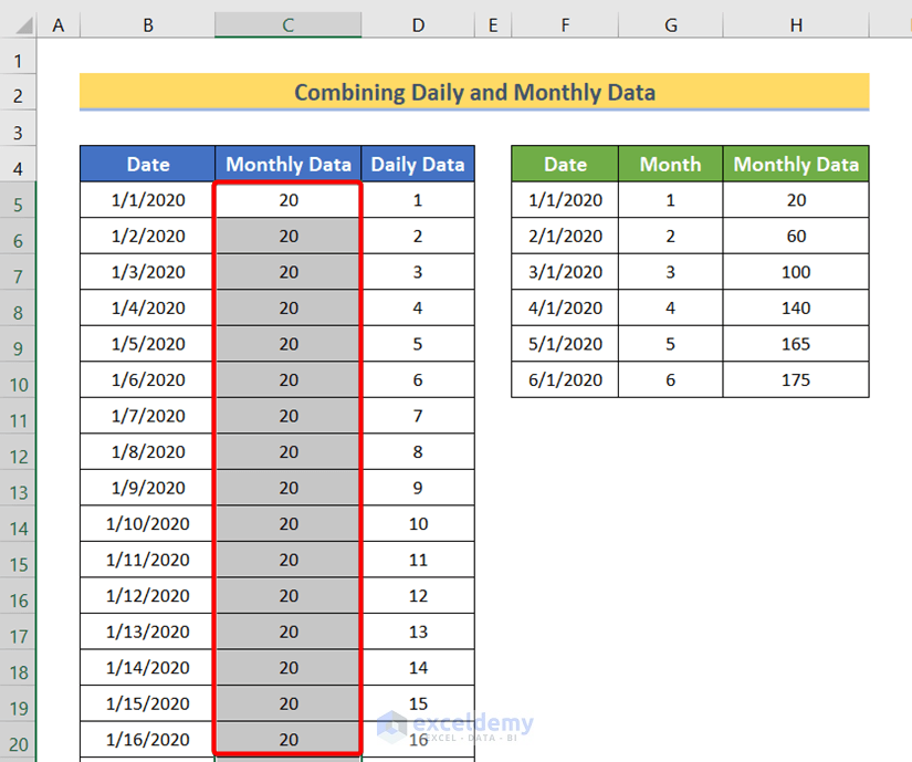
- Drag down the Fill Handle to see the result in the rest of the cells.
This is the output.
Read More: How to Show Only Dates with Data in Excel Chart
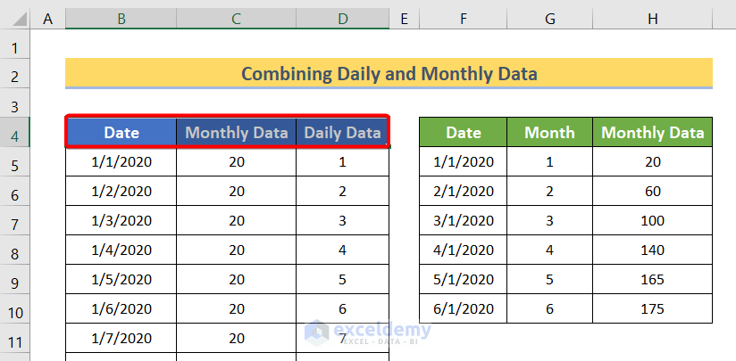
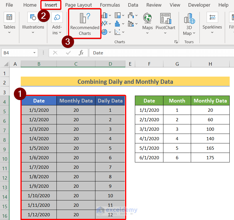
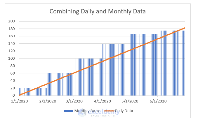
Step 3 – Generate the Chart Combining Daily and Monthly Data
- Select all the column headers of the first dataset.
- Press and hold CTRL & SHIFT.
- Press the down arrow key.
This will select the entire dataset.
- Go to the Insert tab.
- In Charts, click Recommended Charts.
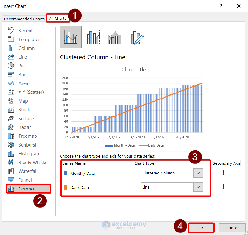
In the Insert Chart dialog box:
- Select All Charts.
- Click Combo.
- Select Clustered Column for Monthly Data and Line for Daily Data.
- Click OK.
This is the output.
Practice Section
Practice here.
Download Practice Workbook
Download the Excel file.
Related Articles
<< Go Back to Data for Excel Charts | Excel Charts | Learn Excel
Get FREE Advanced Excel Exercises with Solutions!
