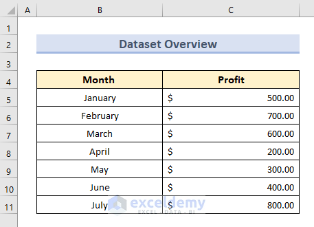
Here is a dataset with the Profit of a company separated by Months that we will use to change X-axis values in Excel.
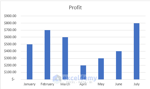
And here is the respective bar chart of the dataset above. We want to replace the Month by the serial number of respective months and see the chart only for Odd serial numbers.
Step 1 – Open the Source Data Selection Panel
- Select the X-axis of the bar chart and right-click on it.
- Click on Select Data.
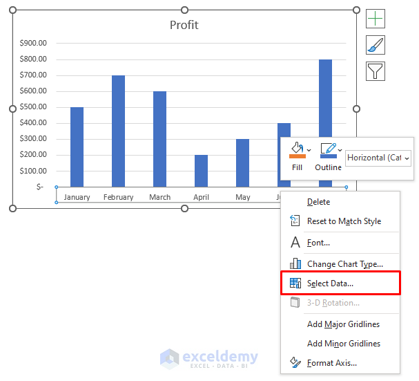
- After clicking on Select Data, the Select Data Source dialogue box will appear.
Read More: How to Change Data Source in Excel Chart
Step 2 – Selection of New Data to Change X-Axis Values
- On the Select Data Source panel, click on Edit.
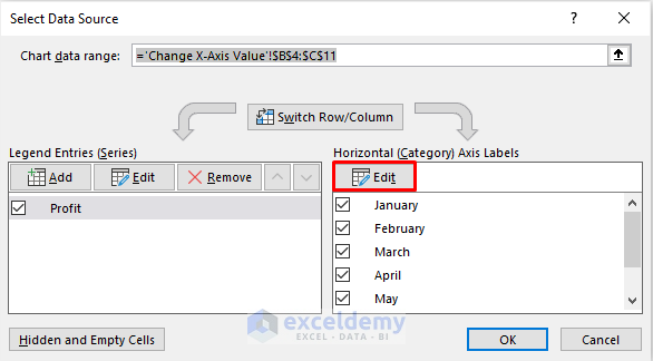
- A data selection box called Axis Labels will appear.
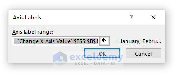
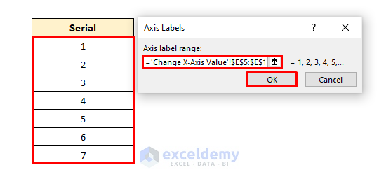
- In a separate column, type the month’s respective numbers serially and select the data.
- Press OK.
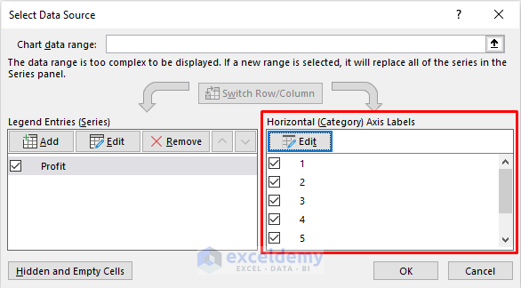
- The horizontal axis data has been replaced in the Select Data Source panel like this.
Read More: How to Change Chart Data Range in Excel
Step 3 – Modify Data for Changing X-Axis Values in Excel
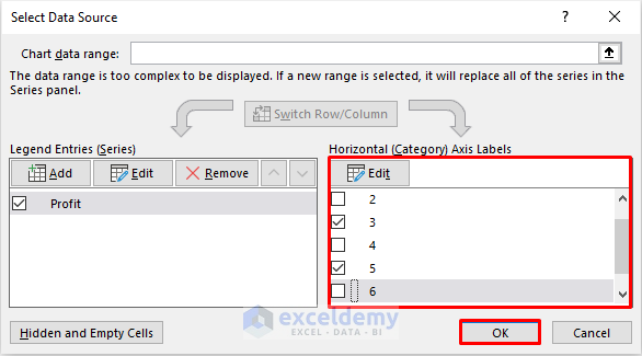
To modify data or filter data according to our need, we can select or deselect which data to show on the plot from the Horizontal (Category) Axis Labels option.
For our case, we need to show only the Odd serial number’s data. So we’ll deselect the Even numbers from the list like in the image below.
Read More: How to Edit Chart Data in Excel
Step 4 – Exit Select Source Data Panel
- Exit the Select Data Source panel by pressing OK.
- We can see our bar chart having data of only Odd serial number months like below.
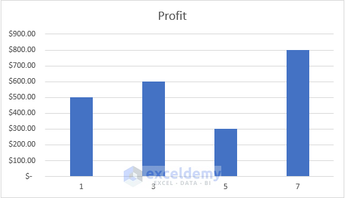
This how we change the X-axis values in Excel.
Read More: How to Change Chart Data Range Automatically in Excel
Changing Intervals to Change X-Axis Values in Excel
Case 1. On Text/Number Based X-Axis Values
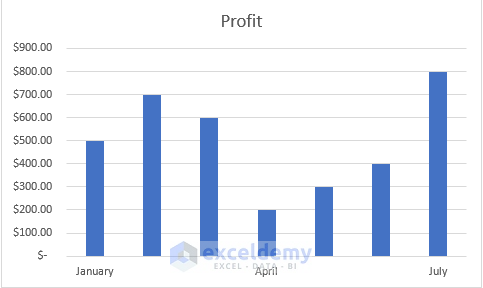
Consider our first dataset and bar chart again. Let’s say we want to see the Month’s name with 3 intervals in between. For example, if we want to see January, then the next label should be April.
Steps:
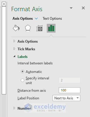
- Double-click on the X-axis to bring out the Format Axis option.
- Find Labels. Here, the intervals are by default selected Automatically.
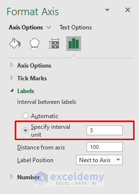
- For our case, we want the interval to be 3. Select Specify interval unit, set it to 3, and press Enter.
- After confirming, we will have a graph like below.
Read More: How to Skip Data Points in an Excel Graph
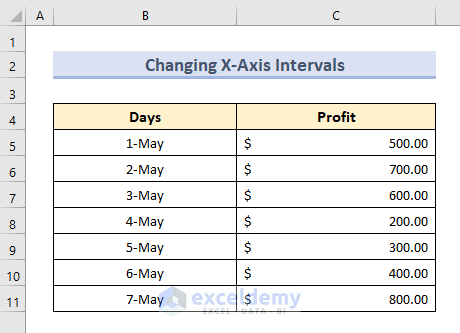
Case 2 – On Date Based X-Axis Values
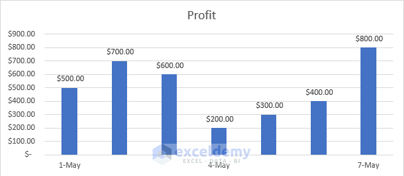
To get our expected result for Date type data, consider the below dataset. It shows the Profit of any store from May 1 to May 7.
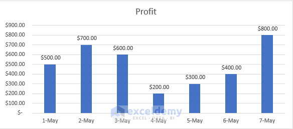
Also, we have a bar chart of the given dataset in the following image.
Steps:
- Double-click on the X axis to enable Format Axis. Here we will see a bunch of extra options for date-specific data.
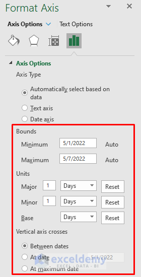
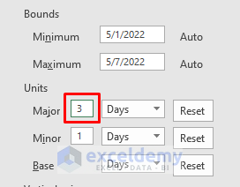
- Since our unit is in Days, set the Major to 3 and press Enter.
- We’ll have our previous bar chart in the following form.
Things to Remember
- While replacing our X-axis values in the mentioned process, we need to make sure our new replacing values are the same in number as the previous values.
- Changing Interval will not remove the rest of the columns having no label. If we want to do so, we will have to follow the previous method.
- For Date type data we need to carefully look at the Interval Unit. For units in Days, if we select Months, we will get the wrong output.
Download Practice Workbook
You can download the practice workbook from here.
Related Articles
- How to Edit Data Table in Excel Chart
- How to Sort Data in Excel Chart
- How to Group Data in Excel Chart
- How to Limit Data Range in Excel Chart
- How to Remove One Data Point from Excel Chart
- How to Hide Chart Data in Excel
<< Go Back to Edit Chart Data | Excel Chart Data | Excel Charts | Learn Excel
Get FREE Advanced Excel Exercises with Solutions!
