Method 1 – Group Adjusting Lineup of Source Data in Excel Chart
STEPS:
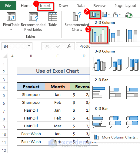
- Select the whole data in range B4:D11.
- Go to the Insert tab on the ribbon.
- Click on the Insert Column or Bar Chart drop-down menu from the Chats category.
- Select the Clustered Column from the 2-D Column section.
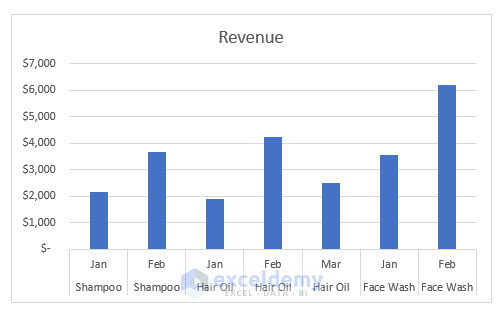
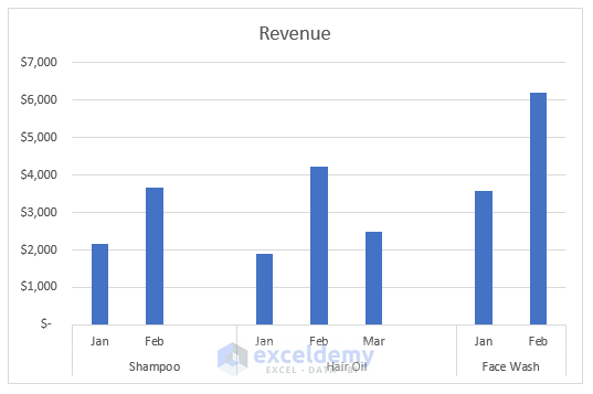
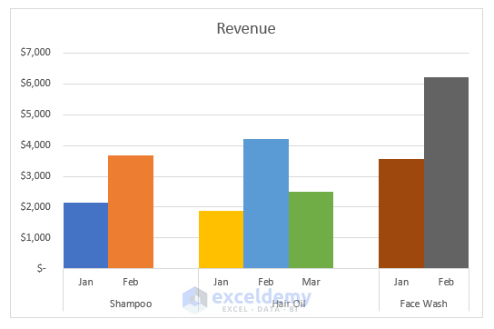
- The Clustered Chart will appear shown in the screenshot below. The graph displays the revenues for various products for the given months.
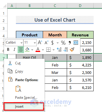
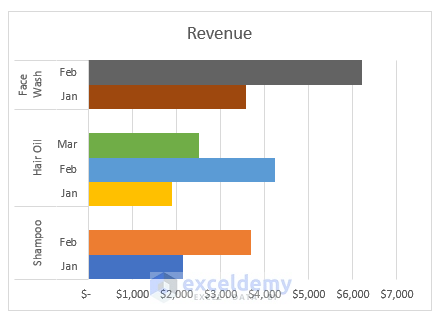
- Organize the products according to the available product data for each month.
- Insert a blank cell for separating the products. To insert a blank cell, right-click on your mouse and select Insert.
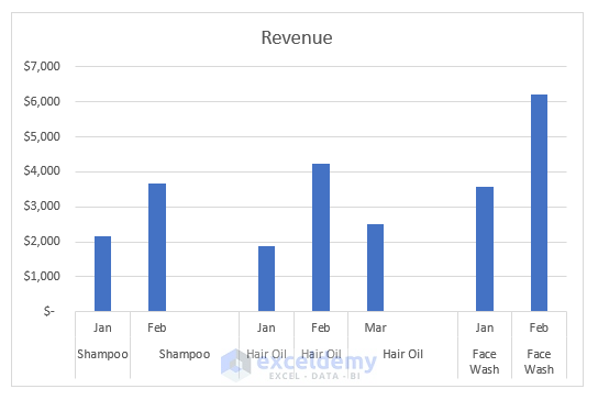
- This will also create some gaps in the chart.
- Remove the duplicate name of the product. Select the cell which has the same product name and press the Delete key on your keyboard.
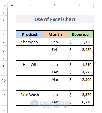
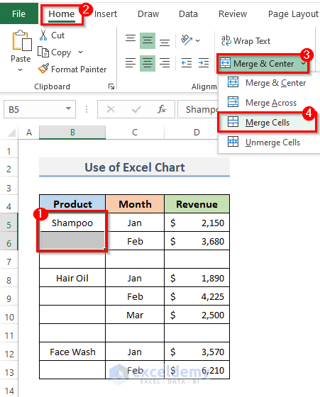
- Merge the same product cells. For this, select the cells and go to the Home tab.
- In the Alignment group, click Merge from the drop-down menu and select Merge Cells.
- The dataset looks like this shown in the picture below.
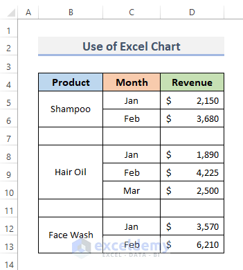
- The various months and products are shown on the chart’s x-axis. The data are now in a group.
- Suppose we want to format the chart to visualize the group data properly.
- Double-click on the chart or press the Ctrl + 1, keyboard shortcut.
- The Format Chart Area window will appear on the right side of the spreadsheet.
- Click on the Chart Options drop-down menu and select Series “Revenue”.
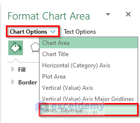
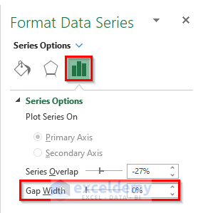
- The Format Data Series dialog box will display.
- From the Series Options, set the Gap Width to 0%. This will gather all the bars for a single category in one spot.
- Select the same chart, then click the Fill option.
- Check the option that says ‘Vary colors by point’. See the colorful chart bars.

- Visualize the group data in Excel charts.
Method 2 – Use Excel Pivot Chart to Group Data
STEPS:
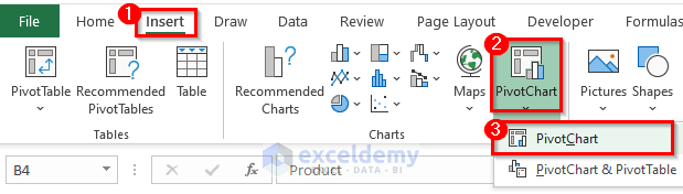
- Select the whole data.
- Go to the Insert tab from the ribbon.
- From the Charts group, click on the Pivot Chart drop-down menu and choose PivotChart.
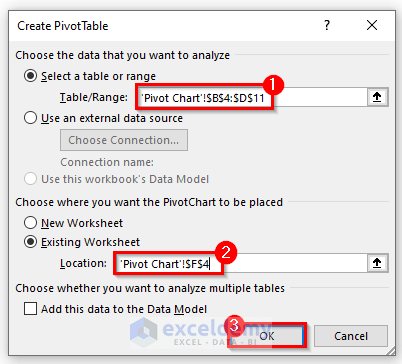
- Open the Create PivotTable dialog box.
- See the Table/Range field filled with our previous selection (as we select the whole data before creating the pivot table) in the Select a table or range selection box under Choose the data you want to analyze.
- Pick the Existing Worksheet from Choose where you want the PivotChart to be placed.
- In the Location field, put the cell where you want to place the pivot chart.
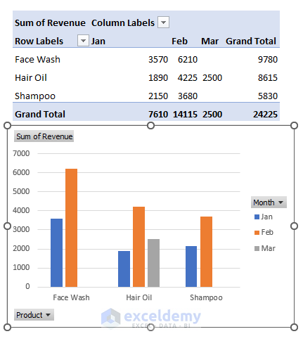
- The PivotChart Fields will display on the right side of the spreadsheet.
- Select the Product and drag it into the Axis (Categories) section. Drag the Month on the Legend (Series) section. Put the Revenue in the Values section by dragging the revenue.

- You will able to see product data are in a group on the Excel Pivot Chart.
Clustered Column Chart to Clustered Bar Chart Conversion in Excel
STEPS:
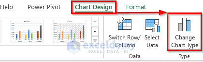
- Select the chart, and by selecting the Chart Design and the Format tab will appear in the excel ribbon.
- Go to the Chart Design from the ribbon.
- Click on the Change Chart Type from the Type category.
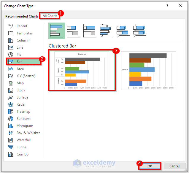
- Display the Change Chart Type dialog box.
- From the All Charts menu, select Bar.
- Click on the Clustered Bar.
- Click on the OK button to complete the process.
- You convert the Clustered Column Chart into Clustered Bar.
Things to Remember
- With group data in Excel Chart, we can perform the following prerequisites.
» Display a dispersion of data points.
» Enable comparison of both within and across groups.
» Examine how one element has changed in relation to another.
» Understanding the charts throughout various eras.
- Excel Charts are the ideal tool for data analysis since graphs depict data more accurately.
- The organization of the data affects how well the grouped chart works.
- The chart type may change after creating a group data chart.
- The data should arrange in a certain sequence, otherwise, the group data chart will not create properly.
Download Practice Workbook
You can download the workbook and practice with them.
Related Articles
- How to Change Chart Data Range in Excel
- How to Edit Data Table in Excel Chart
- How to Change Data Source in Excel Chart
- How to Change X-Axis Values in Excel
- How to Change Chart Data Range Automatically in Excel
- How to Sort Data in Excel Chart
- How to Limit Data Range in Excel Chart
- How to Skip Data Points in an Excel Graph
- How to Remove One Data Point from Excel Chart
- How to Hide Chart Data in Excel
<< Go Back to Data for Excel Charts | Excel Charts | Learn Excel
Get FREE Advanced Excel Exercises with Solutions!

I like it
Hello king,
Thanks for your feedback and appreciation. Glad to hear that you liked our article.
Keep exploring Excel with ExcelDemy!
Regards,
ExcelDemy