You have come to the right place if you are looking for the answer or some unique tips to create a project portfolio Bubble Chart in Excel. There are some quick steps to create a project portfolio Bubble Chart in Excel. This article will walk you through each and every step with appropriate examples. As a result, you can use them easily for your purpose. Let’s move on to the article’s main discussion.
What is Project Portfolio Bubble Chart?
Through the project portfolio bubble chart, one can easily make decisions and compare various products and projects to approve or reject them. There are many kinds of Bubble Charts used in portfolio management. A portfolio bubble chart has the advantage of quickly displaying the current portfolio’s balance. Portfolio bubble charts can help the portfolio governance team have more productive conversations about the portfolio’s management.
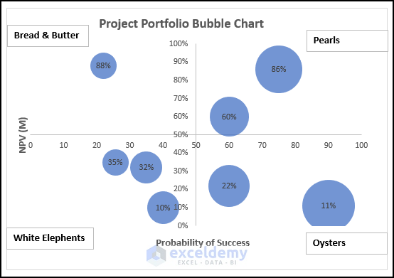
Risk-Reward Bubble Diagram in Portfolio Management
With the help of a risk-reward bubble diagram, projects can be organized by the quadrant in which they fall. There are four quadrants in the Risk Reward Diagram.
- Bread and Butter – Upper Left Quadrant: These projects will have low rewards but a high probability of success. These are simple and usual projects that you may deal usually.
- White Elephants – Bottom Left Quadrant: These projects will have low rewards and a low probability of success. You will try to avoid these projects but still, you have to face some of them.
- Pearls – Upper Right Quadrant: All managers and businessmen aspire to have more pearls. These are called the star projects which are of a high probability of technical success and return a very high reward.
- Oysters – Bottom Right Quadrant: These projects are of low success probability but will give a high return of profit.
Steps to Create a Project Portfolio Bubble Chart in Excel
In this section, I will show you some quick and easy steps to create a project portfolio bubble chart of Risk – Reward Diagram in Excel on the Windows operating system. This article contains detailed explanations with clear illustrations for everything. I have used the Microsoft 365 version here. However, You may use any other version depending on your availability. Please leave a comment if any part of this article does not work in your version.
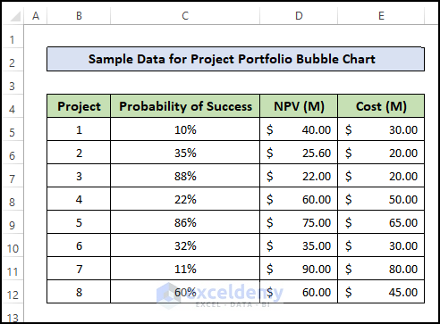
Step 1: Create Dataset
First, you have to collect data on the projects that you are planning to start. You have to collect the required data to assume the technical probability of success, NPV, which is the return on the investment, and the estimated cost. Then, create a dataset accordingly given in the screenshot below:
Read More: How to Create Bubble Chart in Excel
Step 2: Insert Bubble Chart
Then, you can create a bubble chart based on the dataset that you have created. Follow the procedure below:
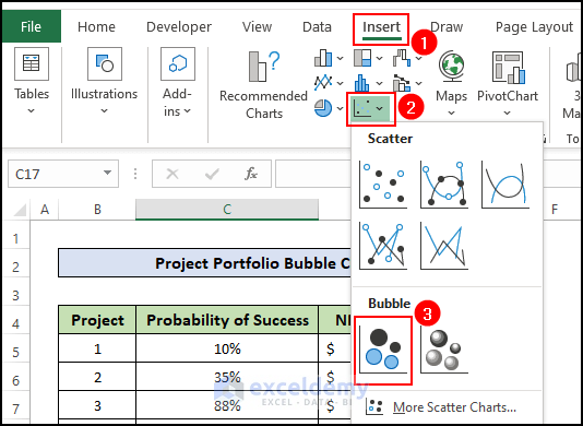
- Go to the Insert tab in the top ribbon.
- Then, click on the Scatter chart icon and select the 2D Bubble Chart
- After that, double-click on the created chart and go to the Chart Design tab on the ribbon.
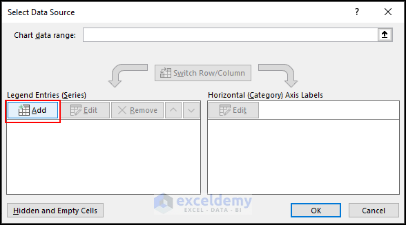
- Then, click on the Select Data

- As a result, a new window named “Select Data Source” will be created.
- Here, click on the Add
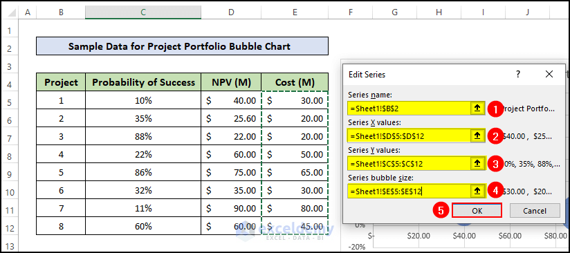
- Then, a new pop-up window named Edit Series will appear.
- Here, select cell B2 for the Series Name box.
- Then, select cell range D5:D12 for the Series X Values box.
- After that, select cell range C5:C12 for the Series Y Values box.
- Lastly, select cell range E5:E12 for the Series bubble Size box and press the OK button.
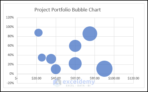
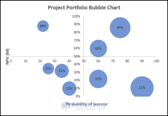
- As a result, you will see a bubble chart will be created in the active worksheet. But, it has not become a Risk Reward. For this, we have to create four distinct quadrants in the chart.
Read More: How to Create a 3D Bubble Chart in Excel
Step 3: Format Bubble Chart
To make a risk-reward bubble chart, we have to make four quadrants inside the graph. For this, we have to shift the axis from the side to the middle positions. For this, you have to follow the below procedures.
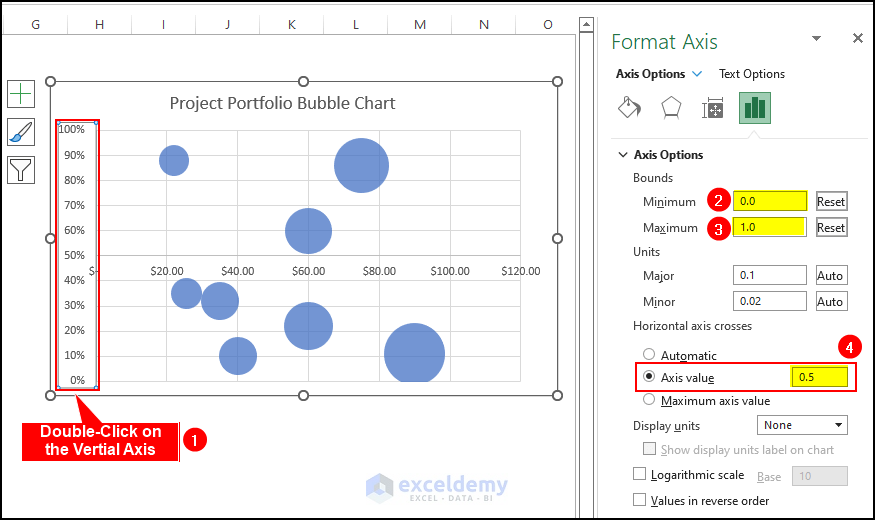
- First, double-click on the vertical axis and you will see there will open a window on the right side of the worksheet named “Format Axis”.
- Here, specify the minimum as 0 and the maximum as 1.
- Then, mark the button “Axis Value” under the “Horizontal Axis Crosses” option.
- After that, insert 5 in the Axis Value box.
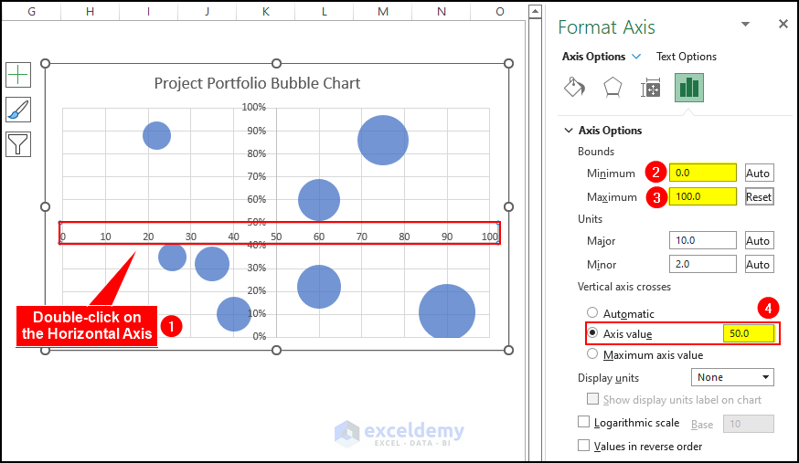
- After that, you have to do the same thing for the horizontal axis also.
- For the horizontal axis, specify the minimum as 0 and the maximum as 100.
- After that, insert 50 in the Axis Value
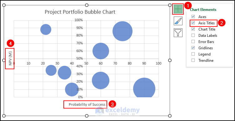
- Then, click on the Plus (+) icon aside the chart and mark Axis Titles
- Then, rename the vertical axis as “Probability of Success” and the vertical axis as “NPV”.
- Thus, now you have the risk-reward bubble chart ready for presentation.
- One more thing is still remaining. You may see that there are no identifications on the diagram for the quadrants.
- For this, you have to insert a Text Box on the Bubble Chart where you can specify the name for the quadrants. So, go to the Insert tab and click on the Text Box option to create a blank text
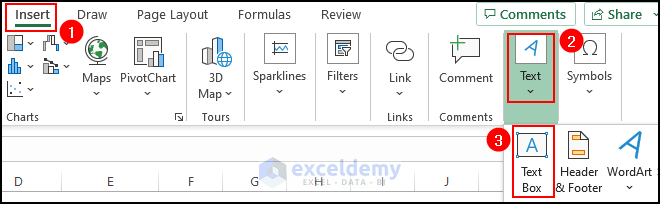
- Then, draw a new text box at a suitable position on the bubble chart.
- Then, type the name for the quadrant.
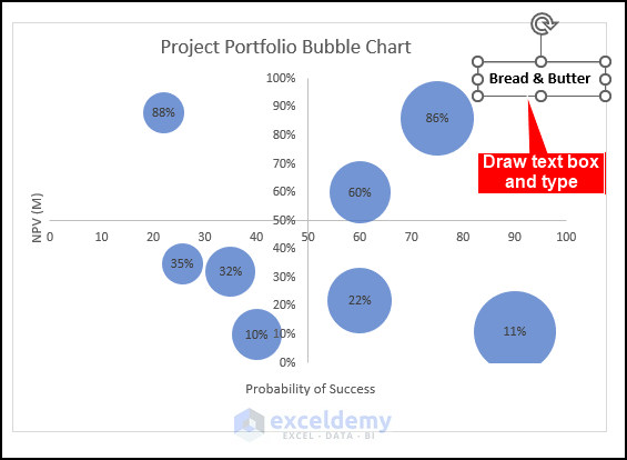
- Similarly, create more text boxes for all four quadrants and type the names inside the text boxes.
- Thus, you have created a project portfolio bubble chart.
Read More: How to Create 4 Quadrant Bubble Chart in Excel
Download Practice Workbook
Conclusion
In this article, you have found how to create a project portfolio Bubble Chart in Excel. I hope you found this article helpful. Please leave comments, suggestions, or queries if you have any in the comment section below. Goodbye!
Related Articles
- How to Create a Bubble Matrix in Excel
- How to Create a Bubble Chart in Excel with Labels
- Excel Bubble Chart Examples
<< Go Back To Bubble Chart in Excel | Excel Charts | Learn Excel
Get FREE Advanced Excel Exercises with Solutions!

This is a great post, Osman. I have a question. Where do the probability of success % come from?
Thanks,
Harrison
Hi Harrison,
Thanks for your comment. Calculating the probability of success of a project is actually a complex task that depends on various factors. One common approach is to use a weighted scoring system based on certain criteria for each project. Here’s a simplified template you can use:
Step 1: Define Criteria and Assign Weights
=>> Create a list of criteria that are important for determining the success of a project. These criteria may include factors such as budget, timeline, team expertise, market demand, and alignment with strategic goals.
=>> Assign weights to each criterion to reflect their relative importance. For example, if the timeline is more critical than the budget, you might assign a higher weight to the timeline criterion.
Step 2: Evaluate Each Project
=>> Assess each project in your portfolio against the defined criteria. You can use a scale (e.g., 1 to 10) to rate each project’s performance on each criterion.
=>> Multiply the ratings by the assigned weights for each criterion and calculate the weighted score for each project.
Step 3: Calculate Probability of Success
=>> Add up the weighted scores for each project to get a total score. The total score represents the overall potential for project success.
=>> You can then convert this total score into a probability of success. This step is somewhat subjective, and you might need to set specific thresholds for what constitutes a “high probability of success“. For example, you could establish that a total score above a certain threshold (e.g., 80 out of 100) indicates a high probability of success.
=>> You may want to use historical data or expert judgment to help determine the relationship between total scores and success probabilities.
Finally, you can express the probability of success as a percentage. For instance, if a project has a total score of 85 out of 100, and this is associated with a high probability of success, you could say that the project has an 85% chance of success.