In any business or in the corporate sector, data visualisation is a crucial factor. For assessing the performance, or to take any decision based on data, a graphical presentation is the best possible way to execute. Excel is a widely used application around the world that can work with a large amount of data successfully. So, in this article, we’ll demonstrate 10 necessary and convenient types of visualisation tools in Excel. Therefore, go through the entire article to grab the benefits.
Importance of Using Visualisation Tools in Excel
The graphical depiction of data is known as data visualization. It facilitates understanding of the data. There are many tools available to visualize data. However, Excel’s excellent data visualization tools make it a popular choice for data research methodology. We can easily create enlightening infographics with Excel’s data visualisation function. Every Excel graph has its own meaning. A wide range of pre-installed charts in Excel can be gracefully applied to enhance the potential of data.
Visualisation in Excel with 10 Examples
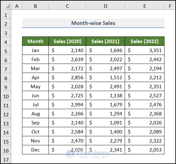
For ease of understanding, we are going to use a Month-wise Sales report. This dataset includes the Month, and corresponding Sales of 2020, 2021, and 2022 in columns B, C, D, and E respectively.
We will illustrate the uses of various charts to better grasp data visualisation tools in Excel. This will acquaint us with the process for creating these Excel representations and using them to extract insights from the above dataset.
Here, we have used Microsoft Excel 365 version, you may use any other version according to your convenience. Please leave a comment if any part of this article does not work in your version.
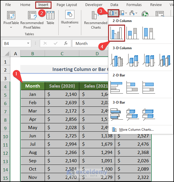
1. Column or Bar Chart
At the very beginning, we’ll discuss the Column or Bar chart. In these charts, our data is displayed in the guise of vertical or horizontal bands. So, let’s see how to insert it into the worksheet.
📌 Steps:
- First of all, select the entire dataset which is in the B4:E16 range.
- Secondly, navigate to the Insert tab.
- Thirdly, click on the Insert Column or Bar Chart drop-down icon.
- Lastly, select the Clustered Column in the 2D Column section.
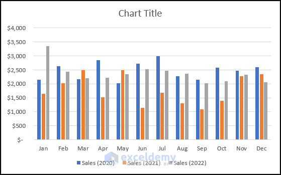
Immediately, a Column Chart will be available in our worksheet.
- Now, give the chart a suitable title like below.
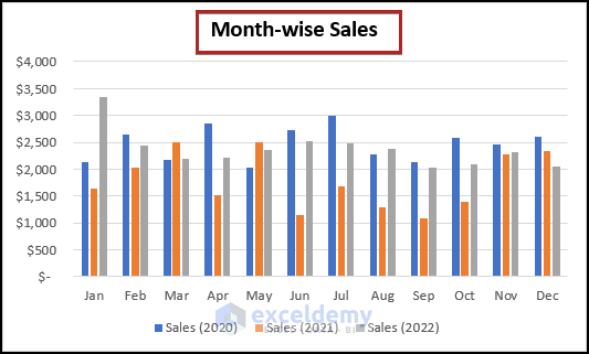
- Similarly, insert another Bar Chart using the same dataset.
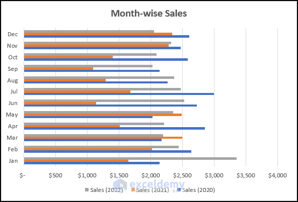
Now, you might be able to understand the difference between these two charts.
2. Hierarchy Chart
We use this type of chart to visualize several components of a whole figure. Let’s see below.
📌 Steps:
- At first, select cells in the B4:E13 range.
- Then, follow the previous steps of Type 1.
- After that, click on the Treemap chart.
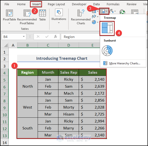
Following this, the chart is available on our worksheet.

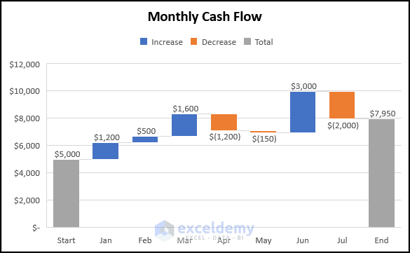
3. Waterfall Chart
A Waterfall Chart is a visual representation of the net changes between the Start and End points of a cumulative value. It shows each unique increase or decrease value that created the net change, instead of just showing the initial and final value. Let;’s see how to create a Waterfall Chart in Excel.
📌 Steps:
- Firstly, select cells in the B4:C13 range.
- Secondly, follow the previous steps.
- Then, choose the built-in Waterfall chart.
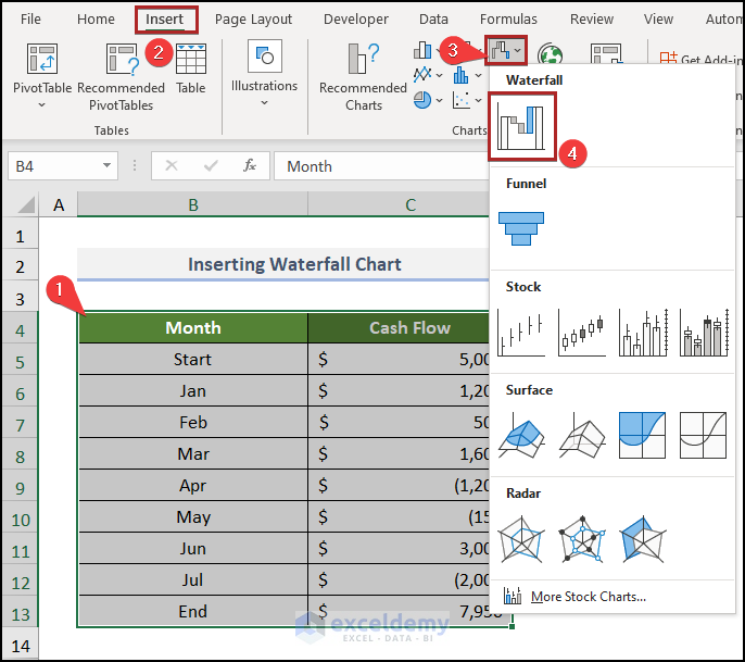
The final look of the chart is like the following.
4. Line or Area Chart
Sometimes for data visualization, you may need to plot a Line chart. There is a built-in process in Excel for making this chart. Let’s see it in action.
📌 Steps:
- First and foremost, select the entire dataset.
- Then, follow the previous steps.
- After that, select 2-D Line from the available options.
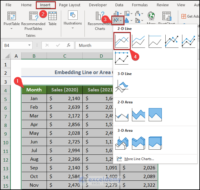
Now, the chart appears before us.
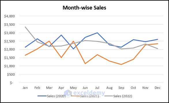
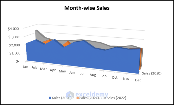
Similarly, you could employ an Area Chart.
5. Statistic Chart
A Statistic Chart allows you to quickly get an overview of a dataset. For example, if you have a histogram created from the test scores of the students in a class, you can assess the performance of the class at a glance. Without further delay, let’s dive in.
📌 Steps:
- Initially, select cells in the C4:C14 range.
- Then, follow the steps like before.
- Afterward, choose Histogram from the Insert Statistic Chart drop-down list.
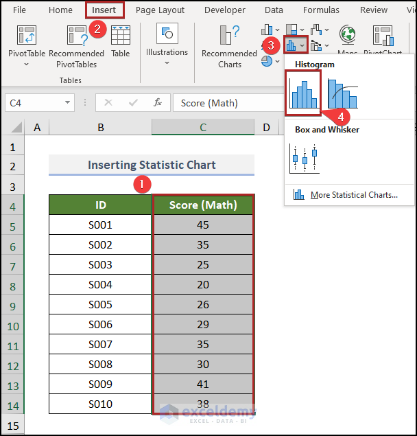
The final look is like the following.
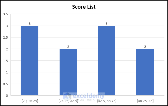
From this chart, we can know how many students get numbers from a selected range of numbers. Like, 3 students get numbers in the 32.5 – 38.75 range.
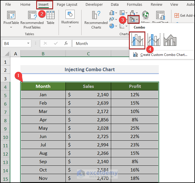
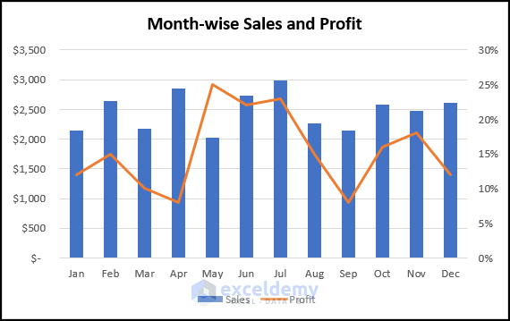
6. Combo Chart
A Combo Chart not only helps us to visualize our data but also allows us to compare various aspects of our data. As a result, we can make decisions based on the information from the combo chart. Follow the steps below to learn how to insert a Combo Chart.
📌 Steps:
- Primarily, select cells in the B4:D16 range.
- Secondarily, do as in the previous steps.
- Then, select Clustered Column – Line from the options.
As a result, the Combo Chart is before our eyes.
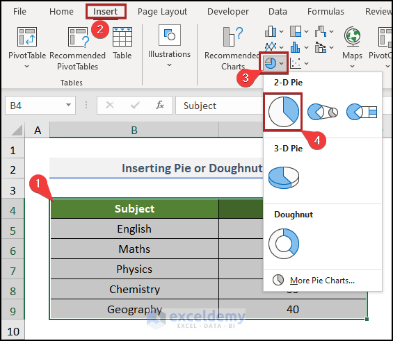
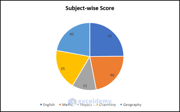
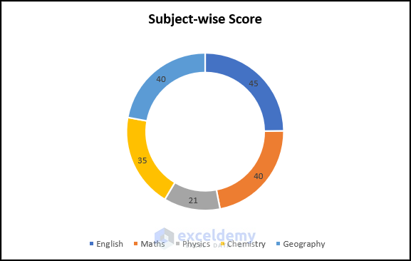
7. Pie or Doughnut Chart
A Pie Chart is made of slices that form a circularly shaped graph to represent the numerical data of an analysis. Pie charts are difficult to draw as they present the relative value of some particular data as a value or as a percentage in a circular graph. See below to insert a Pie chart or Doughnut chart successfully in your worksheet too.
📌 Steps:
- Firstly, highlight the cells in the data range.
- Secondly, follow the previous steps.
- Then, select Pie chart from the options.
Currently, you can see the chart in the worksheet.
Similarly, a Doughnut Chart can present the data in an akin manner.
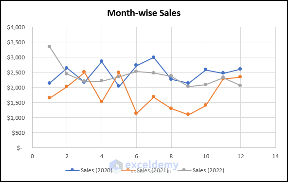
8. Scatter (X, Y) Chart
Scatter charts are usually used to find relationships between two or more variables. It is also known as the XY Scatter Chart. Let’s see the following steps.
📌 Steps:
- At first, select cells in the B4:E16 range.
- Secondly, just do as before.
- Thirdly, select Scatter with Straight Lines and Markers chart from the list.
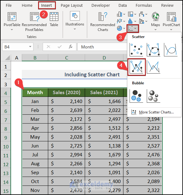
Consequently, Excel will insert the chart.
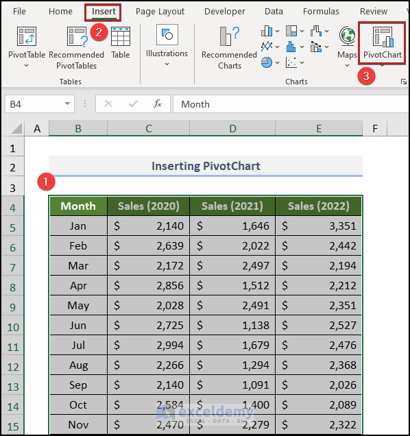
9. PivotChart
With a PivotChart, we can graphically represent the data summarized in a PivotTable. It’s simple & easy, just follow along.
📌 Steps:
- Firstly, select the whole dataset.
- Then, go to the Insert tab.
- After that, click on PivotChart on the Charts group of commands.
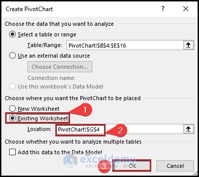
Suddenly, the Create PivotChart dialog box appears before us.
- Presently, select the Existing Worksheet option.
- In the Location box, give the cell reference of G4 of the PivotChart worksheet.
- As usual, click OK.
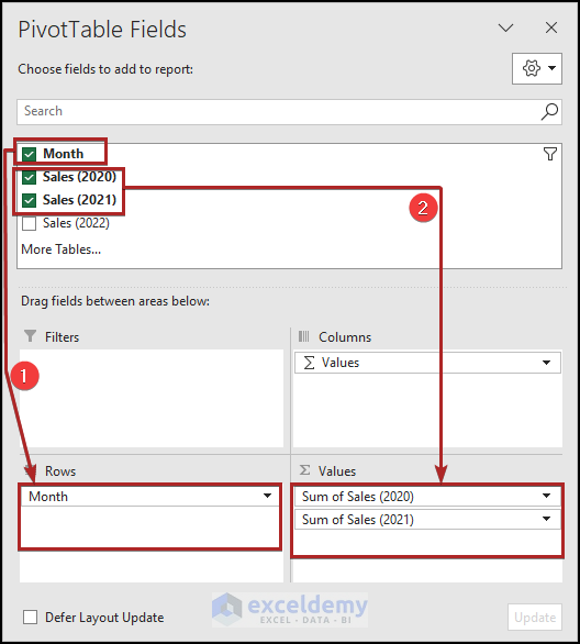
- Now, set the fields into the areas in the PivotTable Fields task pane as in the following image.
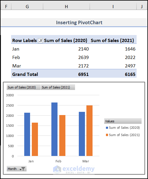
Correspondingly, PivotTable and PivotChart are visible before you.
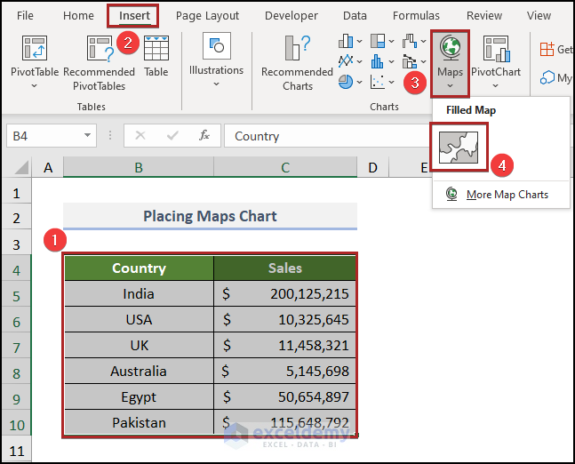
10. Maps
You can use Excel to create a map with your dataset. It is really easy to create a map in Excel. Just follow along.
📌 Steps:
- Originally, select cells in the B4:C10 range.
- Then, mimic the previous steps.
- Afterward, click on the Insert Map Chart drop-down icon and select Filled Map from the list.
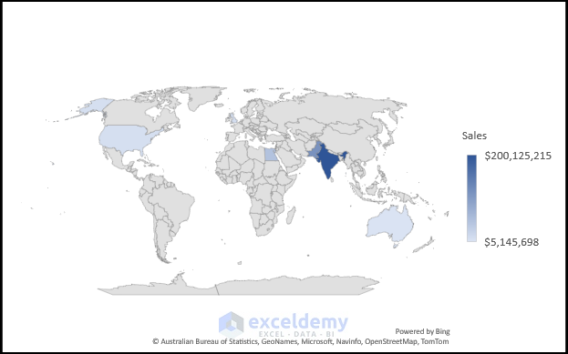
Subsequently, the Map Chart is apparent before us.
How to Create Visualization Dashboard in Excel
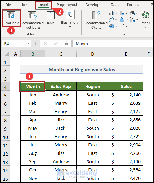
At this moment, we’ll show how you can easily create an interactive but simple dashboard in Excel. Just follow these simple steps.
📌 Steps:
- First and foremost, select any cell inside the dataset. In this case, we selected cell B4.
- Then, advance to the Insert tab.
- Following this, click on PivotTable on the Tables group.
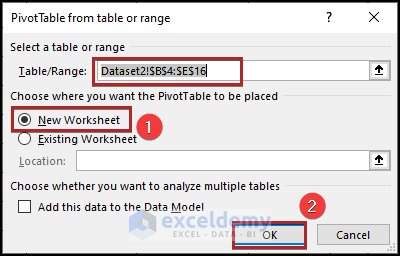
Instantly, the PivotTable from table or range dialog box will pop up.
- Here, select New Worksheet and click OK.
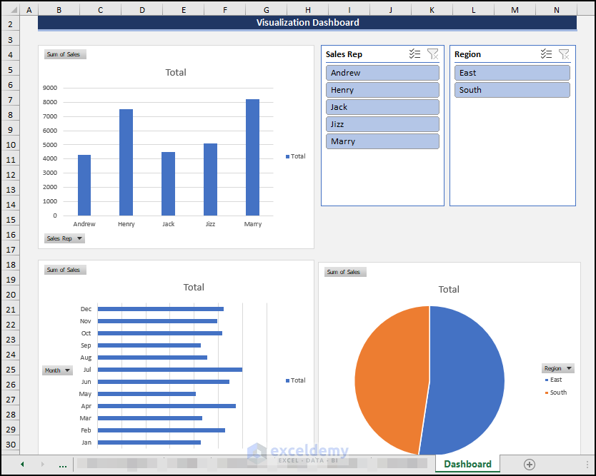
We have created 3 PivotTables for Sales Rep, Month, and Region.
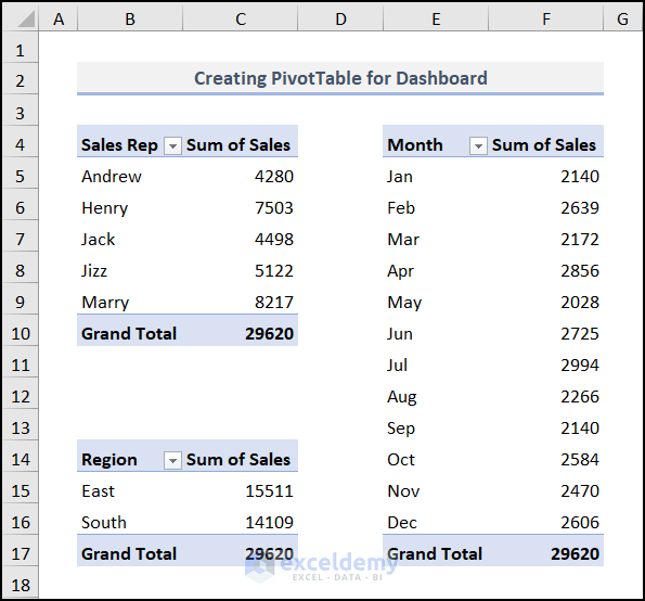
Then, we inserted 3 different charts for these 3 tables. Also, we increased the credibility by adding two Slicers to the worksheet for these charts.
Read More: Visualization Examples in Excel
Practice Section
For doing practice by yourself we have provided a Practice section like the one below in each sheet on the right side. Please do it by yourself.
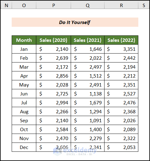
You may download the following Excel workbook for better understanding and practice yourself.
Conclusion
This article explains how to use visualisation tools in Excel in a simple and concise manner. Don’t forget to download the Practice file. Thank you for reading this article. We hope this was helpful. Please let us know in the comment section if you have any queries or suggestions.
<< Go Back to Data Visualisation in Excel | Learn Excel
Get FREE Advanced Excel Exercises with Solutions!

Hi Excel Demy,
I am Gopi Thank you for the valuable emails .Please send some Work force management formula, tips and tricks.
Thanks & Regards
Gopi
Dear Gopi Sahu,
Thanks for reaching out to us. You will get various types of WFM related articles here Excel Solver
If you need solution of any specific topic kindly comment down below.
Regards
ExcelDemy