Looking for ways to know how to create a waterfall chart in Excel? Usually, we use waterfall charts to graphically visualize cumulative values. Here, you will find step-by-step explained ways to create a waterfall chart in Excel.
What Is a Waterfall Chart?
Waterfall Chart is a visual representation of the net changes between the Start and End points of a cumulative value. It shows each unique increase or decrease value that created the net change instead of just showing the initial and final value. We can use this chart for different purposes such as checking Accounts, Inventory, Products, Revenue etc.
How to Create a Waterfall Chart in Excel: 2 Ways
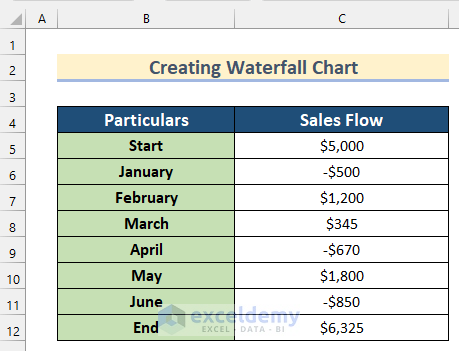
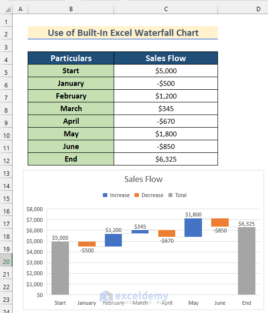
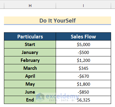
Here, we have a dataset containing the values of Sales Flow for 6 consecutive months and Start and End values of sales. Now, we will show you how to create a waterfall chart in Excel using this dataset.
1. Use of Waterfall Chart Feature in Excel
In the first method, we will use built-in Excel Waterfall Chart to create a waterfall chart in Excel. Follow the steps given below to do it on your own dataset.
Step-01: Inserting Waterfall Chart
Here, we will show you how to insert a Waterfall Chart in Excel.
- First, select the Cell range B4:C12.
- Then, go to the Insert tab >> click on Waterfall, Funnel, Stock or Surface Chart >> select Waterfall Chart.
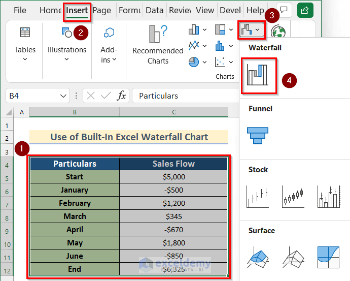
- After that, a Waterfall chart will be created.
Read More:How to Make a Waterfall Chart with Multiple Series in Excel
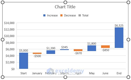
Step-02: Formatting Waterfall Chart
Now, we will show you how to format a Waterfall Chart in Excel going through some simple steps.
- First, click on Chart Title to change it.

- After that, type Sales Flow as Chart Title.

- Then, select the End bar.

- Now, the Format Data Point toolbar will open.
- After that, turn on Set as total.

- Next, select the Start bar.
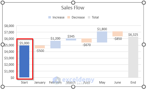
- Again, the Format Data Point toolbar will open.
- Similarly, turn on Set as total.

- Finally, you will get your desired waterfall chart by using built-in Excel Waterfall Chart.
Read More: How to Create a Stacked Waterfall Chart in Excel
2. Using Stacked Column Chart to Create a Waterfall Chart in Excel
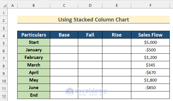
We can also use a Stacked Column Chart to create a waterfall chart in Excel. Stacked Column Charts can show the variation of multiple variables in the most suitable way.
Go through the steps given below to do it on your own.
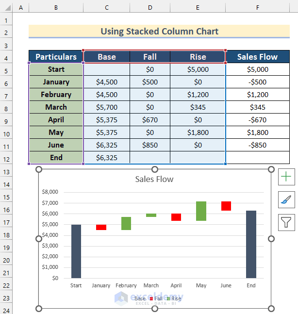
Step-01: Making Dataset to Create a Waterfall Chart
Here, we will show you how to make a dataset using some formulas to create a Waterfall Chart.
- First, create additional columns for Base, Fall and Rise values.
- Then, select Cell D5.
- After that, insert the following formula.
=IF(F5<=0,-F5,0)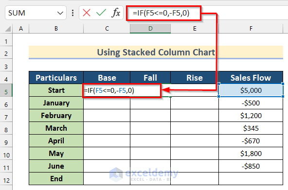
Here, we used the IF Function to check if the value of Cell F5 is positive or negative. If the value is less than 0 it will return the negative value of Cell F5 otherwise it will return 0.
- Now, press ENTER to get the value of Fall.
- Then, drag down the Fill Handle tool to AutoFill the formula for the rest of the cells.
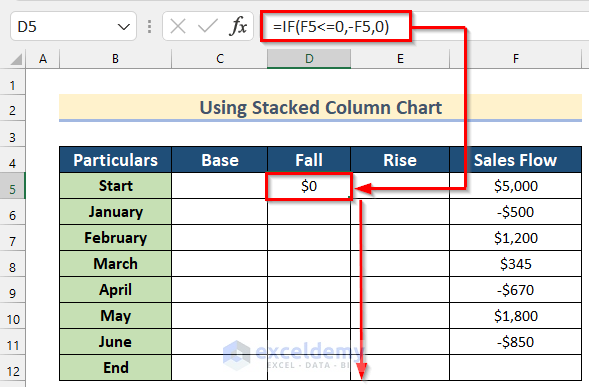
- Thus, you will get all the values of Fall.

- Then, select Cell E5.
- Afterward, insert the following formula.
=IF(F5>0,F5,0)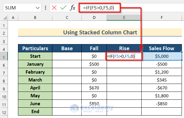
Here, in IF Function to check if the value of Cell F5 is a positive or negative. If the value is greater than 0 it will return the value of Cell F5 otherwise it will return 0.
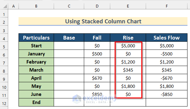
- Now, press ENTER to get the value of Rise.
- Next, drag down the Fill Handle tool to AutoFill the formula for the rest of the cells.

- Thus, you will get all the values of Rise.
- After that, select Cell C6.
- Then, insert the following formula.
=C5+E5-D6
Here, we added the values of Cell C5 and Cell E5 and subtracted it by the value of Cell D6 to get the value of Base.
- Next, press ENTER to get the value of Base.
- Now, drag down the Fill Handle tool to AutoFill the formula for the rest of the cells.
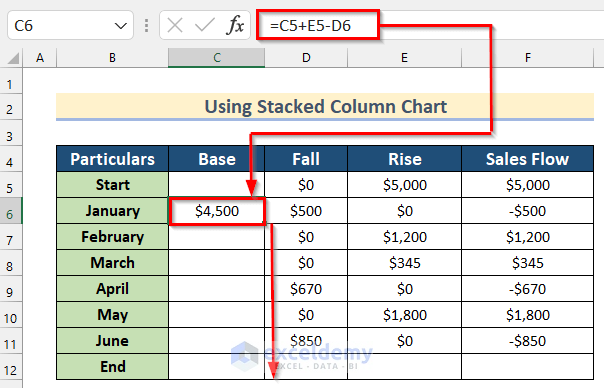
- Thus, you will get all the values of Base.

Read More: How to Create Stacked Waterfall Chart with Multiple Series in Excel
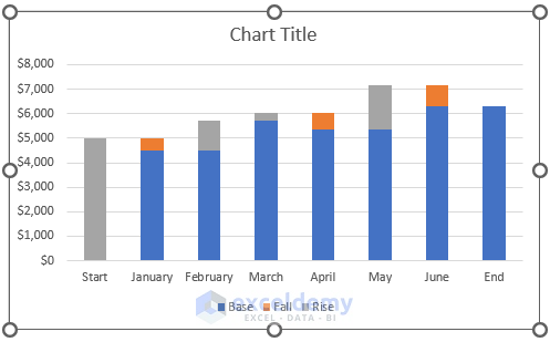
Step-02: Inserting Stacked Column Chart
Now, we will show you how to insert a Stacked Column Chart to create a Waterfall chart.
- In the beginning, select Cell range B4:E12.
- Then, go to the Insert tab >> click on the Column Chart.
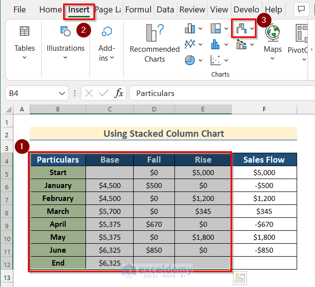
- After that, select Stacked Column.

- Now, you will get your desired Stacked Column Chart.
Read More: How to Make a Vertical Waterfall Chart in Excel
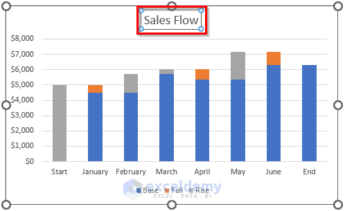
Step-03: Formatting Chart in Excel
Next, you will find how to format a Stacked Column Chart to create a Waterfall Chart below.
- First, click on Chart Title to change it.

- Now, type Sales Flow as Chart Title.
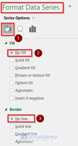
- Then, select the bars containing the value of Base by double clicking.
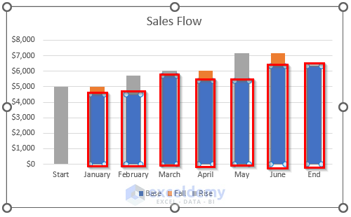
- Now, the Format Data Series toolbox will open.
- Next, go to the first Series Option.
- After that, select No fill as Fill and No line as Border.
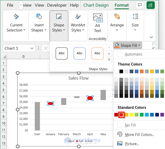
- Then, select all the bars containing the values of Fall.
- Now, go to the Format tab >> click on Shape Styles >> click on Shape Fill.

- After that, select any color of your own choice. Here, we will select Red from Standard Colors.
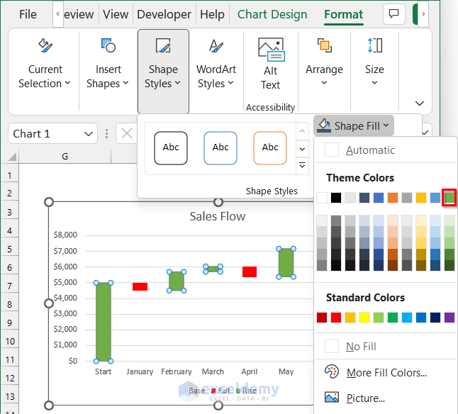
- Now, select the bars containing the value of Rise by double clicking.
- Again, go to the Format tab >> click on Shape Styles >> click on Shape Fill.

- After that, select any color of your own preference. Here, we will select Green, Accent 6 color from Theme Colors.
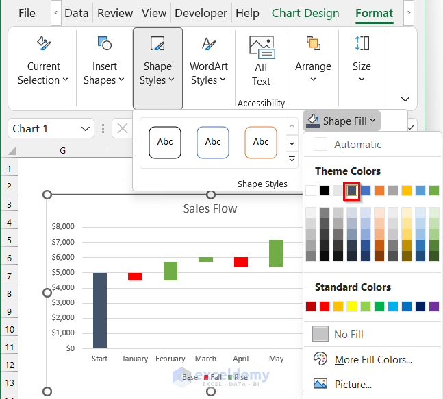
- Now, select the Start bar by double clicking.
- Then, go to the Format tab >> click on Shape Styles >> click on Shape Fill.

- Next, select any color of your own preference. Here, we will select Blue-Gray, Text 2 color from Theme Colors.

- Afterward, select the End bar by double clicking.
- Similarly, go to the Format tab >> click on Shape Styles >> click on Shape Fill.

- Again, select any color of your own preference. Here, we will select Blue-Gray, Text 2 color from Theme Colors.
- Finally, you will get your desired waterfall chart by using the Stacked Column Chart in Excel.
Things to Remember
- The built-in Excel Waterfall Chart is only available in Excel 2016, previous versions do not have this built-in chart.
Practice Section
In this section, we are giving you the dataset to practice on your own and learn to use these methods.
Conclusion
So, in this article, you will find a step-by-step way to create a waterfall chart in Excel. Use any of these ways to accomplish the result in this regard. Hope you find this article helpful and informative. Feel free to comment if something seems difficult to understand. Let us know any other approaches which we might have missed here. Thank you!
Related Articles
- Excel Waterfall Chart with Negative Values
- Excel Waterfall Chart Change Colors
- Excel Waterfall Chart Total Not Showing
<< Go Back to Waterfall Chart in Excel | Excel Charts | Learn Excel
Get FREE Advanced Excel Exercises with Solutions!
