Method 1 – Format Data Structure for Waterfall Chart
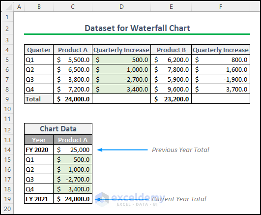
We will use a financial dataset that includes two products (A & B), each with quarterly income and the yearly total income from the products.
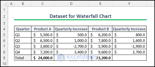
Use the “Quarterly Increase” column to display the positive and negative contributions of each quarter to the total earnings. Create a waterfall chart with this dataset to visualize the data.
Method 2 – Inserting Waterfall Chart in Excel
Select the data range (cell range B12:C19). Go to the insert tab and choose the waterfall chart from the charts group.
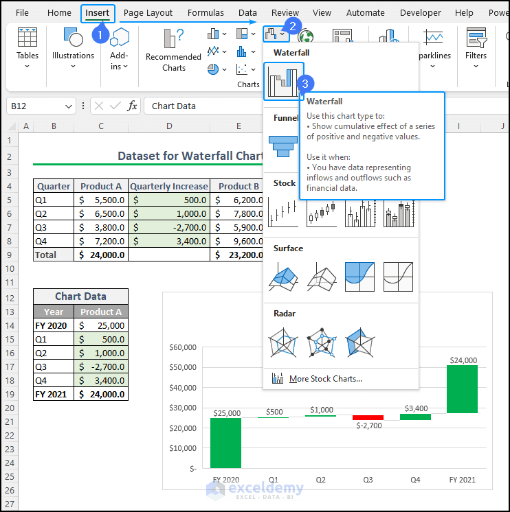
A basic waterfall chart will be created in Excel. Our chart is not complete yet.
Method 3 – Enhance the Visual Appearance of The Waterfall Chart
The chart presents three series: increase, decrease, and Total. Excel requires you to specify the data point for the Total series since it cannot automatically identify it.
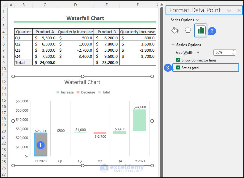
To specify the Total series, double-click the column containing your Total values. Keep double-clicking until the other columns are faded out, indicating that only that particular column is selected.
After selecting the column, a side panel will open on the left side of the window, such as “Format Data Point“, showing options. From this panel, locate the checkbox labeled “Set as total” and check it. The color of the selected column will change, indicating that it is now associated with the Total label.
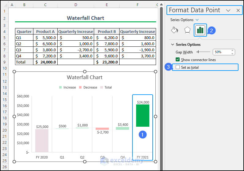
To set the total column for both financial years, i.e. FY 2020 and FY 2021, follow the same process and set two total columns in the chart; one at the beginning and one at the end.
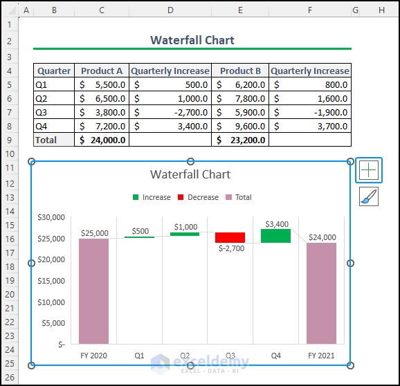
You will have the following waterfall chart. It showcases increases in green and decreases in red, while the total columns are highlighted in grey. To add more chart elements and customize the chart, click on the design or plus sign at the top right corner of the chart.
How to Change Waterfall Chart Color in Excel
In Excel, waterfall chart colors change is an easy task. There are two ways to do this task. However, manually adjusting the colors might be time-consuming and static. To create a dynamic and consistent color scheme, you can customize the theme colors in Excel.
Go to the Page Layout tab and select the Theme Colors option from the Themes group.
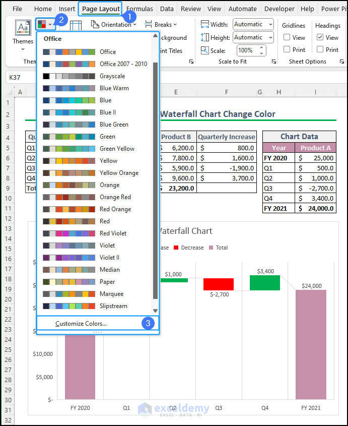
Choose “Customize Colors…” at the bottom of the color options. This will open the Edit Theme Colors window.
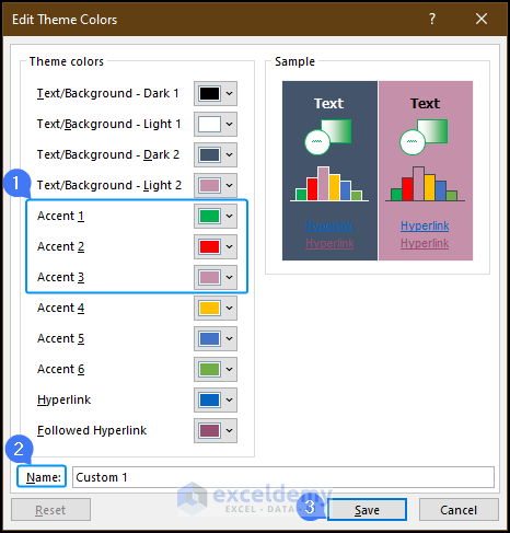
In the Edit Theme Colors window, focus on changing the colors for Accent 1, Accent 2, and Accent 3, as these are the colors used for the data series (increase, decrease, and total) in the waterfall chart.
You can also name this custom color theme, for example, “Custom 1“. Click the Save button to save the changes.
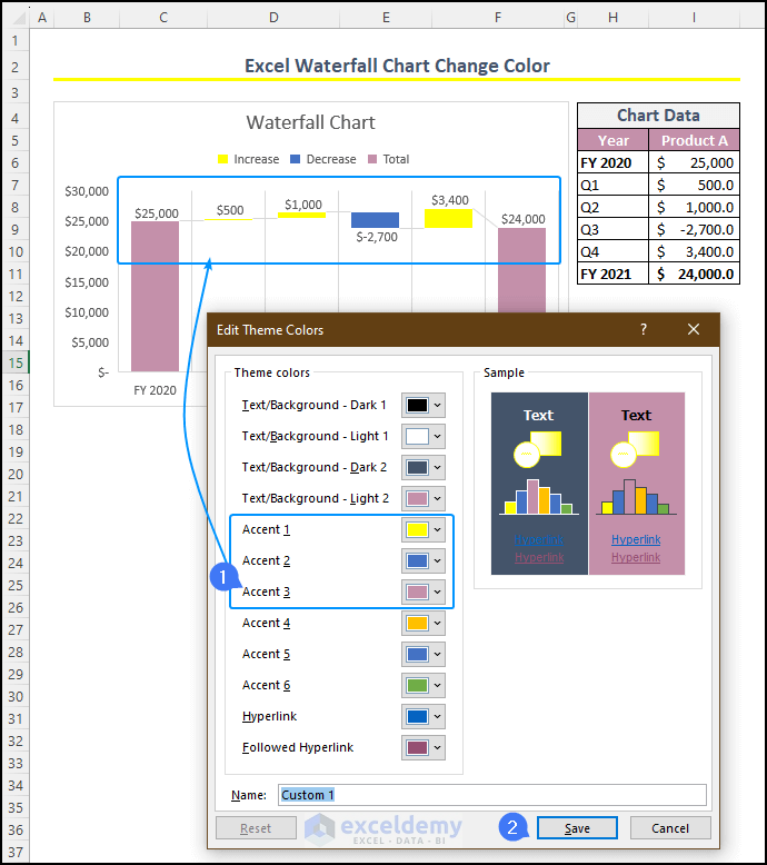
You can change Accent 1 from green to yellow and Accent 2 from red to blue. The waterfall chart will display the increased columns in yellow and the decreased columns in blue. One can easily use Excel for a waterfall chart to change colors.
How to Change Scale in Excel Waterfall Chart
In Excel, it automatically determines the scale of a chart based on the data provided. By changing the scale, we can control the range of values displayed on the chart, allowing us to focus on specific data points and trends more effectively.
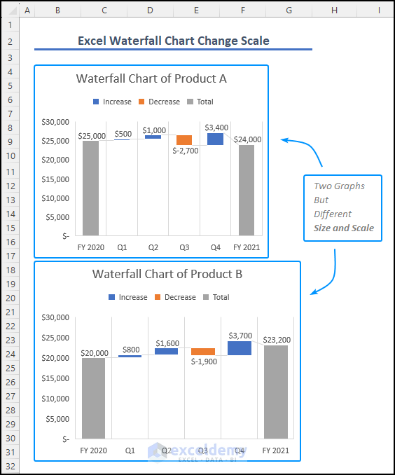
Two charts are not of equal height and width; this can lead to visual distortions and discomfort in the representation. To address this issue, changing the scale in Excel becomes necessary. To do so, right-click on any axis( i.e. vertical axis) and choose Format Axis. Under the Bounds category, manually adjust the Minimum and Maximum values to customize the scale according to your requirements. Press Enter to update the axis scale.
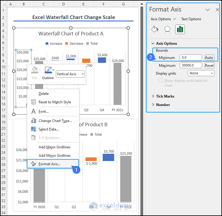
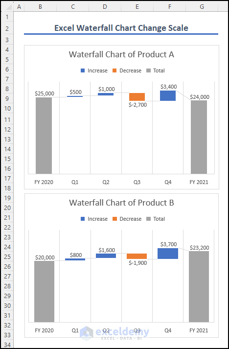
We set the bound value to 100 for both charts to ensure uniformity. You can delete the vertical axis to focus more on the data, making your charts visually appealing and effectively conveying insights.
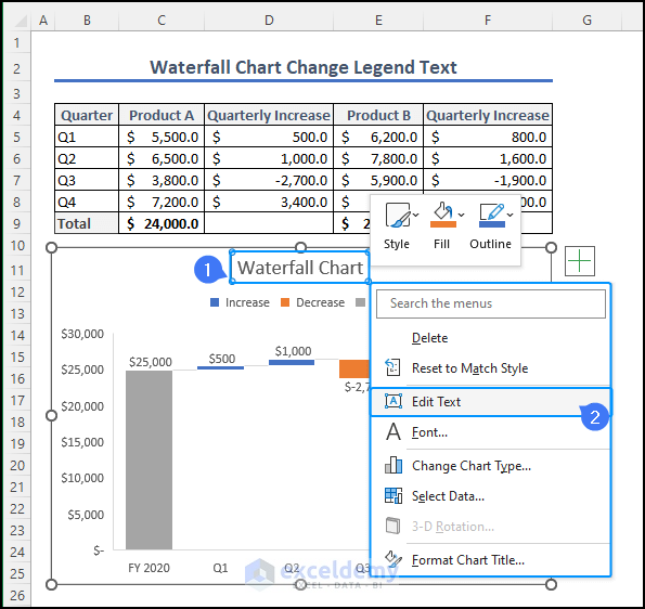
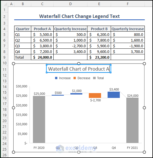
How to Change Legend Text in Waterfall Chart
If you want to change the legend text in the waterfall chart. When creating a chart in Excel, the legend or title is initially labeled as “Graph“, “Chart” or “Legend“. To customize the name and provide a proper label, simply select the text box with a left-click and then right-click to access the options menu. Choose the “Edit Text” option to modify the legend text as desired.
We changed the title of the chart from “Waterfall Chart” to “Waterfall Chart of Product A“.
Things to Remember
- Meaningful Colors: Select colors that convey meaning; for example, green for positive values and red for negative values can enhance visual understanding.
- Dynamic Color Updates and Consistency: Use custom theme colors to keep the color scheme consistent across increase and decrease elements to ensure clarity in data representation.
- Axis Scale: Adjust the axis scale to present data more accurately and avoid misrepresentations in the visual representation.
Frequently Asked Questions
Q1. How do you change the color of the connector lines in a waterfall chart?
To change the color of the connector lines in a waterfall chart, click on the chart to select it. Then, go to the Chart Design or Format tab on the ribbon, and use the Shape Outline or Line Color option to choose a new color for the connector lines.
Q2. How do I change the color scheme in the Excel chart?
To change the color scheme in an Excel chart, select the chart and go to the Chart Design or Format tab on the ribbon. Then, use the Change Colors option to pick a new color scheme from the available presets.
Q3. Will changing the color scheme impact the overall chart appearance?
Yes, changing the color scheme can significantly impact the visual appeal of the waterfall chart. Choose colors that effectively highlight positive and negative values for better data interpretation.
Download Practice Workbook
You can download the workbook, where we have provided a practice section on the right side of each worksheet. Try it yourself.
Related Articles
- How to Create Stacked Waterfall Chart with Multiple Series in Excel
- How to Make a Vertical Waterfall Chart in Excel
- Excel Waterfall Chart with Negative Values
- Excel Waterfall Chart Total Not Showing
- How to Create a Stacked Waterfall Chart in Excel
<< Go Back to Waterfall Chart in Excel | Excel Charts | Learn Excel
Get FREE Advanced Excel Exercises with Solutions!

