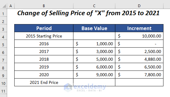
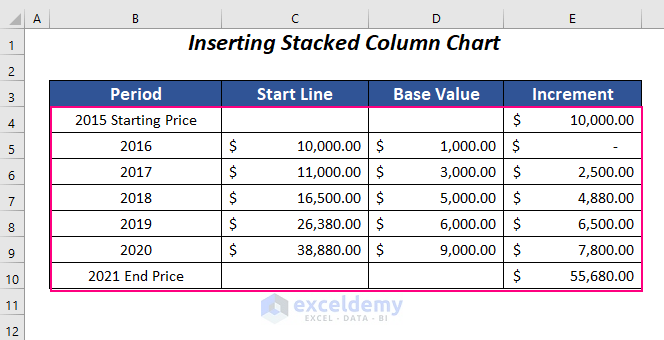
The following dataset contains records of price changes of product “X” from 2015 to 2021. A stacked waterfall chart will show the changes over the years.
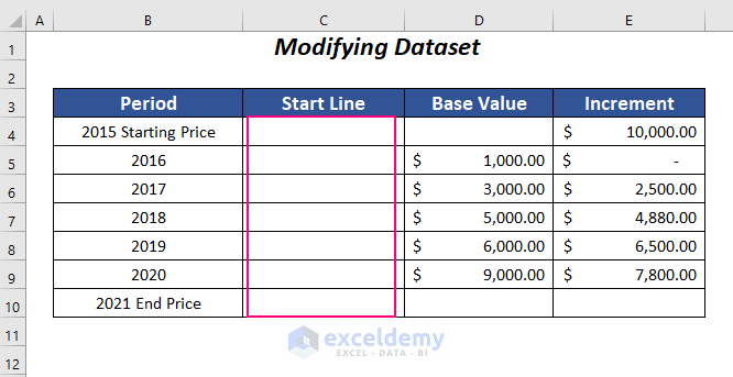
Step 1 – Modifying Dataset to Create a Stacked Waterfall Chart in Excel
- Modify the dataset by adding values. Add an extra column: Start Line before the Base Value column.
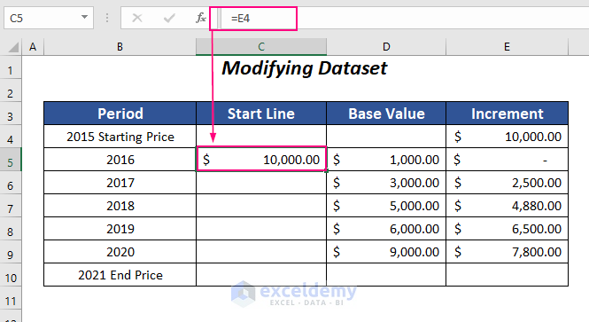
- Use the following formula in the second cell of the Start Line column corresponding to 2016.
=E4It returns the value of the increment from E4 to C5.
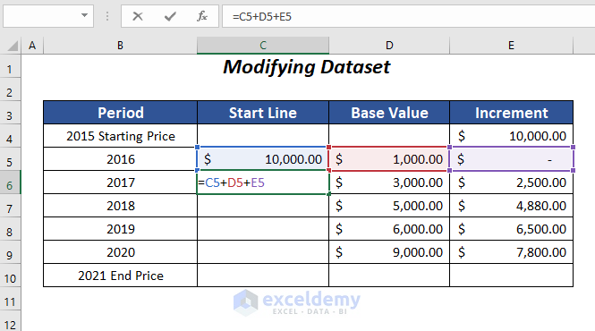
- Use the following formula in C6.
=C5+D5+E5C5, D5, and E5 are the values of the Start Line, Base Value, and Increment columns of the previous row.
- Press ENTER and drag down the Fill Handle tool.
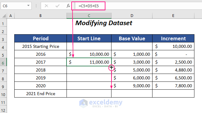
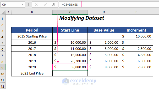
It copies the formula from C6 to C9.
=C8+D8+E8C8, D8, and E8 are the values of the Start Line, Base Value, and Increment columns in the previous row.
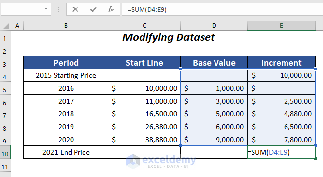
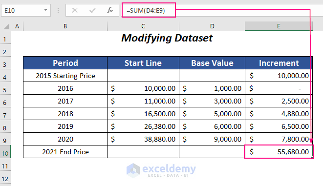
- Add the values of the Base Value and Increment columns by using the following formula in E10.
=SUM(D4:E9)The SUM function adds values in D4:E9.
- Press ENTER
It returns the total value of $55,680.00 as the 2021 End price.
Read More: How to Create Stacked Waterfall Chart with Multiple Series in Excel
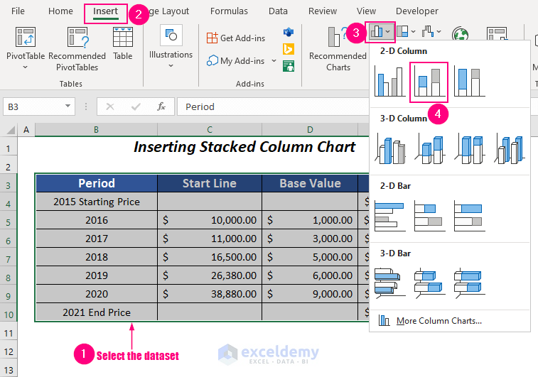
Step 2 – Inserting a Stacked Column Chart to Create a Stacked Waterfall Chart
This is the dataset:
- Select the data range and go to Insert Tab >> Charts Group >> Insert Column or Bar Chart Dropdown >> 2-D Stacked Column.
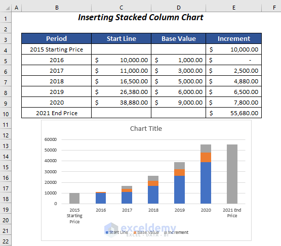
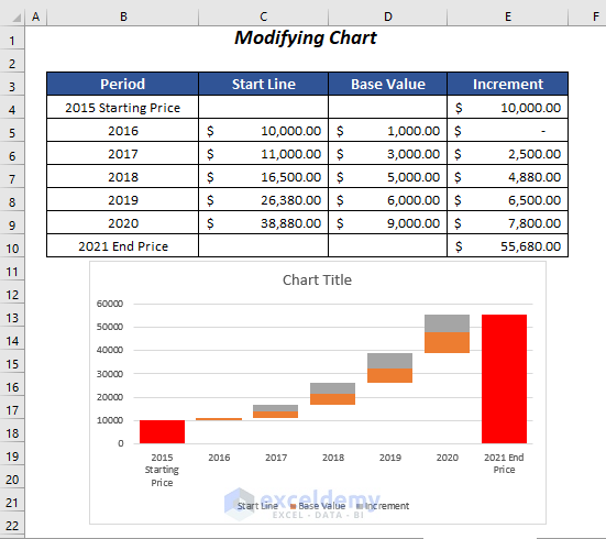
The following chart is showcased:
Read More: How to Make a Waterfall Chart with Multiple Series in Excel
Step 3 – Modifying a Stacked Waterfall Chart
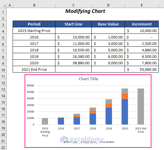
- To hide the Start Line series: select it and Right-Click.

- Click Fill and select No Fill.
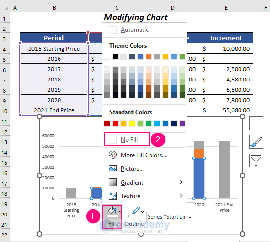
The Start Line series is invisible.
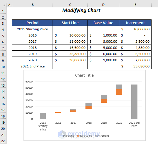
When the color of the 2015 Starting Price column and the 2021 End Price column are similar to the Increment series, changing the color is necessary.
- Double-click the 2015 Starting Price column and Right-click.
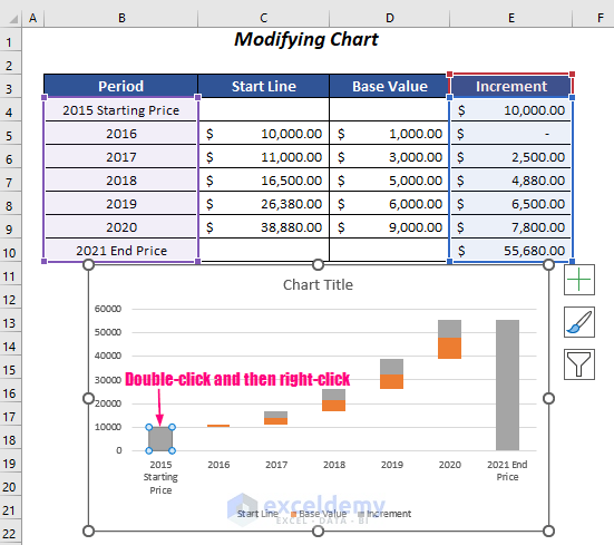
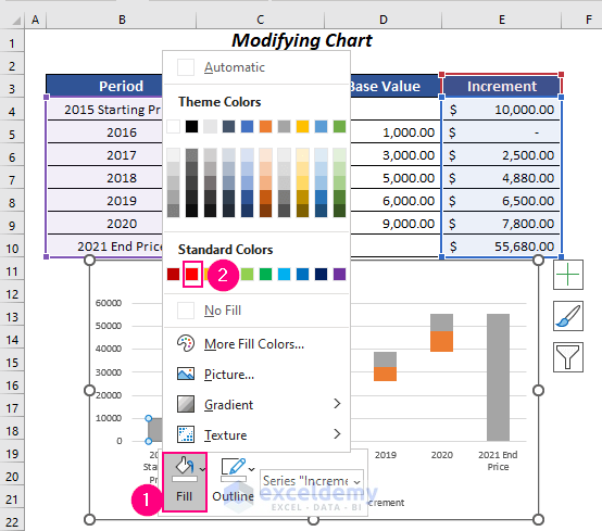
- Click Fill and select a color (Red here).
The color of the 2015 Starting Price column changed.
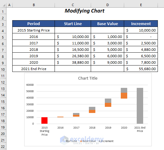
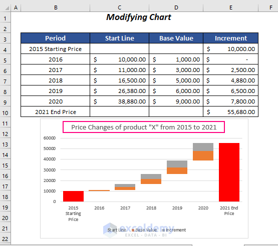
- Change the color of the 2021 End Price column.
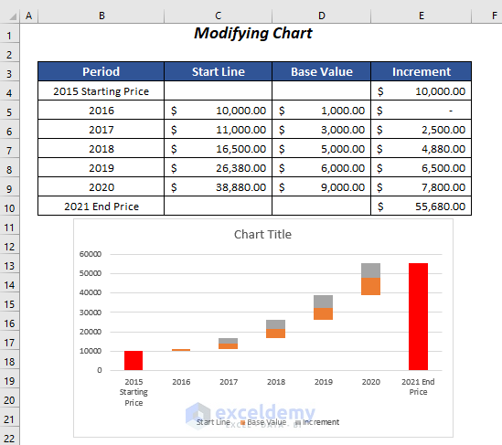
Widen the columns:
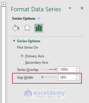
- Select any series in the chart and Right-click.
- Choose Format Data Series.
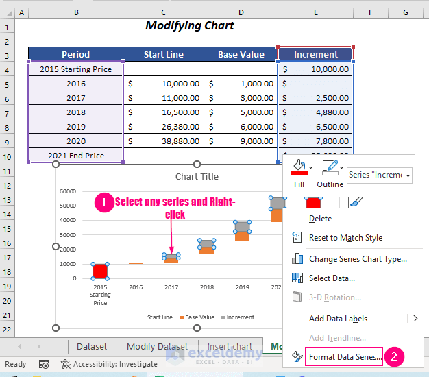
In Format Data Series:
- Select Series and lower the Gap Width value.
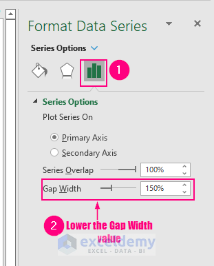
The Gap Width changed from 150% to 26%.
This will be the final chart:
Change the chart title to “Price Changes of product “X” from 2015 to 2021”.
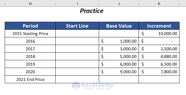
Practice Section
Practice using the table below:
Related Articles
- How to Make a Vertical Waterfall Chart in Excel
- Excel Waterfall Chart with Negative Values
- Excel Waterfall Chart Change Colors
- Excel Waterfall Chart Total Not Showing
<< Go Back to Waterfall Chart in Excel | Excel Charts | Learn Excel
Get FREE Advanced Excel Exercises with Solutions!

This method does not seem to work for negative increments, as it plots them below the x-axis.
Hi Alex,
Here, I have shown the procedure of creating a waterfall chart for positive increments only. However, you can follow the article of this link- https://www.exceldemy.com/excel-waterfall-chart-with-negative-values/ – to create a chart with negative increment values.
Hi Tanjima,
Greetings
Thanks for the tutorial. Hence, can you make me understand what the use of the start line in column B means? Instead of the can we use like B column as the base and columns C, D, as rise and fall.
Thanking You,
Hello Manohar,
Thank you for your question! The “Start Line” in column B is used as the base value for each bar in the stacked waterfall chart. It helps to position the rise (increase) and fall (decrease) segments correctly along the Y-axis, so the chart visually represents the cumulative effect.
If you use column B as the base and columns C and D as rise and fall, you’d need to make sure your chart is set up to stack these values in the correct order. The “Start Line” column specifically helps in showing the starting point for each change, making the chart easier to read.
Hope this helps! Let me know if you need more details.
Regards
ExcelDemy