Method 1 – Using Waterfall Chart
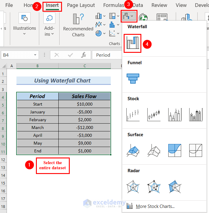
Step-1: Inserting a Waterfall Chart
- Select the entire dataset.
- Go to the Insert tab.
- From Insert Waterfall, Funnel, Stock, Surface, or Radar Chart >> select Waterfall Chart.
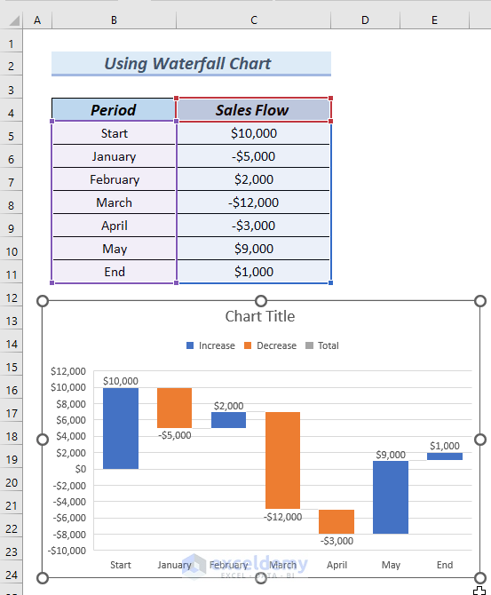
See the Waterfall Chart with negative values.
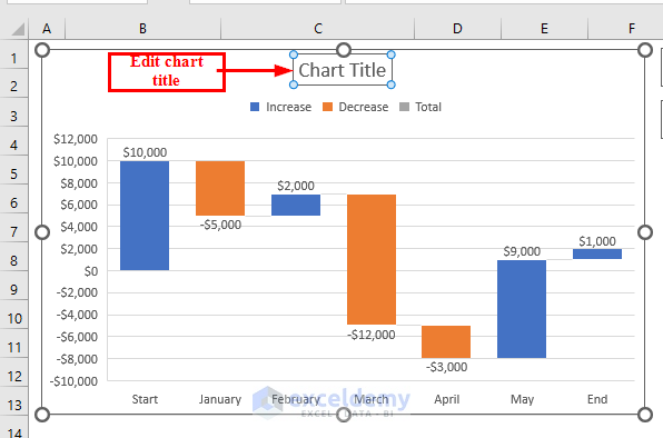
- Click the Chart Title to edit the title.
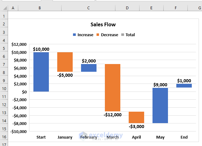
See the Waterfall Chart with our edited Chart Title.
Step-2: Formatting Waterfall Chart
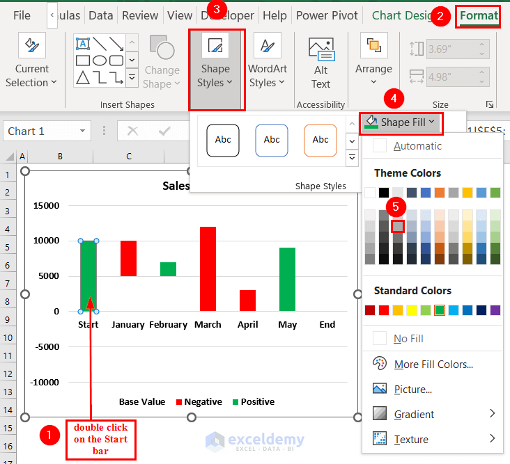
- Select the Start column by double-clicking.
- Right-click >> select Set as Total from the Context Menu.
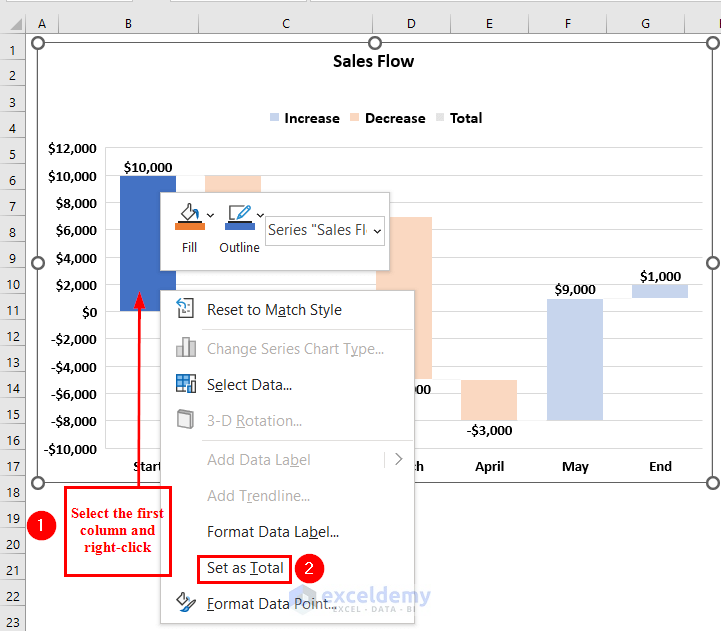
- Select the End column by double-clicking.
- Right-click >> select Set as Total from the Context Menu.
- See both the Start and End columns have been formatted.
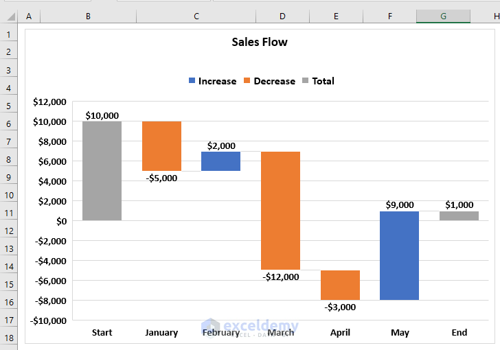
Format the Positive value columns with the Red color.
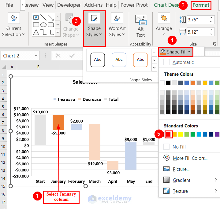
- Select the January column by double-clicking it.
- Go to the Format tab >> select Shape Styles.
- From Shape Fill >> select Red color.
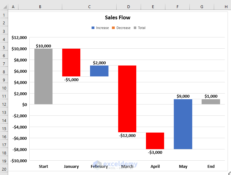
- Repeat the following process for other Negative value columns as well.
See all the Negative value columns have been formatted in Red color.
Format the Positive columns with the Green color.
- Select the February column by double-clicking it.
- Go to the Format tab >> select Shape Styles.
- From Shape Fill >> select a Green color.
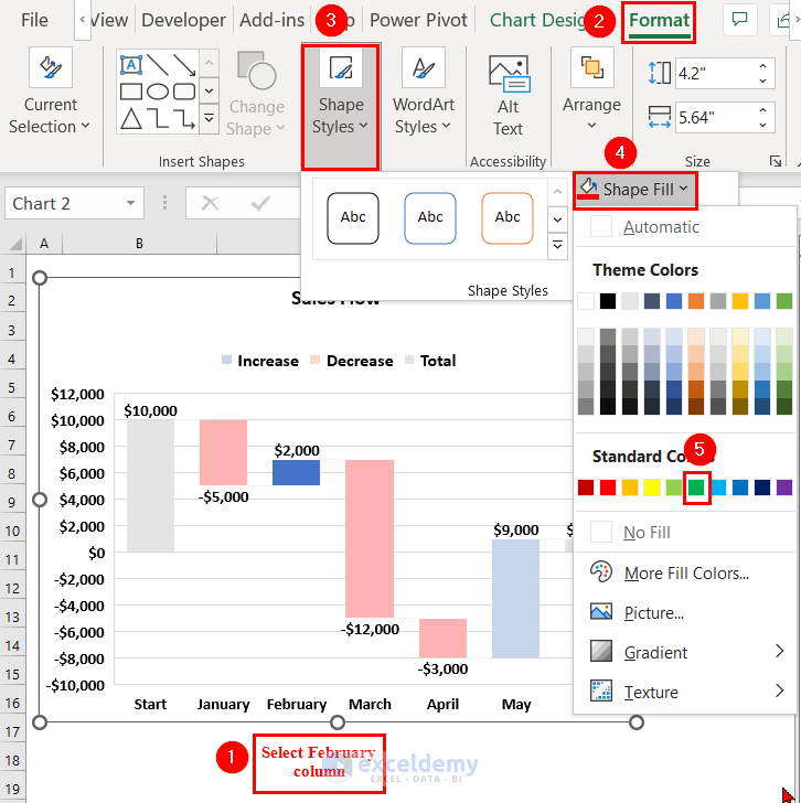
- Repeat the following process for other Positive value columns as well.
See the Waterfall chart with Negative values marked in Red color.

Method 2 – Use of Stacked Column Chart to Create a Waterfall Chart with Negative Values
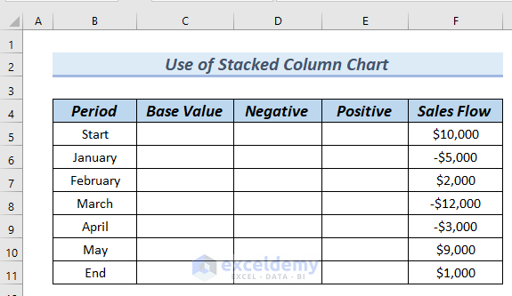
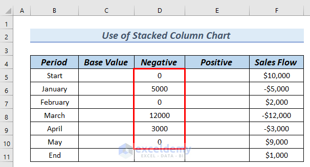
Step-1: Making Dataset
Complete the Base Value, Negative and Positive columns of the following dataset.
- Complete the Negative column. To do so, we will type the following formula in cell D5.
=IF(F5<=0,-F5,0)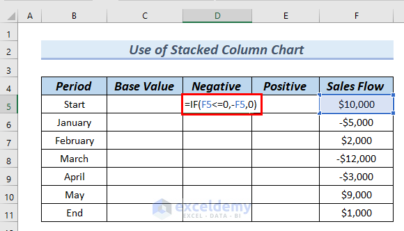
Formula Breakdown
- IF(F5<=0,-F5,0) → the IF function returns 0 when the logical statement is FALSE, otherwise it returns the value of -F5.
- Output: 0
- Explanation: as the logical statement is FALSE, the IF function returns 0.
- Press ENTER. Then you can see the result in cell D5.
- Drag down the formula with the Fill Handle tool from cell D5 to D10.
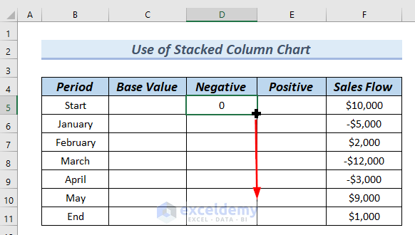
You can see the complete Negative column.
Complete the Positive column of the date.
- Type the following formula in cell E5.
=IF(F5>=0,F5,0)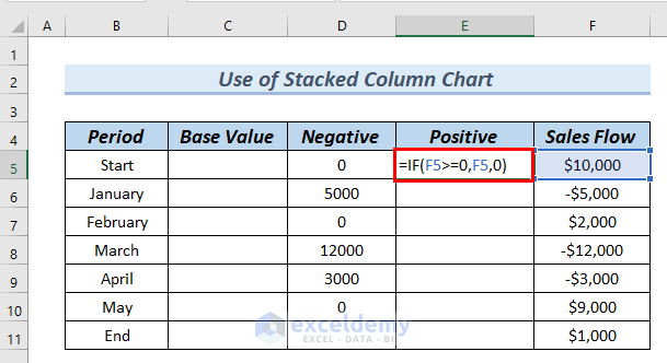
Formula Breakdown
- IF(F5>=0,F5,0) → the IF function returns 0 when the logical statement is FALSE, otherwise it returns the value of cell F5.
- Output: 10000
- Explanation: as the logical statement is TRUE, the IF function returns 10000.
- Press ENTER. You can see the result in cell E5.
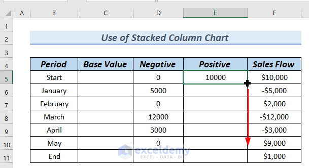
- Drag down the formula with the Fill Handle tool from cell E5 to E10.
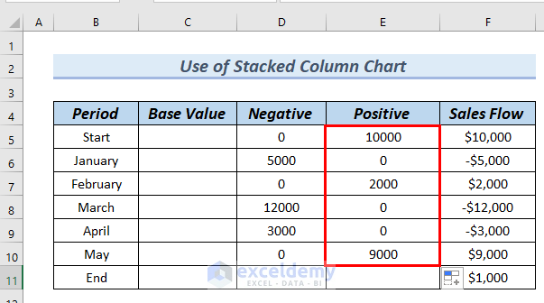
See the complete Positive column.
Complete the Base Value column.
- Type the following formula in cell C6.
=C5+E5-D6This adds cell C5 with E5 and subtracts D6 from the summation.
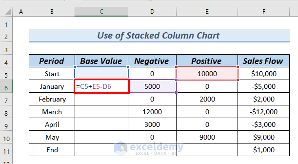
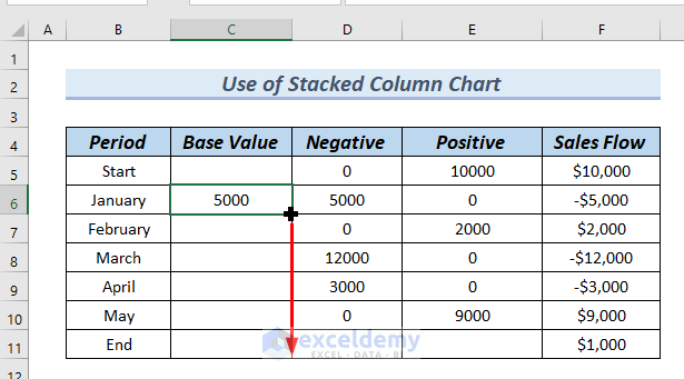
- Press ENTER. See the result in cell C6.
- Drag down the formula from cell C6 to C11 with the Fill Handle tool.
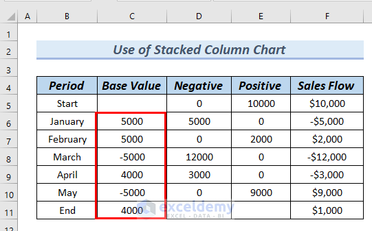
See a complete Base Value column. The dataset is ready for creating a Waterfall chart with negative values.
Step-2: Inserting Stacked Column Chart
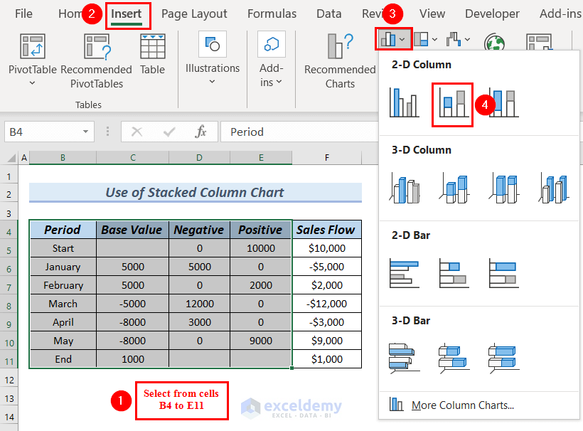
- Select the Period, Base Value, Negative, and Positive columns from cells B4 to E11.
- Go to the Insert tab.
- From Insert Bar or Column Chart >> select Stacked Column chart.
See a Stacked column chart.
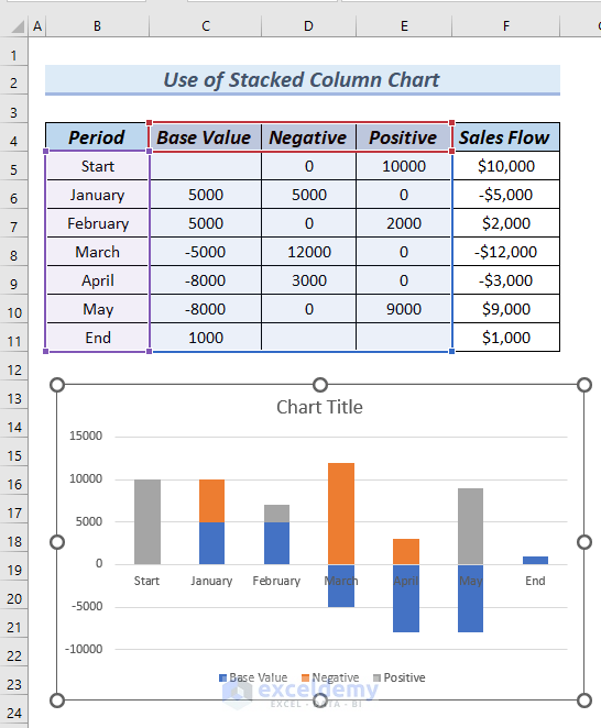
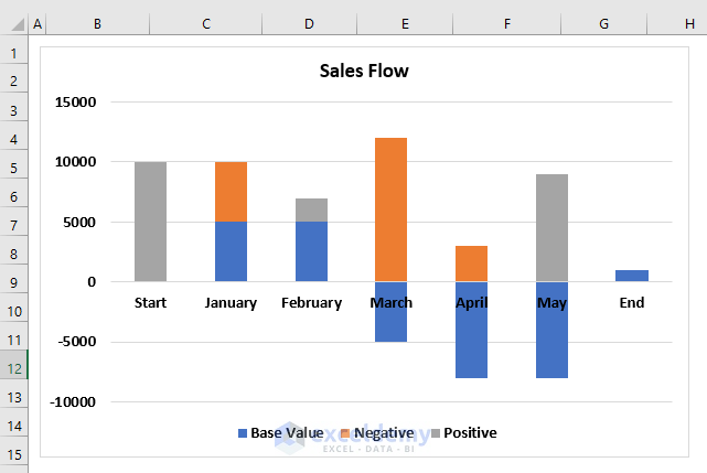
- Click on the Chart Title to edit the title.
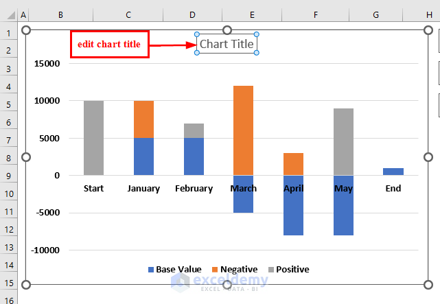
See the Stacked chart with an edited Chart Title.
Step-3: Creating Waterfall Chart
- Click on the Base Values of the Stacked column chart.
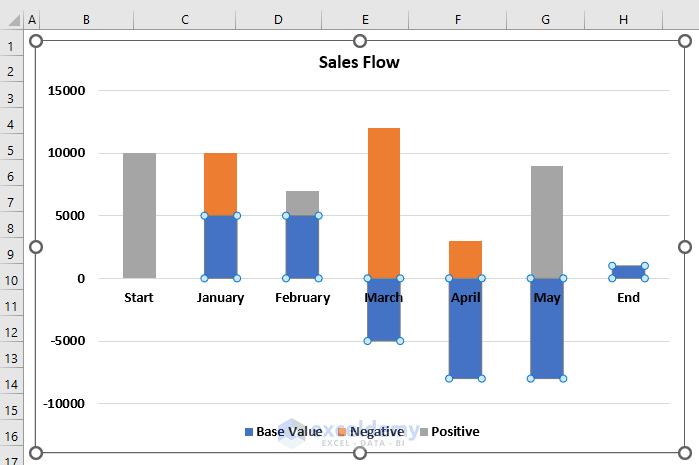
See a Format Data Series dialog box that appears on the right side of the Excel sheet.
- From Fill & Line >> select Fill >> select No fill.
- From Border >> select No line.
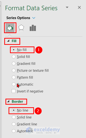
See that the chart now looks like a Waterfall chart.
Step-4: Formatting the Waterfall Chart
In this step, we will Format the Waterfall chart.
- Click on a Negative bar, and you will see that all the Negative bars will be selected.
- Go to the Format tab.
- From Shape Styles >> select Shape Fills >> select Red color.
Select any color, we keep the Negative bars as Red color.
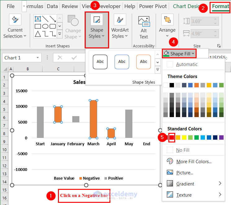
See all the Negative bars have become Red.
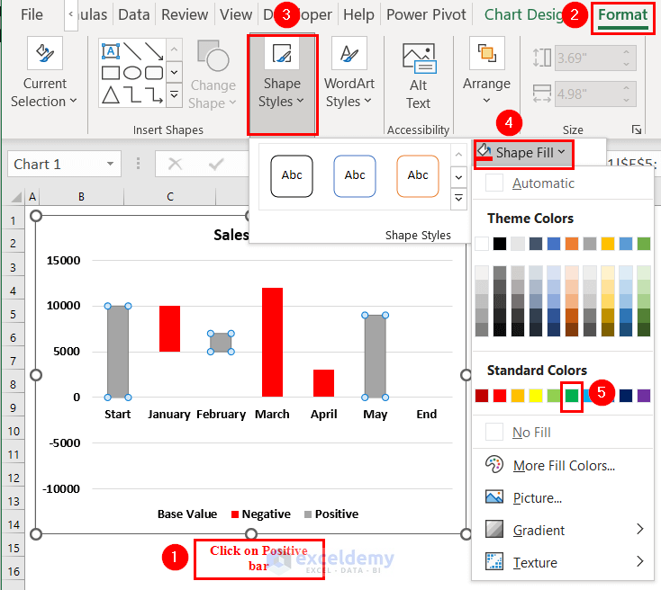
- Click on a Positive bar, and you will see that all the Positive bars will be selected.
- Go to the Format tab.
- From Shape Styles >> select Shape Fills >> select a Green color.
Select any color, we keep the Positive bars as Green color.
See all the Positive bars have become Green.
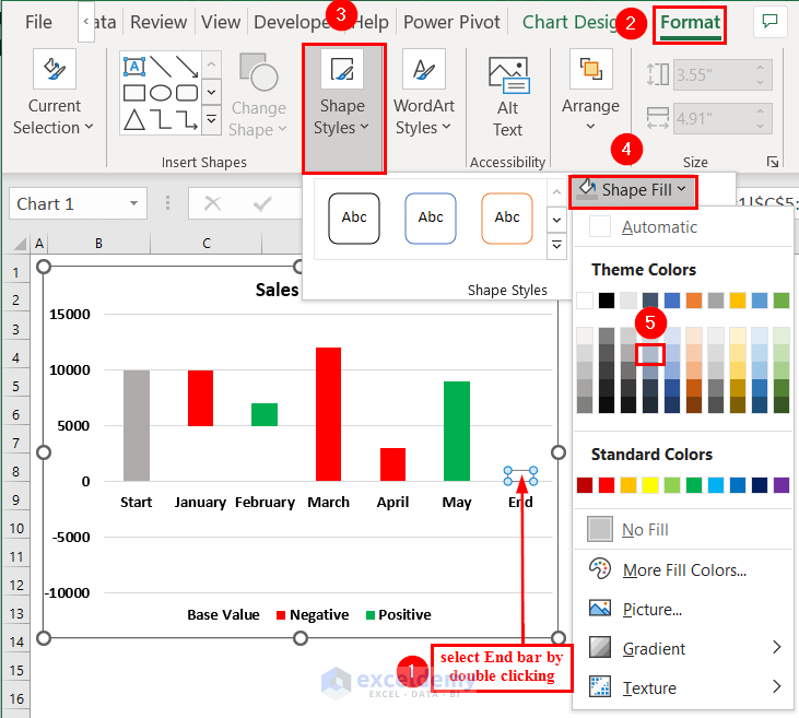
Format the Start and End bars so that the chart looks more visible.
- At this point, we will double-click on the Start bar.
- Go to the Format tab.
- From Shape Styles >> select Shape Fills >> select a color.
Select any color, however, we keep the Start bar color as Light Gray.
Make the End bar visible and we will format the End bar.
- Click on the Base Value, and therefore, we will see the End bar has been selected.
- Click on the End bar.
- Go to the Format tab.
- From Shape Styles >> select Shape Fills >> select a color.
Select any color, and keep the End bar color as Light Gray.
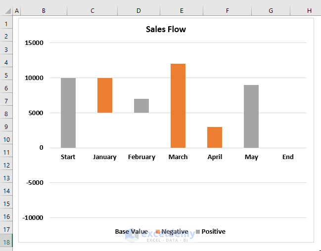
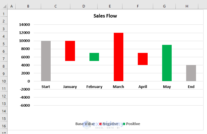
See the Waterfall chart with negative values.
Method 3 – Using a Combo Chart to Create Waterfall Chart with Negative Values.
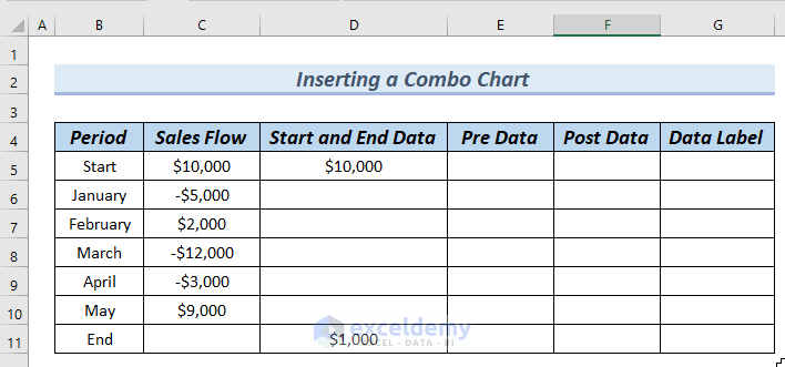
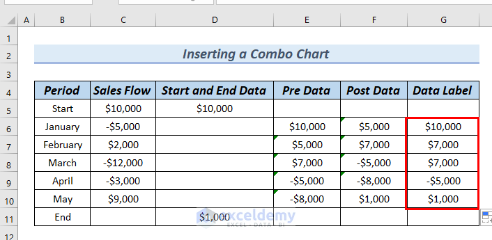
Step-1: Completing Dataset
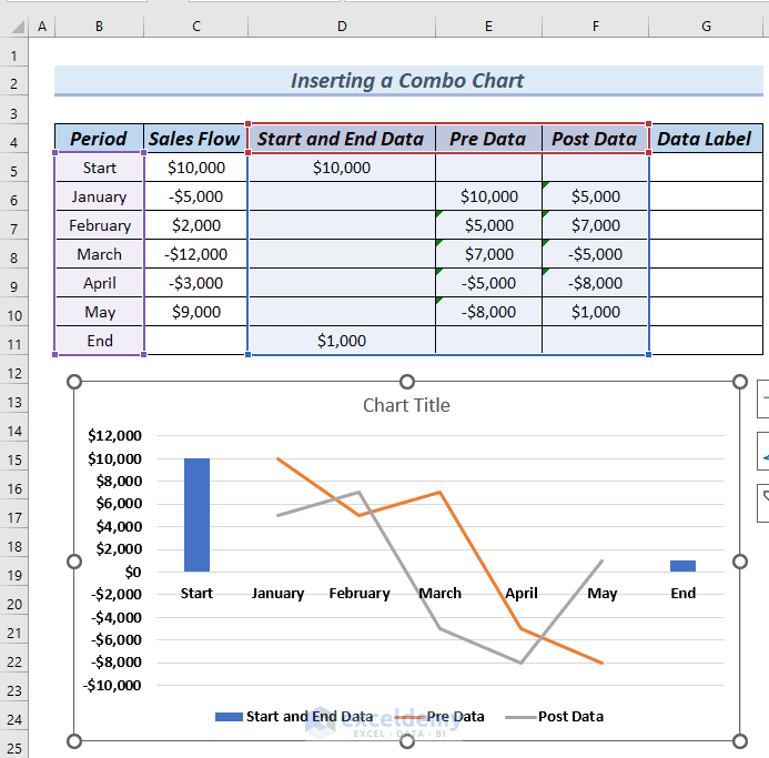
The following dataset has Period, Sales Flow, Start and End Data, Pre Data, Post Data, and Data Label columns. Complete this dataset’s Pre Data and Post Data columns.
- Type the following formula in cell E6.
=SUM($C$5:C5)The SUM function simply adds cell $C$5 with cell C5.
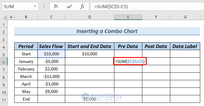
- Press ENTER. You can see the result in cell E6.
- Drag down the formula with the Fill Handle tool from cell E6 to E10.
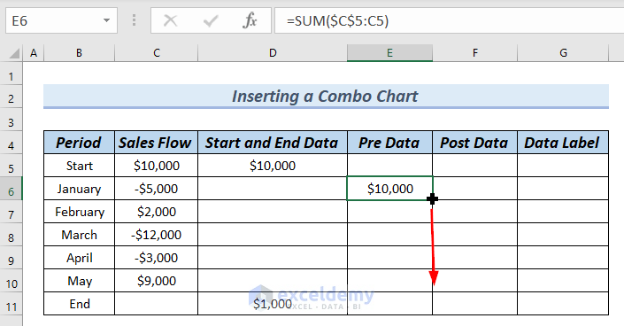
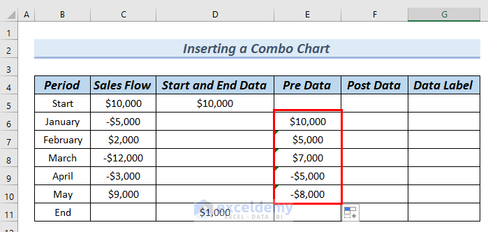
See a complete Pre Data column.
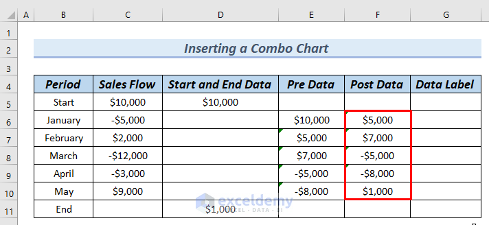
Complete the Post Data column.
- Type the following formula in cell F6.
=SUM($C$5:C6)The SUM function simply adds cell $C$5 with cell C6.
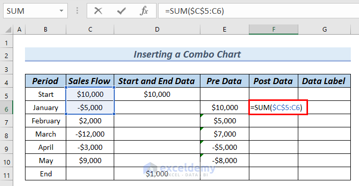
- Press ENTER. You can see the result in cell E6.
- Drag down the formula with the Fill Handle tool from cell F6 to F10.
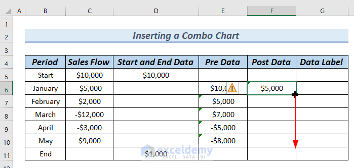
See the complete Post Data column.
The dataset is now ready for inserting the Combo chart.
Step-2: Inserting Combo Chart
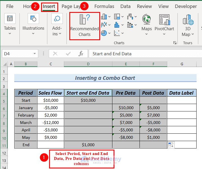
- Select the entire Period column.
- Press and hold the CTRL key, and select the Start and End Data, Pre Data, and Post Data columns.
- Go to the Insert tab.
- Select the Recommended Charts.
An Insert Chart dialog box will appear.
- Select All Charts >> select Combo.
- Click on the downward arrow of the Pre Data.
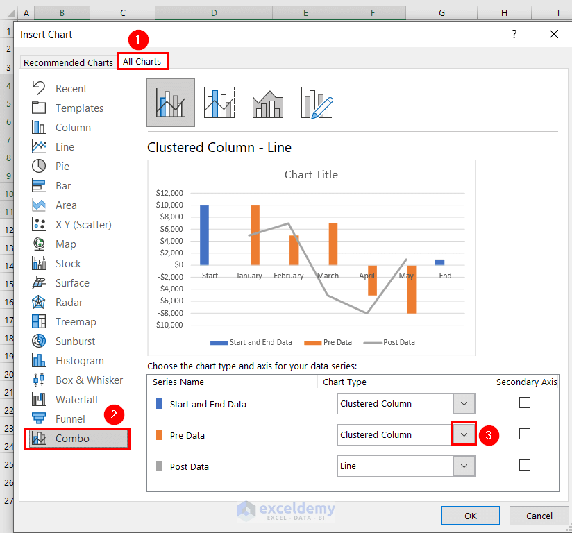
A number of chart types will appear.
- Select a Line chart.
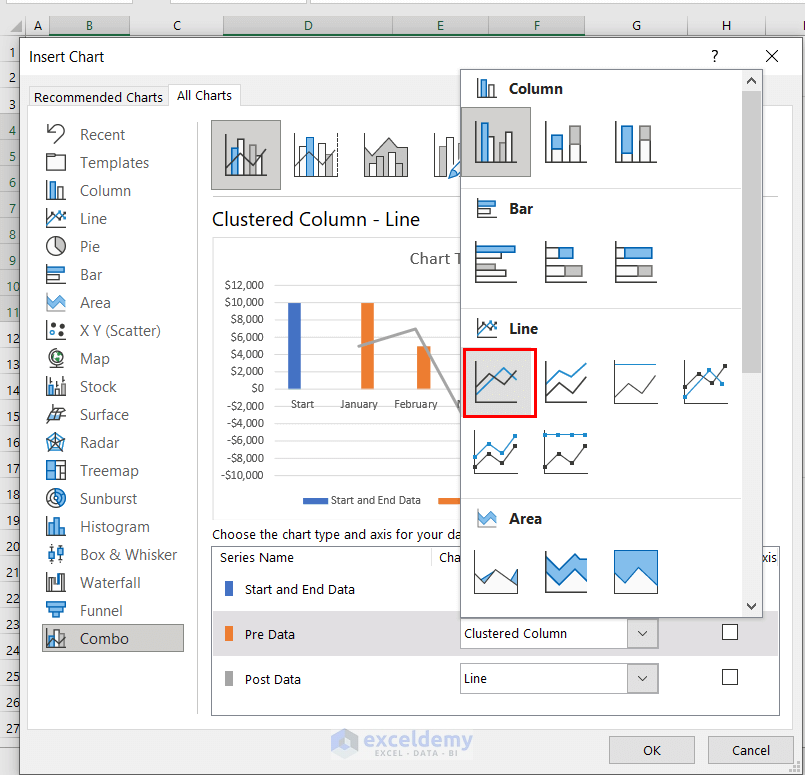
See the Start and End Data are set as Clustered Column, Pre Data is set as Line, and Post Data is Set as Line.
- Click OK.
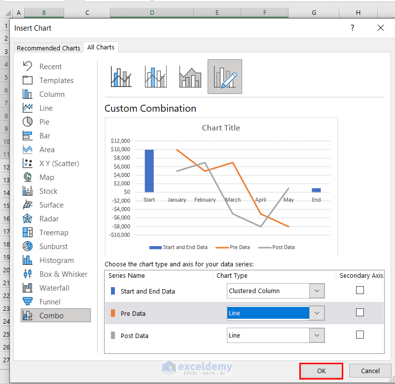
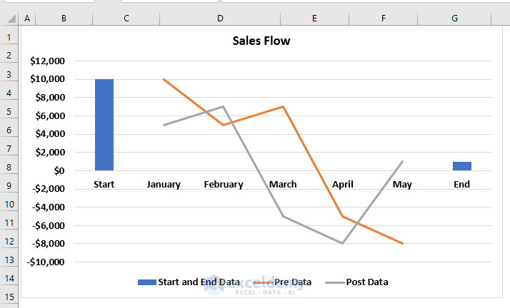
See a Combo chart.
- Click on the Chart title to edit it.
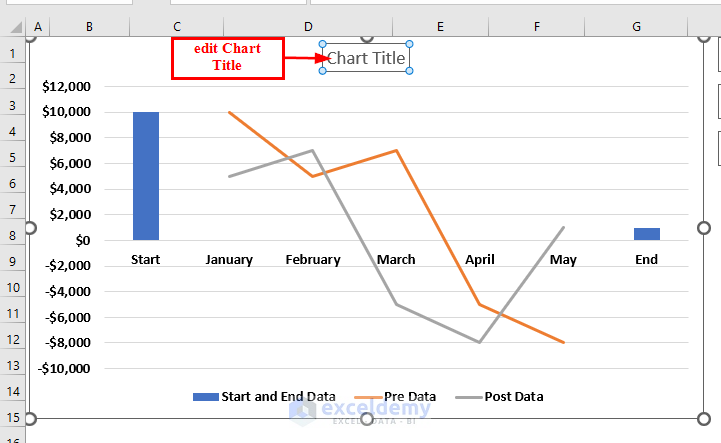
See the Combo chart with the edited Chart Title.
Step-3: Creating Waterfall Chart from Combo Chart
In this step, we will create a Waterfall chart from the Combo chart.
- Click on the Post Data line.
- From Chart Elements >> select Up/Down Bars.
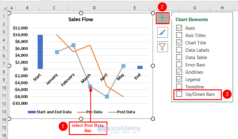
See the chart now looks like a Waterfall Chart.
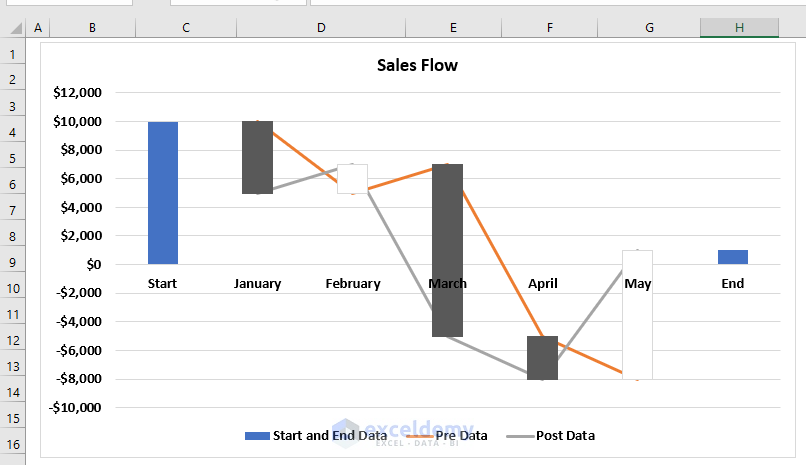
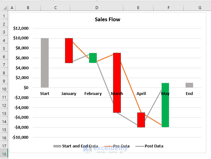
Step-4: Formatting Waterfall Chart
In this step, we will format the Waterfall chart.
- We colored the Positive bars in Red, Negative bars in Green. We also colored the Starting and End bars in Light Gray.
- To color the bars, we follow Step-4 of Method 2.
The Waterfall chart looks more presentable.
We want to hide the Pre Data and Post Data lines from the graph.
- Select the Post Data line and right-click on it.
- Select Format Data Series from the Context Menu.
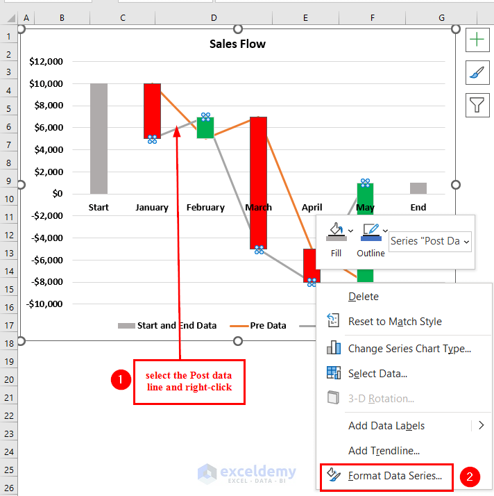
A Format Data Series dialog box will appear.
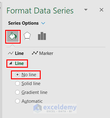
- From Fill & Line option >> click on Line.
- Select No Line.
- Repeat the following procedure for the Post Data line as well.
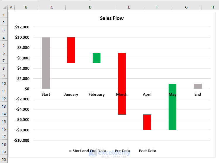
See the Waterfall chart has no line, and the chart looks more visible.
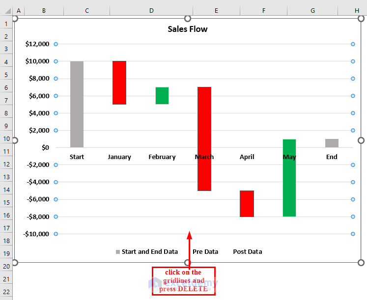
Delete the Gridlines from the chart.
- Click on the Gridlines and press DELETE.
Step-5: Adding Data Label to Start and End Bars
Add Data Label to the Start and End bars.
- Click on the End bar, and along with that, we will right-click on it.
- Select Add Data Labels from the Context Menu.
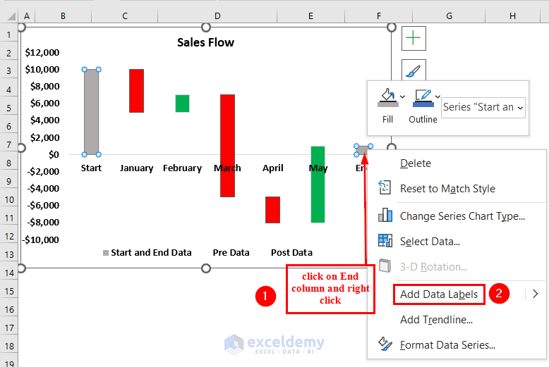
- Add Data Label to our Start bar.
See both the Start and End bar has Data Label.
Step-6: Completing Data Label Column
Complete our Data Label column. This is because we will add a Data label to our floating bars by using the values from the Data Label column.
- Type the following formula in cell G6.
=MAX(E6:F6)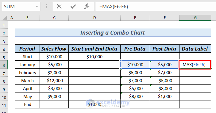
Formula Breakdown
- MAX(E6:F6) → the MAX function returns the maximum number between a set of numbers.
- MAX($10,000:$5000) → becomes
- Output: $10,000
- Press ENTER. Then, you can see the result in cell G6.
- Drag down the formula with the Fill Handle tool.
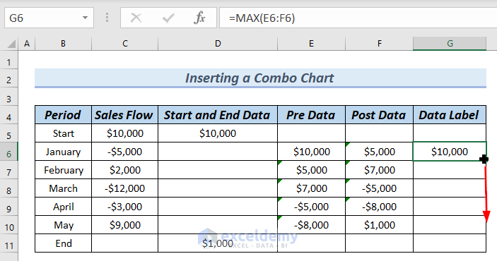
See the complete Data Label column.
Step-7: Adding Data Label to Floating Bars
Add Data Label to the Waterfall chart’s floating bars.
Add the Data Label column’s data to our Waterfall chart.
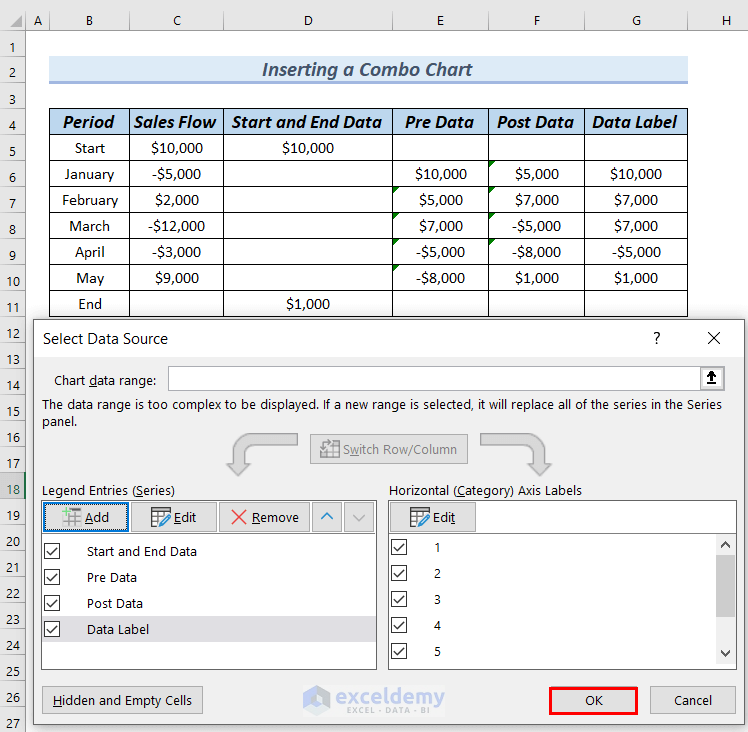
- Right-click on the chart >> choose Select Data from the Context Menu.
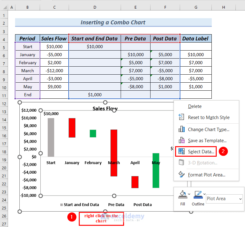
A Select Data Source dialog box will appear.
- Cick on Add to add Data Lable’s data.
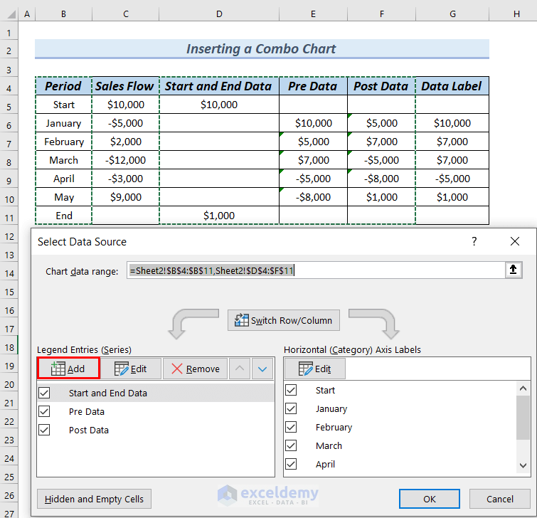
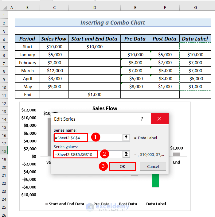
Edit Series dialog box will appear.
- Select cell G4 as Series name>> select from cells G5:G10 as Series value.
- Click OK.
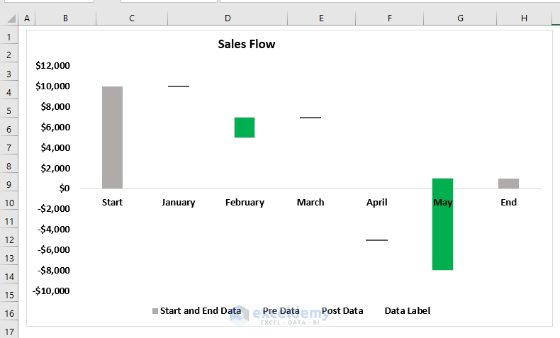
In the Select Data Source dialog box, you can see Data Label is added to the Legend Entries (Series).
- Click OK.
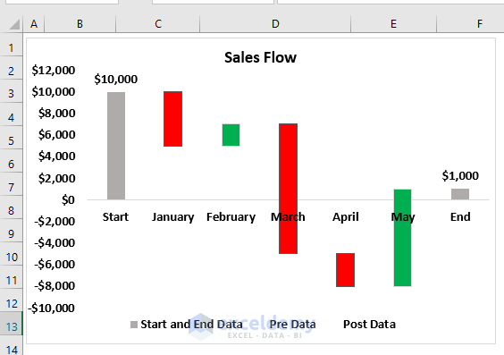
See the Waterfall chart has become like the following picture.
Step-8: Modifying Chart
Modify the above-created chart to a more presentable and visible Waterfall chart.
- Get the chart back to its regular shape, we have to right-click on any of the floating columns.
- We also have to select Change Series Chart Type from the Context Menu.
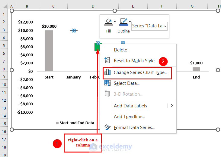
A Change Chart Type dialog box will appear.
- Click on the downward arrow of the Data Label box.
- Select a Scatter chart.
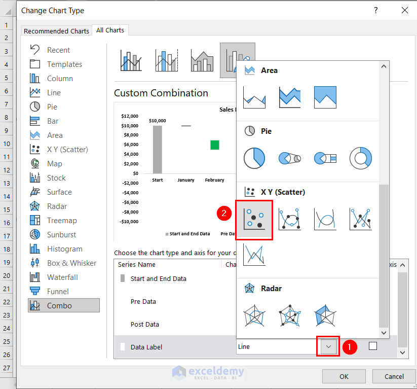
- Click OK.
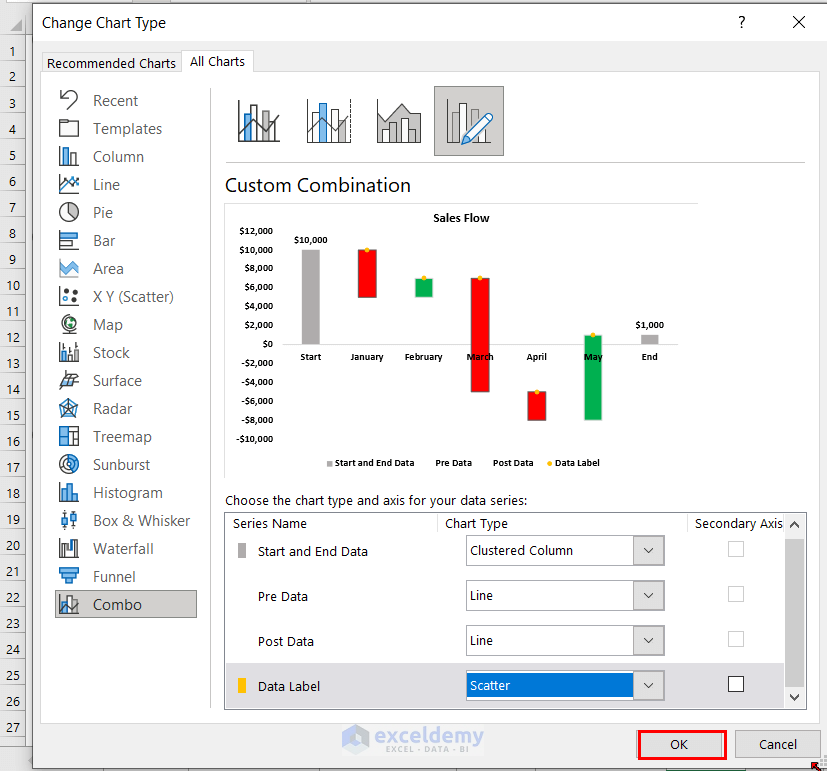
Therefore, you can see, that the chart has now regained the Waterfall chart shape.
Next, we want to add Data Label to the chart.
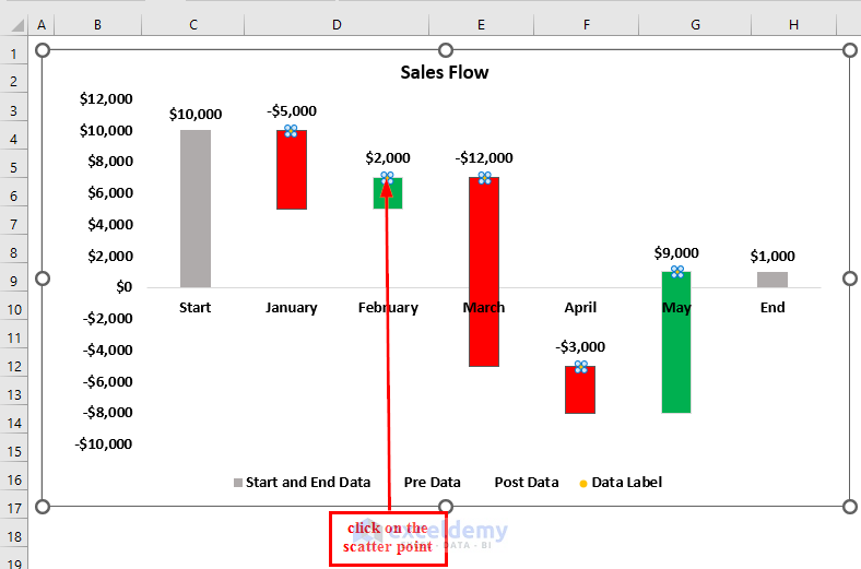
- Right-click on any of the floating bar’s scatter points, these are the minor Yellow points on top of the floating bars.
- Select Add Data Labels from the Context Menu.
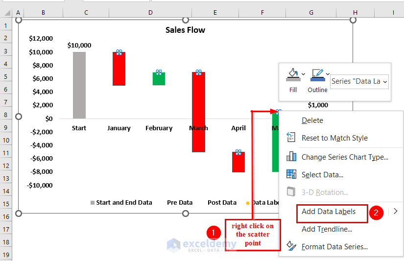
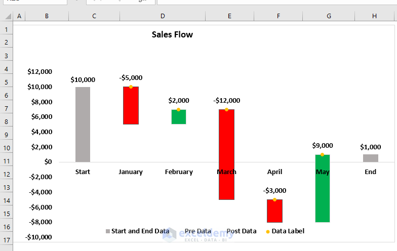
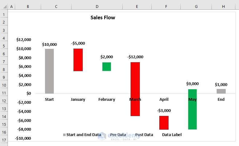
See each of the floating bars now has Data Labels. These are the numeric values of the Data Label column. This is not the Data Label of the floating bars.
For the Floating bars, we want the value from the Sales Flow column.
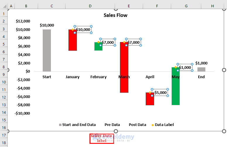
Select the Data Labels of the floating bars by clicking on any of the Data labels.
A Format Data Labels dialog box will appear.
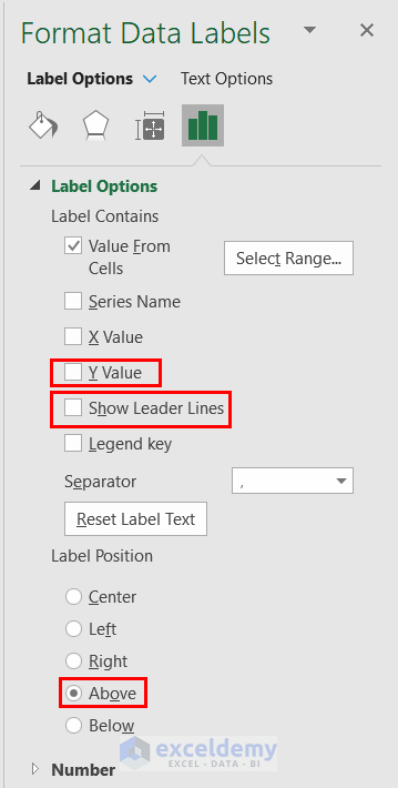
- From Label Options >> select Value from Cells.
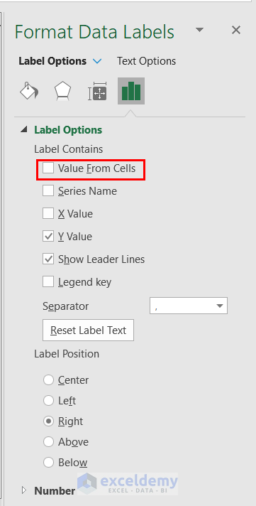
A Data Label Range dialog box will appear.
- From the Sales Flow column, we will select cells C5:C11 as Select Data Label Range.
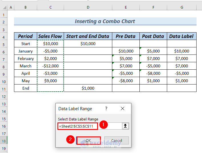
We will unmark the Y Value and Show Leader Lines boxes.
- Also selectAbove as the Label Position. This is because we want our Data Label above the floating columns.
See all the floating bars have Data Label on their top.
Step-9: Hide Scatter Point
Hide the Scatter points from our Waterfall chart to make the chart more visible and presentable.
- Click on the Yellow colored Scatter point.
A Format Data Series dialog box will appear.
- From Fill & Line >> select Marker option.
- From the Fill group >> select No Fill.
- From the Border group >> select No line.
There is no Scatter point in the Waterfall chart.
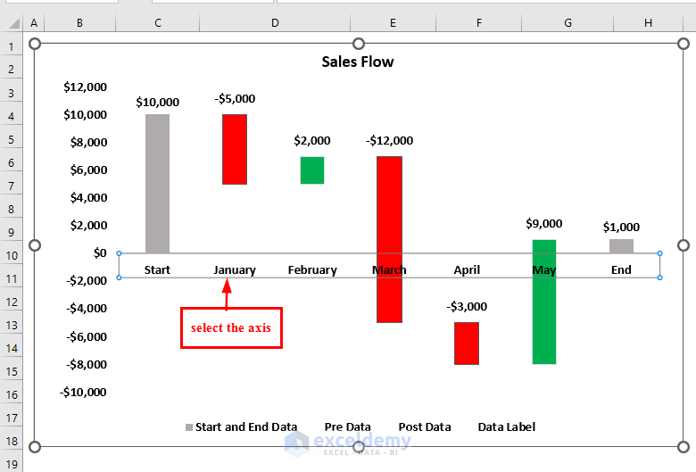
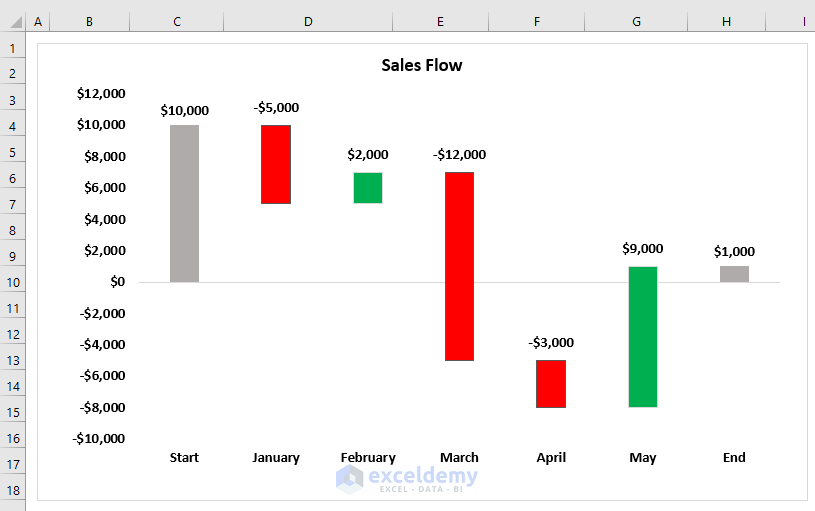
Step-10: Putting Chart Axis Position at Low
In this step, we will put the chart Axis at the low position of the Bars. This will make the chart more presentable.
- Select the chart Axis.
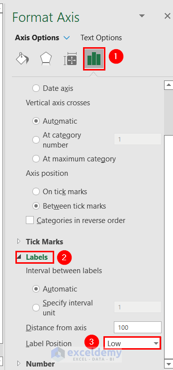
A Format Axis dialog box will appear.
- From Text Options >> select Labels.
- Select Label Position as Low.
- Select the Legend of the chart and press DELETE.
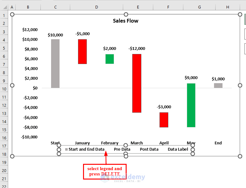
See the Waterfall chart with negative values in Excel.
Download Practice Workbook
You can download the Excel file and practice while you are reading this article.
Related Articles
- How to Create Stacked Waterfall Chart with Multiple Series in Excel
- How to Make a Vertical Waterfall Chart in Excel
- Excel Waterfall Chart Change Colors
- Excel Waterfall Chart Total Not Showing
<< Go Back to Waterfall Chart in Excel | Excel Charts | Learn Excel
Get FREE Advanced Excel Exercises with Solutions!

Dear Afia kona,
Greetings!
Very much delighted for this wonderful tutorial. Hence, this helps a lot; can you explain? Pre, Post and data labels: why these are used in to create waterfall chart
Thanking You
Manohar
Hello Manohar,
Thank you for your kind words! I’m glad you found the tutorial helpful. Regarding your question about “Pre,” “Post,” and data labels in a waterfall chart:
Pre and Post are used to clearly show the starting and ending values in the waterfall chart. They help you see the initial amount before any changes and the final amount after all changes.
Data labels are used to display the exact values on each bar of the chart. This makes it easier to understand the amount for each step, whether it’s an increase or a decrease.
Using these elements together makes the waterfall chart more readable and helps users quickly see how each step contributes to the total change.
Regards
ExcelDemy
Dear Shamima Sultana,
Greetings,
Thanks so much for making me understand this.
Thanking You,
Sincerely
Manohar
Hello Manohar,
Greetings! Thank you for your kind words. I’m glad the explanation was helpful for you. If you have any more questions about Excel or need further clarification, feel free to ask.
Best regards,
ExcelDemy