Here’s an overview of a box and whisker plot and a surface chart in Excel for stocks.
Download the Practice Workbook
What Is a Stock Chart?
A stock chart illustrates the historical price development of a particular stock or resource over a specific period of time. This type of chart shows the trend of a stock’s performance over time.
What are Open, High, Low, and Close Prices in a Stock Chart?
- The opening price is the price at which a stock’s trading starts at the beginning of a particular time period, like a trading day.
- The high price indicates the highest price a stock may be purchased for within the given time frame, which could be a trading day, an hour, or any other period of time.
- The low price represents the stock’s lowest price within the given time period.
- The closing price is the final price at which a stock’s trading ends at the end of the specified time period.
Let’s look at the stock chart below. The highest point represents the high price, and the lowest point represents the low price. The difference between the open and close prices is shown in a bar plot. The opening price can be lower than the closing price.
Create a Stock Chart in Excel: 4 Different Cases
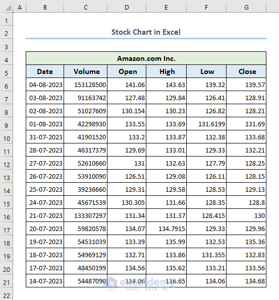
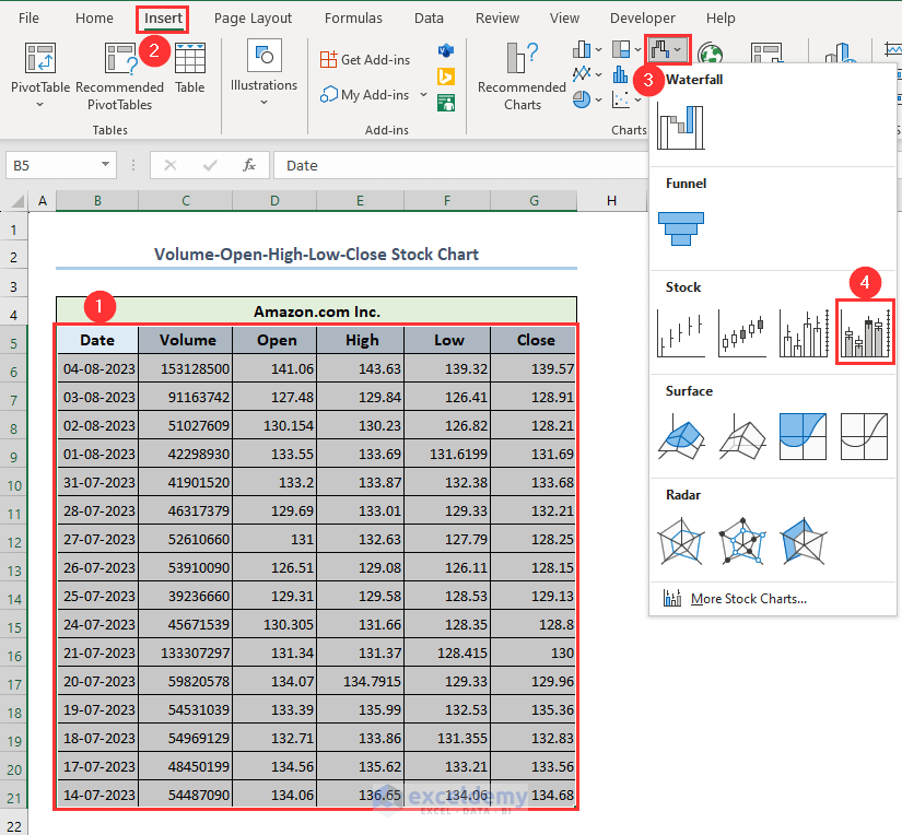
We will be using the following dataset as an example to demonstrate those all. The dataset represents Amazon.com’s volume, open, high, low, and close prices for a specific time period.
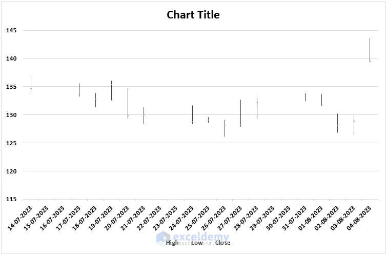
Case 1 – High-Low-Close Stock Chart
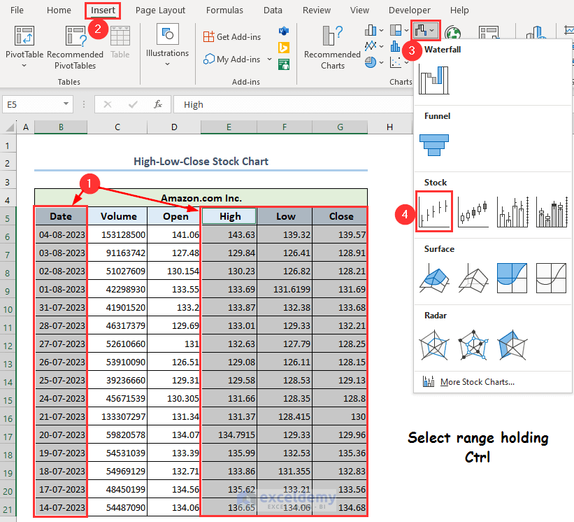
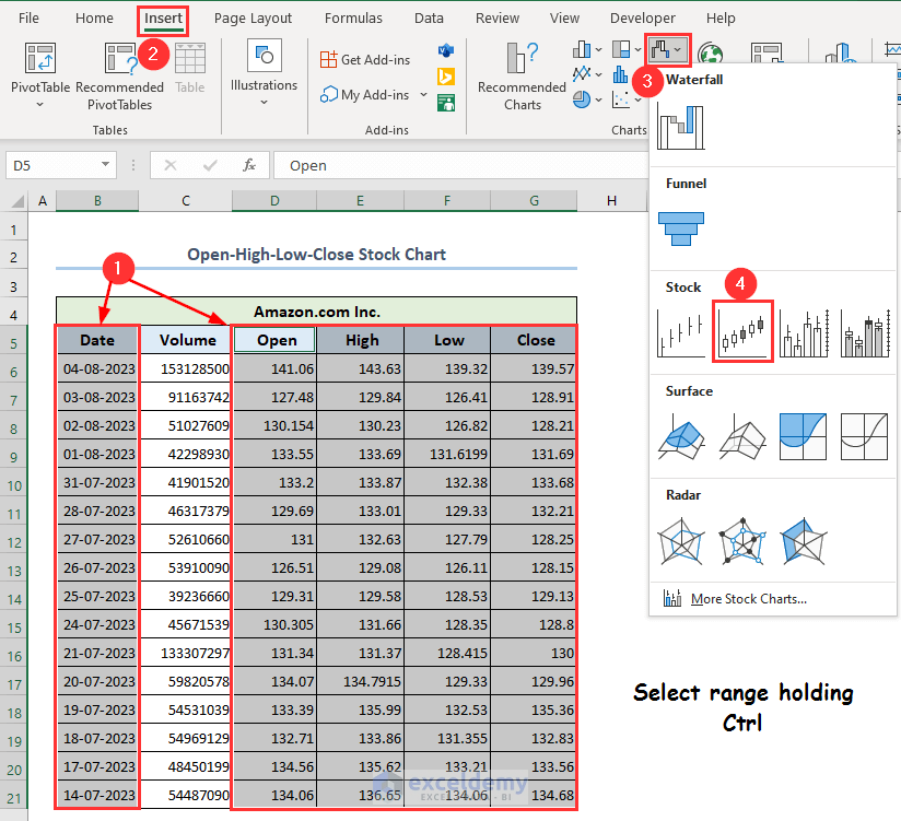
- Select the ranges B5:B21 and E5:G21 holding the Ctrl key.
- Go to the Insert tab, then choose Insert Waterfall, Funnel, Stock, Surface, or Radar Chart.
- Click on High-Low-Close.
- The chart will appear on your worksheet, but it needs to be formatted.
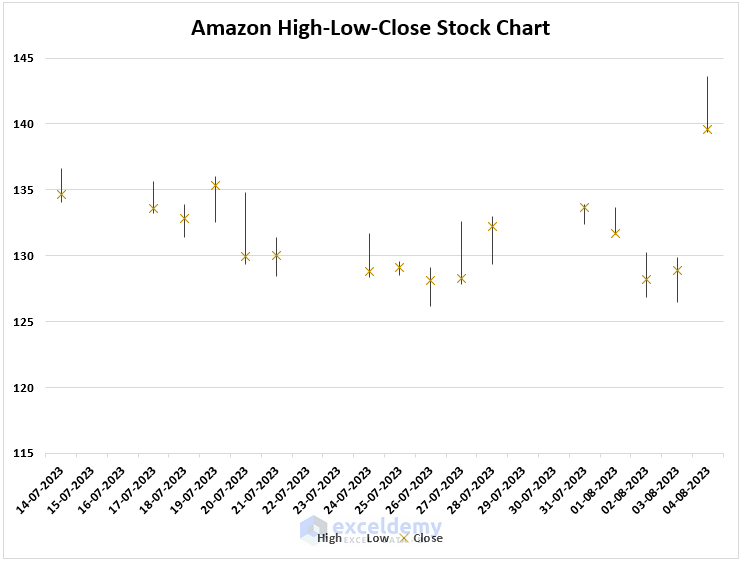
- Select the Chart Title and type down your desired title. We have set the title of our chart as Amazon High-Low-Close Stock Chart.
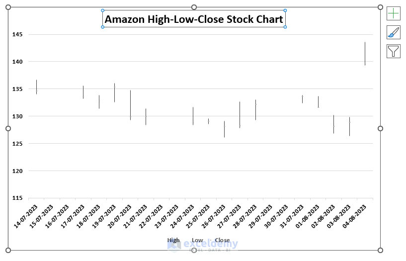
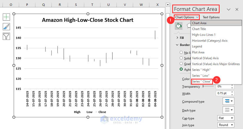
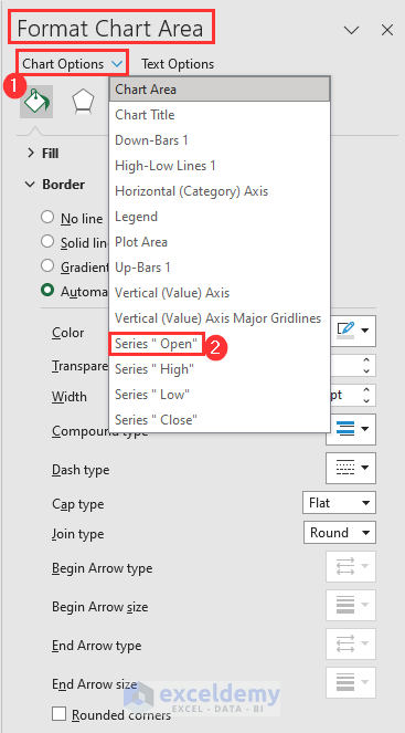
- Double-click on the chart. A separate window titled Format Chart Area will appear on your worksheet.
- Click on Chart Options.
- Select Series “Close”.
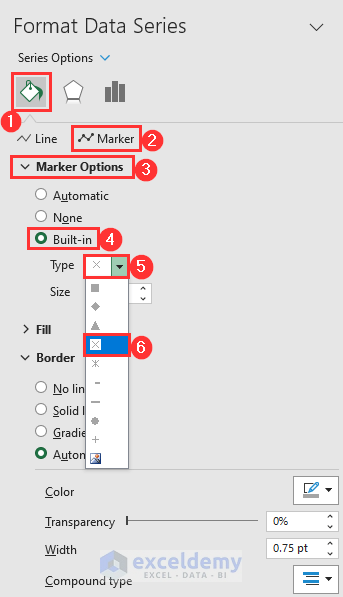
- Click on Fill & Line.
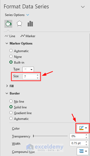
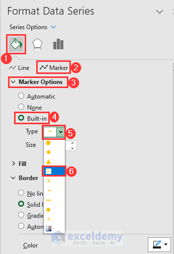
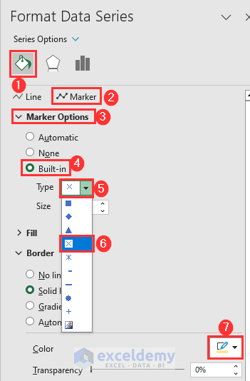
- Select Marker.
- Click on Marker Options.
- Check Built-in.
- Left-click on the Type drop-down menu.
- Select the cross symbol as shown below.
- Increase the size. We have increased it to 7.
- From the Border section, select an appropriate color. We have selected an orange color.
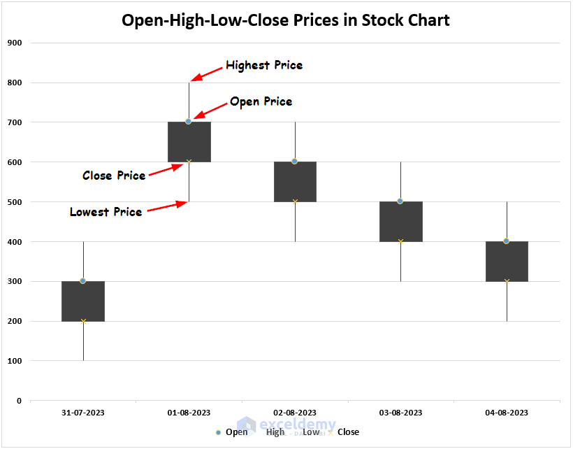
- All the cross points within the chart represent the Closing prices.
- The highest point represents the high price and the lowest point represents the low price.
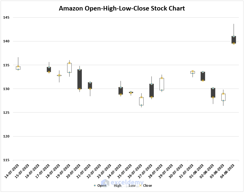
Case 2 – Open-High-Low-Close Stock Chart
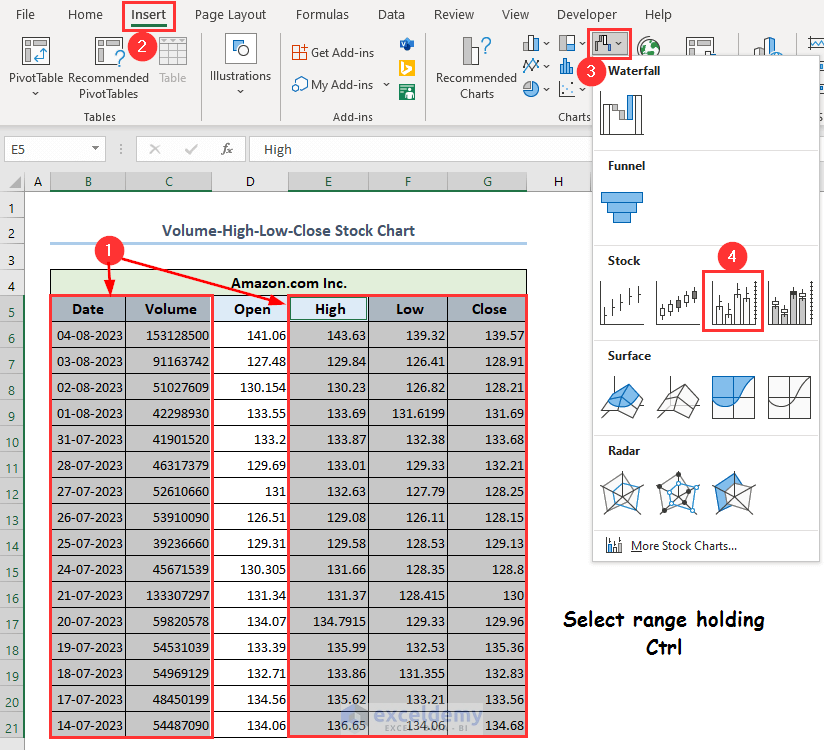
- Select the range B5:B21 and the range D5:G21 together holding the Ctrl key.
- Go to the Insert tab.
- Select Insert Waterfall, Funnel, Stock, Surface, or Radar Chart.
- Choose Open-High-Low-Close.
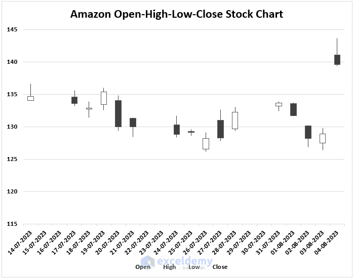
- The following stock chart will be created.
- Double-click on the chart, and the Format Chart Area sidebar will appear on your screen.
- Select Series “Open” from the Chart Options.
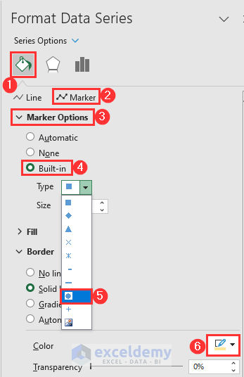
- Go to Fill, Marker, Marker Options, Built-in, and choose the circled symbol.
- Select any color you want.
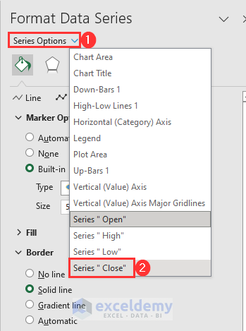
- Click on Series Options then select Series “Close”.
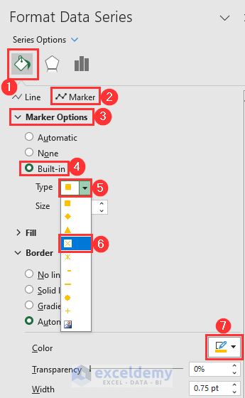
- Go to the Fill & Line option.
- Click on Marker.
- Select Marker Options.
- Mark Built-in.
- Select the cross symbol from the Type drop-down.
- Select a convenient color.
- The chart will be more understandable.
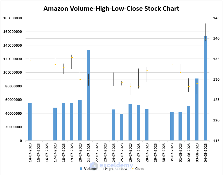
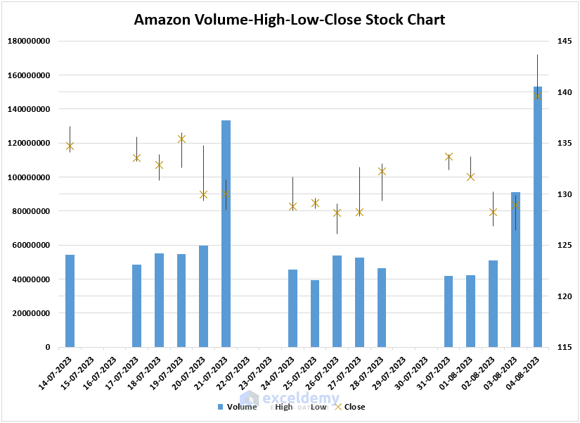
Case 3 – Volume-High-Low-Close Stock Chart
- Select ranges B5:C21 and E5:G21 from the dataset.
- Go to the Insert tab and select Insert Waterfall, Funnel, Stock, Surface, or Radar Chart.
- Pick Volume-High-Low-Close.
- The chart will appear on your sheet. The clustered column bars represent the volume of stock.
- From the Format Chart Area sidebar, select Chart Options.
- Select Series “Close”.
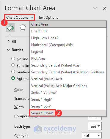
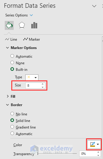
- In Marker options, choose the built-in cross symbol.
- Set the size to at least 8.
- Select any color.
- The chart looks as follows.
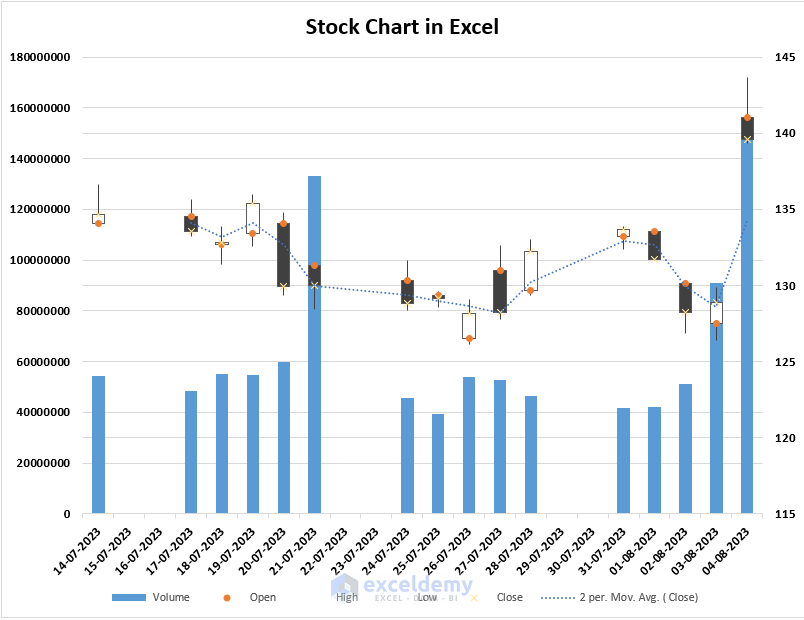
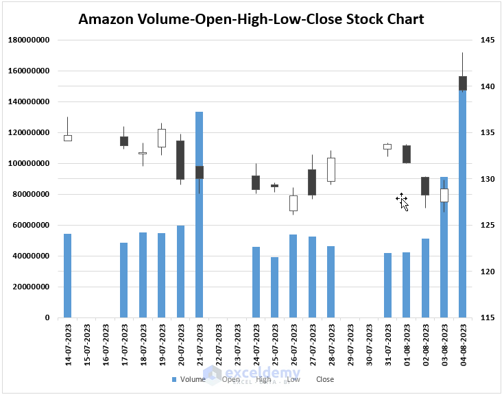
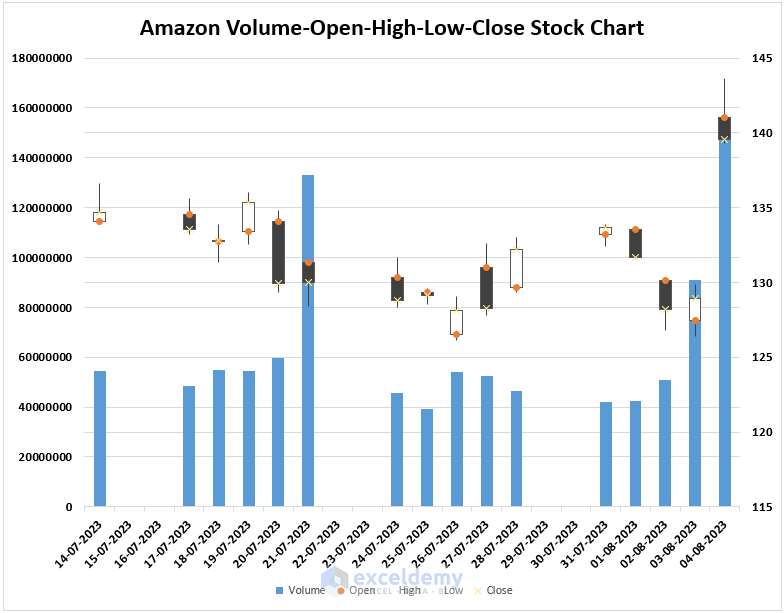
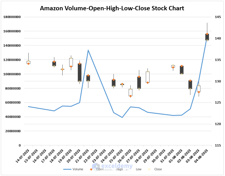
Case 4 – Volume-Open-High-Low-Close Stock Chart
- Select the range B5:G21.
- In the Insert Waterfall, Funnel, Stock, Surface, or Radar Chart drop-down, select Volume-Open-High-Low-Close.
- The following stock chart will appear on your screen.
- Double-click on the chart.
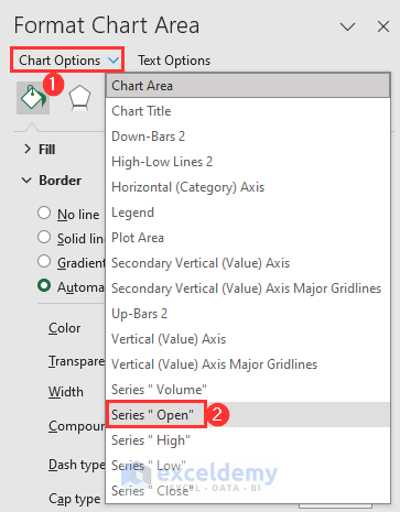
- From the Format Chart Area, click on Chart Options.
- Select Series “Open”.
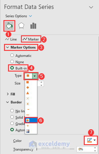
- Go to Marker Options, select Built-in and select a circle.
- Select any color.
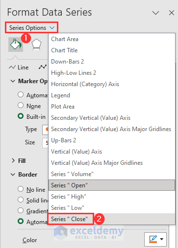
- Click on the Series Options drop-down menu.
- Select Series “Close”.
- Select a cross-shaped Marker.
- Choose a convenient color.
- The chart will look something like the following image.
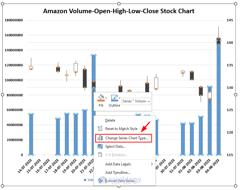
- Let’s put the Volume as a line instead of a clustered column bar.
- Right-click on any Volume column.
- Click on Change Series Chart Type.
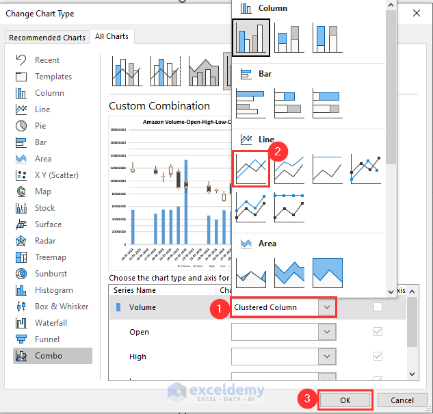
- Click on the Volume drop-down menu.
- Select Line.
- Click on OK.
- Here’s how the chart looks with the volume line.
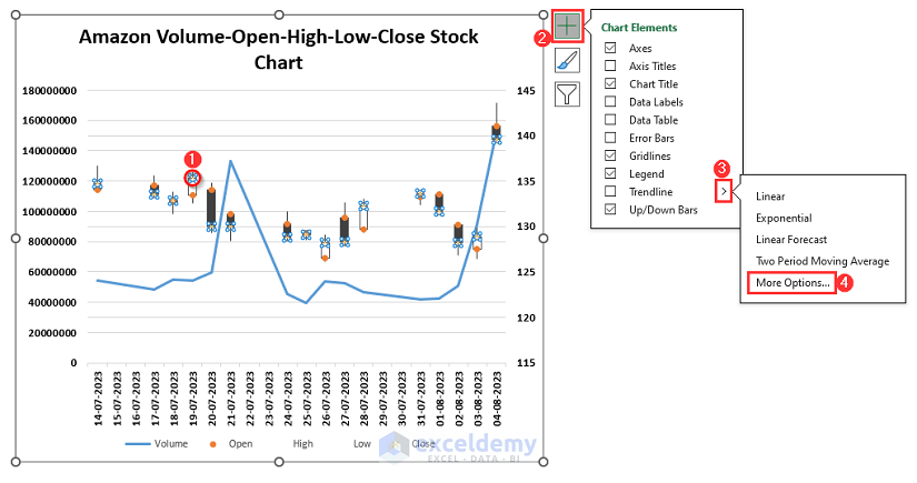
- Let’s add a trendline for closing prices.
- Select any close price point from the chart. Here in the chart, all the cross points represent closing prices.
- Click on the plus (+) icon at the top-rightmost of your chart.
- Click on the arrow sign beside Trendline.
- Select More Options.
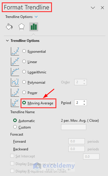
- Mark Moving Average.
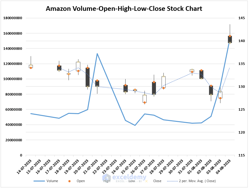
- The trendline is added as follows.
Read More: How to Create Stock Comparison Chart in Excel
Create a Box and Whisker Plot in Excel
- Select the range B5:E21.
- Go to the Insert tab.
- Click on the Insert Statistic Chart menu.
- Select Box and Whisker.
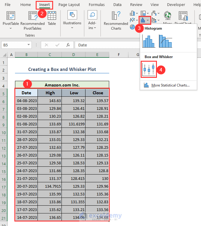
- The graph will appear on your sheet.
- Click on plus (+) icon.
- Click on the arrow symbol next to Legend.
- Select Bottom.
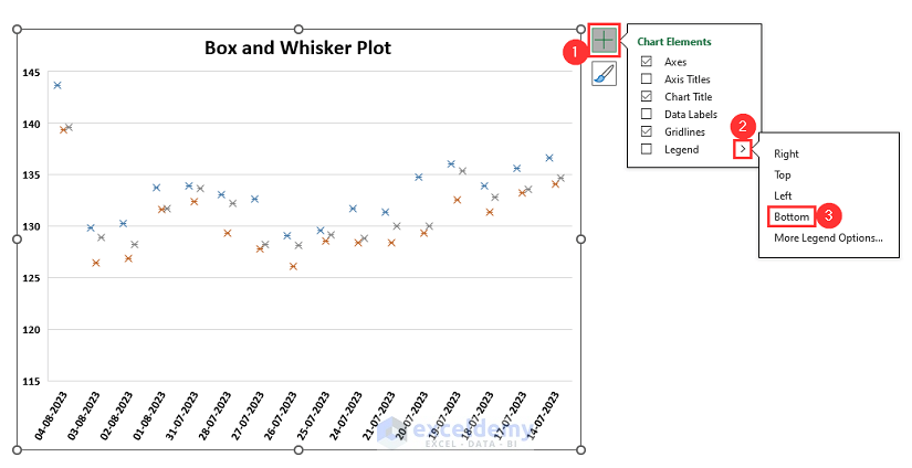
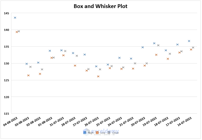
- The Legend is added to the bottom of your chart as follows.
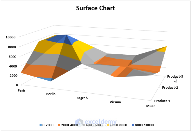
Create a Surface Chart in Excel
Suppose we have a dataset of product sales. We want to create a surface chart out of it.
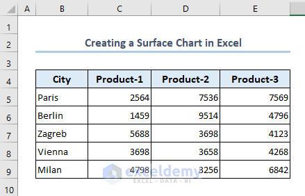
- Select the range B4:E9.
- Go to the Insert tab.
- Click on Insert Waterfall, Funnel, Stock, Surface, or Radar Chart menu.
- Select 3-D Surface.
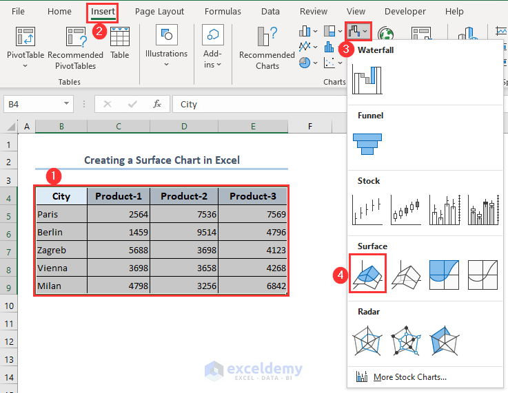
- The surface chart is created as follows.
Things to Remember While Creating a Stock Chart in Excel
While creating any type of stock chart in Excel, you have to follow the sequence of values:
- Volume > Open > High > Low > Close
- Volume > High > Low > Close
- Open > High > Low > Close
- High > Low > Close.
Frequently Asked Questions
Can I create a dynamic stock chart that updates automatically with new data?
Yes, you can create a dynamic stock chart that updates automatically with new data. You may use named ranges and tables in Excel to create a dynamic stock chart. The chart will automatically update as new data rows are added to the table if you create a named range for your data and turn it into a table.
What is the best chart type for displaying stock price trends?
The type of chart you choose will depend on your preferences and the type of your data. However, OHLC (Open-High-Low-Close) is usually the most used type for creating a stock chart.
Can I customize the appearance of my stock chart in Excel?
Excel provides tools for customizing the colors, fonts, gridlines, and other visual components.
<< Go Back To Excel Charts | Learn Excel
Get FREE Advanced Excel Exercises with Solutions!

In an Excel stock table, I need to reference the current market price against the 50-day and 200-day moving averages, and set cross-over flags.
Hello Michael Seleanu,
You can achieve this by adding columns for the 50-day and 200-day moving averages using Excel’s AVERAGE formula, then use logical formulas to set cross-over flags. For example, to flag when the current price crosses above the 50-day moving average, you could use a formula like:
=IF([@[Current Price]] > [@[50-day MA]], “Crossed Above”, “”)
Similarly, compare against the 200-day MA for another flag. You can also use conditional formatting to highlight cross-overs visually in your table.
Regards
ExcelDemy