Sometimes for stock visualization, you may need to prepare a Stock Comparison chart in Excel. Furthermore, you can easily visualize the situation with data charts. In this article, I will explain how to create a Stock comparison chart in Excel. Additionally, for conducting the session, I’m going to use the Microsoft 365 version.
What Is a Stock Chart in Excel?
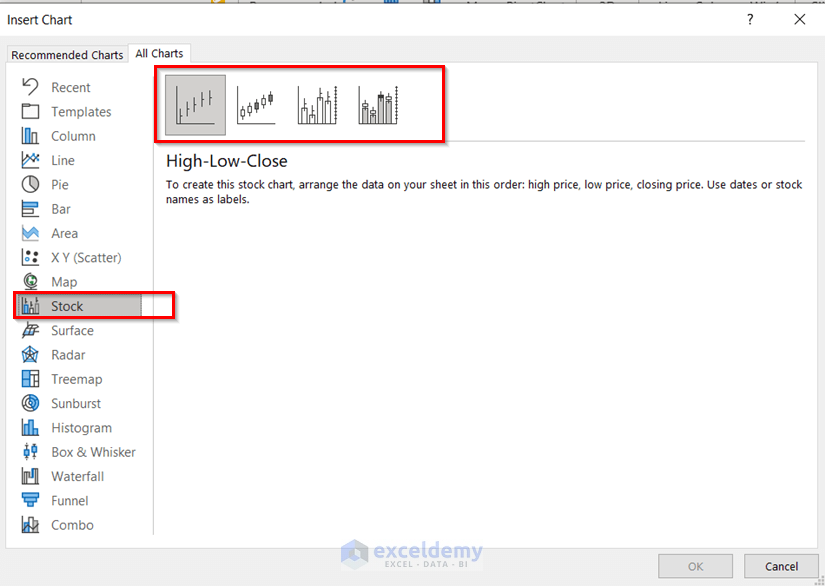
Stock chart is a chart that denotes the conditions of stock for any company. In Excel, there are four stock charts. Furthermore, for preparing any kind of stock chart you must arrange your data according to the name of the chart. Like, if you want to prepare a High-Low-Close stock chart then keep the high values of stock first, then the low values, and then the close values.
How to Create Stock Comparison Chart in Excel: 3 Methods
Here, I will describe 3 methods to create a Stock comparison chart in Excel. In addition, for your better understanding, I’m going to use a sample dataset. Basically, for the dataset, you may include stocks from Excel. Now, let’s talk about how you can insert stocks for different companies in Excel.
Steps for Inserting Stock Values:
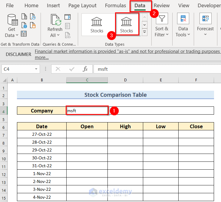
- Firstly, write the company’s short name according to Excel. Here, I have written msft for Microsoft Corporation in the C4 cell.
- Secondly, from the Data tab >> click on the Stocks feature.
As a result, you will see the following output.

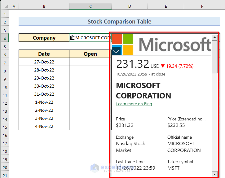
- Now, click on the Stock symbol beside the company’s name.

So, you will get all the information for stock related to that company.
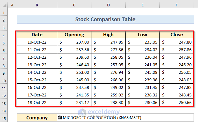
Now, let’s insert the opening, high, low, and close stack values for that particular date of that company.
- Firstly, in the C7 cell write down (=C4.) then you will be available to choose any type of stock value from a list.

As I want to pick the opening value of the stock, so I have chosen Open. Thus, the formula becomes.
=C4.Open- Subsequently, press ENTER.

- Similarly, did this for the Low and High values.
- But, for close value, the formula become:
=C4.[Previous close]
So, you can store the regular update. As the stock values will be changed up to date. Like, I gave an example of storing data.
1. Use of Charts Group to Create Stock Comparison Chart
Now, let’s talk about the method for creating the stock comparison chart in Excel. There is a built-in process in Excel for making charts under the Charts group. So, you may use the Charts group to prepare the stock comparison chart. Additionally, I will create a comparison chart based on different days for the same company.
Steps:
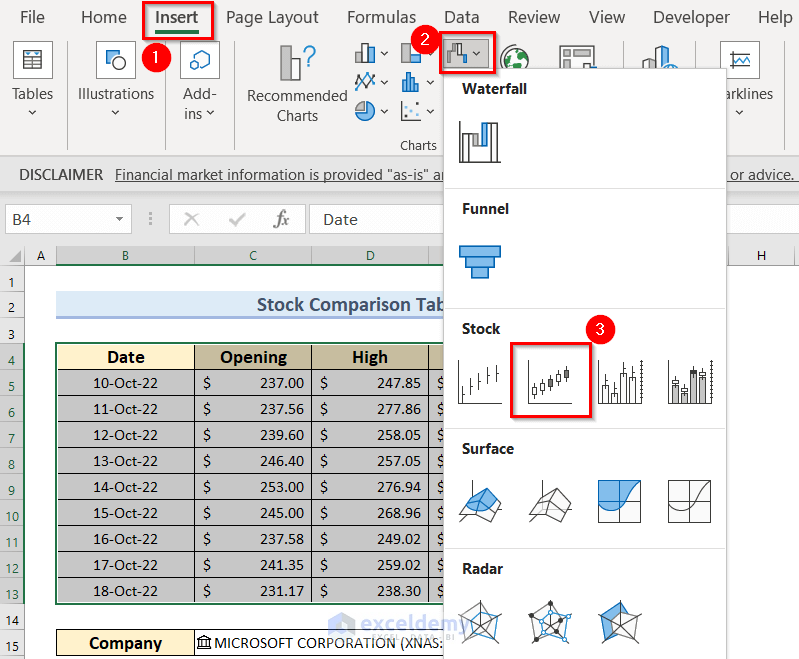
- Firstly, select the whole data.
- Secondly, from the Insert tab >> under the Chart group section, go to the Waterfall chart.
- Thirdly, choose the Stock chart (Open-High-Low-Close). Here, you must arrange your data in the Open-High-Low-Close format.
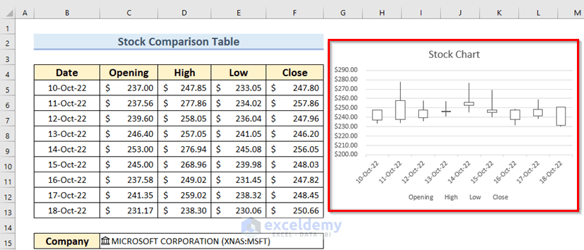
As a result, you will see the following chart.

- Now, choose the Vertical axis values.
- Then, press CTRL+1.

At this time, you will see the Format Axis window, just at the rightmost side of the worksheet.
- After that, change the Minimum and Maximum values according to your dataset.

Finally, you will see the following stock chart.
2. Inserting Excel Template
The most interesting part is that Excel has its own templates for the Stock chart. You can easily use that. Now, let’s talk about how you will get the template.
- Firstly, open an Excel workbook.
- Secondly, go to the File tab from the top ribbon.
- Now, from the New menu >> go to the More templates option.

- After that, write down Stock in the Search box and press ENTER.

Subsequently, you will get 5 types of sheets related to Stock.
- Choose the Investment tracker.

At this time, a new window named Investment tracker appears.
- Here, click on the Create option.
Now, you will get the following Excel file which has three worksheets.

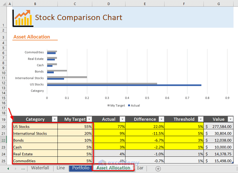
- Here, go to the sheet named Portfolio. You can change anything on this sheet. Additionally, you can remove columns from the table or you can add more columns. Also, you may include more companies or remove any company from this table. Basically, change this template as you want.

- Now, go to the sheet named Asset Allocation. Also, here, you can change anything on this sheet. Additionally, all the calculations including the chart will be auto-updated. You just have to insert the Category and My Target columns. Furthermore, the highlighted cells denote those which have fulfilled your target. Eventually, I changed the title of this sheet.
3. Employing Line Chart to Create Stock Comparison Chart
In addition, you can use Line Charts feature to make the comparison stock chart in Excel. Basically, I will make different charts for different terms. The steps are given below.
Steps:
- Firstly, you should make the dataset by storing the regular stock values. Here, you can see the–7-Steps for inserting Stock Values.
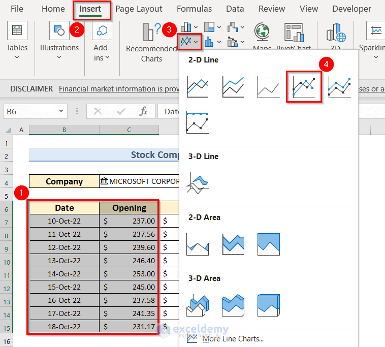
- Secondly, you have to select the data. Here, I have selected the range B6:C15.
- Thirdly, you have to go to the Insert tab.
- Fourthly, from the Charts group section you have to choose 2-D Line >> then choose Line with Markers.
Furthermore, there are 6 features under the 2-D Line. Along with that, you can choose as your requirement. Here, I have used Line with Markers.
Now, you will see the result by clicking the Line with Markers feature. This chart is actually opening stock values versus the date for the same company.

- Now, click on the chart.
- Then, from the Chart Design contextual tab >> choose Style 12 under the Chart Styles section.

- Now, click on the Chart Elements icon, this is a big Plus sign.
As a result, a list appears. You get all the chart elements related to your Chart Type in this list. Here, you see, Axes, Chart Title, and Data Labels are selected.
- Then, to get more options on Axes, move your mouse pointer over the Axes. Here, you see a little triangle appears on the right side of the Axes text.
- After that, click on the little triangle. There are three options in the list: one of them is selected.
- At this time, you may select the Primary Vertical option.
- Then, uncheck the Data Labels option.

Lastly, you will see the following chart.

Similarly, I have made two more comparison charts for High stock values and Low stock values.

How to Create Comparison Chart in Excel
In this section, I will make a comparison chart for two different companies using Excel. Here, I’m going to use the CAT stock symbol for Caterpillar Inc, and the MSFT stock symbol for Microsoft Corporation.
Steps:
- Firstly, you have to make the dataset by storing the regular stock values for both companies. Here, you can follow the–7-Steps for inserting Stock Values.
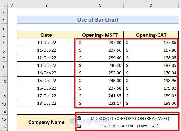
- Now, select the data. Here, I have selected the range C5:D13.
- Then, go to the Insert tab.
- After that, from the Charts group section you may choose Insert Column or Bar Chart >> then choose 2-D Column chart.

Finally, you can see the following Stock comparison chart for two different companies.

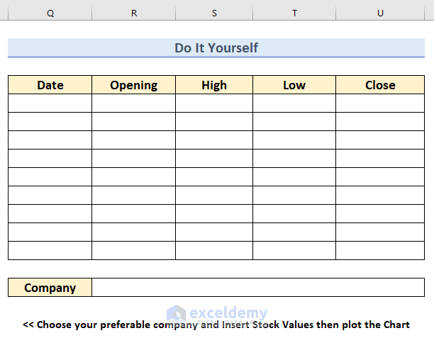
Practice Section
Now, you can practice the explained method by yourself.
Download Practice Workbook
You can download the practice workbook from here:
Conclusion
I hope you found this article helpful. Here, I have explained 3 suitable methods about how to create a Stock Comparison chart in Excel. Please, drop comments, suggestions, or queries if you have any in the comment section below.
<< Go Back To Stock Chart in Excel | Excel Charts | Learn Excel
Get FREE Advanced Excel Exercises with Solutions!
