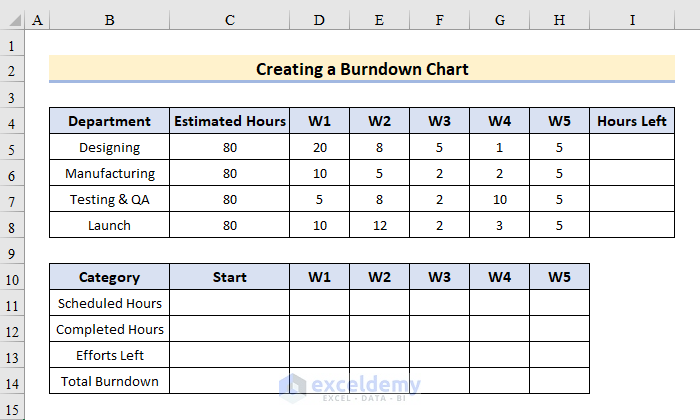
Step 1 – Preparing Dataset to Create a Burndown Chart in Excel
The sample dataset contains 2 tables.
The first table showcases:
- Actual data: the original data assigned for 5 weeks.
- Chart formatting: a line chart based on the table.
The second table includes:
- Scheduled Hours: the weekly time duration assigned to the departments.
- Completed Hours: the amount of time used to complete parts of the project.
- Effort Left: Amount of time left to complete the whole project.
- Total Burndown: the time duration to complete the project before the deadline.
- W represents a week.
Step 2 – Tracking Sprint Timeline Using the SUM Function
Consider the 2nd table.
To build the burndown chart, calculate the totals of the elements in the Category header.
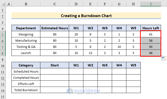
- Hours Left: Calculate the total number of hours in 5 weeks and subtract it from the total estimated hours. To find the remaining hours left in I5, enter:
=C5-(SUM(D5:H5))- Press Enter or Tab.
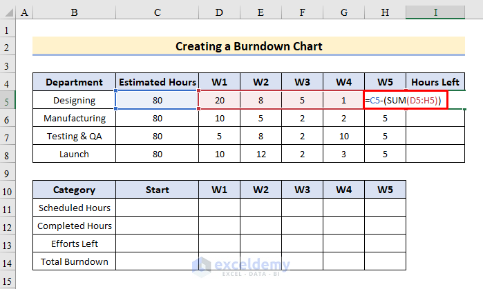
- Drag down the Fill Handle to see the result in the rest of the cells.
- Total Burndown: shows the optimal trend for how many hours per week you should dedicate to your project in order to meet the deadline.
- Efforts Left: determine the total hours left before the completion of the project. To calculate both Total Burndown and Efforts Left in the Start section, enter the formula in C14 and C15:
=SUM(C5:C8)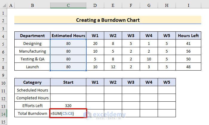
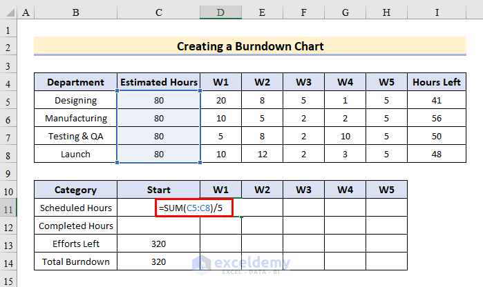
- Efforts Left: the number of weekly hours assigned to the project. Add the Estimated Hours and divide them by the total number of weeks to get the resulting hours. Use the formula:
=SUM(C5:C8)/5- Enter the formula in E11, F11, G11, H11, and I11 and press Enter.
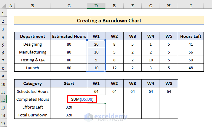
- To count the completed hours each week, use:
=SUM(D5:D8)- Drag the Fill Handle to see the result in the rest of the cells.
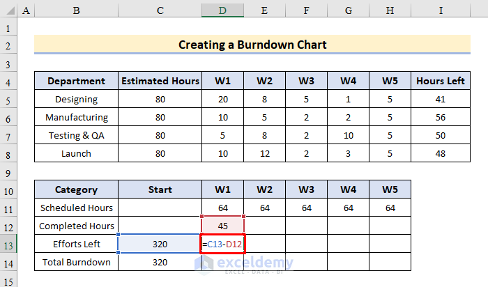
- To display the efforts left per week, enter:
=C13-D12- Drag the formula to the right.
- To calculate the total burndown for each week separately, enter:
=C14-D11- Drag down the Fill Handle to see the result in the rest of the cells.

Read More: How to Create Sprint Burndown Chart in Excel
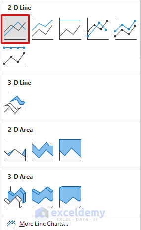
Step 3 – Inserting an Excel Line Chart to Create a Burndown Chart in Excel
- Go to Table 2 and select B11:H14.
- Select Insert and choose Charts.
- Click Insert Line and Area Chart as shown below.
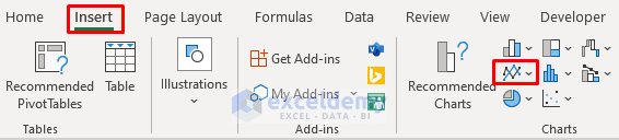
- Choose Line Chart.
- A line chart is displayed.
Step 4 – Entering the Estimated Hours into the Horizontal Axis
- Click the horizontal axis labels and right-click.
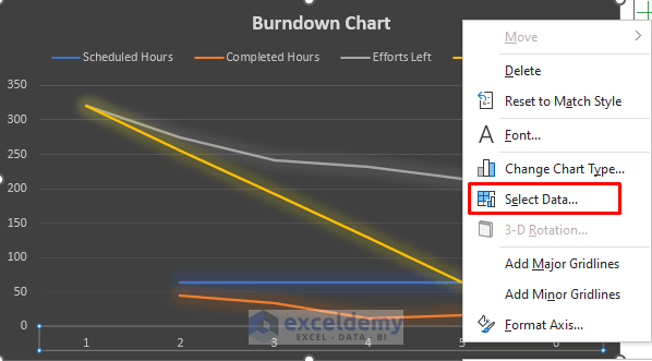
- In Select Data Source, click Edit.
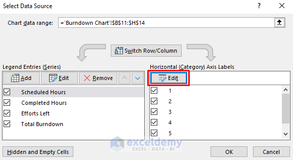
- In the Axis Labels dropdown, select the cell array to display on the chart. Here, $C$10:$H$10.
- Click OK.
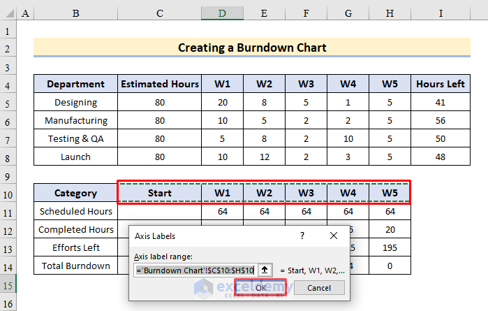
The headers are displayed on the horizontal axis.
Step 5- Entering the Burndown Hours into the Secondary Axis
Modify the data series in Scheduled Hours and Completed Hours to a clustered column chart. It returns a data series in vertical columns.
- Right-click the line of either Schedule Hours or Completed Hours.
- Select Change Series Chart Type… .
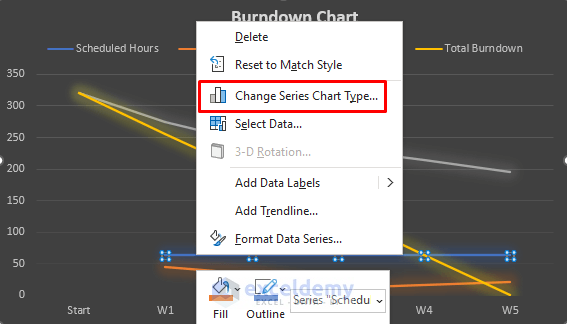
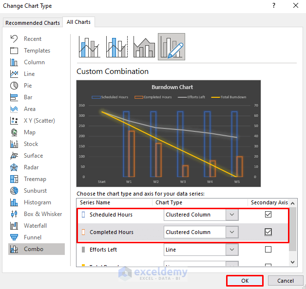
- Choose Combo.
- Choose Clustered Column for Scheduled Hours.
- Check Secondary Axis.
- Do the same for Completed hours.
- Click OK.
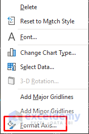
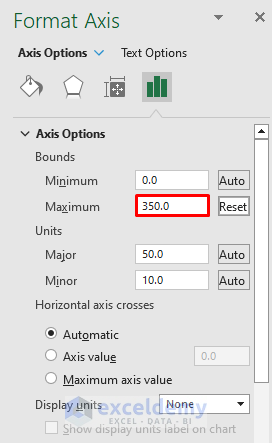
- To reduce the size of the clustered columns, click the secondary axis labels and select Format Axis…
- In Axis Options select Bounds.
- Set the Maximum to 350.
Step 6 – Customizing the Burndown Chart
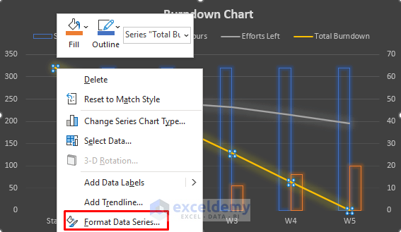
- Right-click either of the two lines.
- Select Format Data Series…
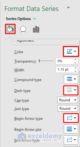
- Go to Fill & Line tab and select Color > Dash type > Begin Arrow type.
- In each type, choose an option and customize the chart.
- Do the same for the other line.
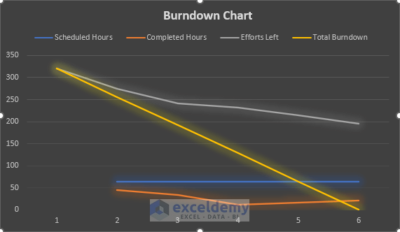
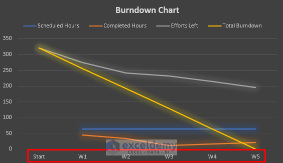
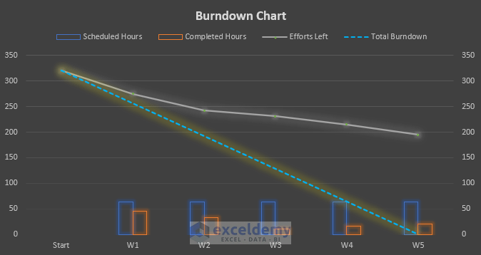
This is the burndown chart.
The Efforts Left line is showing over the Total Burndown line: the team is behind the deadline.
Download Practice Workbook
Download the practice workbook.
Related Articles
<< Go Back to Burndown Chart in Excel | Excel Charts | Learn Excel
Get FREE Advanced Excel Exercises with Solutions!
