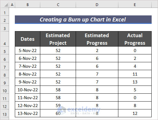
Step 1 – Create a Dataset with Proper Parameters
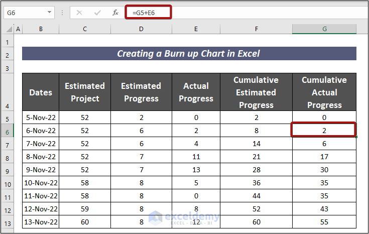
- We have arranged the dataset of a project in the Dates, Estimated Project, Estimated Progress, and Actual Progress columns.
Read More: How to Create Budget Burndown Chart in Excel
Step 2 – Calculate the Estimated and Actual Progress
- In order to find the estimated progress of the project, input the following formula in cell F5.
=D5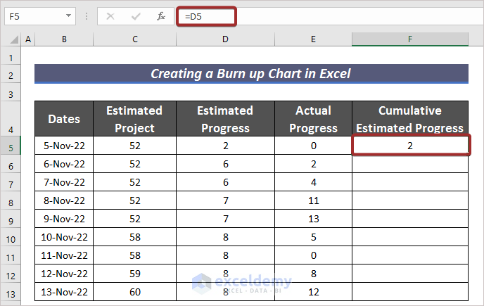
- Apply the following formula in cell F6 to have the total progress on day 2.
=F5+D6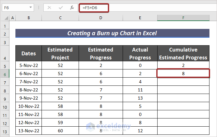
- Use the Fill Handle to AutoFill the rest of the cells in Column F.
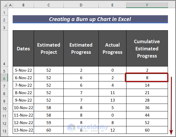
- This calculates the total progress on the ongoing project in the Cumulative Actual Progress column.
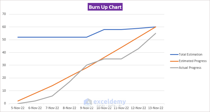
Step 3 – Create a Burn-up Chart
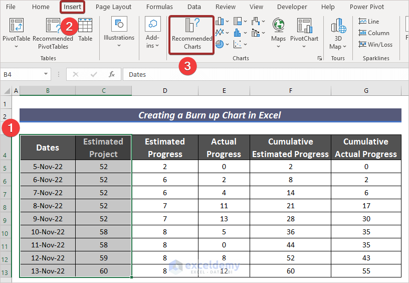
- Select the columns Dates and Estimated Project.
- Go to Insert.
- Click on Recommended Charts from the ribbon.
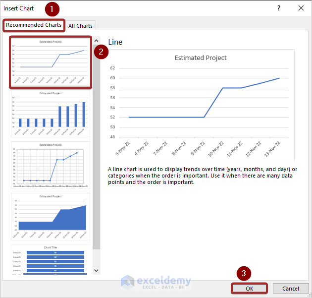
- A wizard named Insert Chart will appear.
- Select the Line pattern for the chart and click on OK.
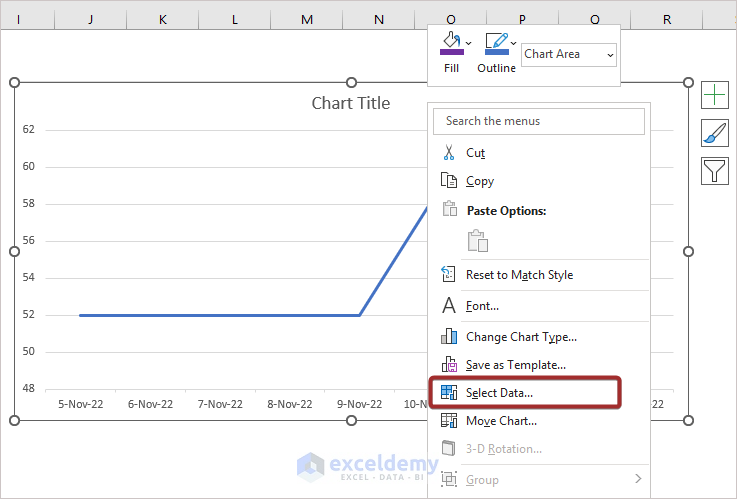
- Right-click on the mouse keeping the cursor on the chart.
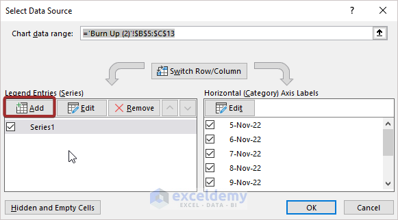
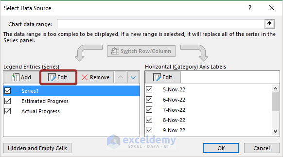
- From the available options, click on Select Data…
- Click on Add to add a new series.
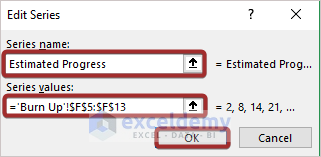
- Put a suitable name and define the range from the Edit Series wizard.
- Press OK.
- Use a similar pattern to further the series.
- We have generated the Estimated Progress and Actual Progress series.
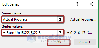
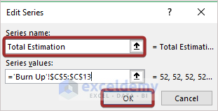
- In order to modify the previously set series, select that series and click on the Edit option.
- Do the necessary modification and press OK to finish it.
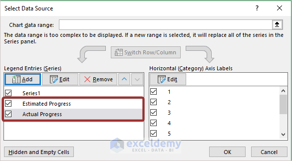
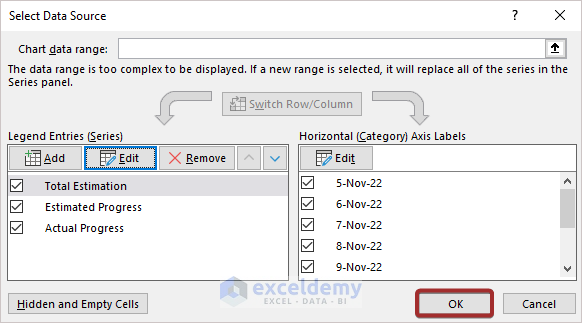
- We can have our defined series in the Select Data Source. Press OK to finish the modification.
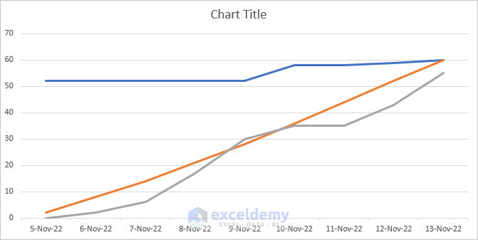
- We can see a Burn-up Chart generated from our data.
Read More: How to Create a Burndown Chart in Excel
Step 4 – Modify the Burn-up Chart
- Select the chart.
- Click on the Plus (+) sign.
- Select the necessary elements from the Chart Elements group to add them to the chart.
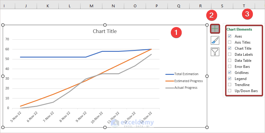
- You can edit further according to your choice.
Download the Practice Workbook
Related Articles
<< Go Back to Burndown Chart in Excel | Excel Charts | Learn Excel
Get FREE Advanced Excel Exercises with Solutions!
