Risk Burndown plan means to lessen the work risk from the higher level to the lower. This value is time-dependent. With time goes, risk lessens. Depending on the value of risk burndown, we can take initiatives to lessen the risk and complete the task in proper time with extra effort. In this article, we will discuss how to create the risk burndown chart in Excel with proper illustrations.
What Is Risk Burndown Chart?
From the risk burndown chart, we will be able to get visual information about the risk percentage of any project in terms of time. For example, we will be able to estimate how much extra effort or extra time is needed to complete the project.
Risk Burndown Chart in Excel: Step-by-Step Procedure to Create
Now, let’s see how to create a risk burndown chart in Excel in detail in the section below.
Say, we want to create a risk burndown chart for a software project and the project deadline is 6 months.
Step 1: Collect and Arrange Data to Create a Risk Burndown Chart
- First, we will insert practical data into the dataset.
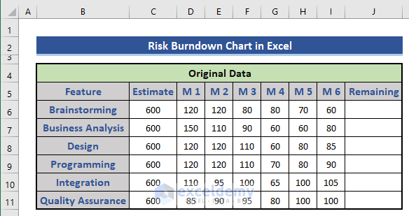
- We will use a formula to calculate the remaining work using the formula on cell J6.
=$C6-SUM($D6:$I6)

Here, we subtract the sum of the total working hours from the estimated work hours. Extend the formula from cell J6 to cell J11.
Read More: How to Create Sprint Burndown Chart in Excel
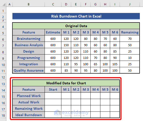
Step 2: Modify Source Data Properly
- For the modified data, we introduce a new data table in the dataset.
- Now, we will calculate the working hour for each month. For that, we will use the following formula on cell D15.
=SUM($C$6:$C$11)/6
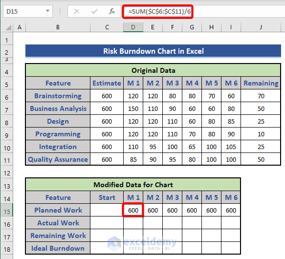
We just divided the total estimated work hours by 6 months. Then, expand this till cell I15.
- Now, we will calculate the actual work hours for each month.
- Use the following formula on cell D16.
=SUM(D$6:D$11)

Similarly, extend this formula till cell I16.
- Now, we will calculate the remaining work and the ideal burndown amount. In the starting, both are the same. We will use this formula on cells C17 and C18.
=SUM($C$6:$C$11)

- Now, we will calculate the remaining work. Use the following formula in cell D17.
=C17-D16
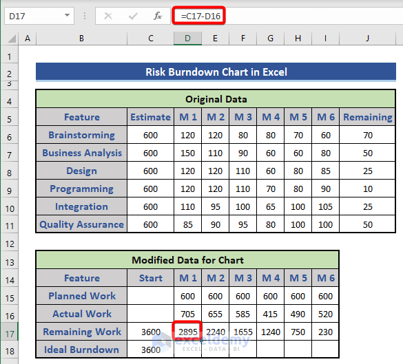
Extend this formula till cell I17.
- Now, we will calculate the ideal burndown using the following formula.
=C18-D15

Extend this formula from cell D18 to I18.
Step 3: Create a Chart from the Modified Data
In this section, we will create an Excel chart based on the modified data.
- Choose the Range B14:I18.
- Select the Insert tab.
- Then, we will choose the Line chart from the Chart group.
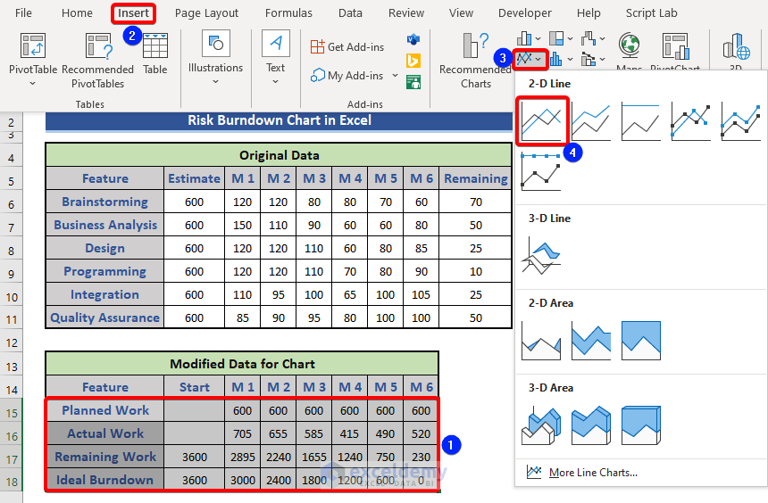
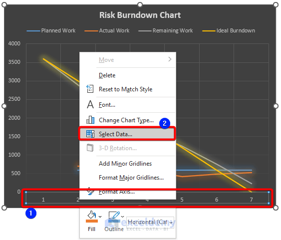
- Look at the chart.

There are four lines in the chart. The legend indicates different lines.
Read More: How to Create Budget Burndown Chart in Excel
Step 4: Format the Graph as Risk Burndown Chart
Now, we will customize the chart for better understanding.
- First, we will customize the horizontal axis. Select the horizontal axis and press the right button of the mouse.
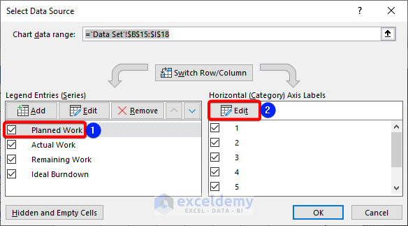
- Choose Select Data… from the Context Menu.
- Choose Planned Work from the Legend Entries section.
- Then, click on the Edit button.
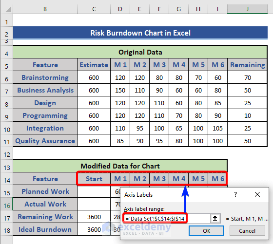
- Choose range C14:I14 as the Axis label range.
- Then, press the OK button.
- We can see the Horizontal Axis Labels have been changed.
- Again, press the OK button.

- Look at the chart again.

We can see the axis value has been changed.
Now, we will change the chart pattern. We will change the chart type of planned work and actual work data.
- Click on the line of planned work from the chart.
- Press the right button of the mouse.
- Choose Change Series Chart Type… from the Context Menu.
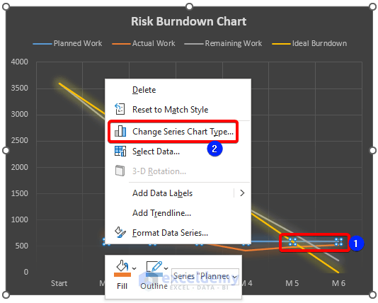
- The Change Chart Type window appears.
- First, mark the Planned Work and Actual Work series to make them secondary axes.
- Then, choose the Clustered Column from the Chart Type section.
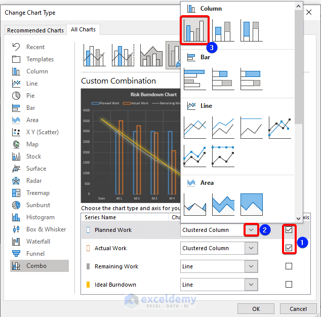
- Finally, press the OK button.

We can see chart type has been changed successfully.
- Click on the secondary axis of the chart.
- Press the right button of the mouse and choose Format Axis… from the Context Menu.

- Set the Maximum Bounds to 3600.
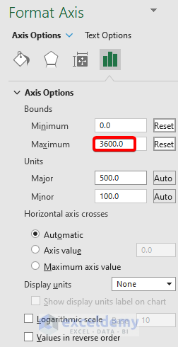
- Finally, look at the chart.

This is our final chart. We will be able to know the difference between actual work speed and estimated work speed with monthly values from this graph. From this, we will estimate the risk.
Download Practice Workbook
Download this practice workbook to exercise while you are reading this article.
Conclusion
In this article, we described how to create a risk burndown chart in Excel. We explained all the steps in detail. I hope this will satisfy your needs. Please give your suggestions in the comment box.
Related Articles
<< Go Back to Burndown Chart in Excel | Excel Charts | Learn Excel
Get FREE Advanced Excel Exercises with Solutions!
