Watch Video – Create a Meter Chart in Excel
Step 1 – Create a Dataset with Proper Parameters
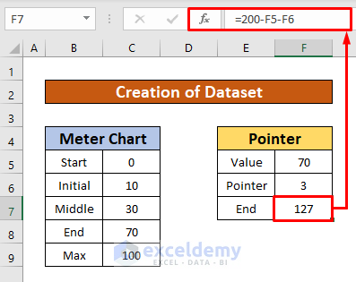
We need to create a dataset to make a meter chart in Excel. We calculate the end value of the pointer using a mathematical formula.
- Enter the following formula:
=200-F5-F6Where 200 is the total reading of speed, F5 is the speed value, and F6 is the pointer value.
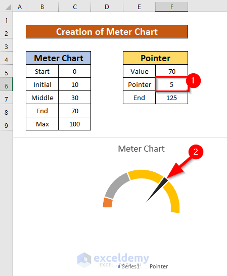
Our dataset reads,
Step 2 – Make a Doughnut Pie Chart
- Select cells range from B5 to C9.
- From your Insert ribbon, go to Insert → Charts → Pie Chart → Doughnut
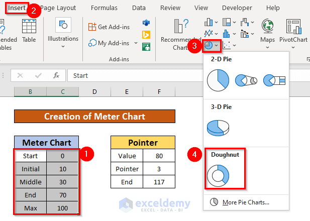
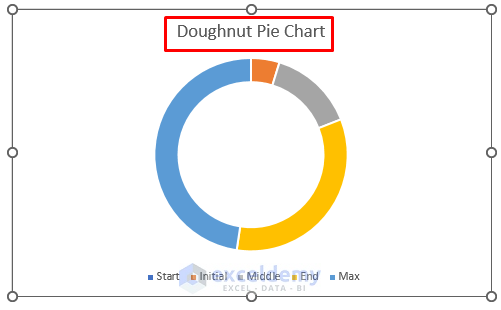
- You can create a doughnut pie chart using the dataset in the screenshot below.
Read More: How to Create a Gauge Chart in Excel
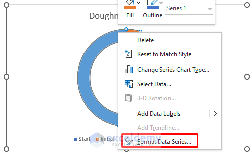
Step 3 – Give a Format to the Meter Chart
- Place your cursor on the chart and right-click on the mouse.
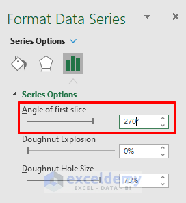
- A window will appear. Select the Format Data Series option.
- A Format Data Series drop-down list pops up.
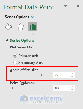
- Type 2700 in the Angle of first slice typing box under the drop-down list named Series Options.
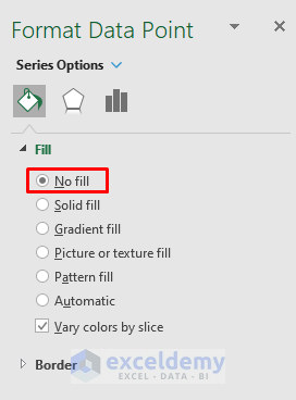
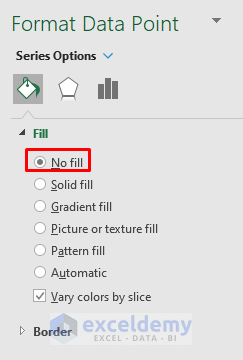
- Select the bigger portion of the Doughnut chart, and check the No fill option under the Fill drop-down list.
- Our chart looks like the screenshot below.

We will create a pointer to the meter chart.
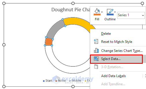
- Place your cursor on the chart and right-click. A window will appear.
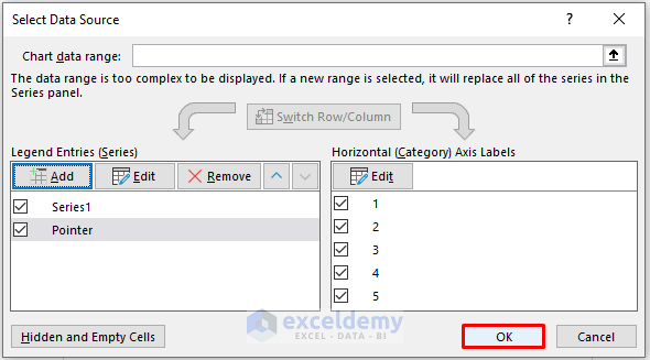
- Select the Select Data option.
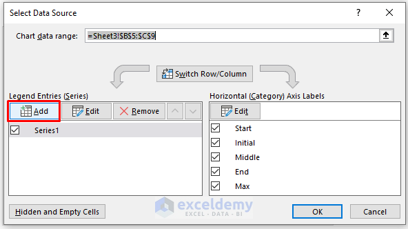
- A dialog box named Select Data Source will appear.
- From the Select Data Source dialog box, select the Add option.
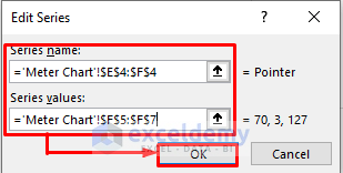
- An Edit Series dialog box pops up. From the Edit Series dialog box, type =’Meter Chart’!$E$4:$F$4 in the Series name typing box.
- Type =’Meter Chart’!$E$4:$F$4 in the Series values typing box.
- Press OK.
- Go back to the Select Data Source dialog box and press the OK option.
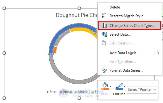
We will change the type of the chart.
- Place your cursor on the chart and right-click.
- A window will appear.
- Select the Change Series Chart Type option.
- A Change Chart Type dialog box pops up. Select the Pie chart in the pointer, and press OK.
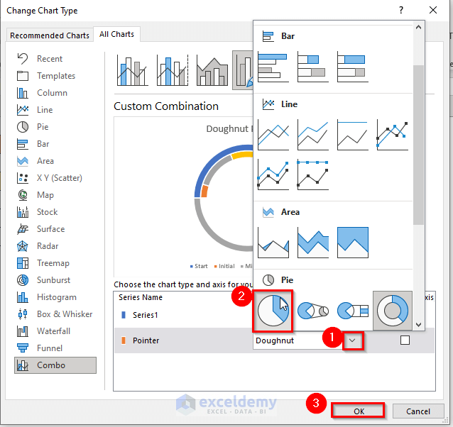
- Select the larger two portions of the Pie chart, and check the No fill option under the Fill drop-down list.
- Type 2700 in the Angle of first slice typing box under the drop-down list named Series Options.
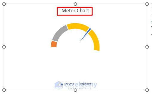
You will have created a meter chart like the screenshot below.
Step 4 – Check the Meter Chart
- We will change the pointer value from 3 to 5, and we will notice that the pointer’s thickness changes automatically.
- You can also change the speed value to check the meter chart. If you change the speed value, the pointer position will change automatically.
Things to Remember
➜ While a value can not found in the referenced cell, the #N/A! error happens in Excel.
➜ #DIV/0! error happens when a value is divided by zero(0) or the cell reference is blank.
Download the Practice Workbook
Related Articles
<< Go Back to Excel Charts | Learn Excel
Get FREE Advanced Excel Exercises with Solutions!
