Step 1 – Create a Dataset.
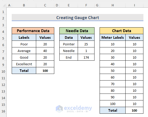
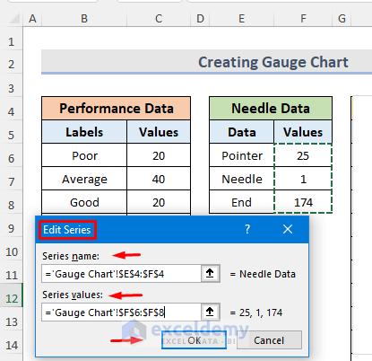
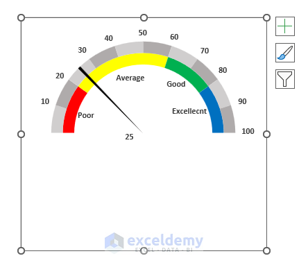
- The first data table contains the category of performance level with the corresponding value limit.
- The second data table is the needle data. It contains the real pointer value we need to track. It also contains the width of the pointer (1) and the end value (174). We can get the end value with the sum of the performance data including the total (20 + 40 + 20 + 20 + 100 = 200) and dividing the output by the sum of the real pointer value (F6) and needle width (F7). The formula is given below.
=200-(F6+F7)- Finally, the third data table is the chart data. It contains meter labels ranging from 0 to 100. The value difference of each range is 10.
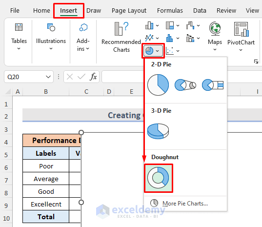
Step 2 – Create a Doughnut Chart (Performance Data)
- Go to the Insert tab.
- In Charts, select Insert Pie or Doughnut Chart.
- Select Doughnut.
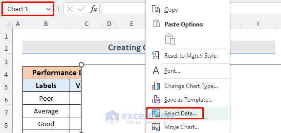
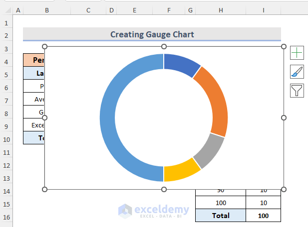
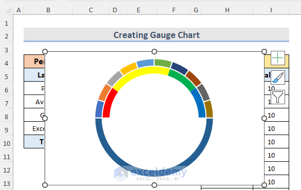
- A blank chart (Chart 1) is displayed.
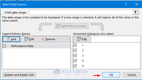
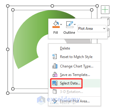
- Right-click the chart and choose Select Data.
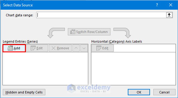
- The Select Data Source window opens.
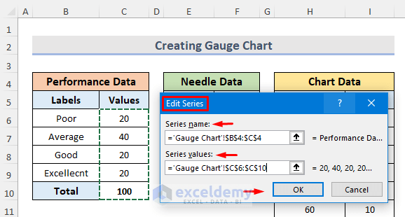
- In Legend Entries (Series), click Add.
- In the Edit Series dialog box, choose the Series name and the Series values from the performance data table.
- Click OK.
- Click OK again.
A doughnut chart is displayed. Remove unnecessary parts like chart title & legend.
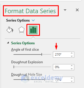
Step 3 – Rotate the Doughnut Chart
- Right-click the chart (Chart 1).
- Select Format Data Series.
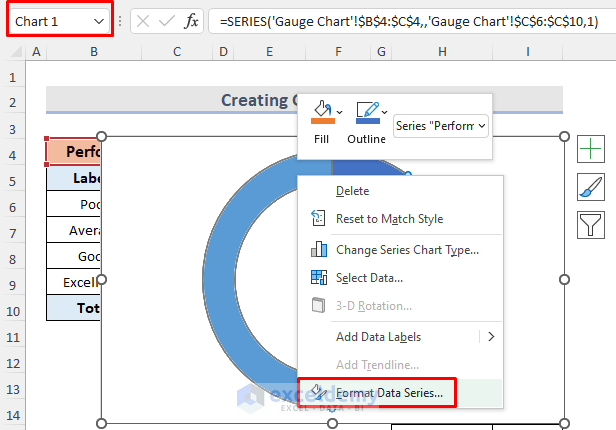
- The Format Data Series window will open.
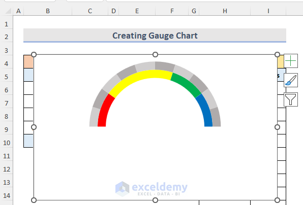
- In the Series Options tab, enter the Angle of first slice. Here, 270.
- Press Enter.
The chart rotated.
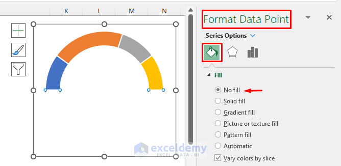
Step 4: Format a Doughnut Chart
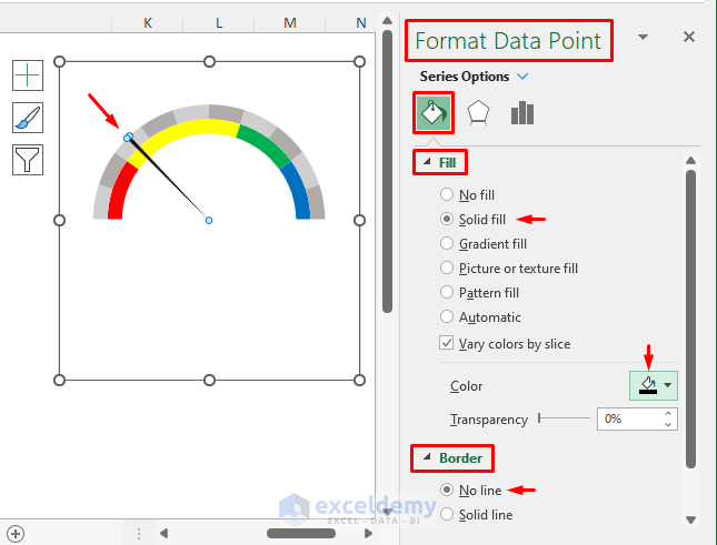
- Right-click the bottom of the chart.
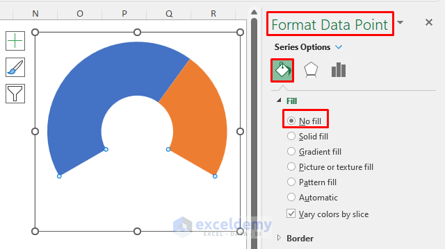
- Select Format Data Point.
- In Series Options, choose Fill & Line.
- In Fill, select No fill.
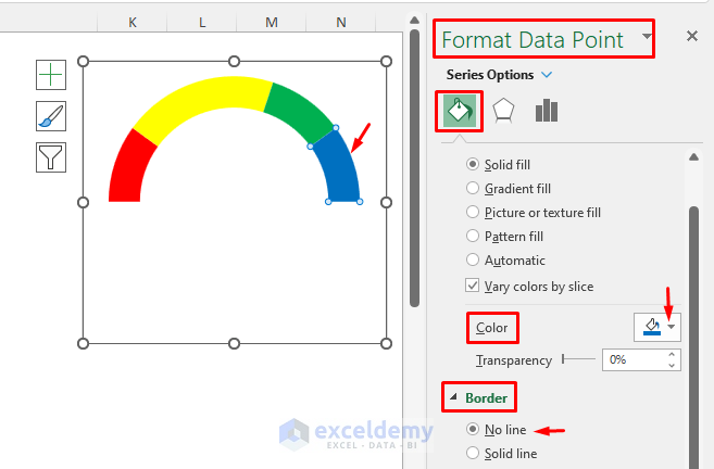
To change the color of portions in the chart:
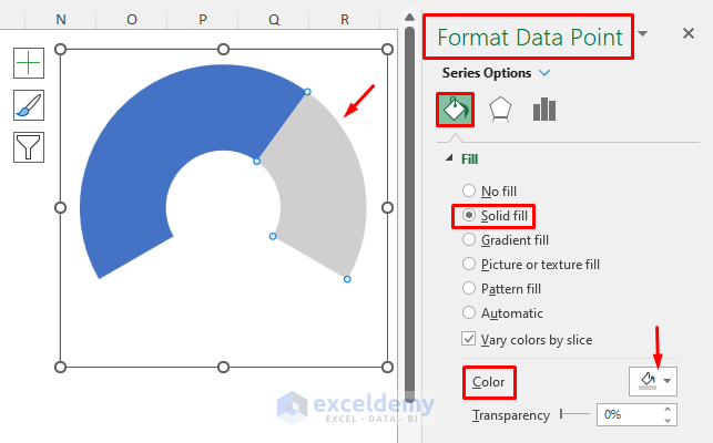
- Double-click any portion of the chart to open the Format Data Point window.
- In Fill, select Solid fill.
- In the Color drop-down menu, change the color.
- In Border select No line.
Colors changed and there are no borders.
Step 5 – Insert a Second Doughnut Chart (Chart Data)
- Right-click the existing chart > Choose Select Data > Select Add from the Select Data Source window > Insert Series name and Series values from the chart data >Click OK.
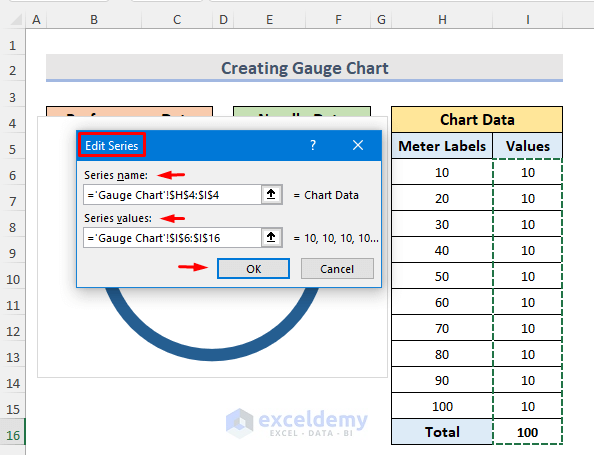
- Click OK again.
This will be the output.
To format the second doughnut chart:
- Right-click the chart’s bottom part > Format Data Point > Fill & Line > Select No fill in Fill> Choose Color from the Color drop-down menu > Select No line in Border.
This is the output
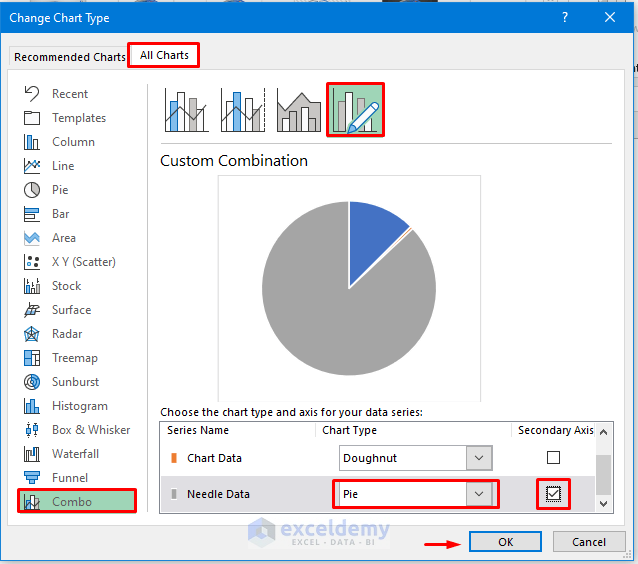
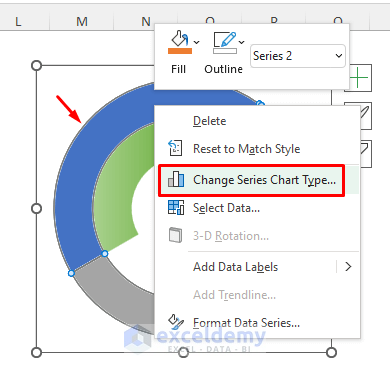
Step 6: Add a Pie Chart (Needle Data)
- Right-click the existing chart.
- Select Data > Choose Add from Select Data Source.
- Enter the Series name and Series values from the chart data.
- Click OK.
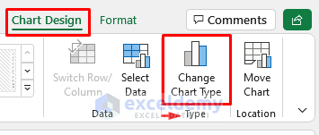
- Go to the Chart Design tab.
- In Type select Change Chart Type.
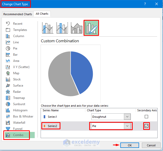
- The Change Chart Type window will open.
- Go to the All Charts tab and select Combo.
- Click Custom Combination.
- In Choose the chart type and axis for your data series, select Needle Data Chart and Pie from the drop-down menu.
- Tick the Secondary Axis.
- Click OK.
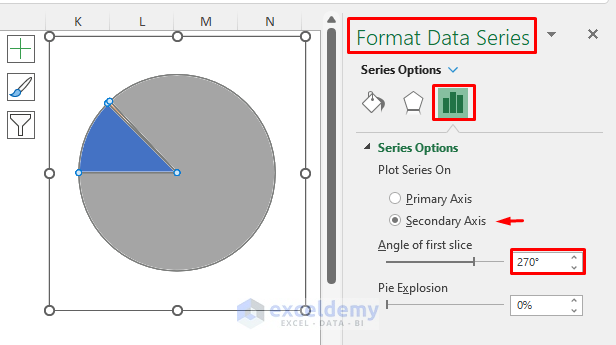
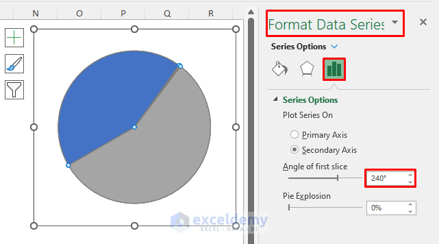
Step 7: Alignment of Pie Chart
- Right-click the chart.
- Format Data Series > Series Options > Click Secondary Axis from Plot Series On option > Insert 270 in Angle of first slice > Enter.
Read More: How to Create Meter Chart in Excel
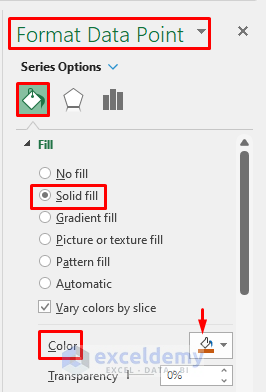
Step 8: Pie Chart Formatting
- Select Format Data Point by right-clicking the bigger part of the chart.
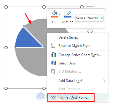
- In Fill choose No fill.
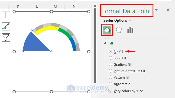
- Select another big part of the chart and in Fill choose No fill.
- Select the smaller portion of the part.
- In Fill, select Solid fill.
- Choose a color from the Color box.
- In Border select No line.
The pointer part of the chart is displayed.
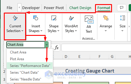
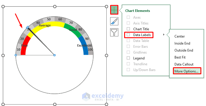
Step 9 – Inserting Data Labels on Doughnut Charts
- Go to the Format tab.
- Click Current Selection.
- Choose a doughnut chart (Series “Performance Data”).
- Click Chart Elements.
- Go to Data Labels > More Options.
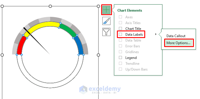
- The Format Data Labels window will open.
- In Label Options, uncheck Value.
- Check Value From Cells.
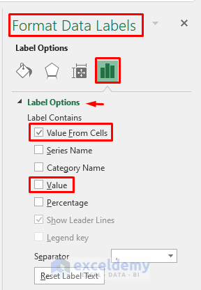
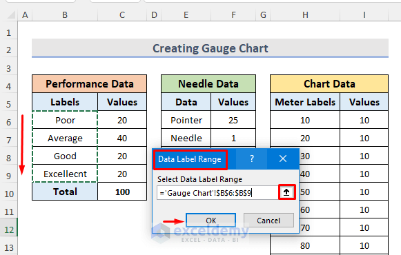
- Click Select Range to select the value from existing cells.
- The Data Label Range window will open.
- Enter the cells and click OK.
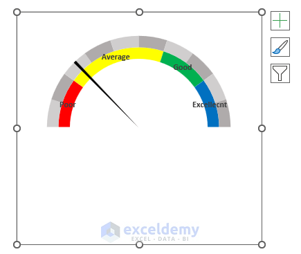
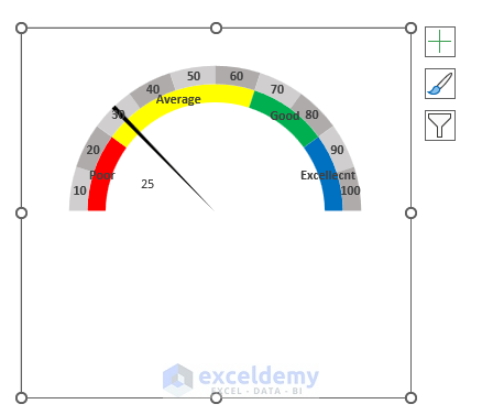
Labels are shown in the chart.
- Follow the same procedure to add labels to other doughnut charts.
Step 10 – Adding Data Labels to a Pie Chart
- Go to Format tab > Current Selection > Series “Needle Data” > Chart Element > Data Labels > More Options.
- Uncheck Value > Check Value From Cells > Click Select Range.
- In the Data Label Range window, select Pointer and click OK.
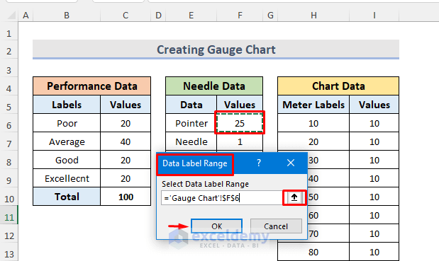
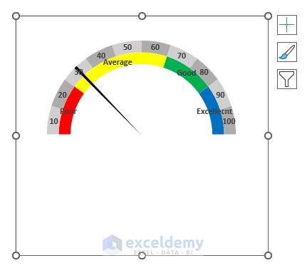
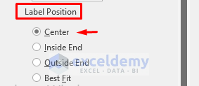
- In Label Position, choose Center.
The pointer label is added.
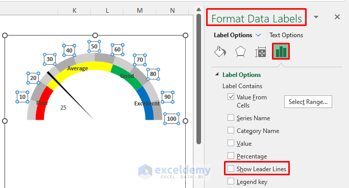
Step 11: Formatting Data Labels
- Select the labels.
- Drag the labels to their position.
- In the Format Data Labels window, select Label Options and uncheck Show Leader Lines.
Final Output
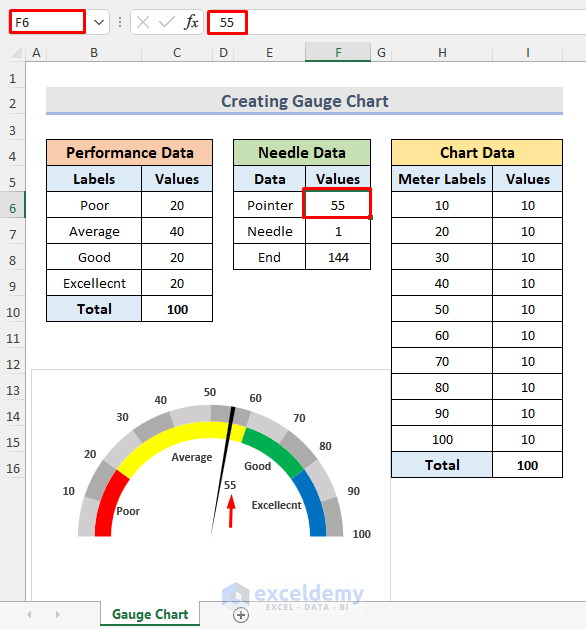
- If the pointer value is changed to 55 in F6, the gauge chart will automatically change.
How to Create an Animated Gauge Chart in Excel
Step 1 – Create a Dataset
- Open a new workbook.
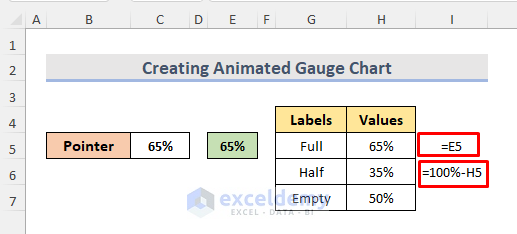
- In C5, enter the Pointer value (65%).
- In E5, enter the same Pointer value (65%).
- Add label values: For Full, enter the below formula in H5. It will be the same as the Pointer value (65%).
=E5- For Half, enter the below formula in H6.
=100%-H5
- Choose Default 50% as the Empty value.
- Enter data values to get the needle chart.
- In K5, enter the formula below.
=E5
- Choose .50% as Needle width.
- Use this formula to get the Empty value.
=150%-SUM(K5:K6)
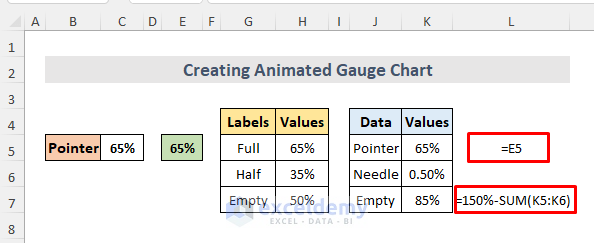
Here, 150 is the total of label values (65 + 35 + 50).
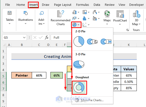
Step 2 – Insert a Doughnut Chart
- Select the range G5:H7.
- Go to Insert tab > Insert Pie or Doughnut Chart > Doughnut chart.
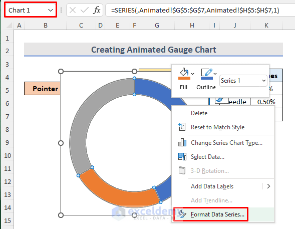
Step 3 – Doughnut Chart Rotation
- Remove the chart title and labels.
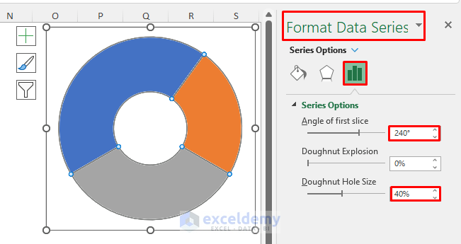
- Select the chart and right-click > Format Data Series.
- Set 240 as the Angle of first slice and press Enter.
- In the Doughnut Hole Size box, enter 40% .
This will be the output.
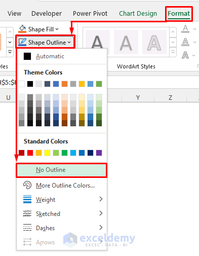
Step 4 – Formatting a Doughnut Chart
- Select the chart and go to the Format tab.
- In Shape Outline > No Outline.
- Double-click the Gray portion of the chart. The Format Data Point window will open.
- In Fill, select No fill to make that part invisible.
- Choose the Orange part of the chart.
- Go to Fill > Solid fill.
- Choose the color from the Color drop-down menu.
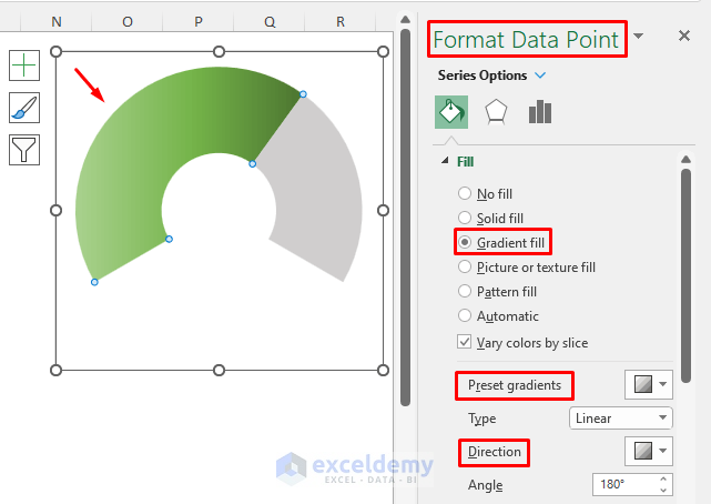
- Select the Blue part of the chart.
- Select Fill > Gradient fill.
- Choose any default gradient in Preset gradients.
- Choose the Direction of the gradient.
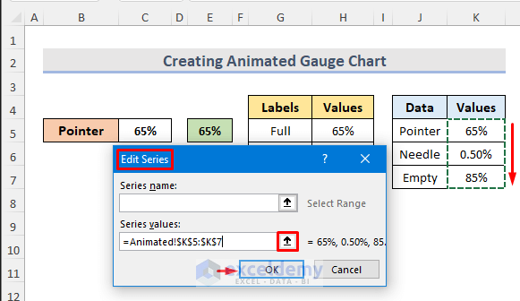
Step 5 – Insert a Pie Chart
- Select the chart > Select Data.
- In the Select Data Source window, choose Add.
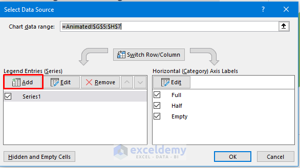
- Enter the Series values from the chart data.
- Leave the Series name blank.
- Click OK.
- In the Select Data Source window, choose Horizontal (Category) Axis Labels and click Edit.
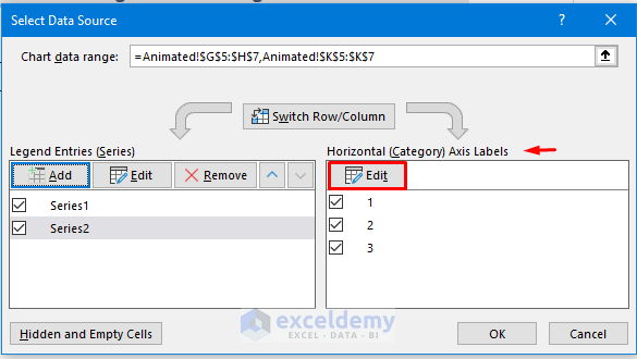
- Enter the Axis label range and click OK.
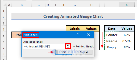
- Click OK again.
- The pie chart is displayed.
- Right-click the chart > select Change Series Chart Type.
- Choose All Charts > Combo > Custom Combination > Choose the chart type and axis for your data series > select Pie in Series2 > tick Secondary Axis box > OK.
Step 6: Pie Chart Alignment
- Go to the Format tab > Shape Outline > No Outline.
- Right-click the chart.
- Select Format Data Series > Series Options > Click Secondary Axis in the Plot Series On option.
- Enter 240 as the Angle of first slice> Enter.
Step 7 – Format Pie Chart
- Click the blue part of the chart and double-click it to open the Format Data Point window.
- In Fill > No fill.
- Select the gray part of the chart and choose No fill in Fill.
- The small pointer part is displayed.
- Double-click to select it.
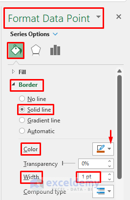
- In Fill choose Solid fill.
- Select the color from the Color drop-down menu.
- In Border, select Solid line.
- Choose the color of the border line from the Color drop-down menu.
- In Width, enter 1pt.
This is the final output.

Step 8 – Add Illustrations
- Go to the Insert tab.
- Select Illustrations > Shapes > Basic Shapes > choose an oval shape.
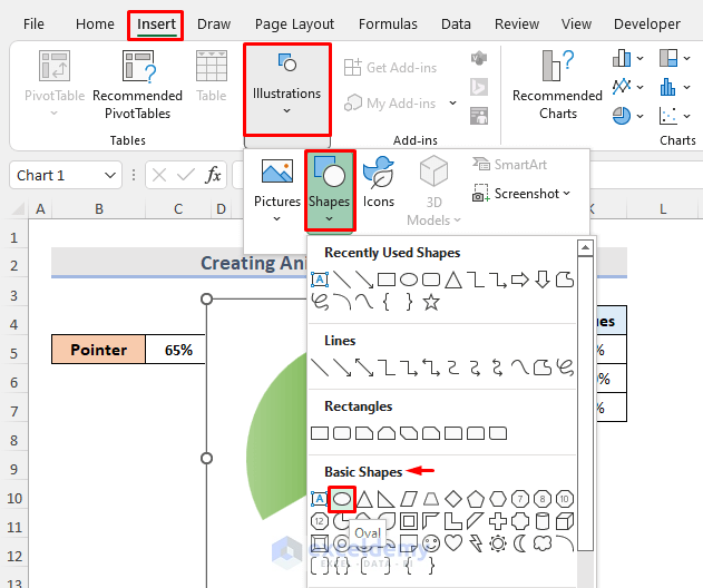
- Insert it in its place.
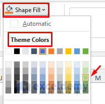
- Select the Shape Fill drop-down menu and choose a color from the Theme Colors option.
- Select the Shape Effects drop-down menu and choose Preset.
- Choose Preset 7.
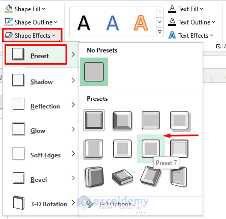
This is your gauge chart.

Step 9 – Insert a Pointer Label
- Select the chart > Insert tab > Text > WordArt > choose any pattern.
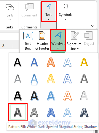
- Place it in its location.
- Select WordArt > go to the Formula bar > Enter Equals (=) sign and select the E5 > Press Enter.
- This is the formula:
=Animated!$E$5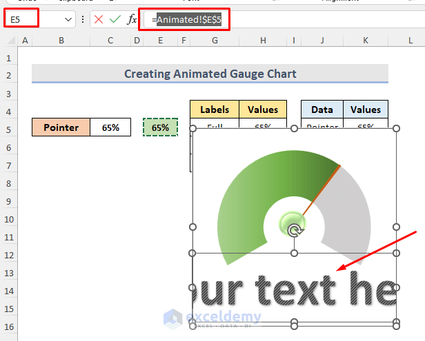
The pointer label is added.

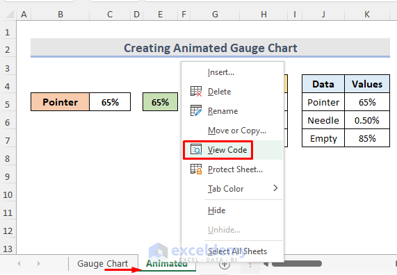
Step 10 – Launch a VBA Window
- Select the worksheet.
- Right-click the sheet.
- Click View Code.
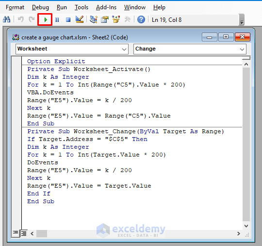
Step 11- Enter & Run a VBA Code
- Press Alt + F11 to open a VBA Module.
- Enter the code below:
Option Explicit
Private Sub Worksheet_Activate()
Dim k As Integer
For k = 1 To Int(Range("C5").Value * 200)
VBA.DoEvents
Range("E5").Value = k / 200
Next k
Range("E5").Value = Range("C5").Value
End Sub
Private Sub Worksheet_Change(ByVal Target As Range)
If Target.Address = "$C$5" Then
Dim k As Integer
For k = 1 To Int(Target.Value * 200)
DoEvents
Range("E5").Value = k / 200
Next k
Range("E5").Value = Target.Value
End If
End Sub- Click Run or press F5 to run the code.
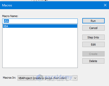
Step 12 – Name & Run Macro
- Choose VBA as the Macro Name in the Macros window and select Create.

- A Macros window will open.
- Select the sheet name and click Run.
Final Output
Related Articles
<< Go Back to Excel Charts | Learn Excel
Get FREE Advanced Excel Exercises with Solutions!
