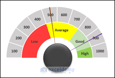
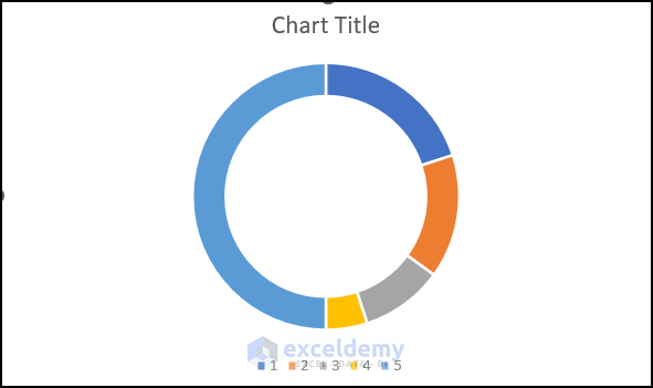
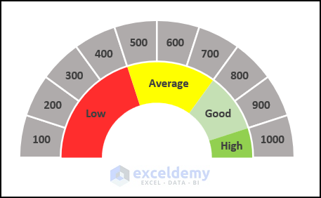
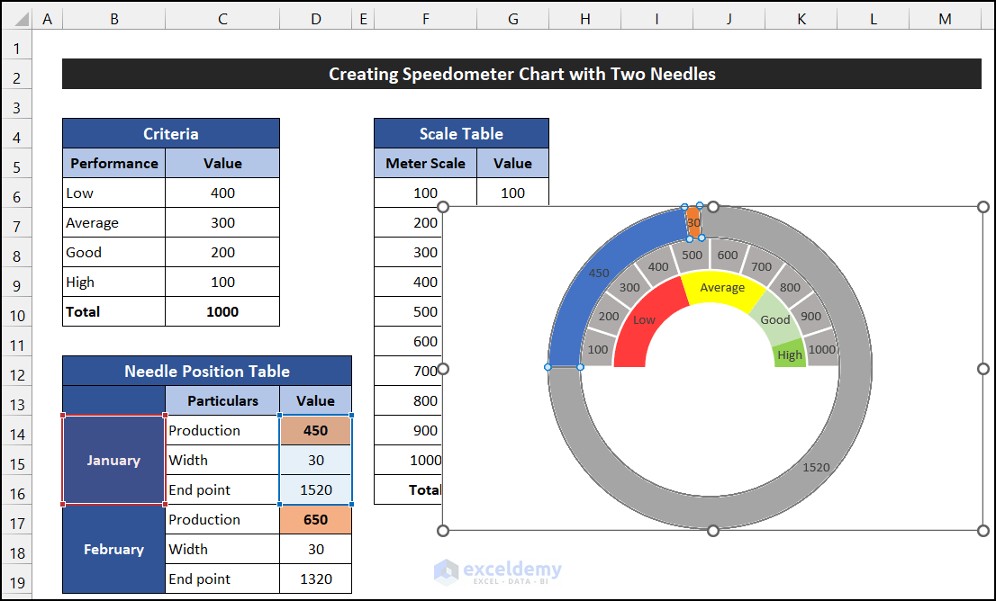
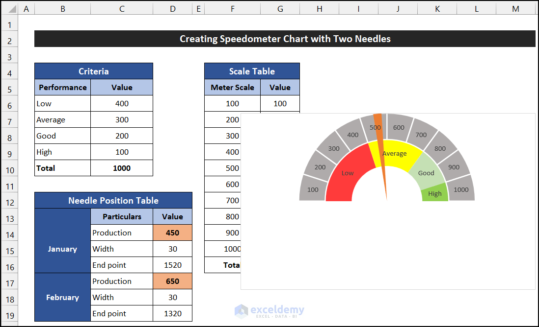
The step-by-step procedure to create a speedometer chart with two needles is explained below. After completing all the steps, the speedometer will look like the image below:
Step 1 – Create Criteria and Scale Table
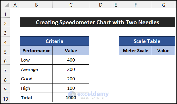
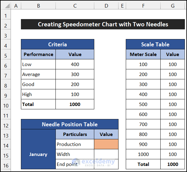
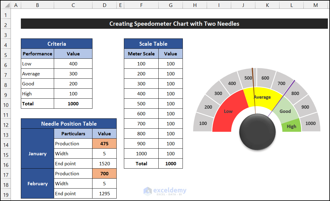
Suppose our dataset shows a monthly production scale of a business. We’ll build the dataset, and then generate a speedometer from it. The first part of the dataset that we need is the Criteria table.
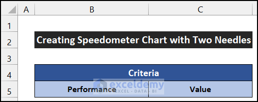
- Enter the title in the merged cell B4, and the heading of this table in the range of cells B5:C5 as in the image below:
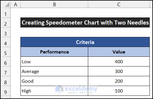
- Fill the category names in the range B6:B9 and their corresponding values in the range C6:C9 as in the image below:
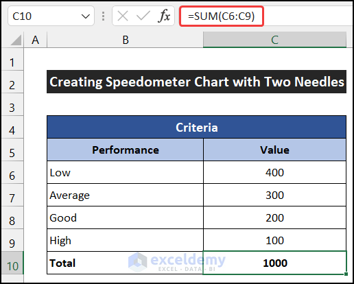
- In cell C10, enter the formula below to show the total of all the values:
=SUM(C6:C9)
- Press Enter.
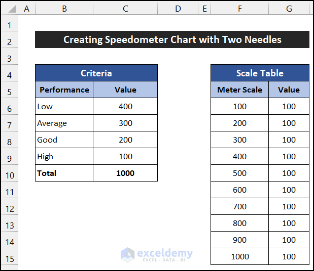
Similarly, now we design the Scale Table.
- Enter the following title in the merged cell F4 and the heading of this table in the range F5:G5:
- Enter the following scale interval units in the range F6:F15 and their corresponding values in the range G6:G15.
- Enter the following formula into cell G16 to sum all the scale interval values:
=SUM(G6:G15)
- Press Enter.
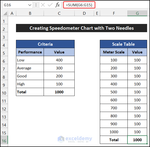
The dataset needed to create a speedometer chart with two needles in Excel is complete.
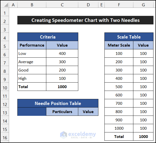
Step 2 – Design Needle Position Table
Next, we design the Needle Position Table. We need two sets of particulars to plot two needles on our speedometer, measured monthly in this example.
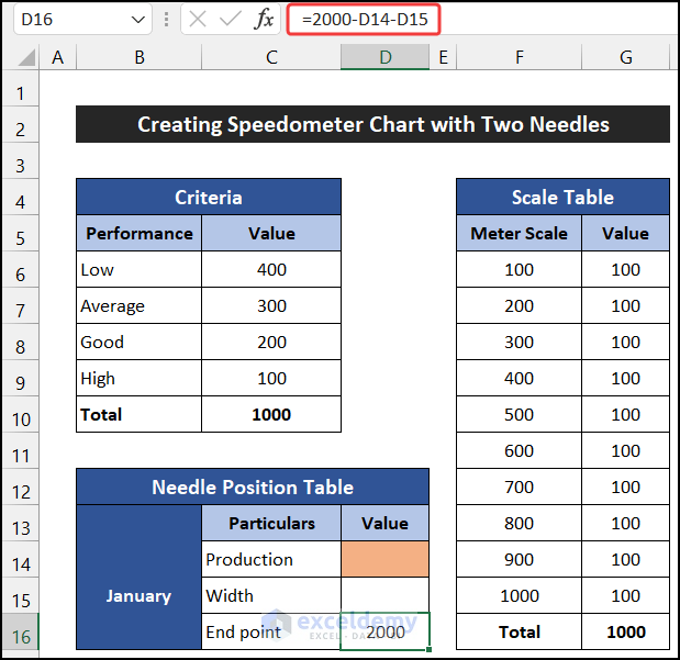
- Enter a suitable title in the merged cell B12 and the heading of this table in the range C13:D13.
- Enter the following details in the range C14:C16 for the month of January. The Production and Width must be input manually. The Width indicates the the width of our needles.
- To calculate the value of the End point, enter the following formula into cell D16:
=2000-D14-D15
- Press Enter.
- Similarly, create another slot for the month of February in the range of cells B17:D19.
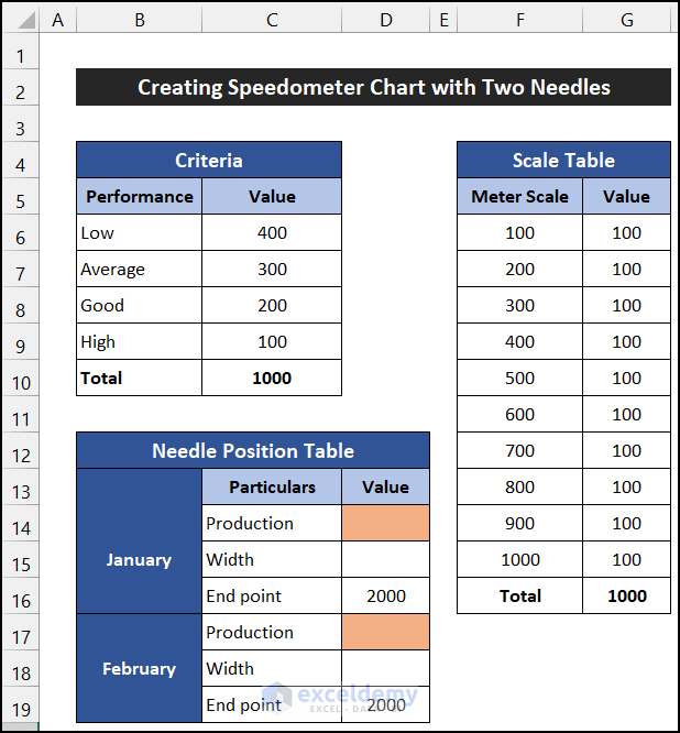
Our dataset for the needles is complete.
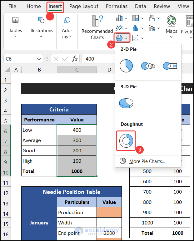
Step 3 – Insert Doughnut Charts for Criteria and Scale Table
Now we’ll insert the values of the Criteria and Scale Table that we created above into a chart.
- Select the range C6:C10.
- In the Insert tab, click on the drop-down arrow of the Insert Pie or Doughnut Chart option, and select the Doughnut chart option from the Doughnut section.
The chart will be generated.
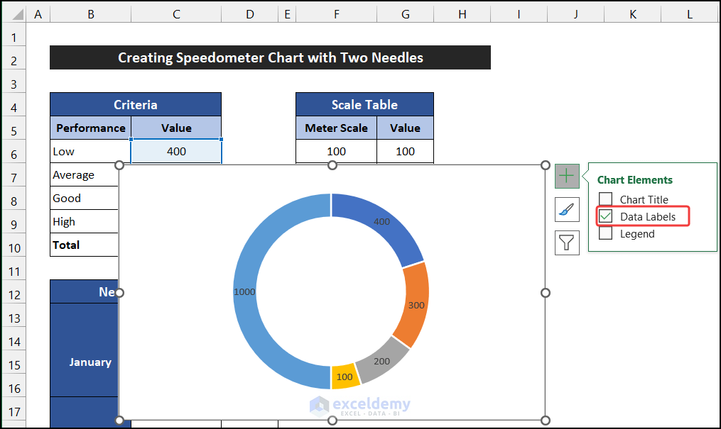
- Click the Chart Elements icon, and uncheck all elements except the Data Labels.
- Right-click on the doughnut and select the Format Data Series option from the Context Menu.
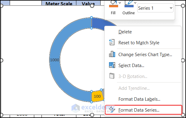
A side window called Format Data Series will appear.
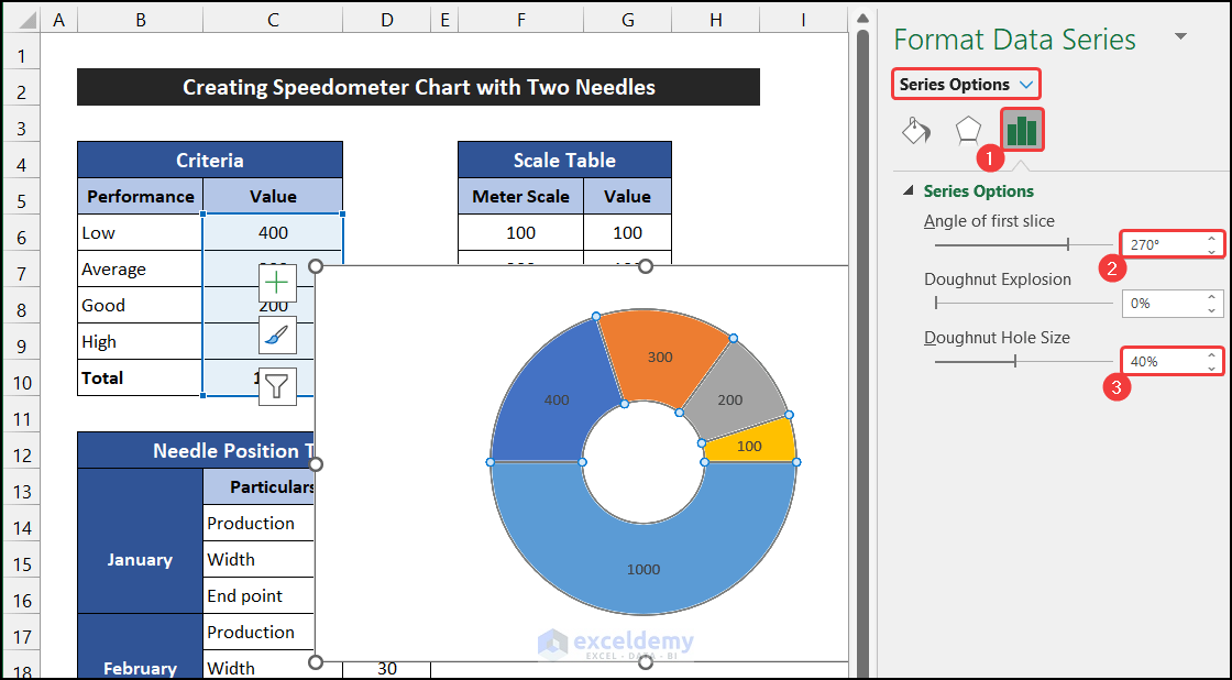
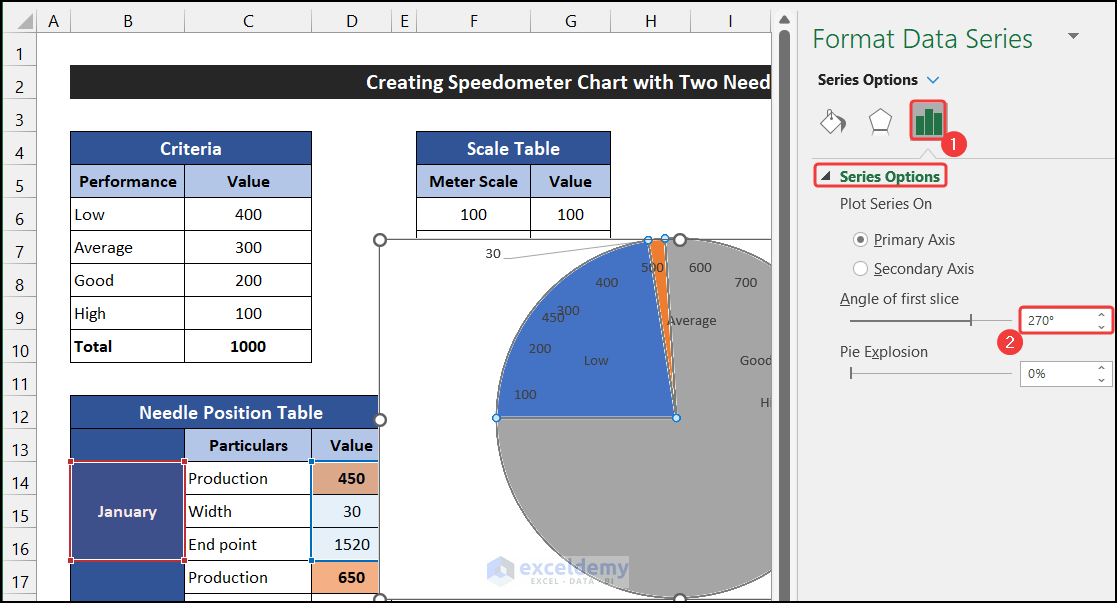
- In the Series Options tab, modify the value of the Angle of the first slice from 0 to 270 degrees, and reduce the Doughnut Hole Size from 75% to 40%.
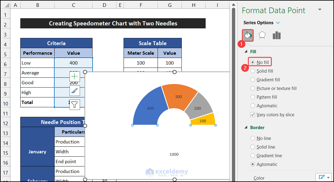
- Click on the large slice of the doughnut.
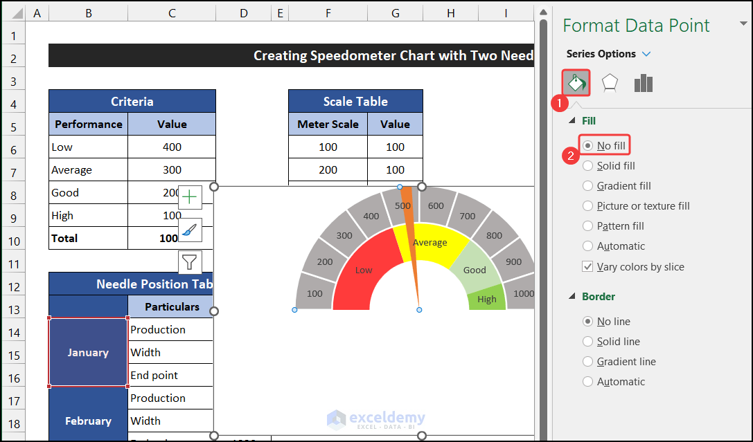
- In the Fill tab, select the No fill option.
- Select the No line option from the Border section.
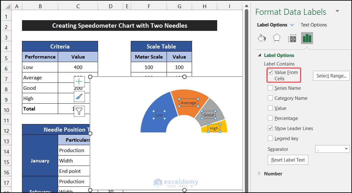
- Click on the Data Labels, and in the drop-down of the Label Options, select the Label Options tab.
- In the Label Options section, uncheck the Value option, and check the Value From Cells option.
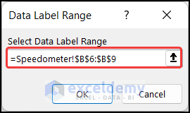
A small dialog box called Data Labels Range will appear.
- Select the range of cells B6:B9.
- Click OK.
Our desired data labels are added to the chart.
To insert the Scale Table value in the same chart:
- Go to the Chart Design tab and select the Select Data option from the Data group.
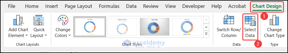
The Select Data Source dialog box will appear.
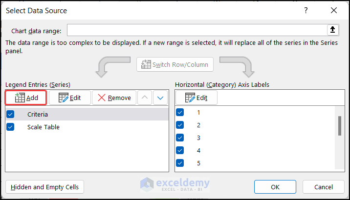
- In the Legend Entities (Series) section, select the Add option.
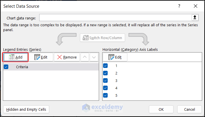
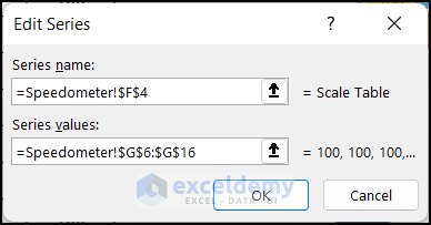
Another dialog box called Edit Series will appear.
- In the Series Name field, select cell F4 as the series name.
- In the Series values field, select the range G6:G16.
- Click OK to close the Edit Series dialog box.
- Click OK to close the Select Data Source dialog box.
- Similarly, format the second doughnut like the first doughnut chart.
Our doughnut chart is done.
Step 4 – Insert Two Needles Chart
Now, we can insert the needles into our chart.
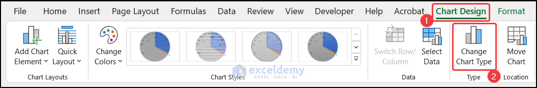
- In the Chart Design tab, click the Select Data option from the Data group.
The Select Data Source dialog box will appear.
- In the Legend Entities (Series) section, select the Add option.
Another dialog box called Edit Series will appear.
- In the Series Name field, select cell B14 as the series name.
- In the Series values field, select the range D14:D16.
- Click OK to close the Edit Series dialog box.
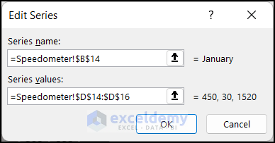
- Click OK to close the Select Data Source dialog box.
The series will appear in our chart.
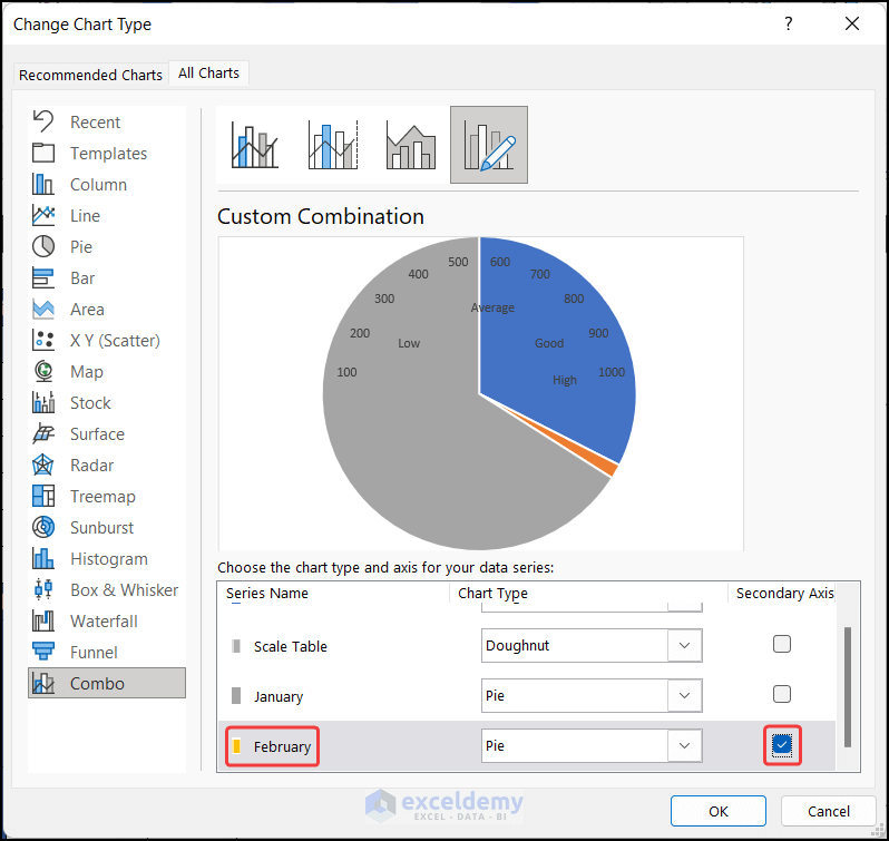
- In the Chart Design tab, click the Change Chart Type option from the Type group.
A dialog box called Change Chart Type will appear.
- Click the drop-down of the Chart Type of the January series and change the chart type Doughnut to Pie chart.
- Click OK.
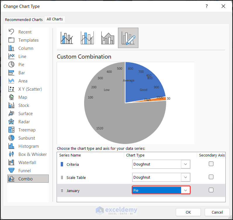
The chart will convert into a Pie chart.
- Right-click on the pie chart and select the Format Data Series option from the Context Menu.
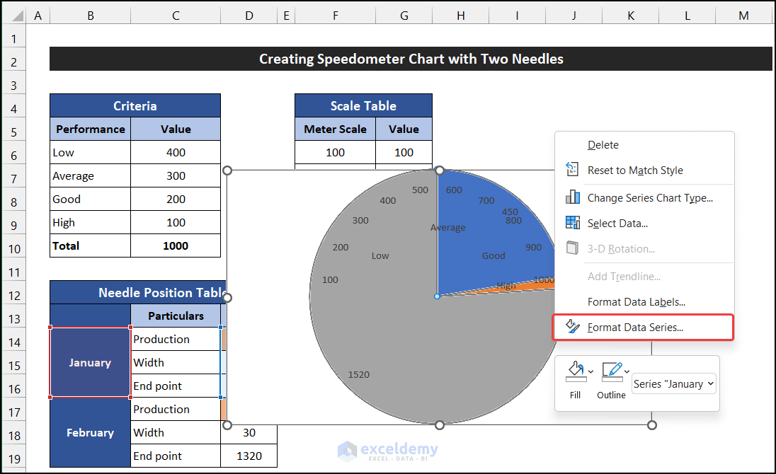
The side window called Format Data Series will appear.
- In the Series Options tab, change the Angle of the first slice option from 0 to 270 degrees.
- In the Fill tab, select the No line option from the Border section.
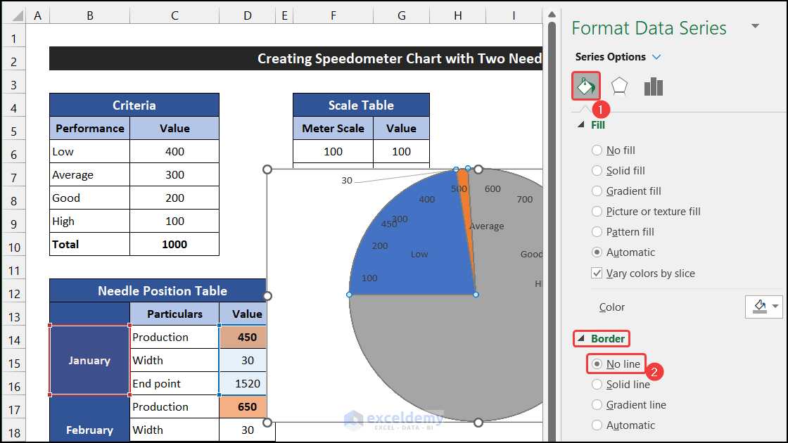
- Select the large two slices of the pie chart.
- In the Fill tab, select the No fill option.
- Select the data labels of the pie chart and press Delete.
- Similarly, add another series for the month of February.
You may notice that no change is shown in our chart.
- Select the Change Chart Type option from the Type group located in the Chart Design tab.
- The Change Chart Type dialog box will appear.
- Scroll down to get the February Series and check the Secondary Axis option.
- Click OK.
This time the pie chart will appear.

- Modify this pie chart like our first pie chart.
- Further, format the chart according to your desire. We insert an Oval shape at the center of our chart for a better look and set no fill for the shape format to keep the speedometer close to our dataset. Besides that, modify the slice fill color of the needles to distinguish them easily.
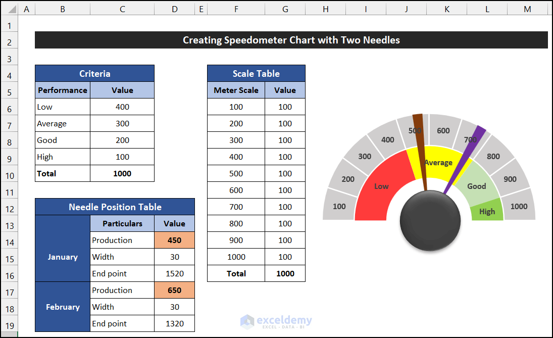
We have finished creating a speedometer chart with two needles in Excel.
Things You Should Know
During the speedometer chart creation, we kept the width of the needle greater than usual. We did this so that we could easily select the needle slice when it was required. This will help you with smooth editing of the charts.
[/wpsm_boxStep 5 – Verify Speedometer Chart with Different Data
Let’s input some different values to check the accuracy of our speedometer.
- In the range D14:D15 and D17:D18, input the following values, respectively:
- Production: 475
- Width: 5
- Production: 700
- Width: 5
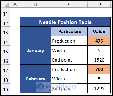
Our speedometer will respond automatically, with the needles marking the new production values.
Our speedometer chart with two needles doesn’t just look good, it works great too!
Read More: How to Create Speedometer Chart in Excel
Download Practice Workbook
Related Articles
<< Go Back to Excel Charts | Learn Excel
Get FREE Advanced Excel Exercises with Solutions!
