Method 1 – Creating a Frequency Distribution Chart in Excel
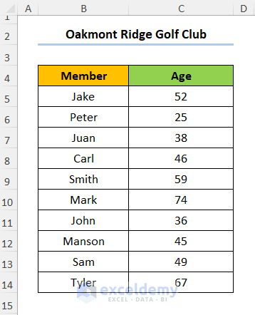
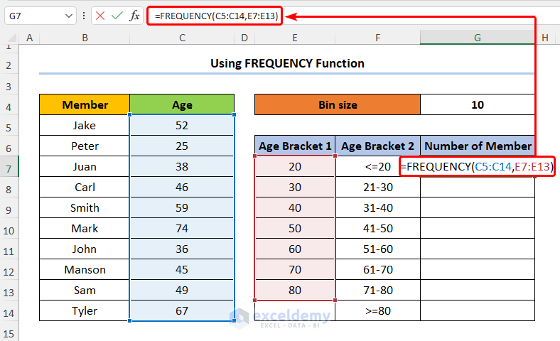
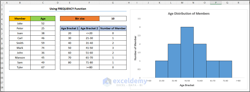
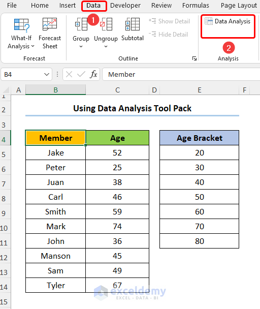
Let’s say we have the information for Oakmont Ridge Golf Club shown in the B4:C14 cells below. Here, the dataset shows the names of the club Members and their Ages.
1.1 Applying FREQUENCY Function to Make Frequency Distribution Chart
Step 1 – Calculate Bins and Frequency
- Add a column for the bins, in this case, Age Bracket 1.
- Let’s set the starting value (E7) of the bin to 20. In addition, we chose a Bin Size of 10.
- Enter the expression given below into E8:
=E7+$G$4
Here, the E7 and the G4 cells represent the Age Bracket 1 and Bin Size respectively.
It is important to note that you must lock the G4 cell reference with the F4 key on your keyboard.
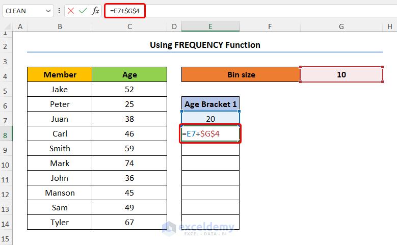
- Drag the fill handle from E8 to E14.
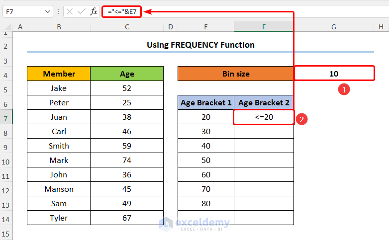
- Put the following first calculation the Age Bracket 2 into F7 shown below:
="<="&E7
In the above formula, we combine the less-than-equal sign (“<=” ) with the E7 cell using the Ampersand (&) operator.
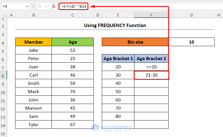
- Type in the expression given below into F8:
=E7+1&"-"&E8
In this expression, the E8 cell refers to Age Bracket 1.
- Add the frequency column with the header Number of Member and enter this formula:
=FREQUENCY(C5:C14,E7:E13)
In the above formula, the C5:C14 and the E7:E13 cells indicate the Age and the Age Bracket 1 columns respectively.
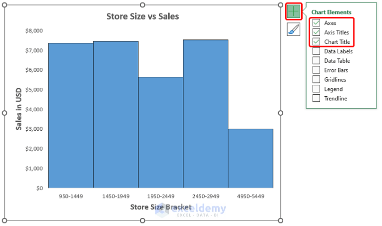
Step 2 – Insert the Chart and Add Formatting
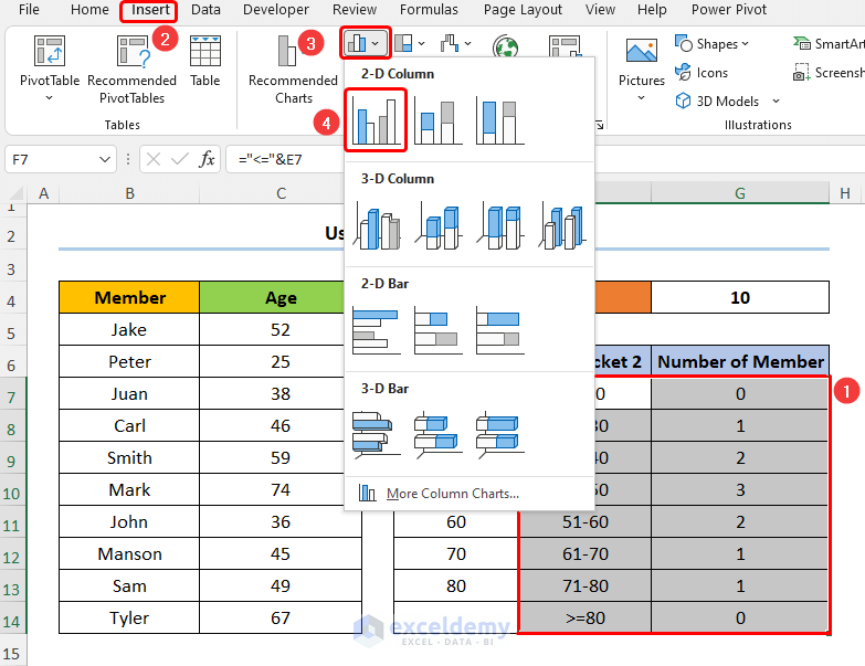
- Select the Age Bracket 2 and the Number of Member columns.
- Go to Insert then to Insert Column or Bar Chart.
- Select Clustered Column.
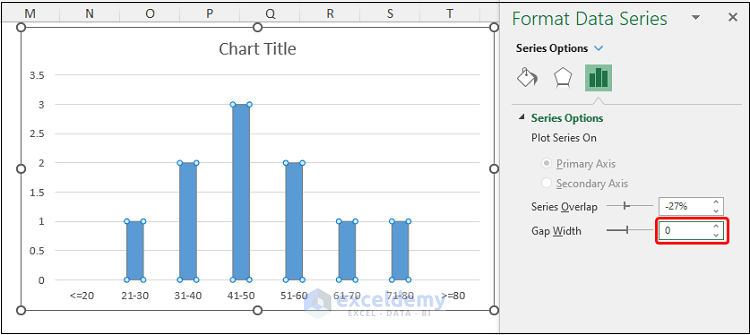
- Double-click on any of the bars to open the Format Data Series window.
- Set the Gap Width to 0%.
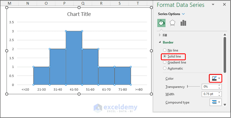
- Go to Border > Solid Line and choose a Color. We chose Black.
- Insert Axis Titles from the Chart Elements option.
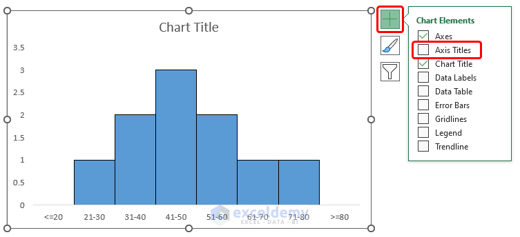
The results should look like the below image.
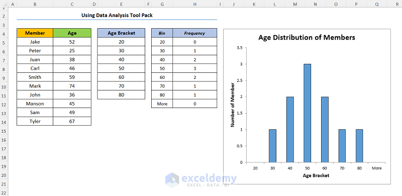
1.2 Using Data Analysis ToolPak to Create Frequency Distribution Chart
Steps:
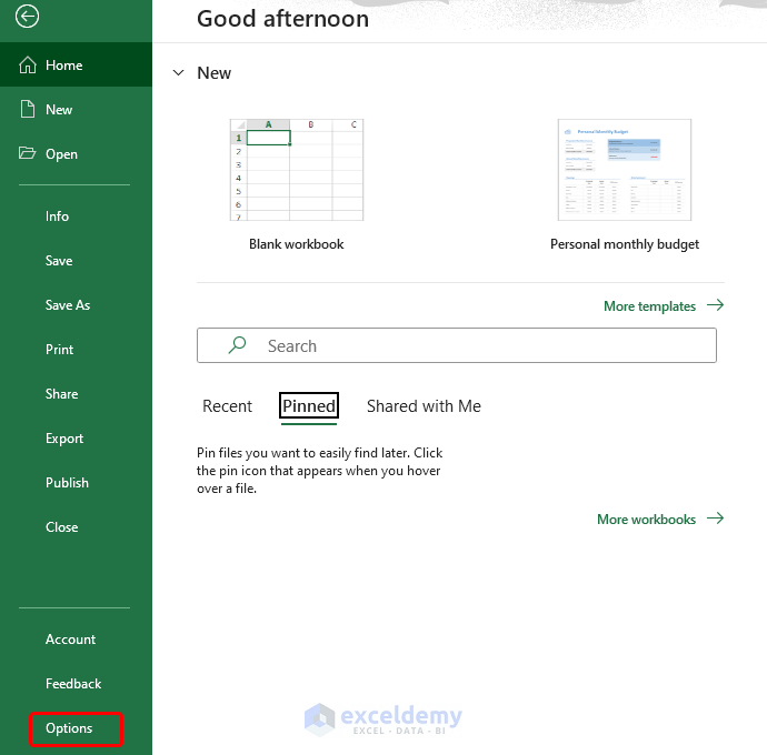
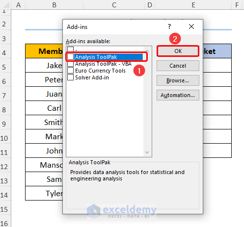
- Navigate to File and Excel Options.
- A dialog box opens. Click the Add-ins and then the Go button.
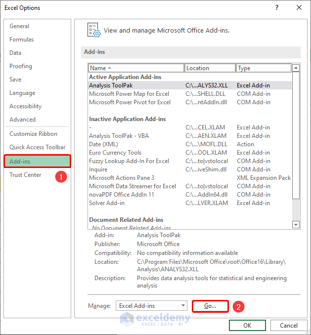
- Choose the Analysis ToolPak option and click OK.
- Go to Data, then to Data Analysis.
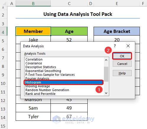
- Choose the Histogram option.
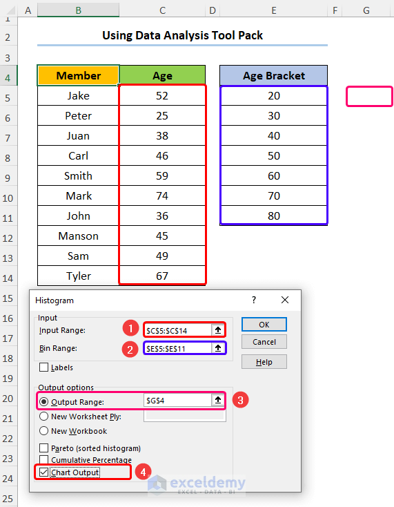
- Enter the Input Range, Bin Range, and Output Range as shown below.
- Check the Chart Output option.
You should get the following output as shown in the screenshot below.
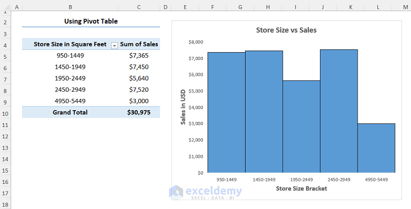
1.3 Inserting Frequency Distribution Chart Pivot Table
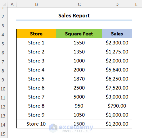
Consider the Sales Report dataset shown below in the B4:D14 cells: the first column indicates the Store number, following that we have the store size in Square Feet, and lastly, we have a column for the Sales amount in USD.
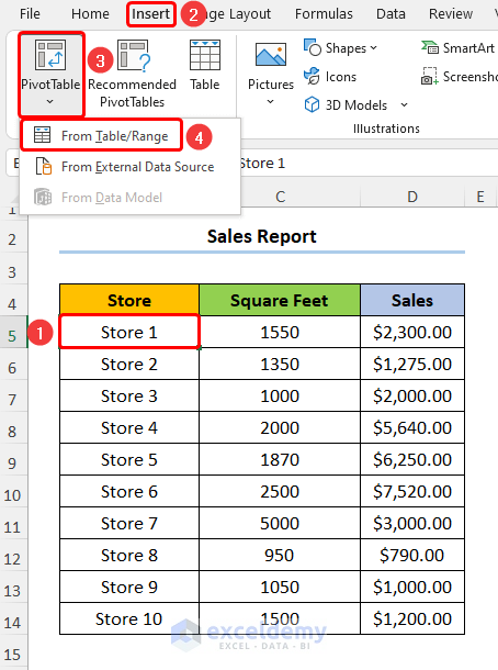
Step 1 – Insert a Pivot Table and Group Data
- Select any cell within the dataset and go to Insert, PivotTable, and From Table/Range.
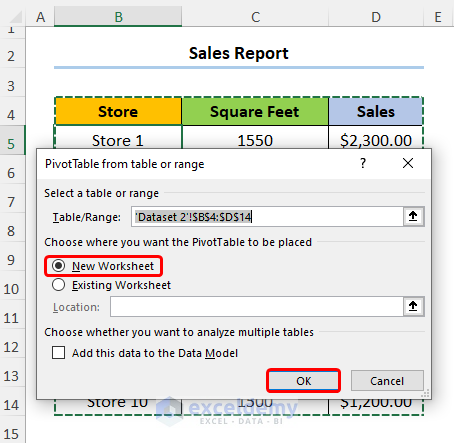
- Check the New Worksheet option and press OK.
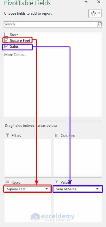
- On the PivotTable Fields pane, drag the Square Feet and Sales fields into the Rows and Values area respectively.
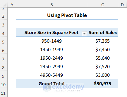
You’ve made a PivotTable.
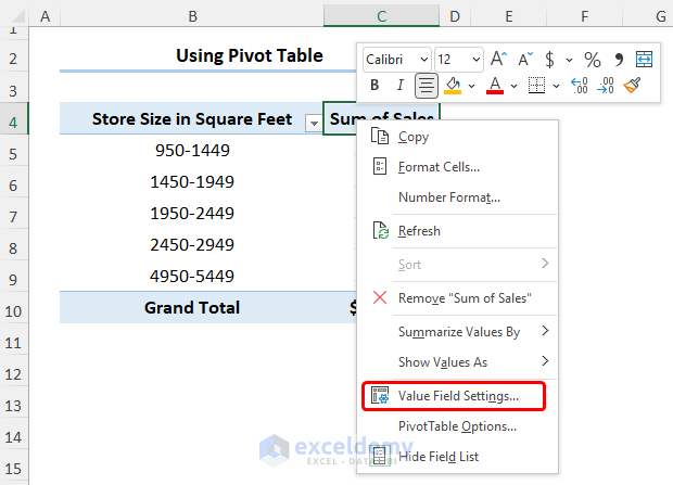
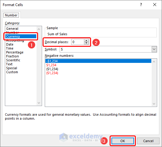
- You can format the numeric values by right-clicking and selecting the Field Value Settings.
- Click the Number Format button.
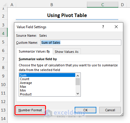
- Choose the Currency option. In this case, we chose 0 decimal places for the Sales value.
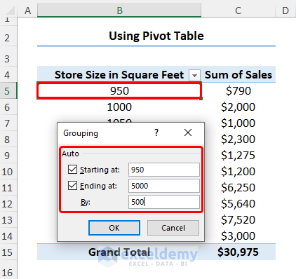
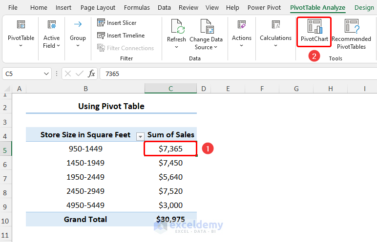
- Select any cell in the PivotTable and right-click to go to Group Data.
- We now want to group the store size into bins. Enter the start value (Starting at), the end value (Ending at), and the interval (By).
Step 2 – Insert Histogram
- Select any cell in the PivotTable and go to PivotChart.
- Choose Column then the Clustered Column chart.
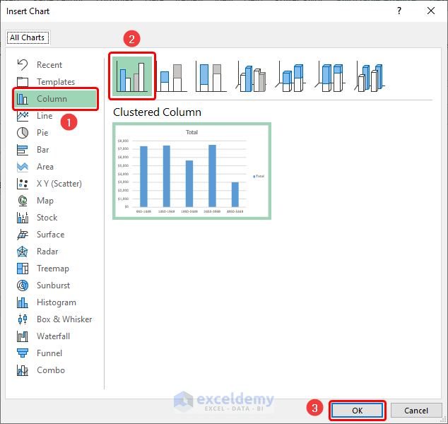
- Add formatting to the chart using the Chart Elements option.
The resulting Histogram should look like the image shown below.
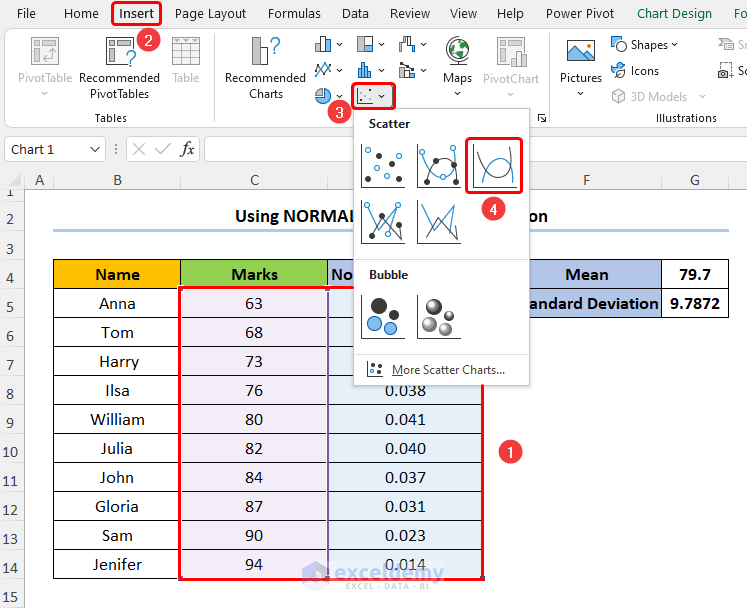
Method 2 – Making a Normal Distribution Chart with NORM.DIST Function in Excel
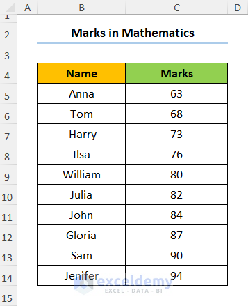
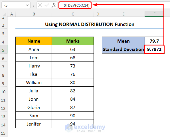
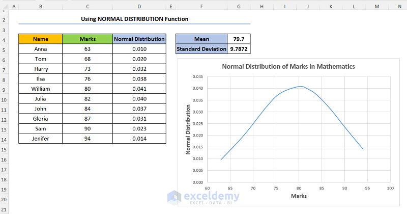
Consider the dataset shown below where the student Names and their corresponding Marks in Mathematics are provided.
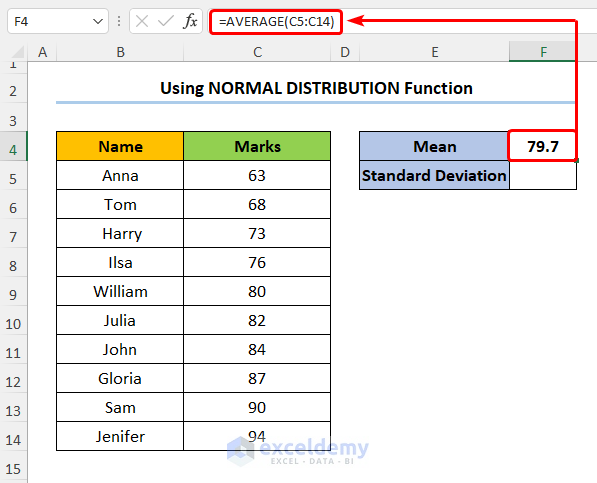
Step 1 – Calculate Mean and Standard Deviation
- Create two new rows for the Mean and Standard Deviation.
- Enter the formula shown below into Mean to compute the mean Marks:
=AVERAGE(C5:C14)
In this formula, the C5:C14 cells point to the Marks. Moreover, we use the AVERAGE function to obtain the mean Marks.
- Type in the formula for Standard Deviation of the Marks:
=STDEV(C5:C14)
Here, we’ve used the STDEV function to get the Standard Deviation.
- Insert a new column D.
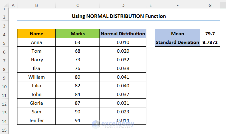
- Calculate the values of the Normal Distribution Table using the NORM.DIST function into D5:
=NORM.DIST(C5,$G$4,$G$5,FALSE)
In this expression, the C5 cell (x argument) refers to the Marks column. Next, the G4 and G5 cells (mean and standard_dev arguments) indicate the Mean and Standard Deviation values of the dataset. Lastly, FALSE (cumulative argument) is a logical value determining the form of the function.
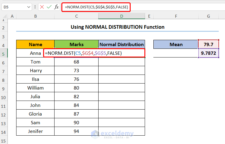
- Drag the fill handle from D5 through the column.
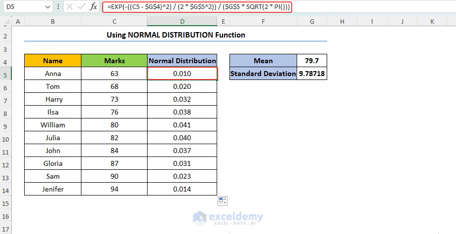
Alternatively, you can determine Normal Distribution using a mathematical formula. To do this, use the following formula in the D5 cell.
Here, $G$4 and $G$ represent Mean (μ) and Standard deviation (σ) respectively.
The basis of the above formula is the following mathematical formula:
f(x) = exp(-(x - μ)^2 / (2σ^2))/((σ * √(2π)) Formula Explanation Now, let’s breakdown our used formula in the D5 cell. Step 2 – Insert Normal Distribution Chart Read More: Plot Normal Distribution in Excel with Mean and Standard Deviation Triangular Distribution 1. How to do histogram Excel? Excel provides the histogram chart type to display the distribution of your data. You can select your data, go to the “Insert” tab, choose the histogram chart type, and customize it to suit your needs. 2. How can I customize the appearance of my distribution chart in Excel? You can modify the axes, add titles, adjust labels, change colors, and apply other formatting options to improve readability and visual appeal. Download Practice Workbook << Go Back to Excel Distribution Chart | Excel Charts | Learn Excel
Suitable Data Type for Different Distribution Chart
Distribution Type
Data Type
Example
Normal Distribution
Continuous numerical data that follows a bell-shaped curve.
Heights of individuals, IQ scores
Uniform Distribution
Continuous numerical data that is evenly distributed across a range.
Random number generation, rolling a fair die
Exponential Distribution
Continuous numerical data representing the time between events in a Poisson process.
Interarrival times in a queue, the time between phone calls
Poisson Distribution
Discrete numerical data representing the number of events occurring in a fixed interval.
Number of emails received per day, number of accidents per month
Geometric Distribution
Discrete numerical data representing the number of trials needed to achieve the first success.
Number of attempts to make a successful shot in basketball
Log-Normal Distribution
Continuous numerical data where the logarithm of the values follows a normal distribution.
Stock prices, incomes
Weibull Distribution
Continuous numerical data used to model reliability and failure rates.
Time to failure of a mechanical component
Gamma Distribution
Continuous numerical data used to model wait times, durations, and arrival rates.
Service times in a queue, time between arrivals in a Poisson process
Continuous numerical data that is bounded and characterized by a peak at the mode.
Estimating project durations, uncertainty analysis
Things to Remember
Frequently Asked Questions
Related Articles

