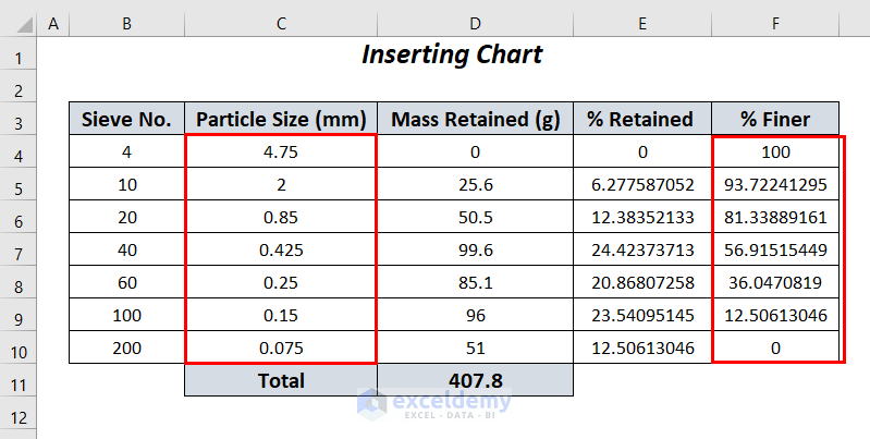
Step 1 – Data Preparation
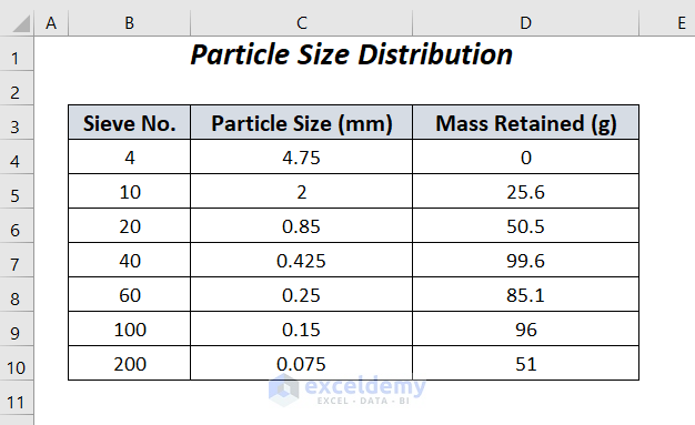
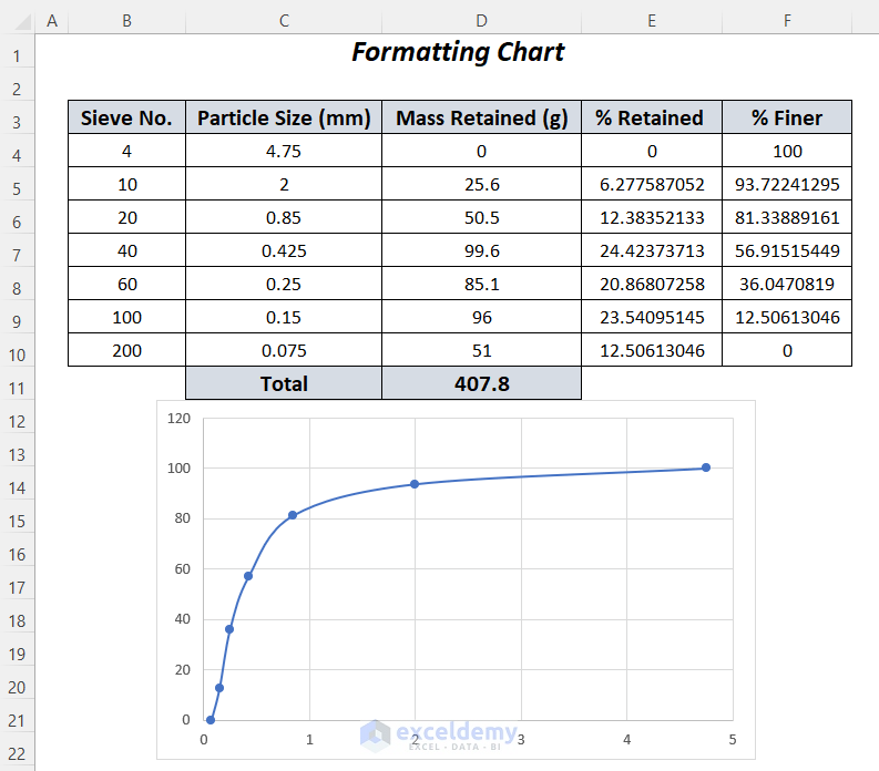
- Gather your data, which typically includes the sieve number, particle size (in millimeters), and mass retained (in grams) for each particle size fraction.
- Organize this data into a table with appropriate column headers.
- We’ll use the following dataset containing Sieve No., Particle Size (mm), and Mass Retained (g) of some particles in a sample.
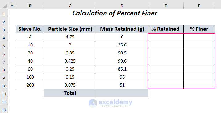
- Let’s calculate the Percent Finer of these particles and then plot these values with respect to the Particle Size (mm) of the particles.
Step 2 – Calculate Percent Finer
- To create the PSD curve, we need to calculate the percent finer for each particle size fraction.
- The percent finer represents the cumulative percentage of particles smaller than a given size.
- Use the following formula to calculate the percent finer:
-
- Cumulative Mass Retained: Sum of mass retained for all sieve sizes smaller than or equal to the current size.
- Total Mass: Total mass of the sample.
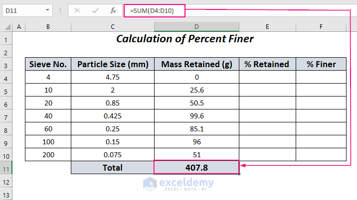
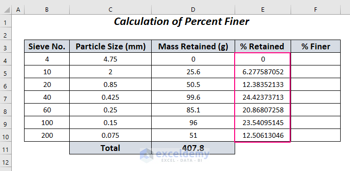
- Calculate Total Retained Mass:
- To get the values in the % Retained column, we first need to find the total retained mass of the particles.
- Enter the following formula in cell D11:
=SUM(D4:D10)
-
- The SUM function will determine the total mass retained across the range D4:D10.
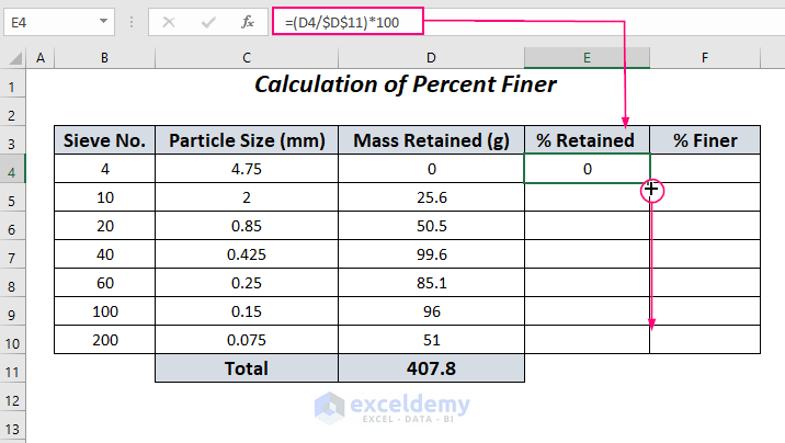
- Calculate Percent Retained:
- Calculate the percent retained for each particle size fraction.
- Apply the following formula in cell E4:
=(D4/$D$11)*100-
- In this formula:
- D4 represents the mass of the particle in cell D4.
- $D$11 refers to the total mass (fixed using absolute referencing).
- The result is multiplied by 100 to express it as a percentage.
- Drag down the Fill Handle to copy this formula for the remaining cells in the % Retained column.
- In this formula:
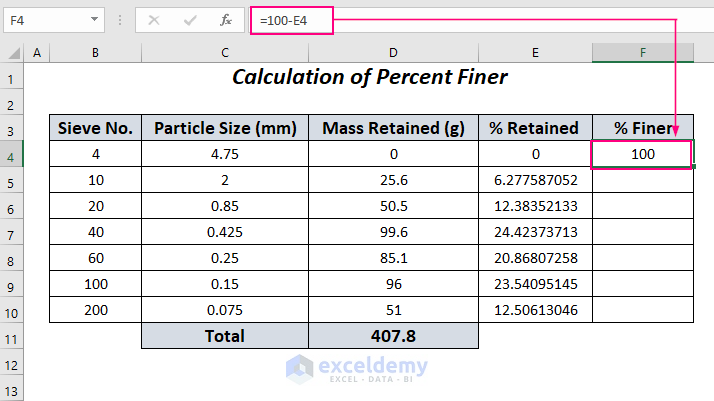
- Calculate Percent Finer:
- Determine the percent finer of the particles.
- In cell F4, enter the following formula:
=100-E4-
-
- This subtracts the value in cell E4 (percent retained) from 100%.
-
-
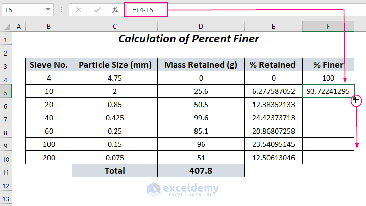
- In cell F5, enter the following formula.
=F4-E5-
-
- This subtracts the % Finer in cell F4 from the % Retained of cell E5 in the following row (Row 5).
-
-
- Drag down the Fill Handle to copy this formula pattern for the remaining cells in the % Finer column.
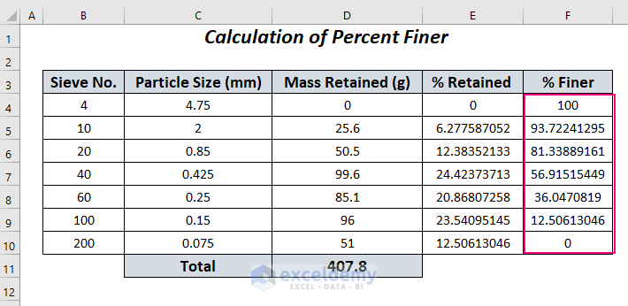
By following these steps, you’ll have the percent finer values for all the sieve numbers, which you can use to plot your PSD curve.
Step 3 – Inserting the Chart
- Go to the Insert tab in Excel.
- In the Charts group, click on the Scatter (X, Y) or Bubble Chart dropdown.
- Choose Scatter with Smooth Lines and Markers.
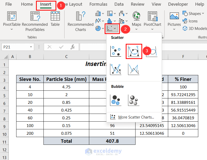
- You’ll see a blank chart after inserting it.
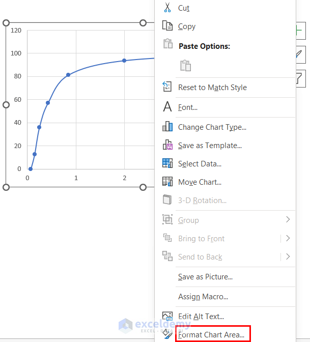
- To configure the chart, right-click anywhere on the chart area.
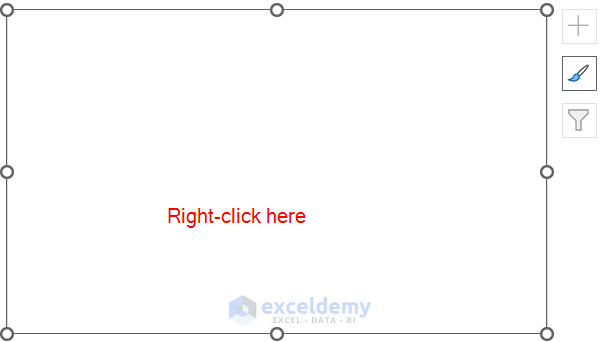
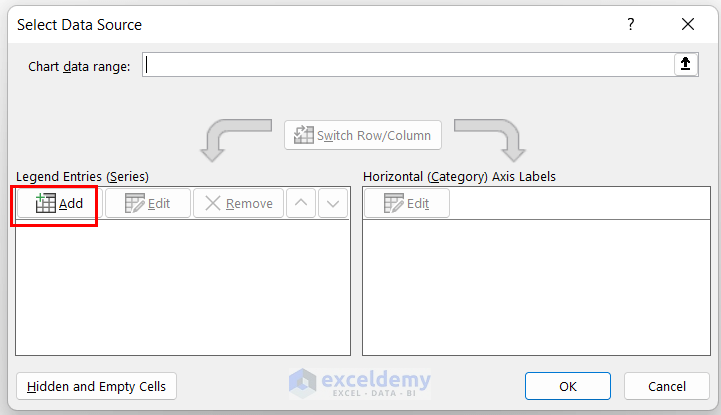
- Choose Select Data.
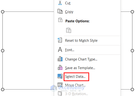
- Click the Add button in the Select Data Source dialog box.
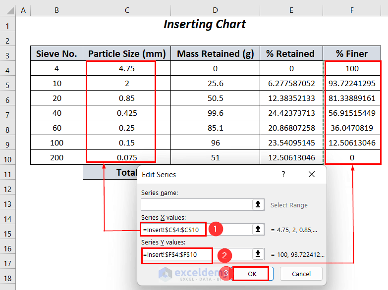
- In the Edit Series dialog box:
- For the X values (horizontal axis), choose the range $C$4:$C$10 (which contains your particle sizes).
- For the Y values (vertical axis), select the range $F$4:$F$10 (which contains the percent finer values).
- Press OK.
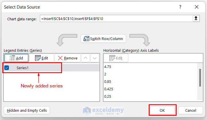
- You’ll be back in the Select Data Source dialog box, where you’ll see the newly created series named Series 1.
- Press OK again.
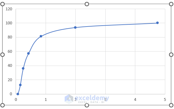
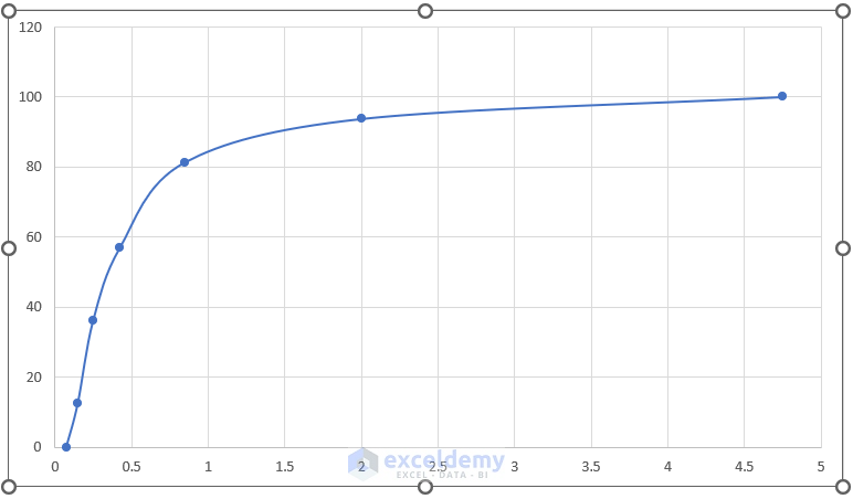
- The chart will now display the Particle Size Distribution curve based on your data.
Read More: How to Create a Distribution Chart in Excel
Step 4 – Formatting the Chart Area
- Right-click on the chart to select it.
- Choose Format Chart Area.
- In the Format Chart Area pane on the right side of your worksheet:
- Go to the Size & Properties tab.
- Set the height to 4 inches and the width to 7 inches.
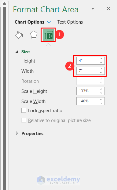
- This adjustment will increase the chart area for better visualization.
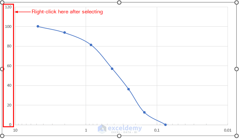
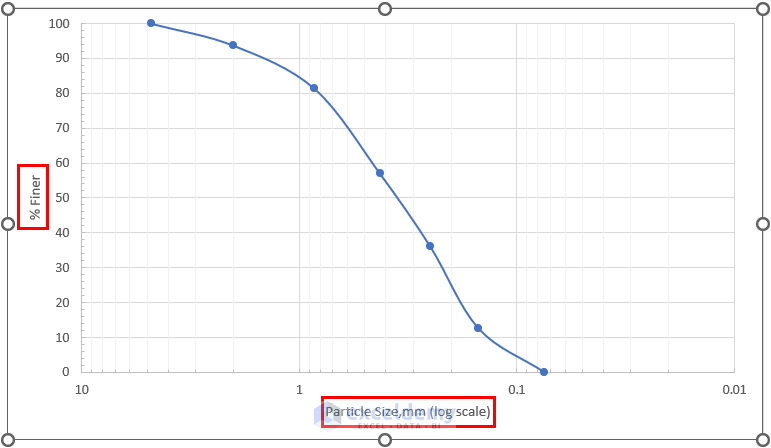
Step 5 – Formatting the X-Axis and Y-Axis
X-Axis (Particle Size):
- Double-click on the X-axis to select it.
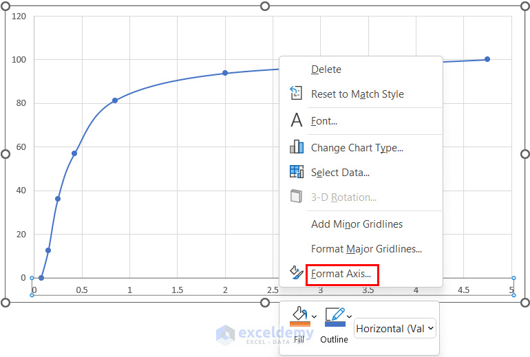
- Right-click to bring up the Context Menu.
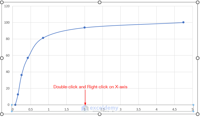
- Choose Format Axis.
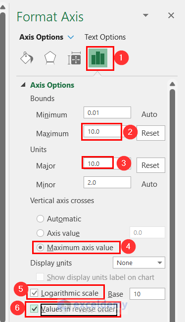
- In the Format Axis pane:
- Go to the Axis Options tab.
- Set the following options:
- Bounds → Maximum → 10.0
- Units → Major → 10.0
- Vertical Axis Crosses → Click on Maximum axis value
- Check the boxes for Logarithmic scale and Values in reverse order.
-
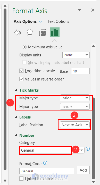
- Scroll down to see the remaining options:
- Select Inside for both major and minor tick marks.
- Choose Next to Axis for label position.
- Set the category of numbers to General.
- Scroll down to see the remaining options:
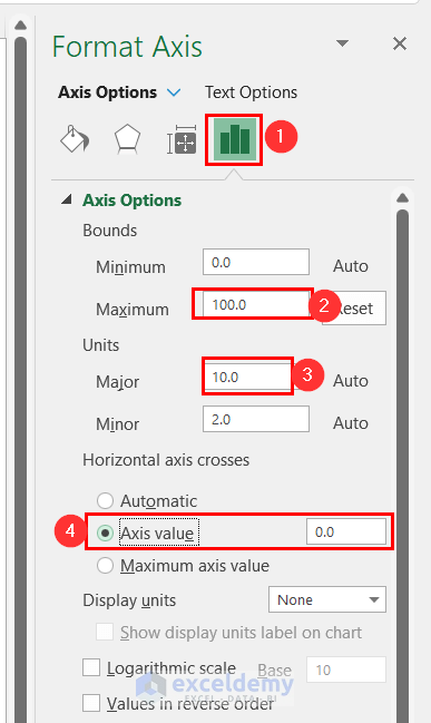
Y-Axis (% Finer):
- Right-click on the Y-axis to select it.
- Choose Format Axis.
- In the Format Axis pane:
- Go to the Axis Options section.
- Set the following options:
- Bounds → Maximum → 100
- Units → Major → 10.0
- Vertical Axis Crosses → Click on the axis value (the box automatically shows 0.0).
-
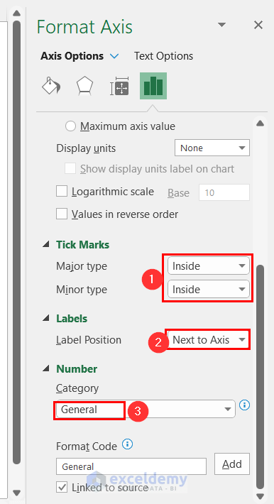
- Scroll down for additional options:
- Select Inside for both major and minor tick marks.
- Choose Next to Axis for label position.
- Set the Category of numbers to General.
- Scroll down for additional options:
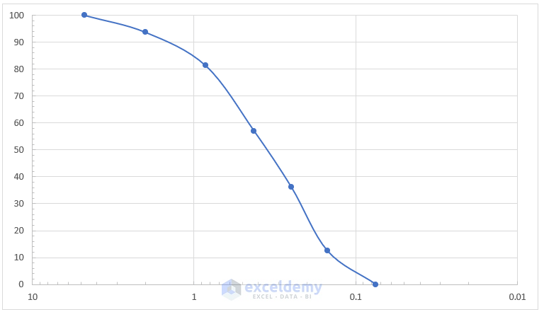
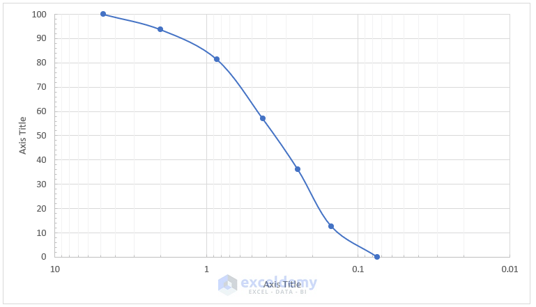
After formatting the axes, your chart should look similar to the following.
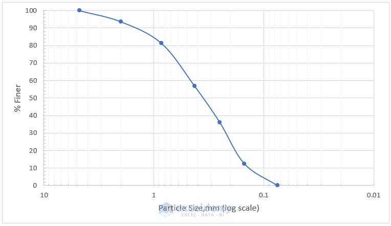
Step 6 – Customizing Chart Elements
- Click on the symbol representing Chart Elements (usually located near the top-right corner of the chart).
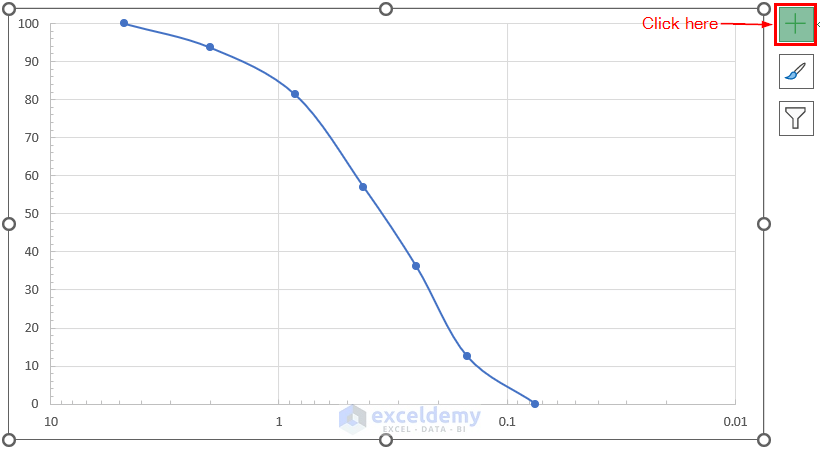
- After selecting the symbol, follow these steps:
- Beside the Gridlines option, check Primary Minor Vertical.
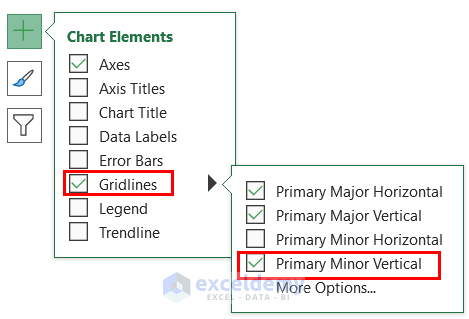
-
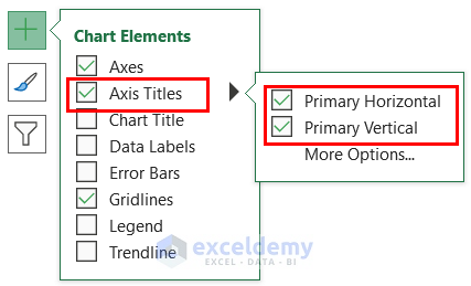
- Under Axis Titles, check both Primary Horizontal and Primary Vertical.
-
- Enabling these options will:
- Display minor vertical gridlines, helping identify the chart as a logarithmic chart.
- Provide space for writing titles for both axes.
- Enabling these options will:
- Adjusting Axis Titles:
- Change the X-axis title to Particle Size (mm) [Log Scale].
- Change the Y-axis title to % Finer.
- Font Size Adjustment:
- Increase the font size for both axis titles from 9 to 11.
- Adjust the font size for the numbers on the axes from 9 to 10.
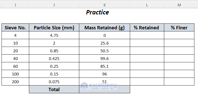
Practice Section
Let’s dive into the practice section. Feel free to follow the instructions and work through the exercises on the right side.
Download Workbook
You can download the practice workbook from here:
Related Articles
- How to Plot Normal Distribution in Excel
- Plot Normal Distribution in Excel with Mean and Standard Deviation
- How to Plot Frequency Distribution in Excel
- How to Create a Probability Distribution Graph in Excel
- How to Plot Poisson Distribution in Excel
- How to Plot Weibull Distribution in Excel
<< Go Back to Excel Distribution Chart | Excel Charts | Learn Excel
Get FREE Advanced Excel Exercises with Solutions!
