This article will describe how to plot Poisson distribution in Excel based on sample data. First, we will discuss what Poisson distribution is, what it does mean, and which Excel function we use to calculate this. Then we will see how to plot the graph.
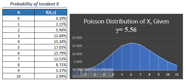
Look at the following image for a brief and quick idea.
What Is Poisson Distribution?
To say very simply, the Poisson Distribution shows the probability of happening an incident for a specific number of instances in a certain period.
For example, say, a football player scores the following number of goals in 5 matches: 0, 1, 1, 3, 0. Now, what is the probability of scoring a certain number of goals in a certain number of matches? The Poisson distribution graph will give an idea of this.
The Poisson Distribution can be described by a statistical function which is as follows:
- Here, X is for the number of successful incidents at a given interval of time
- λ is the mean number of successes during the same interval of time.
To understand in detail, read the whole article, we have discussed an example for your better understanding.
Introduction to POISSON.DIST Function in Excel
MS Excel provides POISSON.DIST function from Excel 2007 version. The objective of this function is simply to return Poisson Distribution in Excel.
It has the following arguments. All of them are of the required type.
- X refers to the number of expected incidents.
- Mean refers to the expected numeric value.
- Cumulative is a logical value that refers to the type returned probability distribution. If it is TRUE, the function returns the cumulative probability output for zero to X inclusive. If it is FALSE, it returns the Poisson probability for exactly x.
How to Plot Poisson Distribution of a Sample Data in Excel: Easy Steps
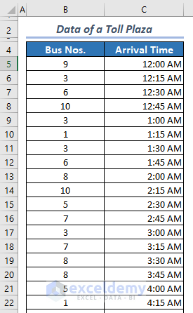
Let’s get introduced to our sample data first. You have to gather sample data like this first off.
The following is data of a Toll Plaza. It describes the number of bus arrival incidents at 15 minutes of intervals. In this example, we will find the probability of arrival of a certain number of buses at a 1-hour interval.
📌 Step 1: Calculate Mean, λ
- The first thing is to calculate the mean, λ of this data. It’s very simple. Just divide the number of occurrences by the number of cases.
- In this particular case, we have calculated λ with the following formula in cell E5.
=SUM(B5:B101)/COUNT(B5:B101)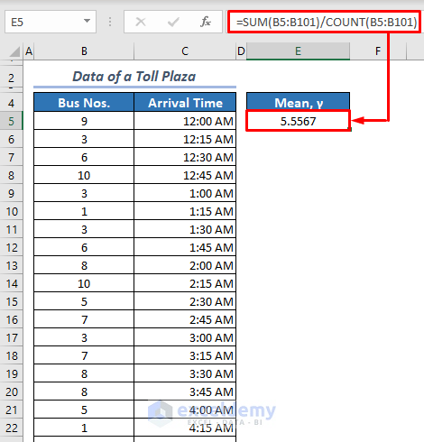
- Here, SUM(B5:B101) returns the number of buses that arrive at the toll plaza.
- COUNT(B5:B101) is the number of case-count.
📌 Step 2: Calculate Poisson Distribution
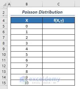
- Now, arrange a table like the following.
What are we going to calculate here? Suppose you are thinking what is the probability that 5 buses will arrive at the toll plaza during a 1-hour interval? We will calculate this now.
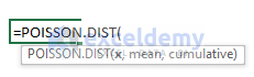
- To do that, insert the following formula in cell C5, and drag the fill handle icon to the last cell of this order.
=POISSON.DIST(B5,'Source Data'!$E$5,FALSE)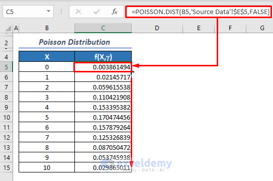
Here, B5 is the number of incidents X, ‘Source Data’!$E$5 refers to the mean λ, and FALSE is for non-cumulative Poisson Distribution. If we do this calculation in the same sheet as the source data, the formula would be =POISSON.DIST(B5,$E$5,FALSE). Not a big issue, right? Don’t forget to use Absolute Reference for mean. Otherwise, you will not get the correct result.
Read More: Plot Normal Distribution in Excel with Mean and Standard Deviation
📌 Step 3: Plot Poisson Distribution Results
We are almost done!
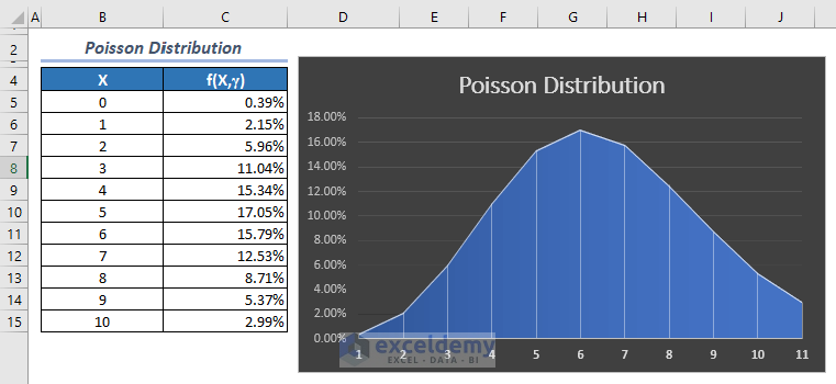
- Now, select the f(X,λ) column and go to the Insert tab. Then from the Chart group, click on the Insert Line or Area Chart drop-down menu, and select the first icon of the 2-D Area section.
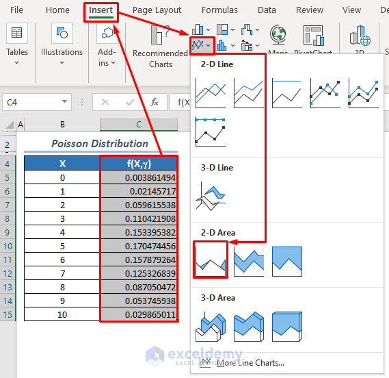
The following graph will appear.
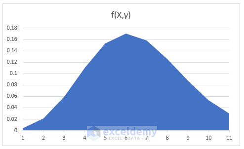
- We have completed our job here. But we can add some formatting to get a better interpretation and to have an eye-soothing graph. After applying the percentage format for Poisson Distribution results, style 2 for the chart, and changing the chart title, we have the following result.
Read More: How to Create a Distribution Chart in Excel
Quick Notes
- In the Poisson Distribution formula, you must use absolute reference for the mean, or hard code the mean in the formula.
- All the inputs must be numeric, otherwise #VALUE! error occurs.
- X and λ must not be less than zero, otherwise, you will get #NUM! Errors.
- If X is not a whole number, Excel will truncate it to a whole number.
- If you choose TRUE instead of FALSE in the formula =POISSON.DIST(B5,’Source Data’!$E$5,FALSE), you will get cumulative results that indicate the probability of 0 to X. But choosing FALSE will return the probability of exactly X.
Download Practice Workbook
Download the following sample workbook from the link below to practice along with it.
Conclusion
So, in this article, we have discussed how you can plot Poisson Distribution in Excel. If you have found this write-up useful, please let us know in the comment box. Also, don’t hesitate to ask if you have any queries.
Related Articles
- How to Plot Normal Distribution in Excel
- How to Plot Frequency Distribution in Excel
- How to Plot Weibull Distribution in Excel
- How to Plot Particle Size Distribution Curve in Excel
- How to Create a Probability Distribution Graph in Excel
<< Go Back to Excel Distribution Chart | Excel Charts | Learn Excel
Get FREE Advanced Excel Exercises with Solutions!
