What Is the Normal Distribution?
The normal distribution is the probability of data distribution. The graph generally looks like a bell curve. To plot the normal distribution, you need to find the mean and standard deviation.
Mean: Mean is the average value of all data. Use the AVERAGE function.
Standard Deviation: It is the measurement of the deviation of your data from the mean value. Use the STDEV function.
Introduction to NORM.DIST Function
Objective:
The NORM.DIST function is used to find the normal distribution points for data in a given dataset.
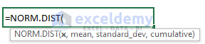
Arguments:
x: the data for which you are calculating the normal distribution.
mean: the average value of your dataset.
standard_dev: the standard deviation of your dataset.
cumulative: a TRUE or FALSE value. TRUE represents the cumulative distribution function and FALSE represents the probability mass function.
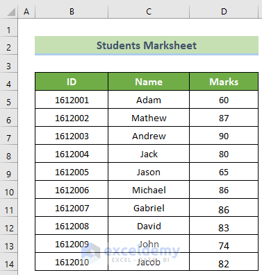
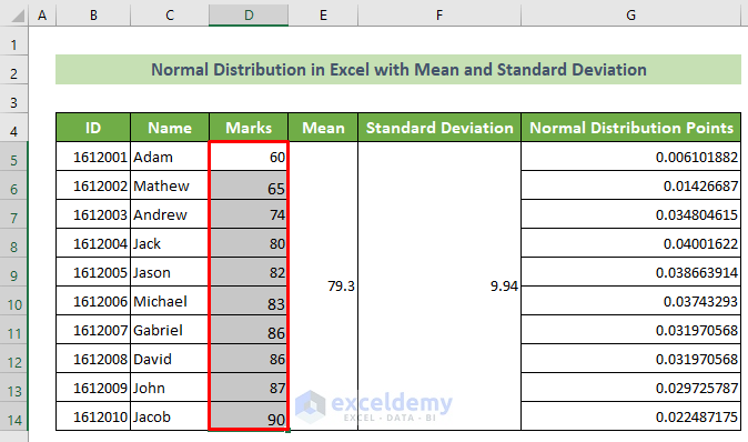
The dataset showcases 10 students’ IDs, names, and marks in the final exam.
Plot the normal distribution of the marks with mean and standard deviation:
Step 1- Calculating the Mean and the Standard Deviation in Excel
- Select new columns named Mean, Standard Deviation, and Normal Distribution Points.
- Merge E5:E14.
- Merge F5:F14.
- Click E5 and enter the following formula.
- Press Enter.
=AVERAGE(D5:D14)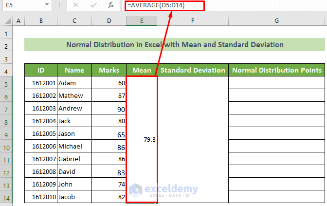
- Click F5 cell and enter the formula below.
- Press Enter.
=STDEV(D5:D14)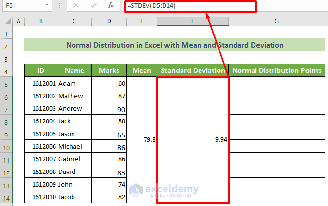
Step 2 – Finding Data Points in the Normal Distribution Chart
- Click G5 cell and use the following formula.
- Press Enter.
=NORM.DIST(D5,$E$5,$F$5,FALSE)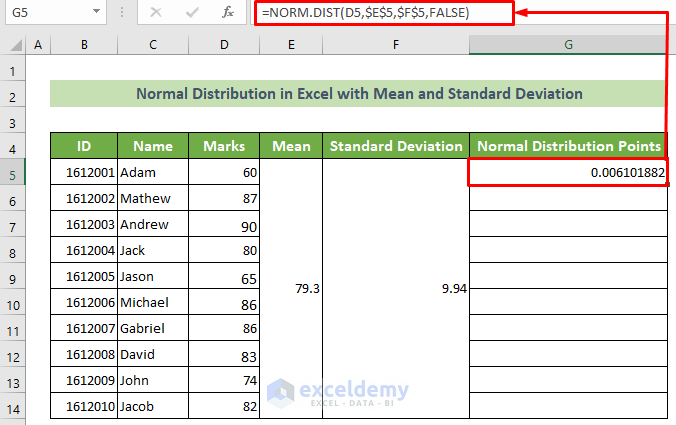
Note:
The mean argument and standard_dev argument should be absolute. Press F4 key or enter the dollar sign ($) before the row and column heading.
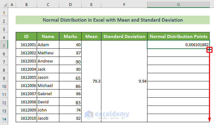
- Drag down the Fill Handle to see the result in the rest of the cells.
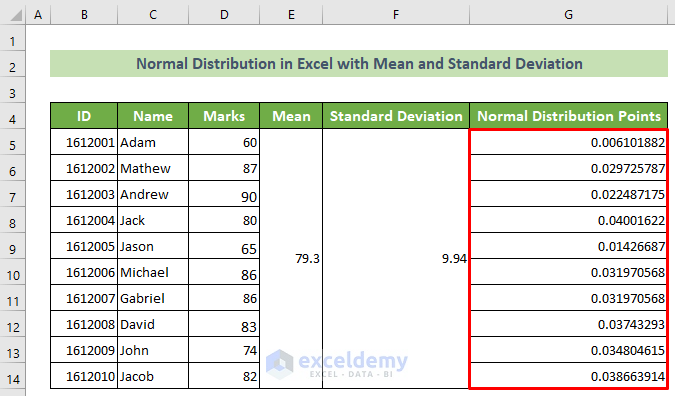
This is the output.
Step 3 – Plotting the Normal Distribution Chart in Excel
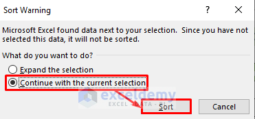
- Select the cells in the column >> go to the Home tab >> Editing >> Sort & Filter >> Sort Smallest to Largest.
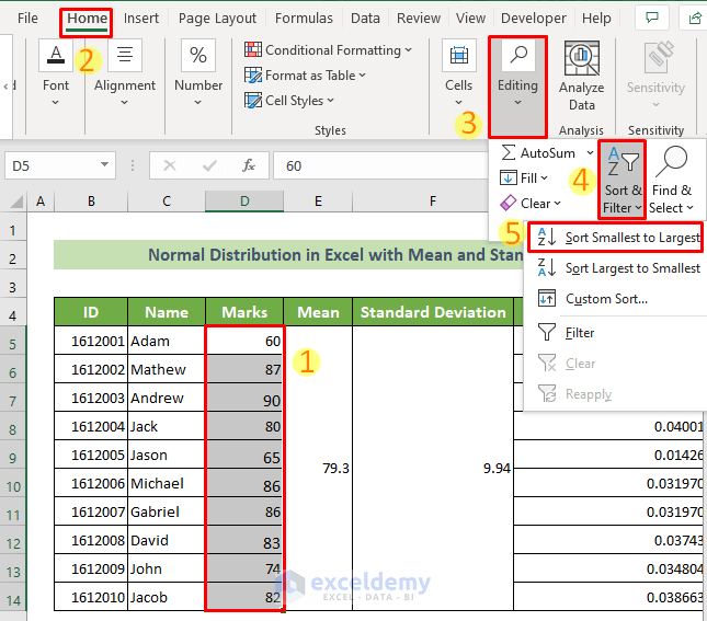
- In the Sort Warning window, select Continue with the current selection.
- Click OK.
- Marks are sorted from the smallest to the largest value.
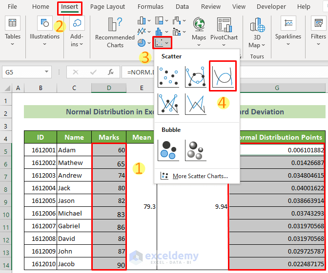
- Select the Marks column and the Normal Distribution Points column.
- Go to the Insert tab >> Insert Line or Area >> Scatter with smooth lines.
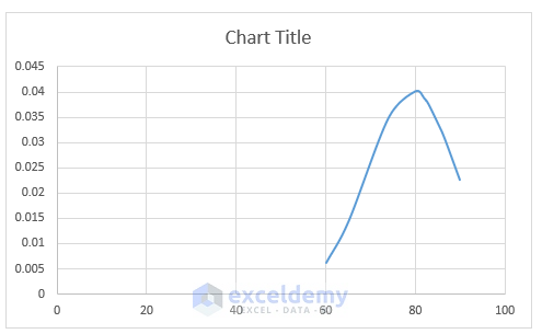
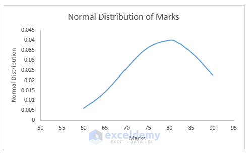
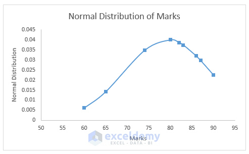
You will see the normal distribution chart.
Read More: How to Create a Distribution Chart in Excel
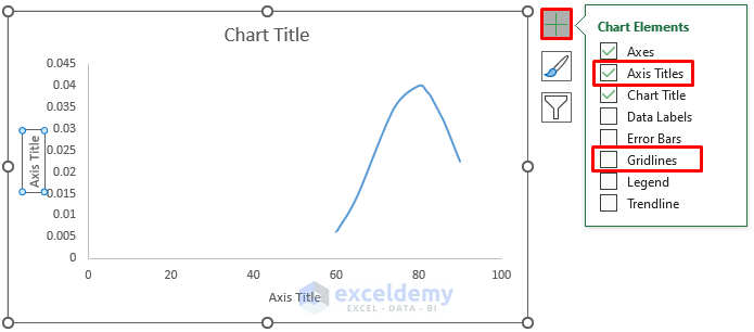
Step 4 – Modifying the Chart
- Click the chart >> Chart Elements >>check Axis Titles>> uncheck Gridlines.
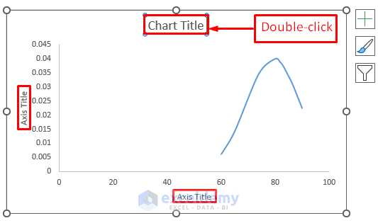
- Double-click the Chart Title and both Axis Titles. Rename the titles.
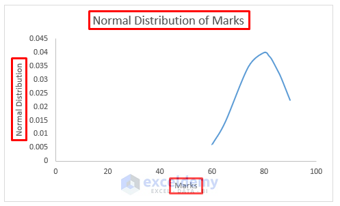
- This is the output.
- Double-click the Horizontal axis.
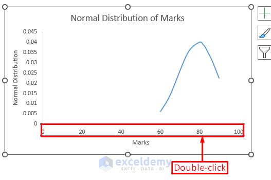
- Go to Axis Options >> set Minimum Bounds to 50.0.
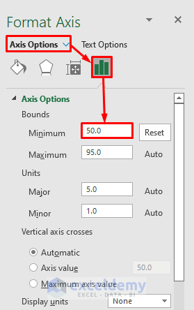
- This is the output.
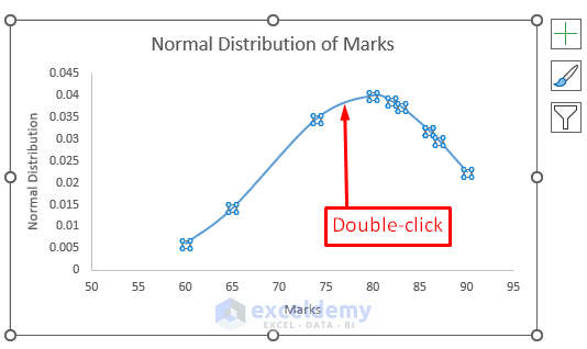
- Double-click the graph line.
- In the Format Data Series task pane, go to Series Options >> Fill & Line >> Marker >> Marker Options >> choose Built-in.
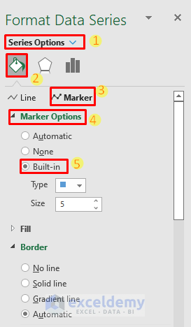
This is the output.
Read More: How to Create a Probability Distribution Graph in Excel
Things to Remember
- Sort data before plotting the normal distribution.
- The mean and standard deviation must be numeric. Otherwise, the #VALUE error is displayed.
- The standard deviation must be greater than zero. Otherwise, the #NUM! error is displayed.
Download Practice Workbook
Download the practice workbook.
Related Articles
- How to Plot Frequency Distribution in Excel
- How to Plot Poisson Distribution in Excel
- How to Plot Weibull Distribution in Excel
- How to Plot Particle Size Distribution Curve in Excel
<< Go Back to Excel Distribution Chart | Excel Charts | Learn Excel
Get FREE Advanced Excel Exercises with Solutions!

It is very useful information. Now I am able to easily plot standard distribution graphs and do my grade analysis.
Hello Chanyalew,
Thanks for your appreciation.
Regards
ExcelDemy