The Weibull Distribution is a continuous probability distribution that is used to analyze life data, model failure times, and assess the reliability of access products. This distribution is used in different fields to analyze data.
Reliability Function: R(t) = e^-[{(t-γ)/α}^β]
Where,
β = Shape Parameter.
α = Scale Parameter.
γ = Location Parameter, which is usually 0.
From R(t), we can calculate the Failure function F(t):
F(t) = 1-R(t)
After calculation, we get
ln(ln(1/(1-F(t))) = βlnt-βlnα
This resembles the y=mx+c equation
Consider the following dataset, containing instances of failure and the number of days of the failure. For example, the 1st failure occurs after 400 days, 2nd one after 820 days, etc.
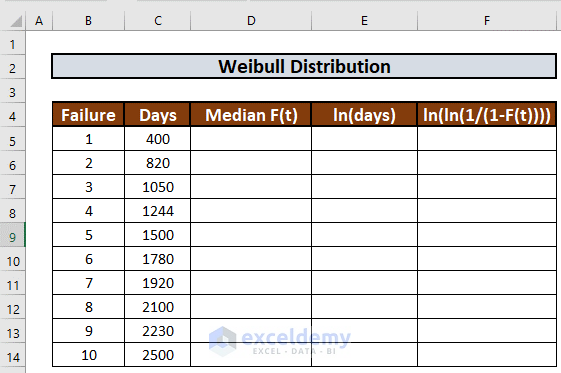
Let’s use this data to calculate the Weibull Distribution and understand the failure rate.
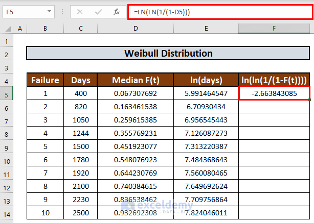
Step 1 – Calculate Median Rank
To calculate the median rank we will use Bernard’s approximation.
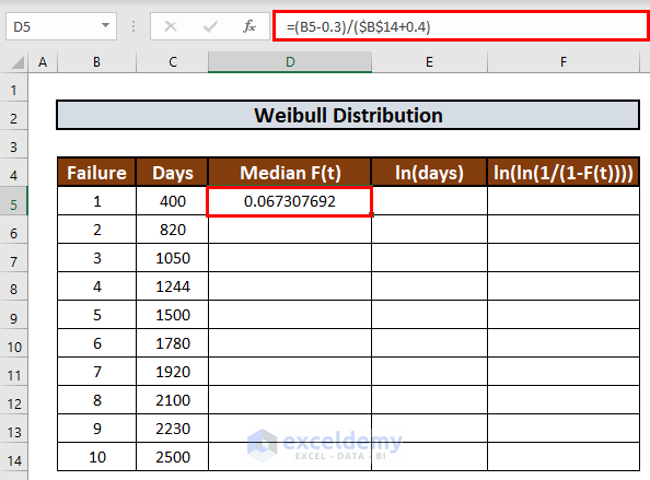
- Go to cell D5 and enter the following formula:
=(B5-0.3)/($B$14+0.4)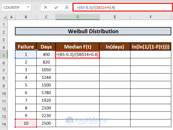
- Press ENTER to get the output.
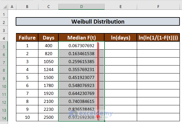
- Use the Fill Handle to AutoFill up to D14.
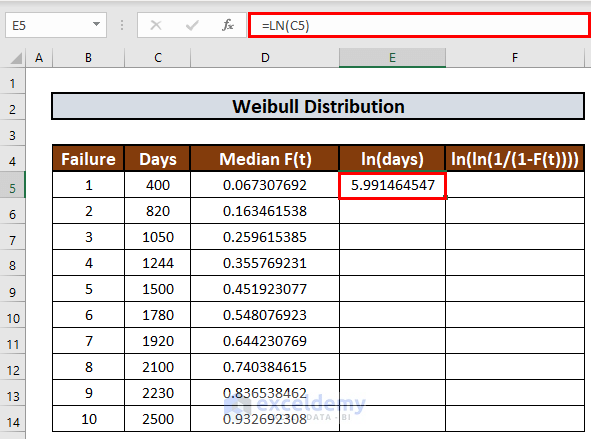
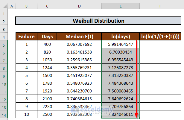
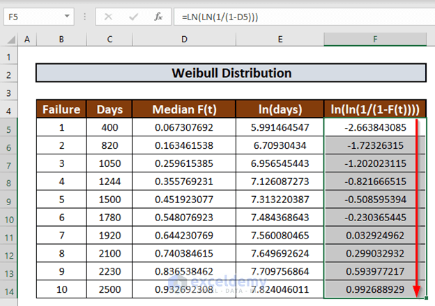
Step 2 – Determine Natural Logarithm
Now we can calculate the natural logarithm. First, we will determine the logarithm of days.
- Go to E5 and enter the following formula:
=LN(C5)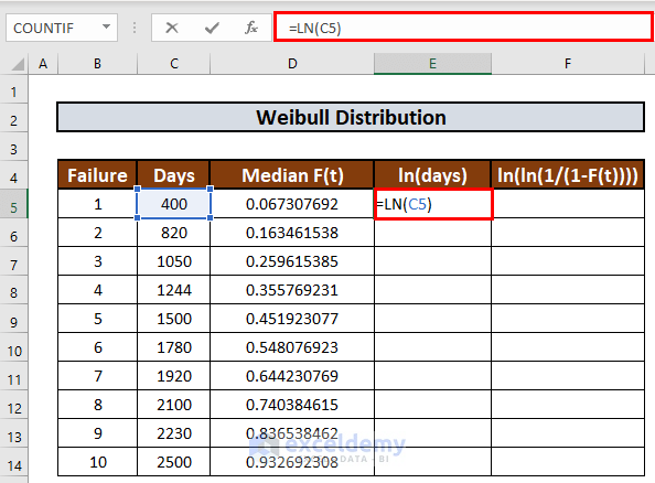
- Press ENTER to get the output.
- Use Fill Handle to AutoFill up to E14.
- In a similar way, we will fill up the next column. The formula in F5 will be:
=LN(LN(1/(1-D5)))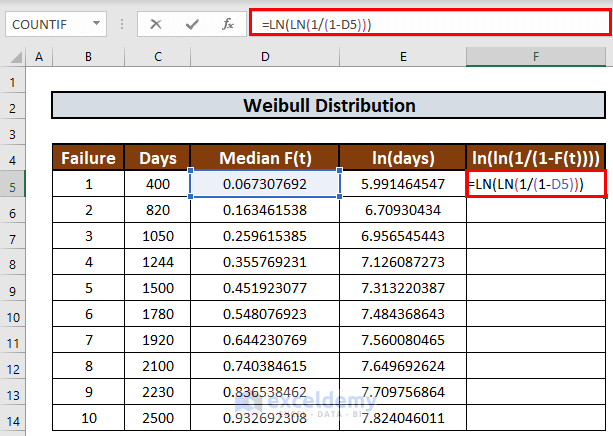
- Press ENTER to get the output.
- Use the Fill Handle to AutoFill up to F14.
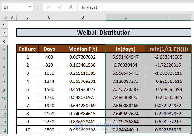
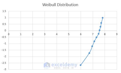
Step 3 – Plot Distribution Chart
Now we can plot a chart using ln(days) as x-axis and ln(ln(1/(1-F(t)))) as y-axis.
- Select E4:F14.
- Go to the Insert tab.
- Select the Scatter option.
- Select one you like.
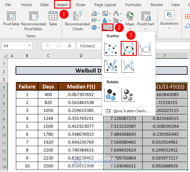
Excel will create a scatter plot.
- Rename the plot to Weibull Distribution.
Read More: How to Create a Distribution Chart in Excel
Step 4 – Compare Equation to Determine Coefficients
Now we will determine the parameters. We will derive the trendline equation and compare it with the equation ln(ln(1/(1-F(t))) = βlnt-βlnα
- Go to Chart Design.
- Select Add Chart Element.
- Select a Trendline.
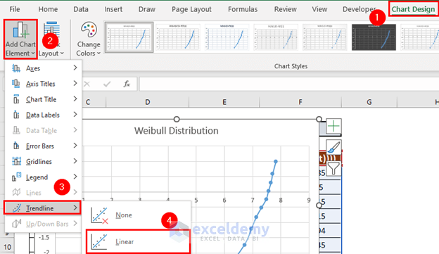
Excel will add a trendline.
- Select the trendline and right-click your mouse.
- Select Format Trendline.
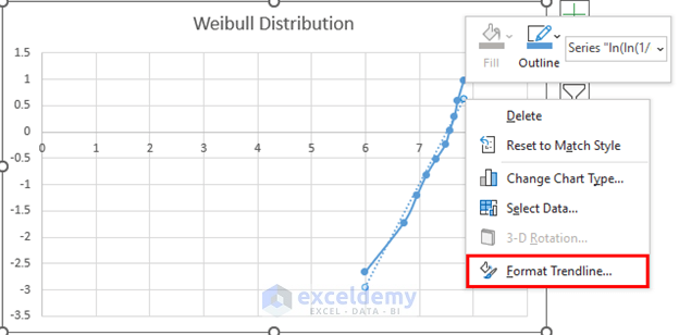
- Check the box for Display Equation on Chart.
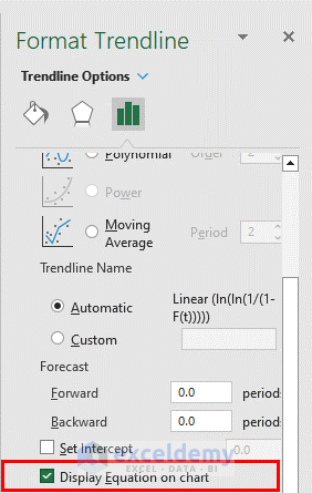
Excel will display the equation.
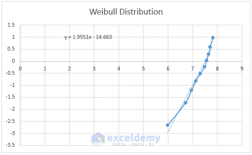
- The equation is y=1.9551x-14.663. After comparing with ln(ln(1/(1-F(t))) = βlnt-βlnα, we get
- β = 1.9551
- βlnα = 14.663
- Using these values, we get
- α = 1807.811
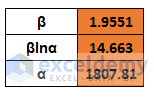
- So, the Reliability Function becomes
R(t) = e^-[(t/1807.811)^1.9551]
Things to Remember
The shape parameter indicates the failure rate:
- If β < 1, then the failure rate decreases with time
- If β = 1, then the failure rate is constant
- If β > 1, the failure rate increases with time
Use absolute references to lock a cell.
Download Practice Workbook
Related Articles
- How to Plot Normal Distribution in Excel
- Plot Normal Distribution in Excel with Mean and Standard Deviation
- How to Plot Frequency Distribution in Excel
- How to Plot Poisson Distribution in Excel
- How to Plot Particle Size Distribution Curve in Excel
- How to Create a Probability Distribution Graph in Excel
<< Go Back to Excel Distribution Chart | Excel Charts | Learn Excel
Get FREE Advanced Excel Exercises with Solutions!

Thank you so much for your contribuition!
Dear Tiago,
You are most welcome.
Regards
ExcelDemy
Do you know how could I implement suspesions data in such analisys?
Dear Tiago
To implement suspension data in a Weibull Distribution, follow these steps:
•Collect completed failure data and suspended data.
•Estimate Weibull distribution parameters (shape and scale) using standard methods for completed data.
•Determine the truncation point for suspended data.
•Modify the Weibull PDF and CDF formulas to account for truncation.
•Estimate parameters for suspended data using methods that consider truncation.
•Evaluate the model’s fit using techniques like Q-Q plots or statistical tests.
Thank you.
Thank you Mr. Rashid! I got it, I finished my work here using the MRR method. Have you done some similar work with Maximum Likelihood Estimation (MLE) for Weibull?
Dear Tiago
It’s good to know that you have finished your work successfully. No, I have not tried the MLE method for Weibull Distribution yet.
Thank you. Have a good day!
Thank you very much for your contribution, I really appreciate.
On the other hand, how did you get the alpha value of 1,807.811? I tried several way but I didn’t get it.
Thank you very much.
Hello Abraham Poo,
Thank you for your kind words! I truly appreciate your feedback.
Regarding your question about the alpha (scale) value of 1,807.811, it was derived using the trendline equation from the Weibull probability plot in Excel. The steps to obtain it are:
Plot the data using the natural logarithm of failure times on the x-axis and the double natural logarithm of (1 – median rank) on the y-axis.
Add a trendline to the scatter plot and select the linear regression option to obtain the equation of the line.
The intercept of the trendline represents the log of the scale parameter (ln(α)).
To get alpha (α), apply the exponential function:
= intercept
If you’re using Excel, you can calculate it with the formula:
=EXP(intercept_value)
If you’re getting a different result, please check whether you’re correctly applying Bernard’s approximation for the median rank and ensure that the trendline equation is displayed in the correct format. Let me know if you need further clarification!
Best regards,
ExcelDemy