A back-to-back stem and leaf plot in Excel is a type of data visualization tool that helps you compare two sets of data on the same graph. It shows ...
Microsoft Office 365 was used to create this article, however you can use other versions according to your preference. If any of the steps don't work ...
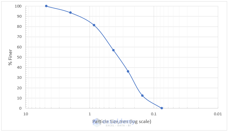
Excel has a powerful graphing feature that can add visual depth and clarity to even the most mundane of datasets. For instance, you may need to make ...
The Weibull Distribution is a continuous probability distribution that is used to analyze life data, model failure times, and assess the reliability ...
This article will describe how to plot Poisson distribution in Excel based on sample data. First, we will discuss what Poisson distribution is, what ...