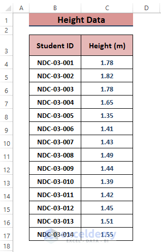
We have the following data representing student heights in meters. We’ll use it to make a cumulative distribution graph.
How to Make a Cumulative Distribution Graph in Excel: 3 Easy Ways
There is no special graph known as the Cumulative Distribution Graph in Excel, so we’ll use other options to make one.
Method 1 – Making a Frequency Table to Insert a Cumulative Distribution Graph
Steps:
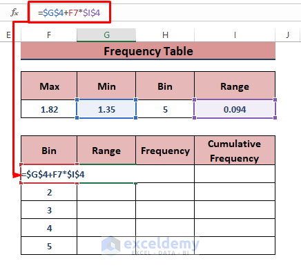
- Determine the maximum and the minimum value in the graph via the MAX and MIN functions in cells F4 and G4, respectively.
- Input a bin size in H5 (we used 5).
- Determine the range (interval between the Max and Min values divided by the Bin value) for I5.
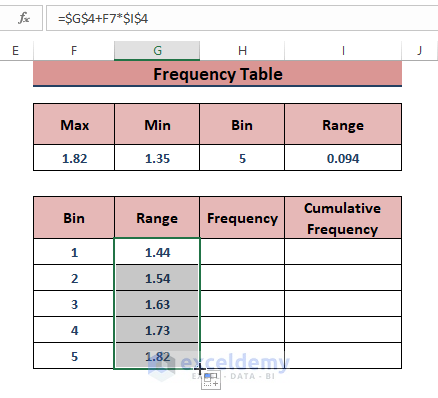
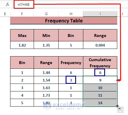
- Make a bin table below that (see the image).
- Use the following formula in the G7 cell.
=$G$4+F7*$I$4
- Drag the Fill Handle to display the upper limits within the range.
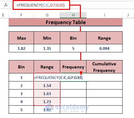
- Use the following formula in H7 to display all the frequencies, then press Ctrl + Shift + Enter to apply the formula (if you use Excel 365, you can use Enter).
=FREQUENCY(C:C,G7:G10)The FREQUENCY function is an array function and takes the column C as its data_array and G7:G10 as its bins_array arguments.
- Find the cumulative frequencies using consecutive addition (the value in I7 will be a copy of H7):
=I7+H8
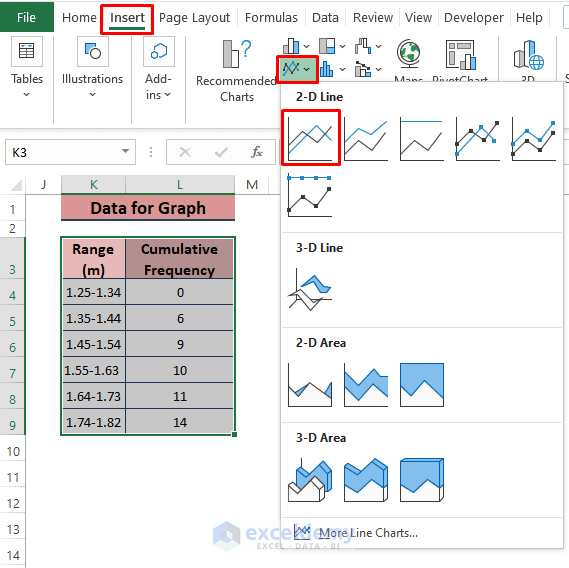
- Prepare a simple data representation consisting of the range and cumulative frequencies.
- Go to Insert.
- Choose any graph type from the Charts section (we chose Insert Line or Area Chart).
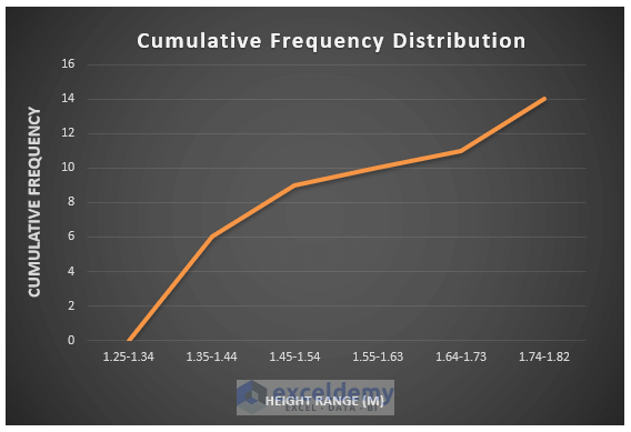
- Format the graph however you want it. You can use the Format Axis side window to adjust the plot area. Here’s what we did.
Method 2 – Applying the NORM.DIST Function to Find a Cumulative Distribution Plot in Excel
The NORM.DIST function returns the normal distribution, maintaining a fixed Mean and Standard Deviation. By assigning the Cumulative argument to True, the normal distribution becomes the cumulative distribution.
Steps:
- Sort the data using the Custom Sort option (smallest to largest).
- Find the Mean using the AVERAGE function in cell D4.
=AVERAGE(C:C)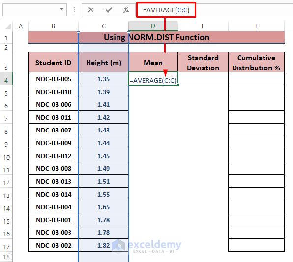
- Calculate the Standard Deviation using the STDEV function in cell E4.
=STDEV(C:C)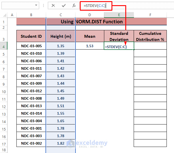
- The syntax of the NORM.DIST function is
NORM.DIST(x,mean,standard_dev,cumulative)- Insert the following formula into cell F4, then drag the Fill Handle to display all the percentages.
=NORM.DIST(C4,$D$4,$E$4,TRUE)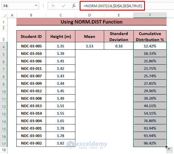
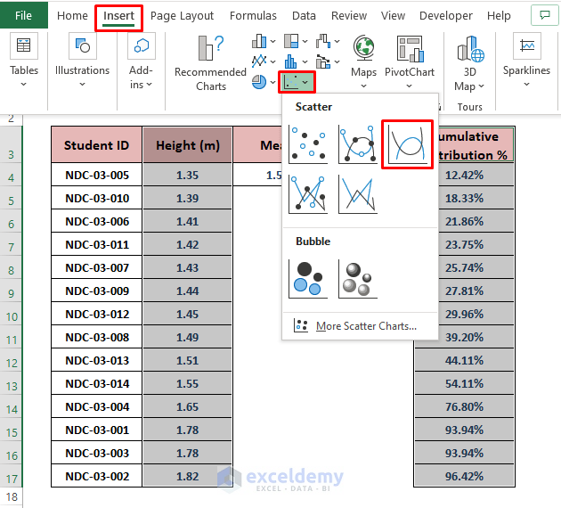
- Select the Height and Cumulative Distribution % columns.
- Go to Insert and Choose any chart to depict the data (we used a Scatter with Smooth Lines).
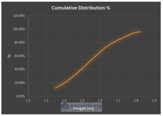
- Excel displays the cumulative distribution graph. Modify the graph as you want it.
Method 3 – Using Actual Frequency to Make a Cumulative Distribution Graph
Steps:
- Use Custom Sort to organize the data in ascending order.
- Use the following formula in the D4 cell.
=1/COUNT(C:C)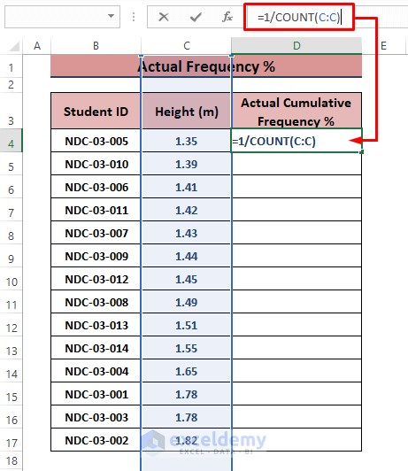
- In D5, use the following formula and apply the Fill Handle to populate other cells.
=1/COUNT(C:C)+D4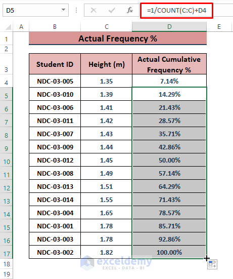
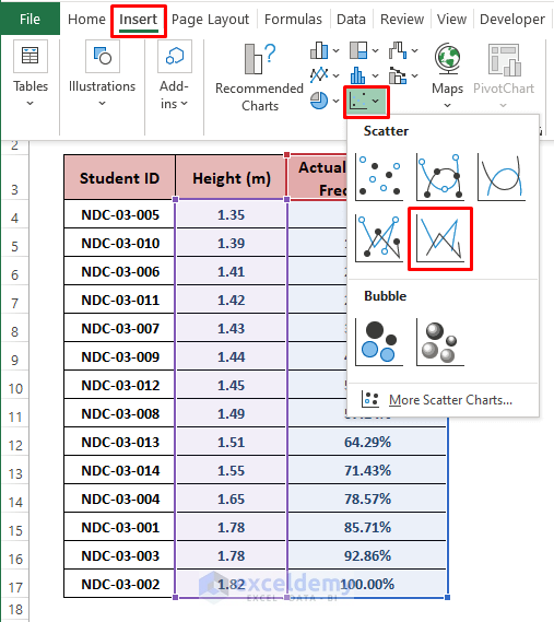
- Go to Insert and the Charts section, then select any chart (such as Scatter with Straight Lines).
- Excel inserts the Cumulative Distribution Chart. Add Chart and Axis titles and use the Format Axis window to best fit the plot area.
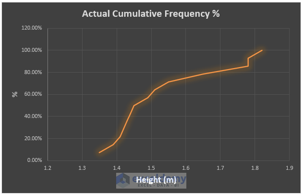
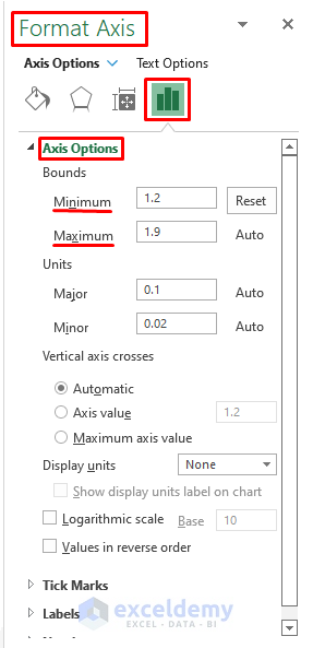
⧭ To best fit or adjust the plot area, double-click on any axis value and the Format Axis side window appears. Provide your preferred Bounds as depicted in the image below to increase the appeal.
Download the Excel Workbook
Related Articles
- How to Make a t-Distribution Graph in Excel
- How to Make Cumulative Percentage Polygon in Excel
- How to Create a Percentage Polygon in Excel
- How to Create Grade Distribution Chart in Excel
- How to Create Gaussian Distribution Chart in Excel
- Stem and Leaf Plot in Excel: A Robust Tool to Visualize Data
<< Go Back to Excel Distribution Chart | Excel Charts | Learn Excel
Get FREE Advanced Excel Exercises with Solutions!
