Excel has a powerful graphing feature that can add visual depth and clarity to even the most mundane of datasets. For instance, you may need to make a percentage polygon, and this is where Microsoft Excel excels! In this article, we’ll demonstrate 2 handy ways to create a percentage polygon in Excel. Moreover, we’ll also discuss how to make a cumulative percentage polygon in Excel.
Introduction to Percentage Polygons with Their Uses
The percentage polygon consists of a line chart drawn by connecting the percentage values of the frequency of the dataset. Simply put, it represents the data in terms of percentages and helps determine the appearance of the distribution. Typically, percentage polygons are used to graph marks scored by students, population weight, birth rate, death rate, etc.
2 Ways to Create a Percentage Polygon in Excel
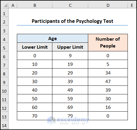
Considering the Participants of the Psychology Test dataset shown in the B4:D4 cells. Here, the dataset divides the Age into Lower and Upper Limits and shows the Number of People in each of the age groups. Now, we want to insert a percentage polygon showing the age distribution of the participants, so let’s observe each method in detail in the following section.
Here, we have used the Microsoft Excel 365 version, you may use any other version according to your convenience.
Method-1: Making a Percentage Polygon Utilizing Line Chart
Let’s start with a simple way to insert a percentage polygon using a Line Chart. However, before inserting the chart we’ll use Excel’s SUM function to obtain the Midpoint values and compute the Total Number of People. Hence, let’s see it in action.
📌 Steps:
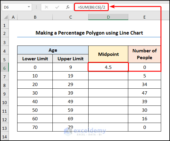
- At the very beginning, go to the D6 cell >> enter the formula given below.
=SUM(B6:C6)/2
Here, the B6:C6 range refers to the Lower and Upper Limits respectively.
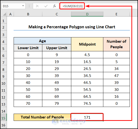
- Then, use the Fill Handle Tool to copy the formula into the cells below.

- Next, move to the D15 cell >> calculate the Total Number of People using the expression below.
=SUM(E6:E13)
In this case, the E6:E13 range of cells represents the Number of People (Frequency) in each age group.
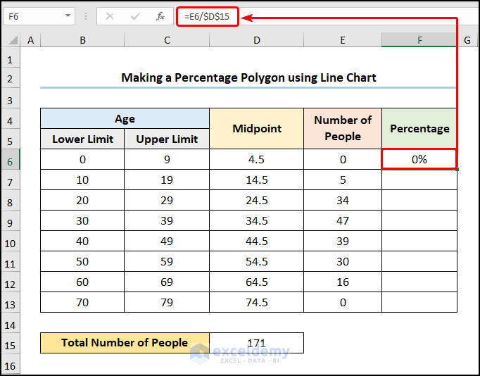
- Then, compute the corresponding Percentage for each age group by applying the following equation.
=E6/$D$15
In the above equation, the E6 and D15 cells point to the Number of People and the Total Number of People respectively.
📃 Note: Please make sure to use Absolute Cell Reference by pressing the F4 key on your keyboard. Additionally, change the cell formatting of the F6:F13 cells to Percentage using the CTRL + 1 shortcut keys.
- Afterward, select the F6:F13 cells >> navigate to the Insert tab >> click the Insert Line or Area Chart drop-down>> choose the 2-D Line Chart option.
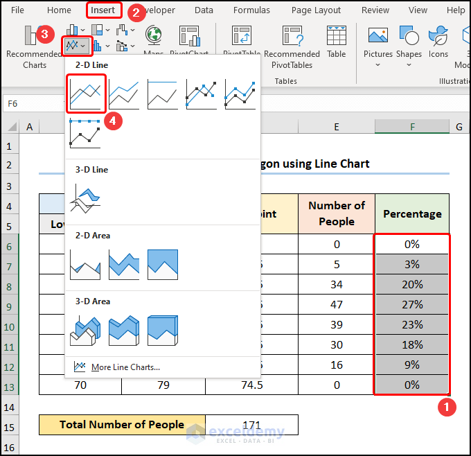
- Now, select the chart >> click the Select Data option.

Immediately, the Select Source Data wizard pops out.
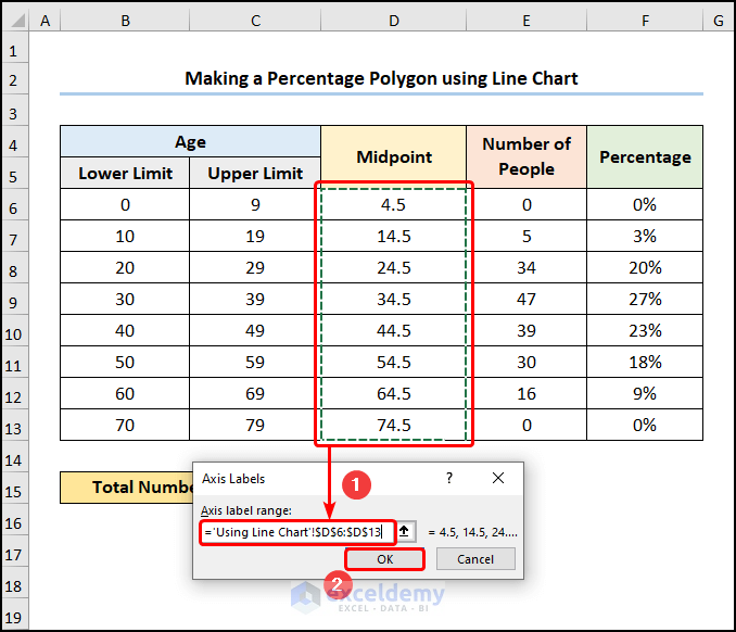
- Next, press the Edit button under the Horizontal Axis Labels field.

- In turn, select the D6:D13 cells (Midpoint values) as the x-axis values >> hit the OK button.
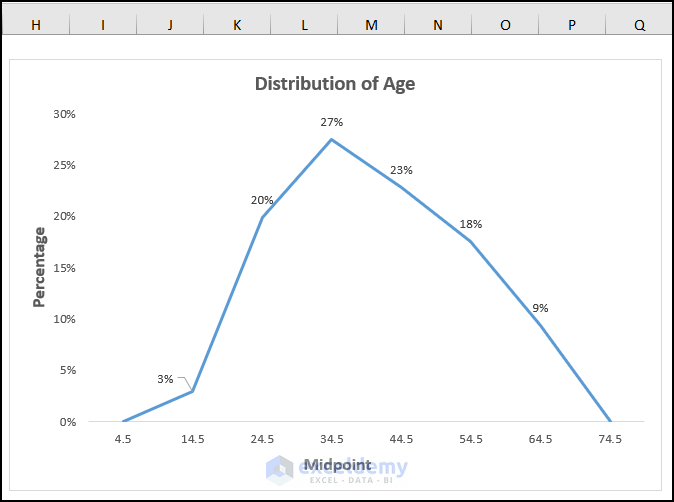
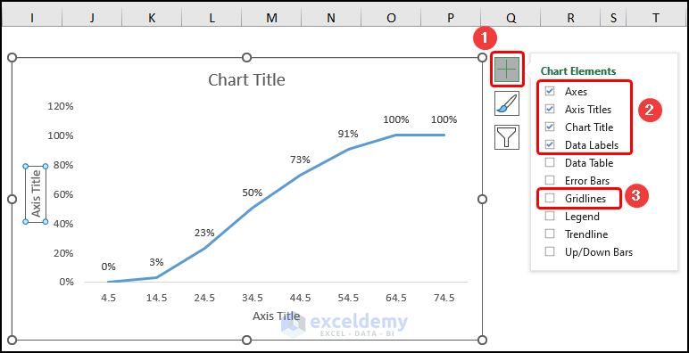
Following this, format the chart using the Chart Elements option.
- In addition to the default selection, enable the Axes Title to provide axes names. Here, it is the Midpoint for the x-axis and the Percentage for the y-axis.
- Now, add the Chart Title, for example, Distribution of Age.
- Lastly, disable the Gridlines option to give your chart a clean look.

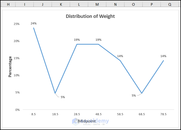
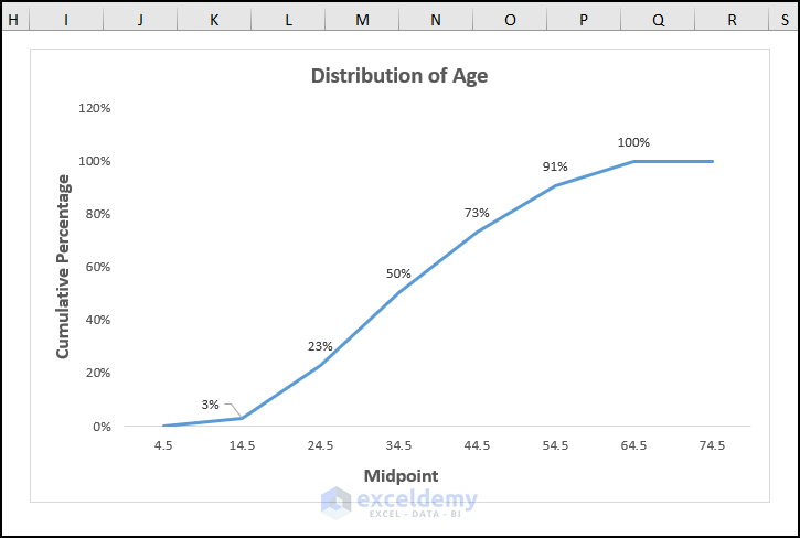
Finally, this should generate the chart as shown in the picture below.
Method-2: Using PivotTable to Create a Percentage Polygon
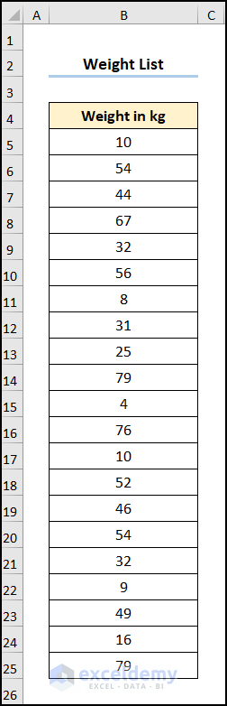
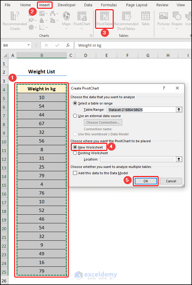
Another way to make a percentage polygon involves using the PivotTable option to group the data and obtain the percentage values of the corresponding data points. Now, assuming the Weight List dataset shown in the B4:B25 cells which shows a list of weights in kilograms. Here, we want to group the data into bins, then count the number of data points within that bin and compute the percentage of the total to generate a percentage polygon. Therefore, let’s go through the steps.
📌 Steps:
- First, select the B4:B25 range of cells >> jump to the Insert tab >> click the PivotTable option.
Now, this opens the Create PivotChart dialog box.
- Next, select the New Worksheet option >> press the OK button.
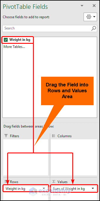
- Then, drag the Weight in kg field into the Rows and Values areas successively.
- Second, move to the B5 cell >> choose the Group Selection option from the Group dropdown options.
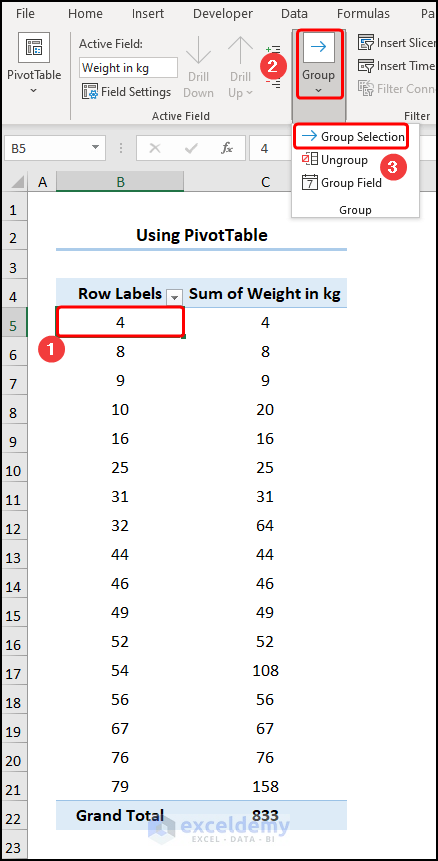
- Afterward, enter the group limits. In this case, the default limits are chosen, and press OK to confirm.

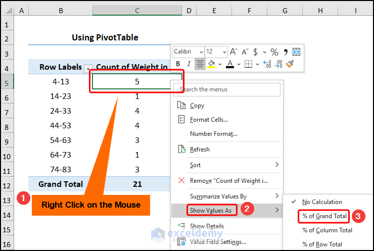
- Third, navigate to the C5 cell >> Right Click on the mouse >> go to Summarize Values By >> click the Count option.
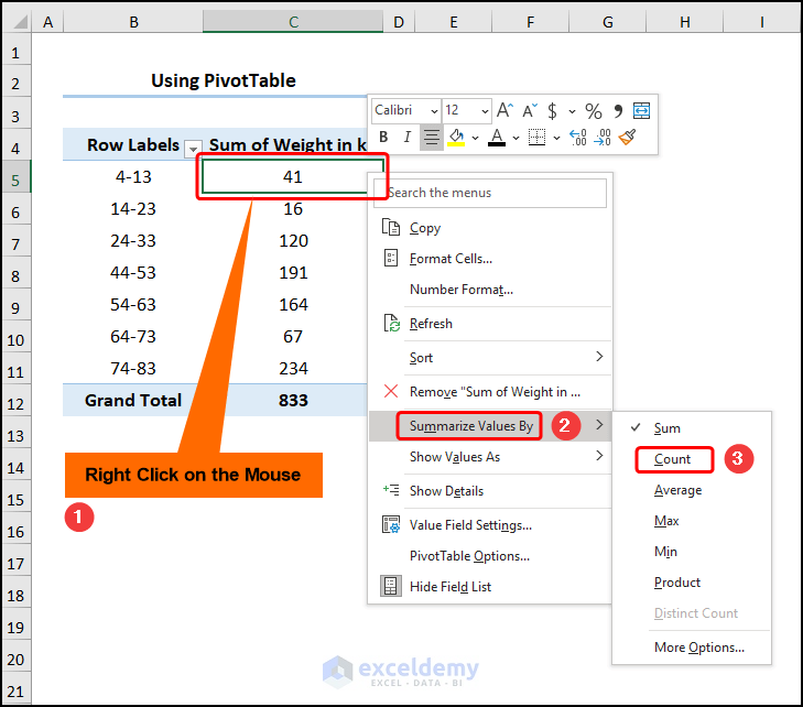
- Similarly, in the C5 cell, again Right Click on the mouse >> proceed to Show Values As >> choose the % of Grand Total option.
Now, this groups the data into bins and gives the corresponding percentages of the data points within the bin.
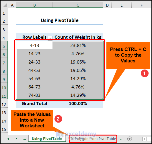
- Fourth, copy the B5:C11 cells >> paste them into the % Polygon from PivotTable worksheet as values.
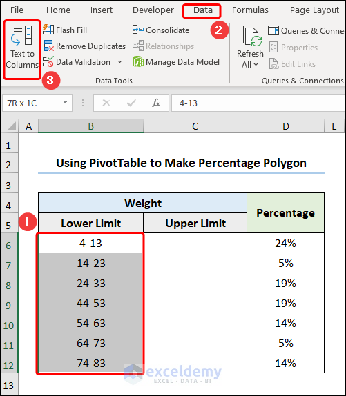
- Following this, choose the B6:B12 cell >> go to the Insert tab >> press the Text to Columns option.
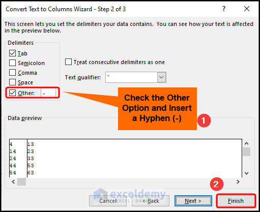
In an instant, the Convert Text to Columns window appears.
- In the first step, click the Next button.
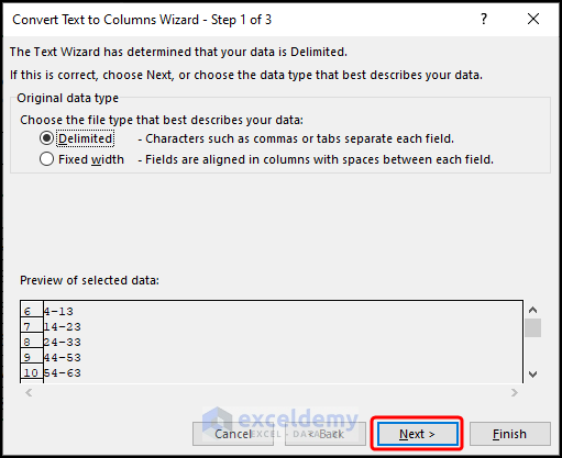
- In the second step, insert a check on the Other option >> type in a Hyphen(-) in the adjacent box >> hit the Finish button.
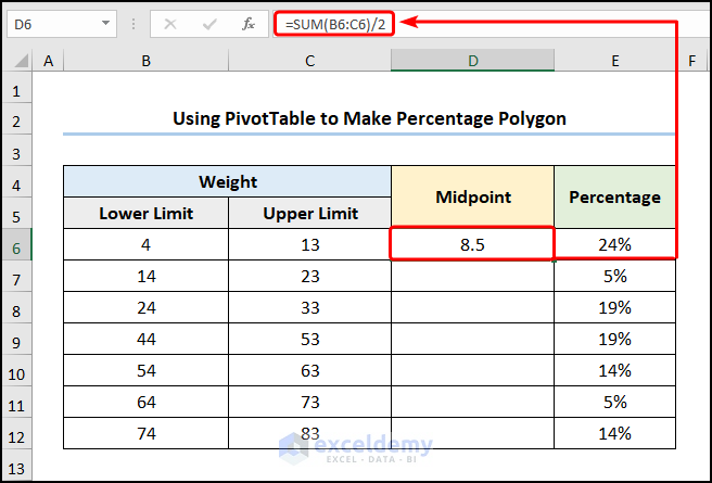
- Fifth, obtain the Midpoint values using the following expression.
=SUM(B6:C6)/2
In the above formula, the B6:C6 cells indicate the Lower and Upper Limits.
- In the following step, select the F6:F13 cells >> move to the Insert tab >> select the Line Chart option.
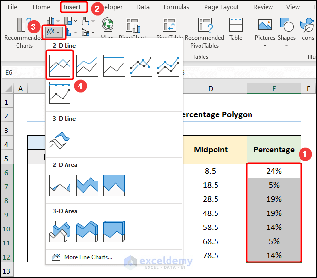
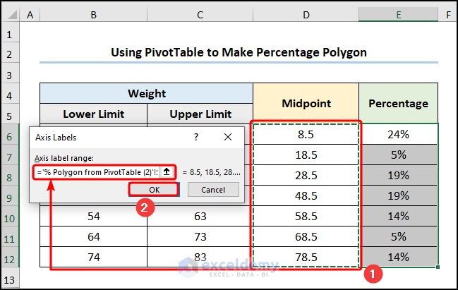
- Then, select the chart >> choose the Select Data option.

- Next, enter the Midpoint values as the x-axis values.
- Eventually, apply the formatting as shown in Method 1 and your results should look like the screenshot shown below.
How to Make a Cumulative Percentage Polygon in Excel
What if you want to generate a cumulative percentage polygon? Then, you’re in luck because our next method answers this exact question. Now, the process is similar to Previous Method except for the addition of cumulative frequency which adds the previous frequency to the current frequency. So, the last frequency is equal to the total frequency of the dataset. Now, allow me to demonstrate the process in the steps below.
📌 Steps:
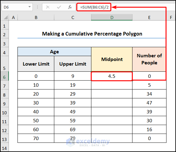
- First and foremost, navigate to the D6 cell and insert the formula given below.
=SUM(B6:C6)/2
In the above formula, the B6:C6 cells point to the Lower and Upper Limits.
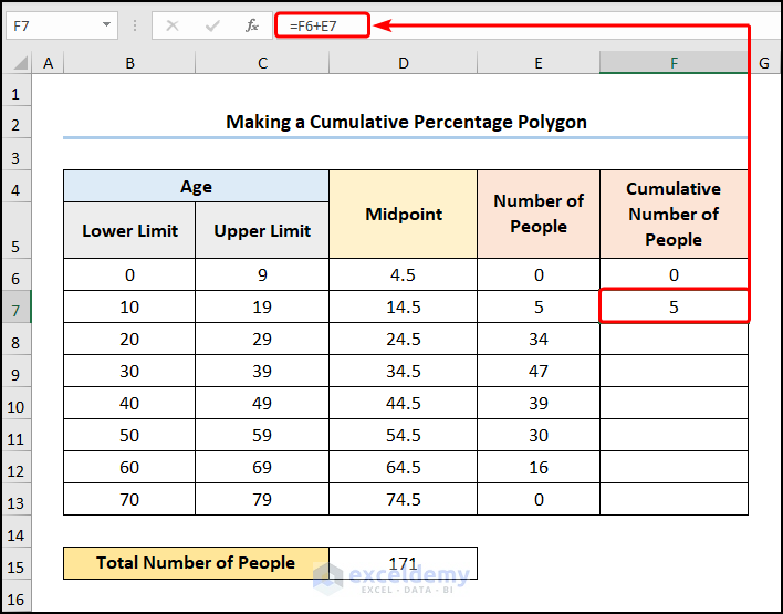
- In the second step, jump to the D15 cell and insert this expression into the Formula Bar.
=SUM(E6:E13)
In this instance, the E6:E13 cells indicate the Number of People (Frequency)

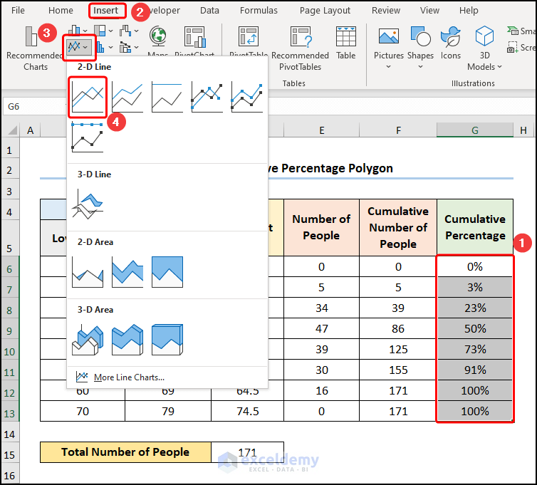
- Then, calculate the Cumulative Number of People (Cumulative Frequency) by typing in the equation in the F7 cell.
=F6+E7
Here, the F6 and E7 cells represent the Cumulative Number of People and the Number of People.
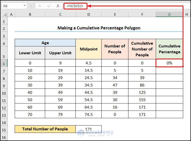
- Following this, get the Cumulative Percentage values in the G6 cell.
=F6/$D$15
For instance, the F6 and D15 cells refer to the Cumulative Number of People and the Total Number of People.
- In the third step, choose the G6:G13 cells and insert a Line chart.
- In turn, use the Chart Elements option to format the chart as shown in Method 1.
Subsequently, your output should appear as the image given below.
Read More: How to Make a Cumulative Distribution Graph in Excel
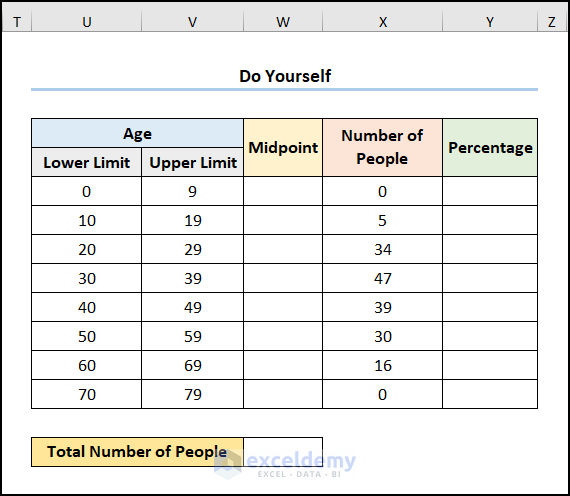
Practice Section
We have provided a Practice section on the right side of each sheet so you can practice yourself. Please make sure to do it by yourself.
Download Practice Workbook
Conclusion
Henceforth, this article shows 2 effective methods how to create a percentage polygon in Excel. Now, read the full article carefully and apply the knowledge by downloading the free practice workbook. Additionally, if you have any further queries or recommendations, please feel free to comment here.
Related Articles
- How to Make a t-Distribution Graph in Excel
- How to Create Grade Distribution Chart in Excel
- How to Create Gaussian Distribution Chart in Excel
- Stem and Leaf Plot in Excel: A Robust Tool to Visualize Data
- Back to Back Stem and Leaf Plot Excel
<< Go Back to Excel Distribution Chart | Excel Charts | Learn Excel
Get FREE Advanced Excel Exercises with Solutions!
