A back-to-back stem and leaf plot in Excel is a type of data visualization tool that helps you compare two sets of data on the same graph. It shows the distribution and range of the data in a visual format, allowing you to easily identify any differences or similarities between the two sets of data. Today, in this article, I am sharing with you some simple steps to create a back to back stem and leaf plot in Excel. Stay tuned!
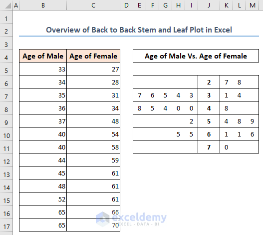
In the following, you will find an overview of creating a back to back stem and leaf plot in Excel.
What Is Back to Back Stem and Leaf Plot?
The back-to-back stem and leaf plot is a type of chart that displays two sets of data side by side, with one set on the left and the other on the right. It uses a stem and leaf plot format, where the stem values are shared between the two sets of data and the leaf values represent individual data points. This format allows you to easily compare the distribution and range of the two sets of data and identify any differences or similarities between them.
How to Create Back to Back Stem and Leaf Plot in Excel: with 3 Simple Steps
In the following, I have shared three steps to create a back to back stem and leaf plot in Excel.
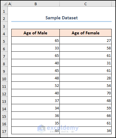
Suppose we have a dataset of some employee records, including Age of Male and Age of Female. Now we will create a back to back stem and leaf plot with this data table to compare these two sets of data on the same graph.
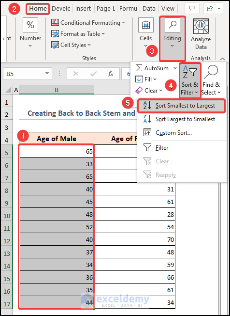
Step 1: Sort Data in Ascending Order
- Here, we will apply the Sort and Filter option from the Home tab to sort the first column from smallest to largest. To do this, go to Home tab >> Editing option >> pick Sort Smallest to Largest from the drop-down options of Sort & Filter.
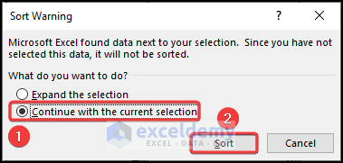
- A window will be opened named Sort Warning where we will choose Continue with the current selection and press Sort.
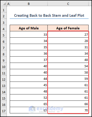
- Immediately, our data will be sorted in ascending order.
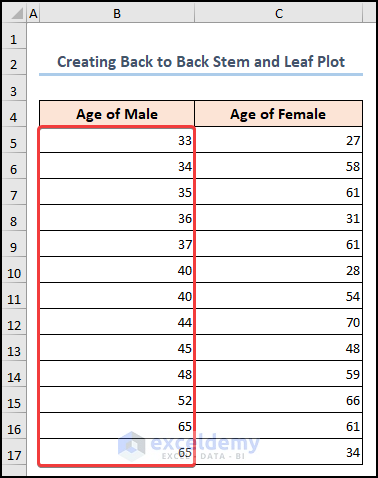
- Similarly, we will sort the next column following the previous steps.
Step 2: Plot Stem Value
As our data is sorted now, we will compare both columns by finding the stem and leaf values. For this,
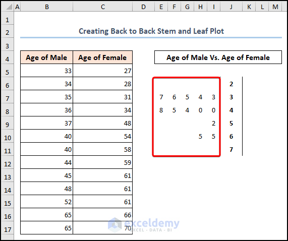
- Choose a new column and there we will put our stem values column-wise from 2 to 7. Here 27 is the lowest value and 70 is the highest value in the range. As stem is counted by the first one or two digits of each data value thus we put 2 to 7.
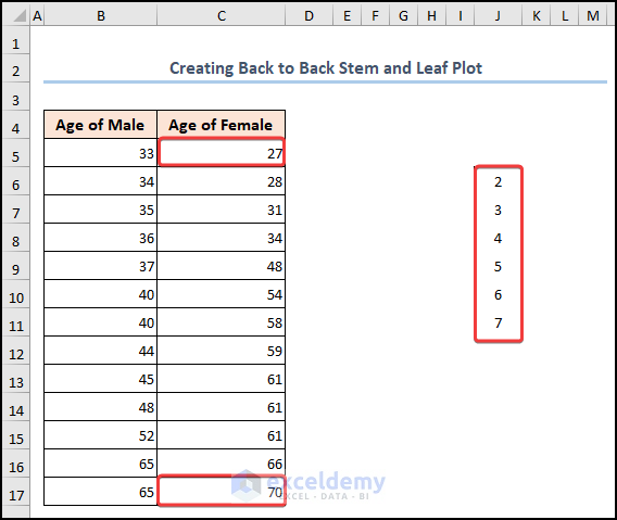
- Then, we will write a title for the graph on top.
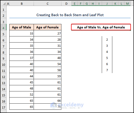
Step 3: Plot Leaf Value
Here, we will enter leaf values according to the stem values. Under the first stem value 3, enter the corresponding leaf values 3, 4, 5, 6, and 7, one per row. Similarly, for stem value 4, put 0, 0, 4, 5, and 8, which is placed as the second value beside 4. Thus, we will put leaf values for all the stem values.
- In the below image, you will find leaf values for Age of Male on the left side.
Follow the below video to grasp the process of plotting leave values.
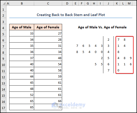
- Similarly, we will insert the leaf values for Age of Female.
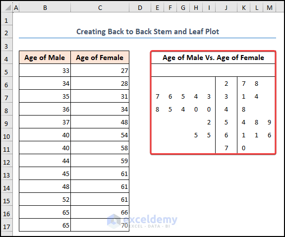
- Finally, our back to back stem and leaf plot is ready where we can see the comparison between both the dataset.
How to Make Stem and Leaf Plot in Excel
A stem and leaf plot is a data visualization tool that organizes and displays data values in a way that shows the distribution of the data. It is a simple and effective way to show the shape and spread of the data, as well as to identify any outliers or patterns in the data.
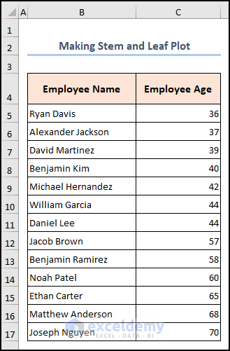
Suppose we have a dataset of some Employee Names and their Ages. Now we will make a stem and leaf plot using the scatter chart in Excel.
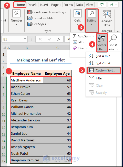
Step 1: Sort Data from Smallest to Largest
- Here, just like the previous method, we will start with sorting the data table by using the Custom Sort option from the Home
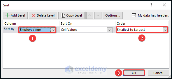
- Next, from the Sort window, choose Employee Age from the Sort By drop-down list and change the Order to Smallest to largest.
- Then, click OK.
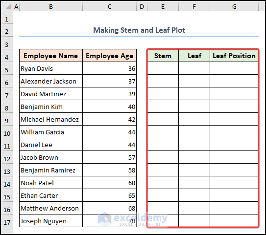
- As you can see, our data is sorted in ascending order.
- Now we will create some helper columns where we will put the Stem, Leaf, and Leaf Position value for further tasks.
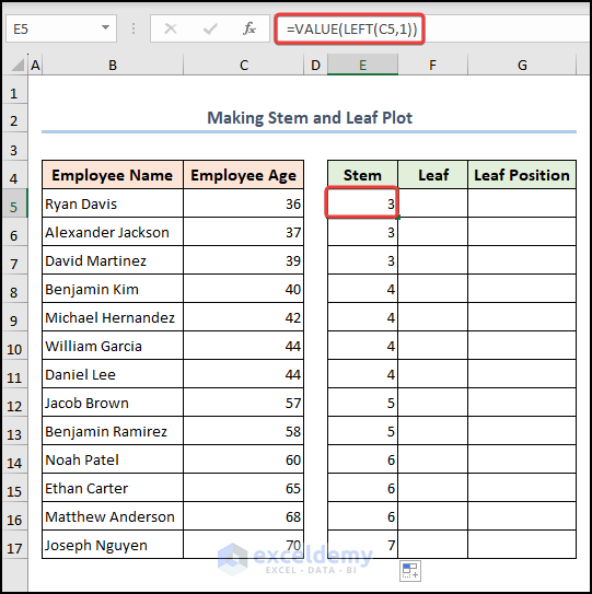
Step 2: Find Stem Value
- Use the below formula to find the stem Here, the LEFT function returns the first character from a string. The VALUE function converts the output to numeric value.
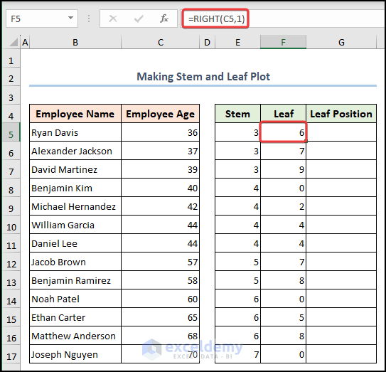
- In the same fashion, we will find the leaf values by applying the below formula. The RIGHT function returns the last character from a string.
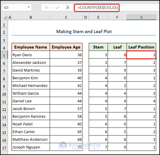
- Hence, for the leaf position, perform the below formula. Here, the COUNTIF function is counting cells within the given condition.
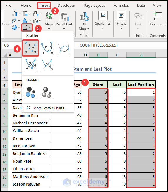
Step 3: Plotting and Designing Scatter Chart
- Now selecting Stem and Leaf Position values, we will plot a scatter chart using the Insert
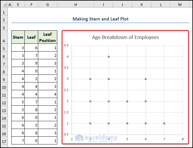
- Simply, our scatter chart is ready where we can plot our stem and leaf values.
- This time we will visit the Select Data option choosing the chart.
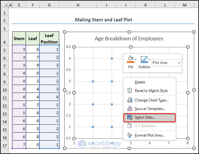
- From the Select Data Source window click the Edit
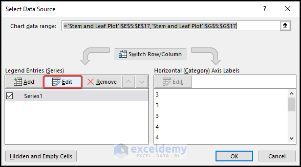
- Further, we will change the Series X values and Series Y values and hit OK.
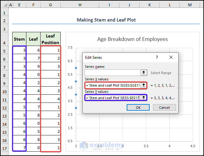
- After that, selecting the axis we will go to the Format Axis
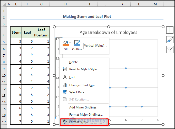
- From the right pane, change the Maximum value to 7 and checkmark the Values in reverse order.
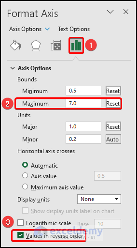
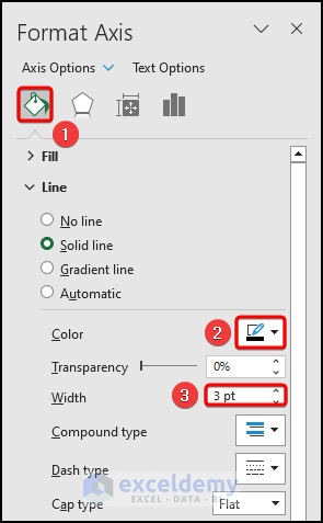
- Without exiting the window, change the Color and Width of the axis for better visualization.
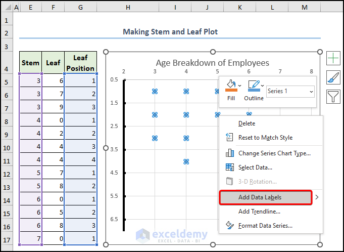
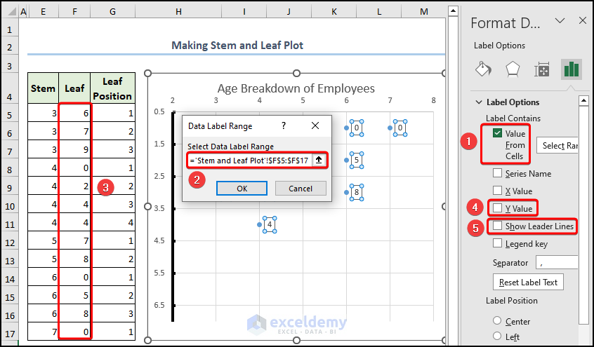
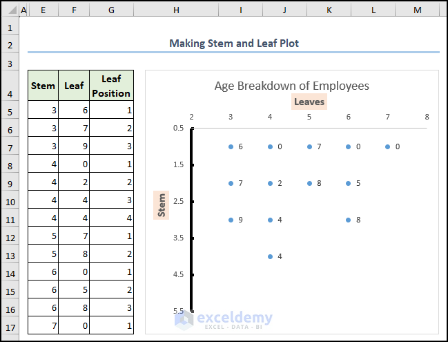
Step 4: Adding and Formatting Data Labels
- In this final step we will attach labels using the Add Data Labels
- Hence, selecting the data labels let’s visit the Format Data Labels
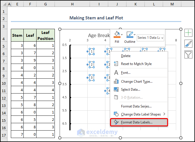
- Therefore, we will change the Label Values with leaf values and remove the checkmark from the Y Value and Show Leader Lines
- Finally, insert the Axis Title and our stem and leaf plot is ready in our hands. It’s that simple.
Things to Remember
- For a large dataset, be careful with putting data points for stem and leaf values to avoid cluttering the plot.
- You must ensure that both sets of data have the same formatting, such as font size, color, and label style to make the plot easy to read.
Frequently Asked Questions
1. Can we customize the Back to Back Stem and Leaf Plot in Excel?
Yes, you can customize the back-to-back stem and leaf plot in Excel by changing the formatting, colors, and labels, as well as by adding titles or other chart elements. This allows you to create a back-to-back stem and leaf plot that meets your specific needs.
2. What types of data are best suited for a Back to Back Stem and Leaf Plot in Excel?
Back-to-back stem and leaf plots in Excel are best suited for comparing data sets that have similar ranges and distributions. It is particularly useful for identifying any differences or similarities between two data sets that may not be apparent when using other types of charts or graphs.
Download Practice Workbook
Conclusion
In conclusion, a back-to-back stem and leaf plot in Excel is a powerful tool for comparing two sets of data side by side. It uses the stem and leaf plot format to display the data in a way that is easy to interpret and identify any differences or similarities between the two sets of data. Take a tour of the practice workbook and download the file to practice by yourself. Please inform us in the comment section about your experience. We, the Exceldemy team, are always responsive to your queries. Stay tuned and keep learning.
Related Articles
- How to Make a Cumulative Distribution Graph in Excel
- How to Make a t-Distribution Graph in Excel
- How to Make Cumulative Percentage Polygon in Excel
- How to Create a Percentage Polygon in Excel
- How to Create Grade Distribution Chart in Excel
- How to Create Gaussian Distribution Chart in Excel
<< Go Back to Excel Distribution Chart | Excel Charts | Learn Excel
Get FREE Advanced Excel Exercises with Solutions!
