This tutorial will demonstrate how to make a cumulative percentage polygon in Excel. The percentage polygon consists of a line chart drawn by connecting the percentage values of the frequency of the dataset. Simply put, it represents the data in terms of percentages and helps determine the appearance of the distribution. Typically, percentage polygons are used to graph marks scored by students, population weight, birth rate, death rate, etc. So, it is very important to learn how to make a cumulative percentage polygon in Excel.
How to Make Cumulative Percentage Polygon in Excel: Step-by-Step Procedures
Excel has a powerful graphing feature that can add visual depth and clarity to even the most mundane datasets. For instance, you may need to make a percentage polygon, which is where Microsoft Excel excels! If you follow the steps correctly, you should learn how to make cumulative percentage polygon in Excel on your own. The steps are as follows.
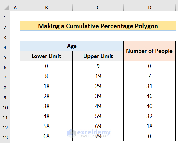
Step 1: Arranging Dataset
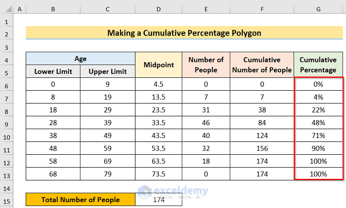
We need a dataset to create a cumulative percentage polygon in Excel. Considering the Participants of the Psychology Test dataset shown in the (B4:D4) cells. Here, the dataset divides the Age into Lower(shown in Column B) and Upper Limits(shown in Column C) and represents the Number of People(shown in Column D) in each of the age groups. Now, we want to insert a percentage polygon showing the age distribution of the participants, so let’s observe each method in detail in the following section.
Step 2: Determining Midpoint
Next, our goal is to determine the midpoint to generate a cumulative percentage polygon in Excel. However, before inserting the chart we’ll use Excel’s SUM function to obtain the Midpoint values. MS Excel provides a most useful function called SUM for summation purposes. Formula with this function automatically updates with the addition or deletion of a value. It also combines the changes made to a current cell range. This step will share the complete idea of how the SUM function works in Excel autonomously and then use it to generate a cumulative percentage polygon in Excel. The process of this step is.
- First, in the D6 cell insert the following formula.
=SUM(B6:C6)/2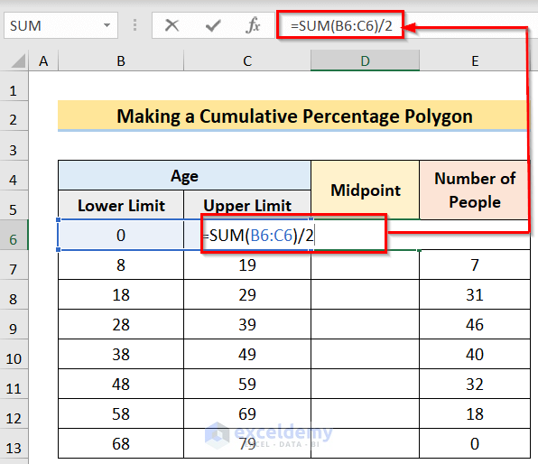
- Second, after pressing the Enter button, you will get the result for the cell and then use the Fill Handle to apply the formula to all the desired cells.
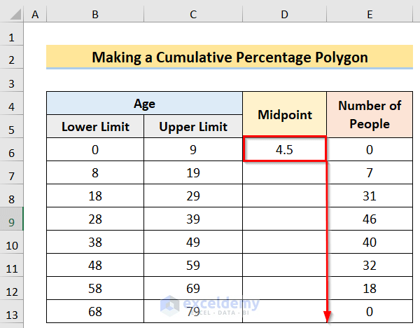
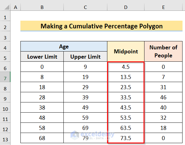
- Last, you will get the desired result.
Step 3: Finding Cumulative Percentage
We will try to find the cumulative percentage now. The total number of the percentage values that remain across a set of responses to show the overall percentage is called the cumulative percentage. We can find the cumulative percentage by following the below steps.
- To begin with, we have to take zero in the very first value of the cumulative section(in cell F6). Then, in the F7 cell insert the following formula.
=F6+E7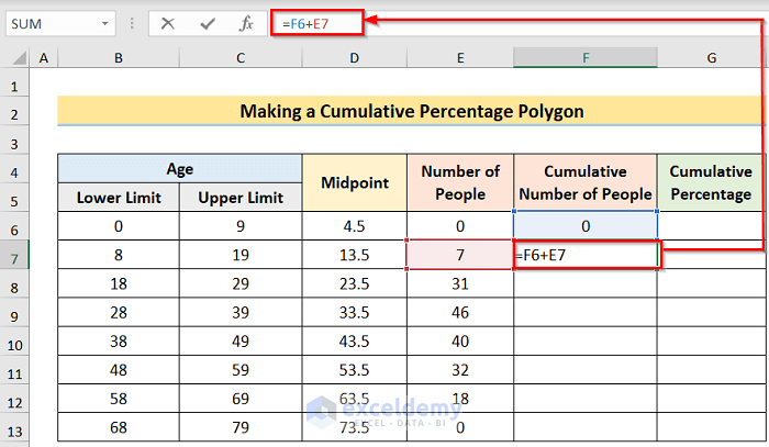
- In addition, after pressing the Enter button, you will get the result for the cell and then use the Fill Handle to apply the formula to all the desired cells.
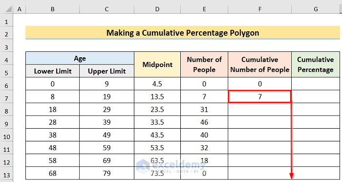
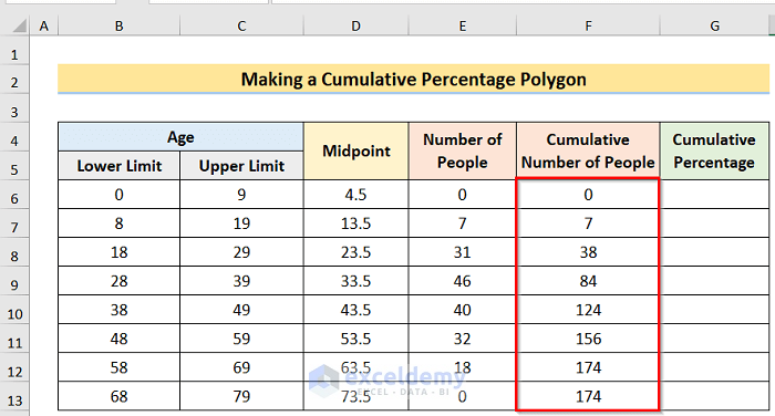
- Furthermore, you will get the desired result.
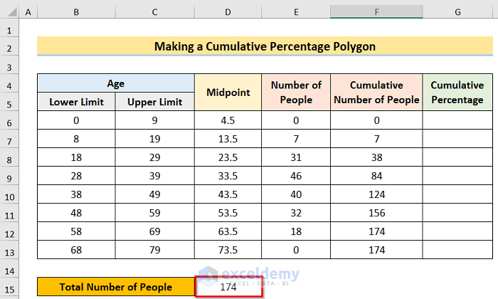
- Afterward, in the D15 cell insert the following formula.
=SUM(E6:E13)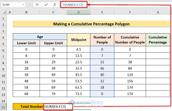
- Moreover, you will get the desired result.
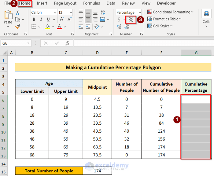
- Then, select the whole column and go to the Home tab, and in the Number Format section select the Percentage option.
- Next, in the G6 cell insert the following formula.
=F6/$D$15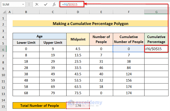
- Now, after pressing the Enter button, you will get the result for the cell and then use the Fill Handle to apply the formula to all the desired cells.
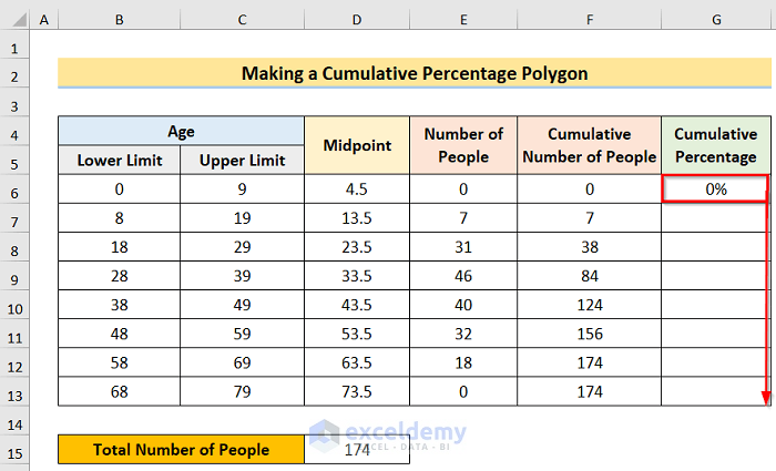
- Finally, you will get the desired result.
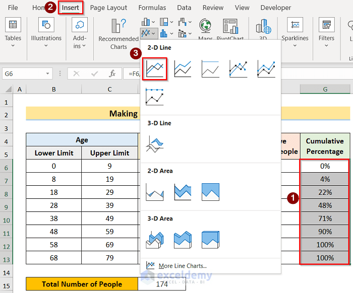
Step 4: Creating Cumulative Percentage Polygon
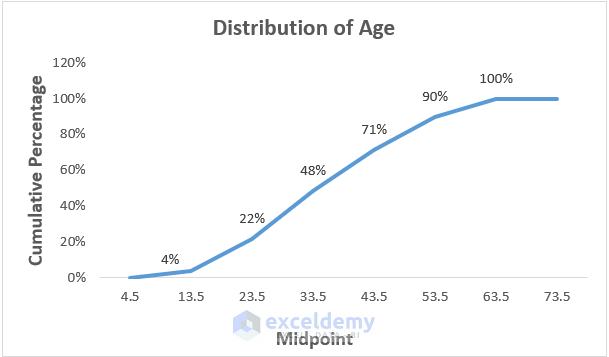
In this case, our goal is to create a cumulative percentage polygon in Excel. It represents the data in terms of percentages and helps determine the appearance of the distribution. We can do this by following the below steps.
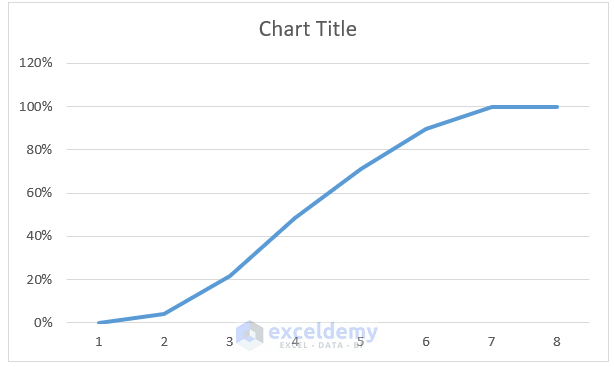
- Firstly, select the desired column > Insert > 2-D Line options.
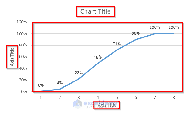
- Secondly, you will get the desired result.
Read More: How to Make a Cumulative Distribution Graph in Excel
Step 5: Labeling Axes of the Polygon
In this case, we want to label the chart properly to present the data without confusion. The steps of this process are.
- To begin with, go to Chart Elements > Axis Titles > Data Labels options to mark the chart properly.
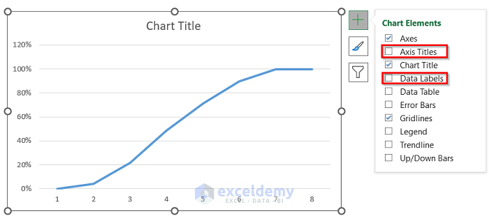
- Next, you will get the desired result.
- Furthermore, right-click on the chart and select the Select Data option.
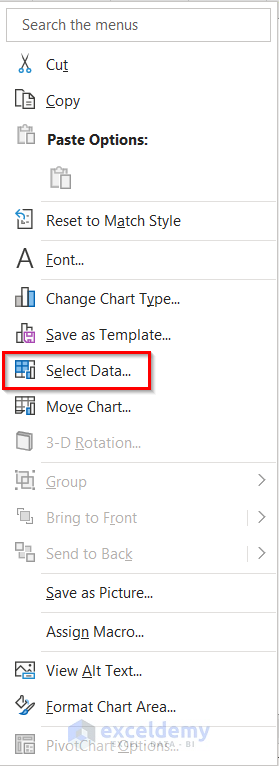
- However, the Select Data dialog box will come on the screen. In the Edit section, make the desired changes.
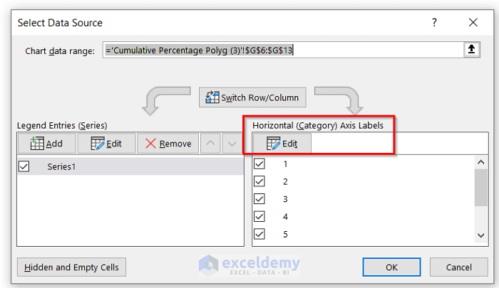
- Moreover, the Axis Labels dialog box will come on the screen after selecting Edit Choose the desired column in the Axis Label Range section and press OK.

- Lastly, you will get the desired result.
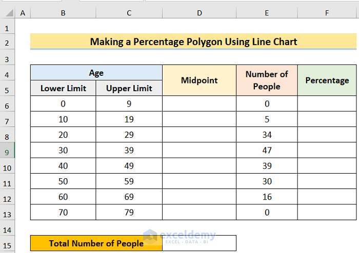
How to Make Percentage Polygon Using Line Chart in Excel
Excel has a powerful graphing feature that can add visual depth and clarity to even the most mundane datasets. For instance, you may need to make a percentage polygon, which is where Microsoft Excel excels! In this article, we’ll demonstrate 2 handy ways to create a percentage polygon in Excel. The steps of this method are as follows.
Steps:
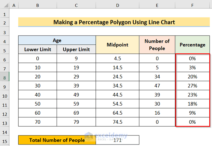
- First, arrange a dataset like the below image.
- Second, in the D6 cell insert the following formula.
=SUM(B6:C6)/2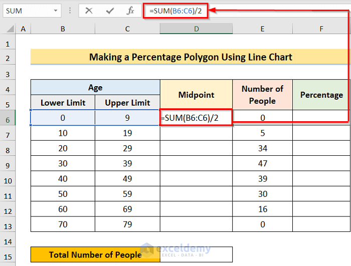
- Third, after pressing the Enter button, you will get the result for the cell and then use the Fill Handle to apply the formula to all the desired cells.
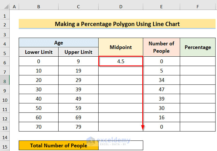
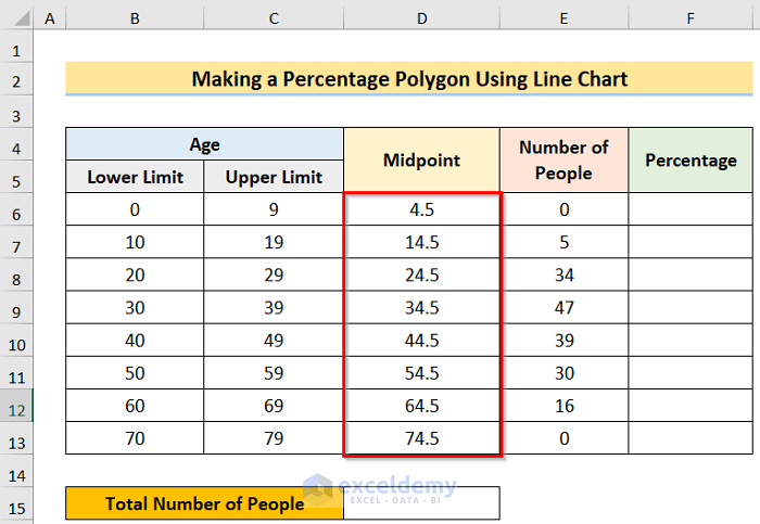
- Forth, you will get the desired result.
- Fifth, in the D15 cell, insert the following formula.
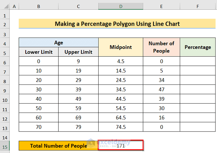
=SUM(E6:E13)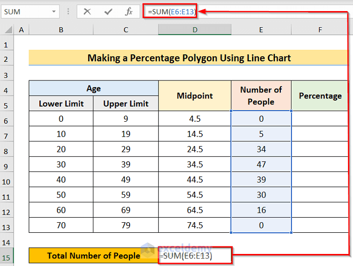
- Sixth, you will get the desired result.
- Seventh, in the F6 cell, insert the following formula.
=E6/$D$15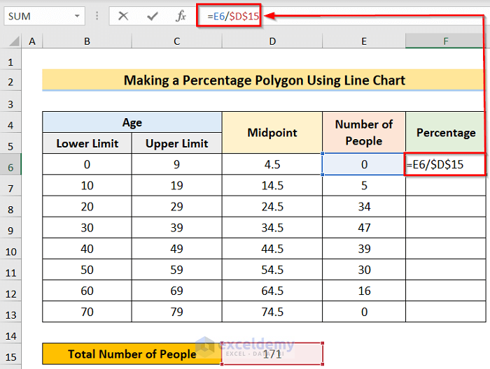
- Eighth, after pressing the Enter button, you will get the result for the cell and then use the Fill Handle to apply the formula to all the desired cells.
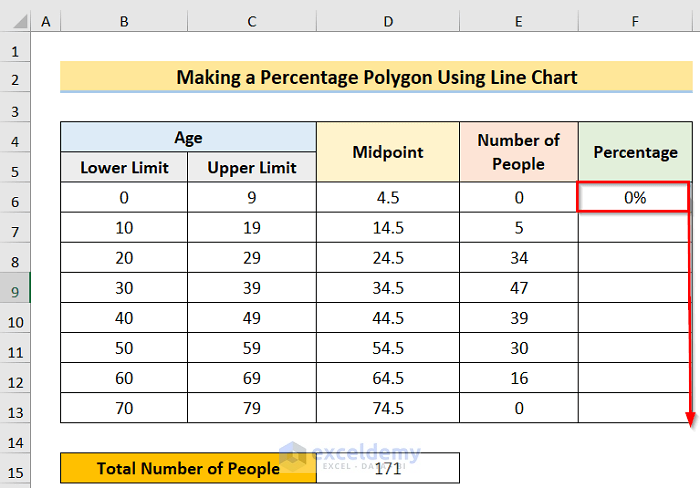
- Ninth, you will get the desired result.
- Tenth, select the desired column > Insert > Insert Line options.
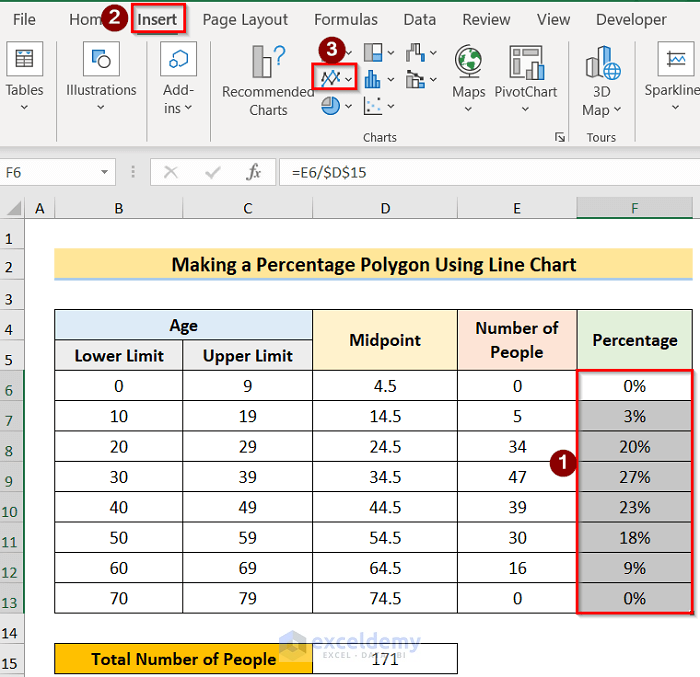
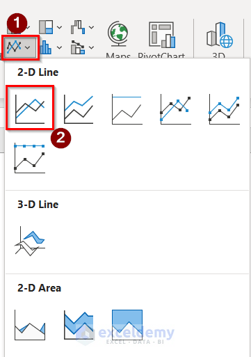
- Eleventh, select the Insert Line > 2-D Line options.
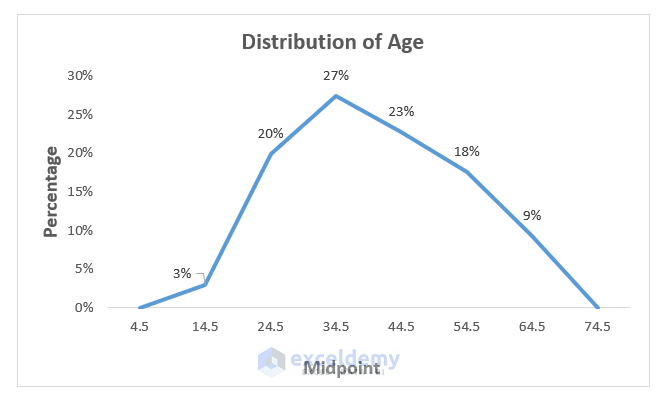
- Last, you will get the desired result.
Download Practice Workbook
You can download the practice workbook from here.
Conclusion
Henceforth, follow the above-described methods. Hopefully, these methods will help you to make a cumulative percentage polygon in Excel. We will be glad to know if you can execute the task in any other way. Please feel free to add comments, suggestions, or questions in the section below if you have any confusion or face any problems. We will try our best to solve the problem or work with your suggestions.
Related Articles
- How to Make a t-Distribution Graph in Excel
- How to Create Grade Distribution Chart in Excel
- How to Create Gaussian Distribution Chart in Excel
- Stem and Leaf Plot in Excel: A Robust Tool to Visualize Data
- Back to Back Stem and Leaf Plot Excel
<< Go Back to Excel Distribution Chart | Excel Charts | Learn Excel
Get FREE Advanced Excel Exercises with Solutions!
