Example 1 – Insert a Pie Chart for Grade Distribution
Steps:
- Insert a column named “Grades”.
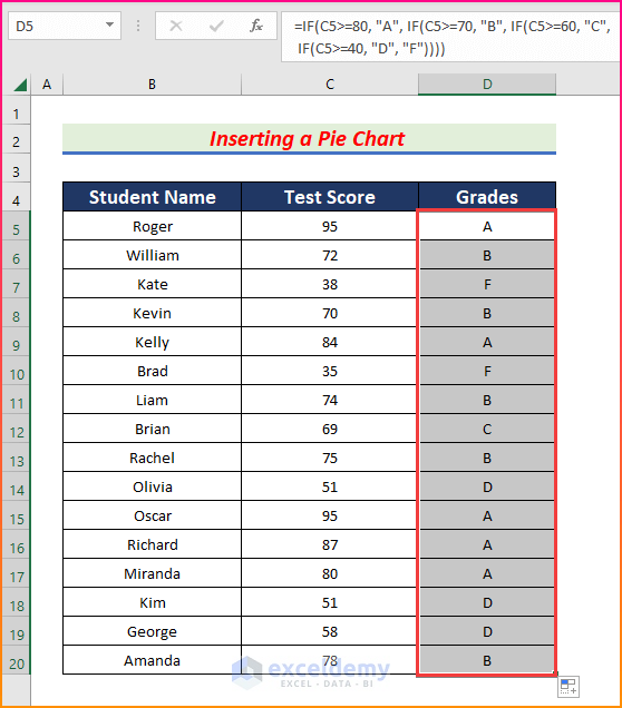
- To find out the grade, select cell D5 and enter the following formula and press Enter.
=IF(C5>=80, "A", IF(C5>=70, "B", IF(C5>=60, "C",IF(C5>=40, "D", "F"))))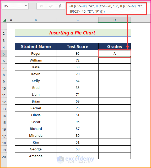
- AutoFill formula to the rest of column D.
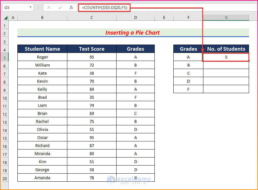
- Add two more columns named “Grades” and “ of Students”.
- Select cell G5 and enter the following formula using the COUNTIF function.
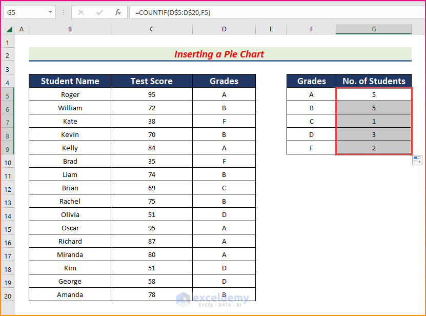
=COUNTIF(D$5:D$20,F5)- Press Enter to get the students who got an A.
- AutoFill formula to the rest of the cells in column G.
- Insert a pie chart. Select all the data from column F to column G and from the Insert tab, go to,
Insert → Charts → Insert Pie or Doughnut Chart → Pie
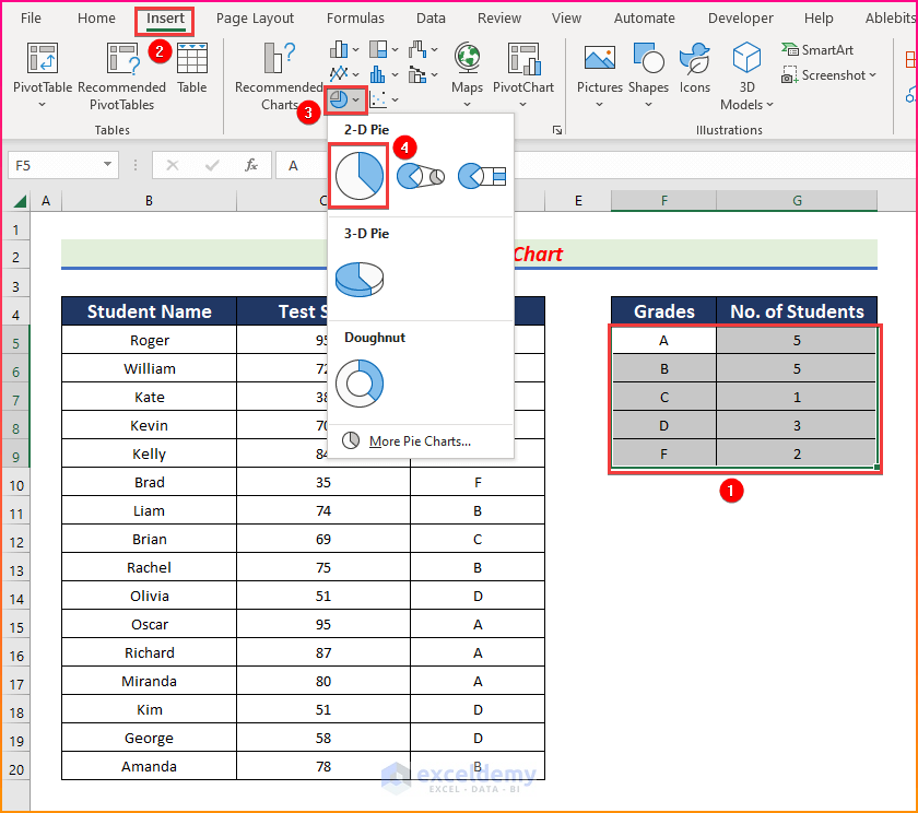
- The pie chart will be created.
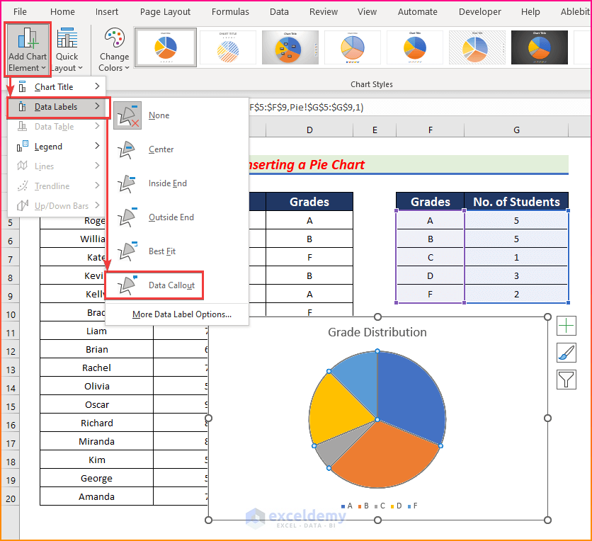
- Double-click on the chart title and edit it as needed.
- Click on the chart and from the Chart Design tab, go to,
Chart Design → Add Chart Element → Data Labels → Data Callout
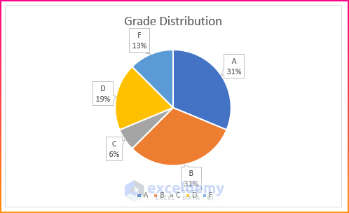
- You will get the grade distribution chart with proper formatting.
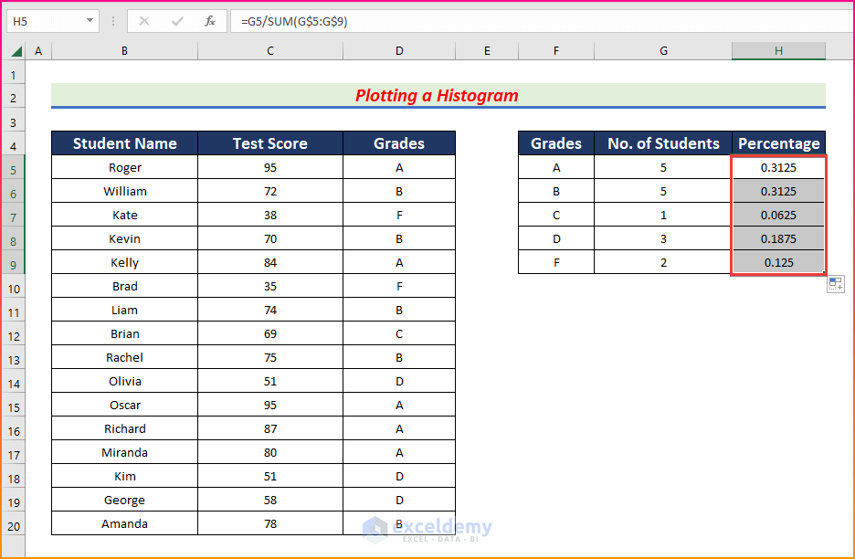
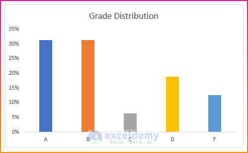
Example 2 – Plot a Histogram for Grade Distribution
Steps:
- Determine the number of students who got an A, B, and other grades.
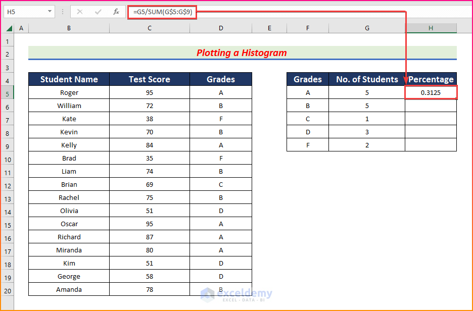
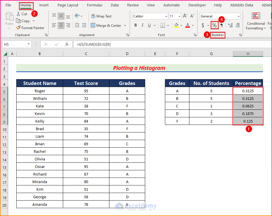
- Insert a column named “Percentage” and enter the following formula in cell H5.
=G5/SUM(G$5:G$9)- Press Enter.
- AutoFill formula to the rest of column H.
- To convert the column H data into a percentage, select cells H5 to H9 and from the Home tab, go to,
Home → Number → Percentage
- Once the values are converted into percentages, select the Grades column and select the Percentage column while holding the Ctrl
- Click on the Insert tab and go to,
Insert → Charts → Insert Column or Bar Chart → Clustered Column
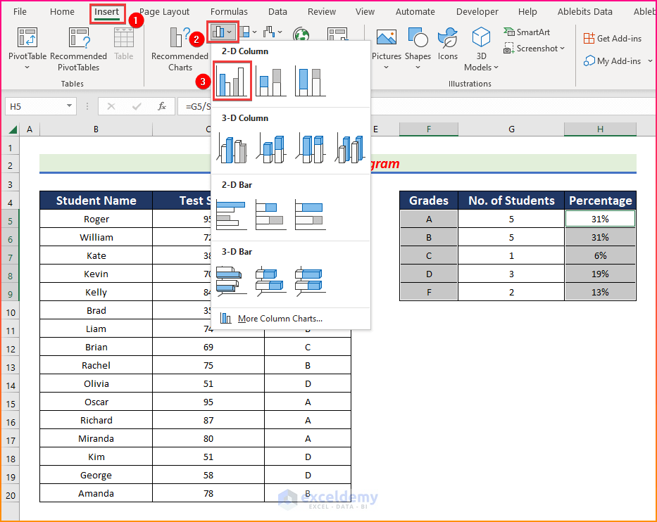
- The histogram will be created. Double-click on any of the bars to open the Format Data Point panel.
- Click on Fill & Line and check the box of Vary colors by point.
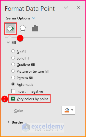
- The bars will have different colors.
Notes
- Don’t forget to give proper cell references or you won’t get the desired results.
Download Practice Workbook
Related Articles
- How to Make a Cumulative Distribution Graph in Excel
- How to Make a t-Distribution Graph in Excel
- How to Make Cumulative Percentage Polygon in Excel
- How to Create a Percentage Polygon in Excel
- How to Create Gaussian Distribution Chart in Excel
- Stem and Leaf Plot in Excel: A Robust Tool to Visualize Data
<< Go Back to Excel Distribution Chart | Excel Charts | Learn Excel
Get FREE Advanced Excel Exercises with Solutions!
