This article illustrates how to make a t-distribution graph in Excel. Distribution in statistics deals with the relationships between observations and their probabilities. There are various types of distributions in statistics. The t-distribution, also known as the student’s t-distribution, is similar to the normal distribution except with heavier tails. There is a greater possibility for a few students in a classroom to make very high or low scores. The t-distribution is used in such a scenario. Follow this article to make a t-distribution graph in Excel.
What Is t-Distribution?
Distribution in statistics deals with the relationships between observations and their probabilities. There are various types of distributions in statistics. The t-distribution, also known as the student’s t-distribution, is similar to the normal distribution except with heavier tails. It is usually used for hypothesis testing of small sample datasets. There is a greater possibility for a few students in a classroom to make very high or low scores. The t-distribution is used in such a scenario.
How to Make a t-Distribution Graph in Excel: Easy Steps
Follow the steps below to create a t-distribution graph in Excel.
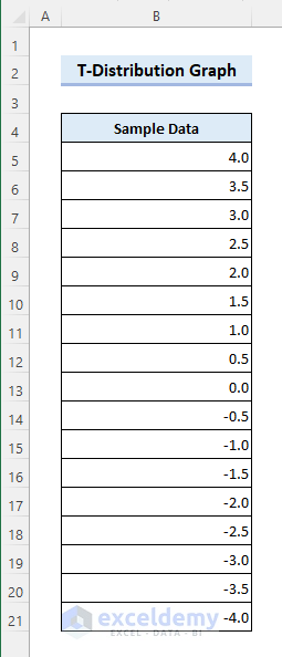
📌 Step 1: Organize Data
- You need to organize your dataset properly to make a proper t-distribution graph in Excel. Here we will create a dataset for the purpose of illustration.
- At first, enter 4 and 5 in cells B5 and B6 respectively. Then select those cells.

- Now drag the Fill Handle icon to cell B21. After that, you will get the following result.
📌 Step 2: Generate t-Distribution
- Next, enter the following formula in cell C5. Then, drag the Fill Handle icon to cell C21. After that, you will see the following result. Here the T.DIST function returns the left-tailed t-distribution.
=T.DIST(B5,30,FALSE)
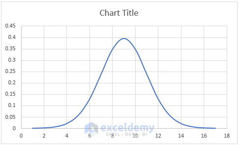
📌 Step 3: Insert t-Distribution Graph
- Now select the range C5:C21. Then choose Insert Scatter (X, Y) or Bubble Chart >> Scatter >> Scatter with Smooth Lines from the Insert tab.

- After that, you will get the following result.
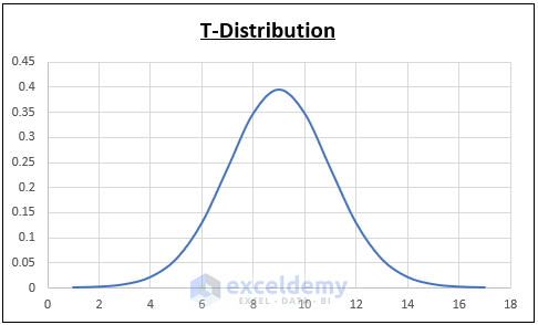
📌 Step 4: Edit Chart Title
- Now click on the Chart Title to rename it as required.
📌 Step 5: Change Chart Type
- Next, right-click on the chart and click on Change Chart Type.

- Then choose the Clustered Column chart type and click OK.

- After that, you will get the following result.
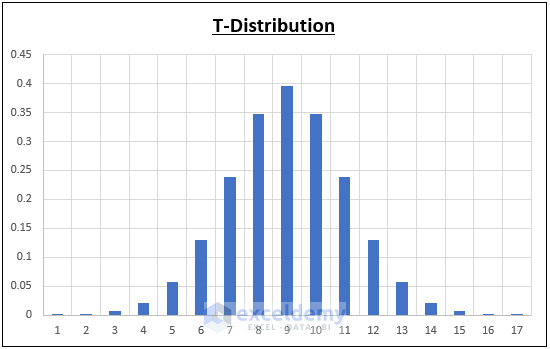
📌 Step 6: Finalize t-Distribution Graph
- Now click on the graph to access the Format Then click on Curve in the Insert Shapes group.

- Next, click on the top of all columns to create a smooth curve and press Enter at the end. After that, the final graph will look as follows.

Things to Remember
- The t-distribution should be used for a smaller number (<30) of sample datasets with unknown standard deviation.
- You should use the normal distribution instead for accuracy in case of larger datasets and known standard deviations.
Download Practice Workbook
You can download the practice workbook from the download button below.
Conclusion
Now you know how to make a t-distribution graph in Excel. Do you have any further queries or suggestions? Please let us know using the comment section below. Stay with us and keep learning.
Related Articles
- How to Make a Cumulative Distribution Graph in Excel
- How to Make Cumulative Percentage Polygon in Excel
- How to Create a Percentage Polygon in Excel
- How to Create Grade Distribution Chart in Excel
- How to Create Gaussian Distribution Chart in Excel
- Stem and Leaf Plot in Excel: A Robust Tool to Visualize Data
- Back to Back Stem and Leaf Plot Excel
<< Go Back to Excel Distribution Chart | Excel Charts | Learn Excel
Get FREE Advanced Excel Exercises with Solutions!
