Probability distribution is in general a representation of the frequency distribution of a specific data series. It illustrates the possibility of certain trials under specific conditions among the variable values. The basic rule of the probability distribution is the higher the probability of a value, the higher the frequency, and vice versa.
Probability distribution can be shown with or without a graph based on the function used. It is a very useful Excel feature to project population, performance, climatic forecast, business proposition etc.
There are 2 basic types of probability distribution, which can be sub-divided as follows:
1. Discrete Probability Distribution
-
- Binomial
- Discrete Uniform
- Poisson
2. Continuous Probability Distribution
-
- Normal
- Continuous Uniform
- Log-Normal
- Exponential
Here we will discuss the Binomial and Normal Probability Distribution Graphs in Excel.
Example 1 – Normal Probability Distribution Graph
The normal probability distribution graph, also known as the bell curve, is a method to find the value distribution of a dataset. This function depends entirely on the mean and standard deviation values received from the dataset. Let’s create a normal distribution graph in Excel.
STEPS:
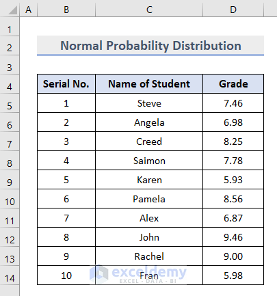
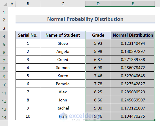
- Prepare a dataset containing the information of 10 students’ names and their grades.
- Insert the AVERAGE function in cell E5 as below, and press Enter.
=AVERAGE(D5:D14)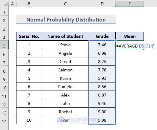
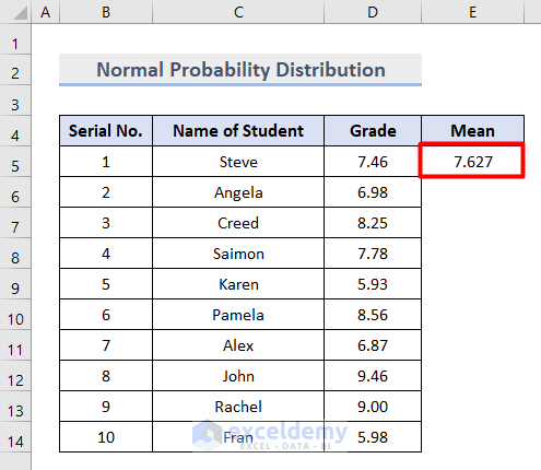
The average value of the grades in cells D5:D14 is returned.
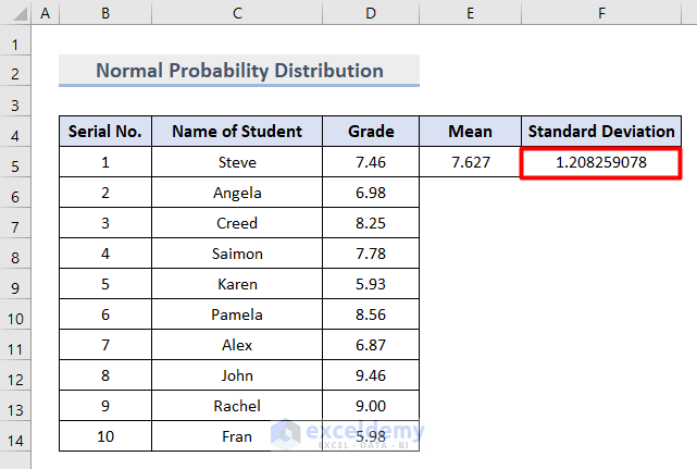
- Insert the STANDARD DEVIATION function in cell F5 as follows:
=STDEV.S(D5:D14)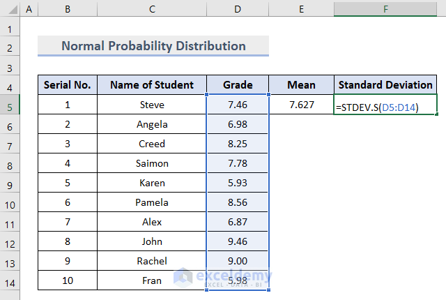
The standard deviation value, which represents the deviation from the mean value we calculated earlier, is returned.
- Insert the NORMAL DISTRIBUTION function in cell G5:
=NORM.DIST(D5,$E$5,$F$5,FALSE)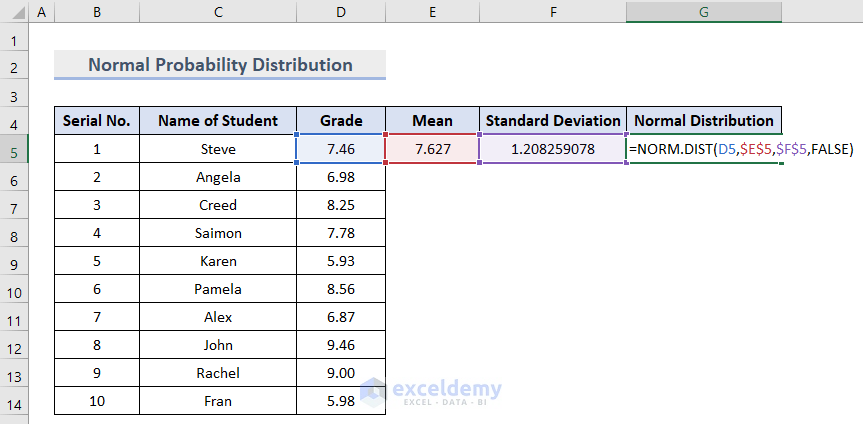
- Copy the same formula to cells G6:G14 by dragging down the Fill Handle at the corner of cell G5.
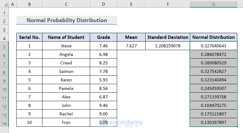
Our complete dataset to create the normal probability distribution graph is ready.
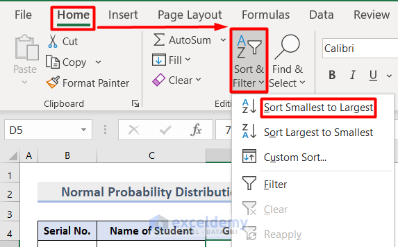
- Sort the Grade and Normal Distribution values from smallest to largest, using the Sort & Filter section in the Home tab.
- Select the values of Grade and Normal Distribution columns as in the image below:
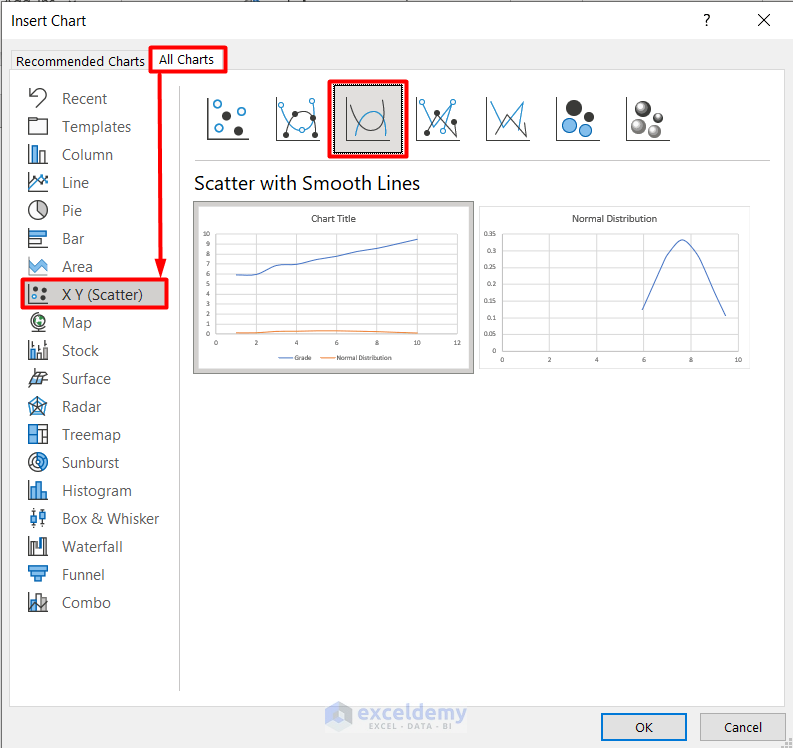
- Select Recommended Charts from the Charts section on the Insert tab.
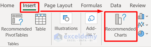
A window named Insert Chart pops up.
- Select any of the Scatter with Smooth Line options from the XY (Scatter) chart in the All Charts section.

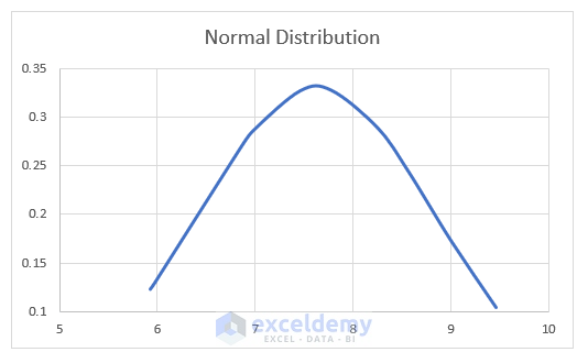
Our normal probability distribution graph is generated.
Read More: Plot Normal Distribution in Excel with Mean and Standard Deviation
Example 2 – Binomial Probability Distribution Graph
The binomial probability distribution graph is a statistical measure to calculate the probability of the number of successes from a specified number of trials.
STEPS:
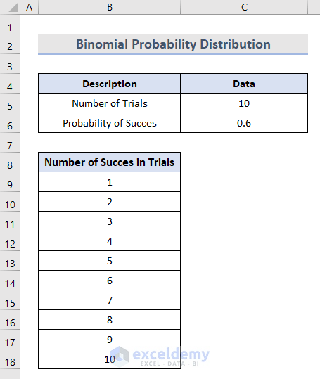
- Insert values for the Number of Trials and the Probability of Success in cells C5 and C6 respectively.
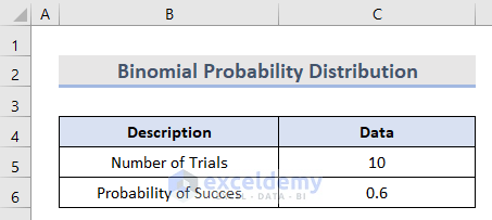
- Insert the value of each possible Number of Successes in cells B9:B18.
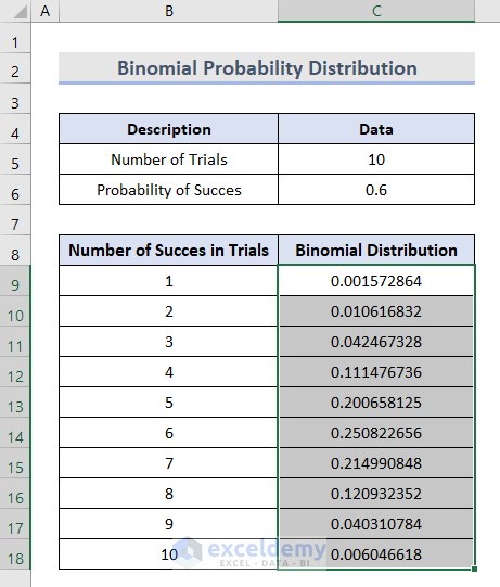
- In cell C9, use the BINOMIAL DISTRIBUTION function to calculate the binomial probability for the first number of successes:
=BINOM.DIST(B9,$C$5,$C$6,FALSE)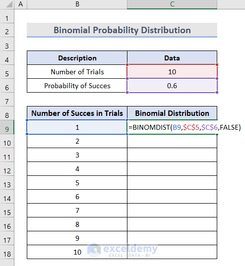
- Copy the same function in cells C10:C18 by dragging the Fill Handle at the corner of cell C9.
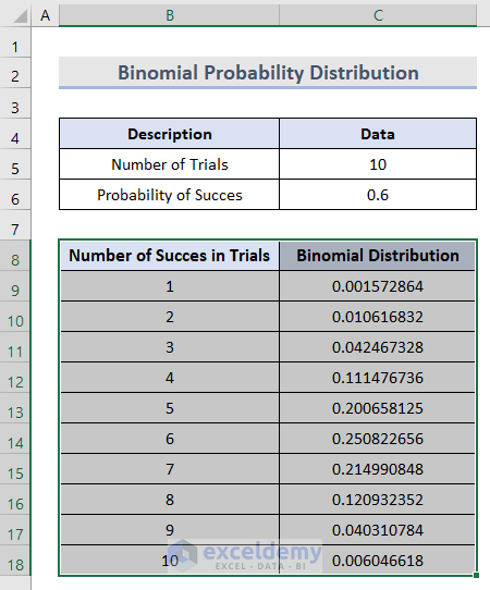
- Select cells B8:C18.
- Go to the Insert tab.
- Select the Recommended Charts option from the Charts section.

An Insert Chart window will open.
- Go to the All Charts section.
- Select any of the Scatter with Smooth Line options from the XY (Scatter) chart.
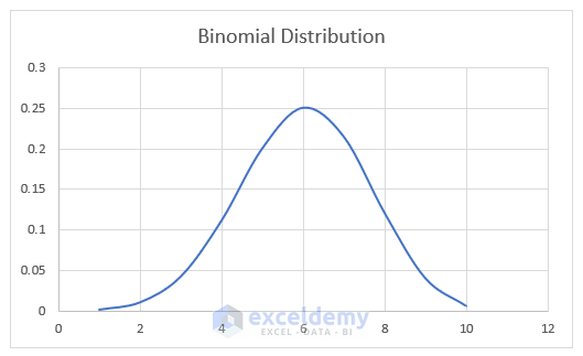
The graph based on binomial probability distribution is generated.
Things to Remember
- An error value #VALUE will return when the Mean or Standard Deviation is not in Number format in the Normal Distribution Graph.
- When the Standard Deviation ≤0, the NORM.DIST function will return a #NUM! error.
- Each trial in a Binomial Distribution gives only two possible outcomes.
- In Binomial Distribution, The probability of each outcome remains constant from trial to trial.
Download Workbook
Related Articles
- How to Plot Poisson Distribution in Excel
- How to Create a Distribution Chart in Excel
- How to Plot Weibull Distribution in Excel
- How to Plot Particle Size Distribution Curve in Excel
<< Go Back to Excel Distribution Chart | Excel Charts | Learn Excel
Get FREE Advanced Excel Exercises with Solutions!
