What Is a Bell Curve?
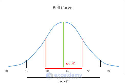
The Bell Curve, also known as the Normal Distribution Curve, is a graph that represents the distribution of a variable. We observe this distribution pattern frequently in nature. For example, when we analyze exam scores, we often find that most of the scores cluster around the middle.
Here are some key points about the Bell Curve:
- Peak Point (Mean):
- The peak point of the curve represents the mean (average) of the distribution.
- It indicates where the majority of values are concentrated.
- Symmetry:
- The curve is symmetric, with lower values on both sides of the peak.
- This symmetry reflects the balanced nature of the distribution.
- Probability and Extreme Values:
- The probability of extreme values (highest or lowest) is much lower.
- Most data points fall within a certain range around the mean.
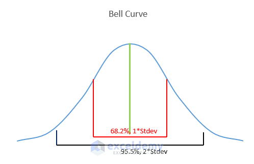
Features of the Bell Curve:
- Within One Standard Deviation:
- Approximately 68.2% of the distribution lies within one standard deviation of the mean.
- Within Two Standard Deviations:
- About 95.5% of the distribution falls within two standard deviations of the average.
- Within Three Standard Deviations:
- A vast majority (99.7%) of the distribution falls within three standard deviations of the mean.
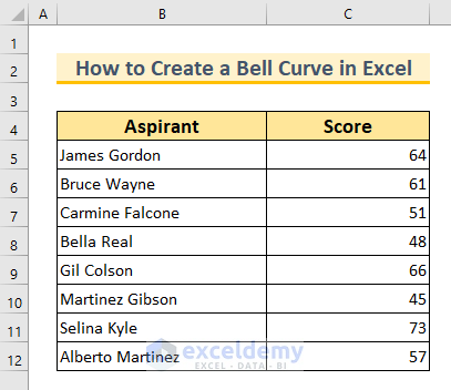
Dataset Overview
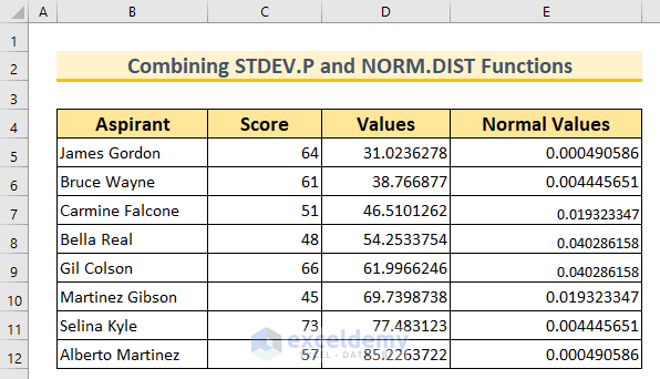
To demonstrate these concepts, let’s work with a dataset containing two columns: Aspirant and Score. This dataset represents the obtained scores of 8 students in a particular subject. We’ll use this dataset for the first method only.
Method 1- Create a Bell Curve in Excel with a Dataset
We’ll use the AVERAGE and STDEV.P functions to find the mean and standard deviation, and then create data points for our curve. We’ll use the NORM.DIST function to complete the curve.
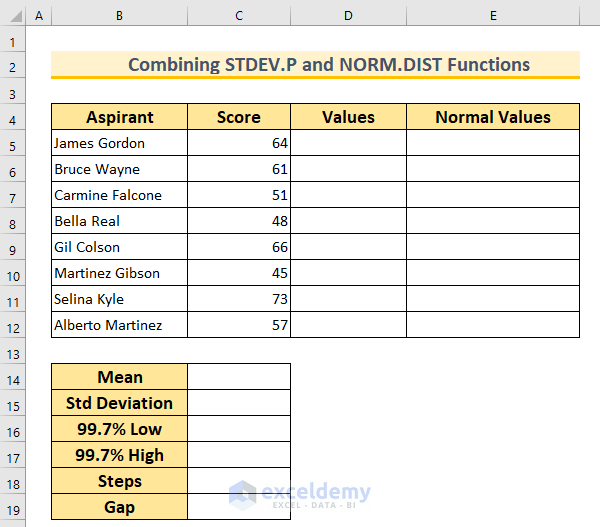
Steps:
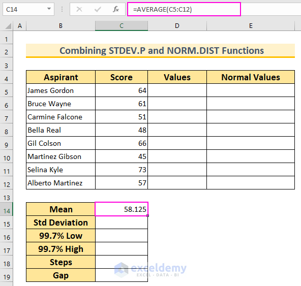
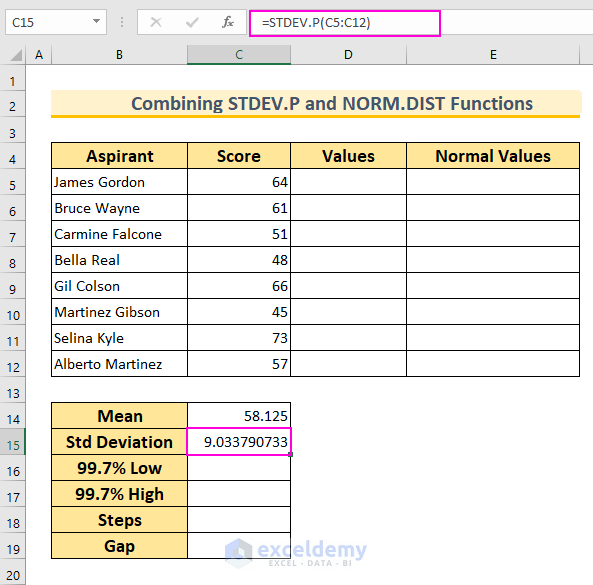
- Find the Mean (Average):
- In cell C14, insert the following formula and press Enter:
=AVERAGE(C5:C12)
-
- This function calculates the mean value for the cell range C5:C12.
- Find the Standard Deviation:
- In cell C15, insert the following formula and press Enter:
=STDEV.P(C5:C12)
-
- This function calculates the standard deviation for the same cell range.
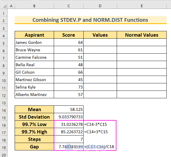
- Define the Range for the Bell Curve:
- Since 99.7% of values fall within 3 standard deviations, we’ll create a range around the mean.
- In cell C16, insert:
=C14-3*C15
-
- In cell C17, insert:
=C14+3*C15
-
- In cell C18, enter the value 7 (we want 8 values, so we subtract 1 from our desired count).
- Calculate the Interval:
- In cell C19, insert:
=(C17-C16)/C18
-
- This formula determines the interval between data points.
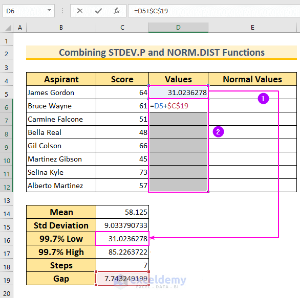
- Generate Data Points for the Bell Curve:
- Start with the first value from cell C16.
- Select the cell range D6:D12 and insert the formula:
=D5+$C$19
-
- Press Ctrl+Enter to autofill the formula for the selected cells.
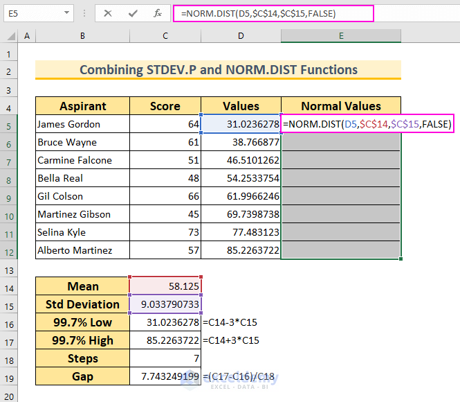
- Calculate Normal Distribution:
- In cell range E5:E12, insert:
=NORM.DIST(D5,$C$14,$C$15,FALSE)
-
- This formula returns the normal distribution for the given mean and standard deviation. We’ve set Cumulative to False to get the probability density function.
- Finalize the Dataset:
- Press Ctrl+Enter to complete the calculations.
- You’ve prepared your dataset to create a Bell Curve in Excel.
- Select Data Range:
- Select the cell range D5:E12.
- Insert Scatter Chart:
- Go to the Insert tab.
- Click on Scatter (X, Y) or Bubble Chart.
- Choose Scatter with Smooth Lines.
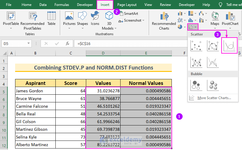
-
- This will give you the basic Bell Curve.
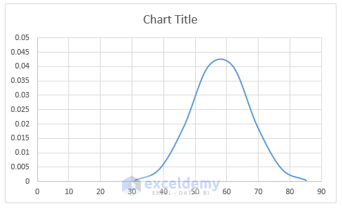
- Format the Bell Curve:
- Double-click on the Horizontal Axis to open the Format Axis dialog box.
- Set the bounds:
- Minimum: 30
- Maximum: 85
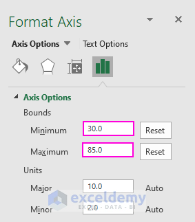
-
- Remove Gridlines and Vertical Axis by deselecting those options.
- Display Chart Elements by clicking on the plus sign.
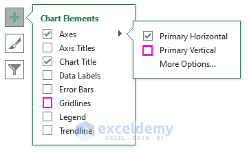
- Add Standard Deviation Lines:
- Add straight lines (using the Shape tool) to denote the standard deviation in the curve.
- Chart Title:
- Add a chart title to your curve.
- Mean Line:
- The green line signifies the mean of the data in the Bell Curve.
- Turn on Gridlines again to add these straight lines.
- Final Touches:
- Turn off the lines if needed.
Method 2 – Create a Bell Curve without a Dataset in Excel
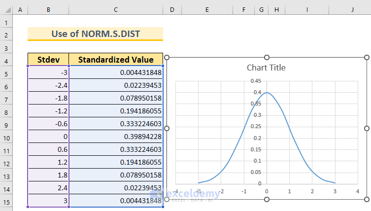
Let’s walk through the steps to create a Bell Curve in Excel without an existing dataset using the NORM.S.DIST function. We’ll consider a mean of 0 and a standard deviation of 1.
- Set Up the Columns:
- Create a dataset with two columns.
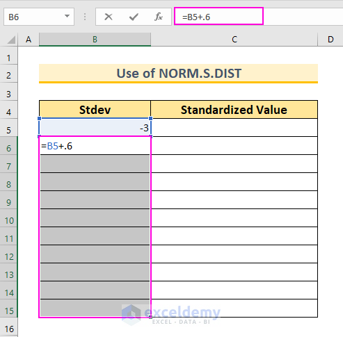
- In cell B5, insert the value -3. This represents 3 standard deviations below our mean (which is 0).
- Calculate Data Points:
- In cell B6, insert the following formula:
=B5+0.6
-
-
- This value represents an interval (you can adjust it as needed).
-
-
- Press Ctrl+Enter to autofill the formula for the selected cells (B6:B15).
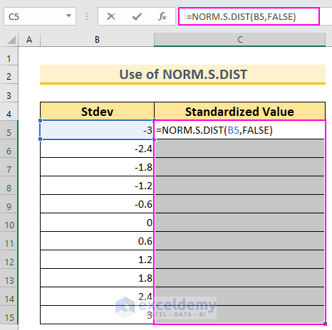
- Calculate Normal Distribution:
- In cell C5, insert the following formula:
=NORM.S.DIST(B5,FALSE)
-
-
- We use this function because we have a mean of 0 and a standard deviation of 1.
- The FALSE argument ensures that we get the probability mass function.
-
- Finalize the Bell Curve:
- As shown in the first method, create the Bell Curve using the data points in column B and the corresponding probabilities in column C.
Read More: How to Create a Skewed Bell Curve in Excel
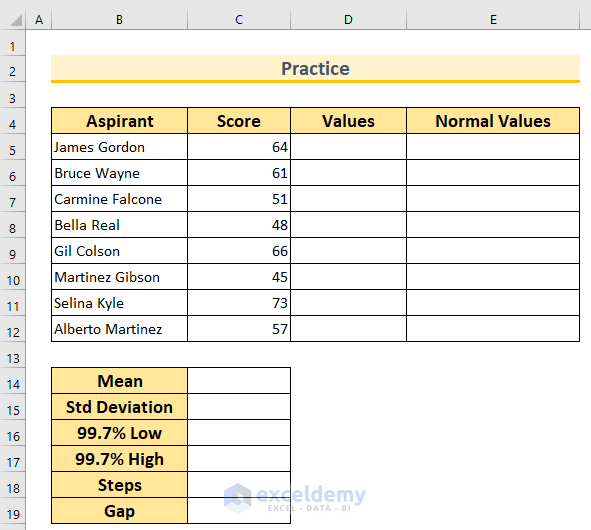
Practice Section
We’ve included a practice dataset for each method in the Excel file. This way, you can easily follow along with our methods.
Download Practice Workbook
You can download the practice workbook from here:
Related Articles
- How to Make Bell Curve in Excel for Performance Appraisal
- Create a Bell Curve with Mean and Standard Deviation in Excel
<< Go Back to Bell Curve in Excel | Excel for Statistics | Learn Excel
Get FREE Advanced Excel Exercises with Solutions!
