The Bell curve provides a quick visualization of a dataset summary. We can get a dataset’s mean, mode, and median using the Bell curve of a normal distribution. We can get an overall idea about the checkpoints that divide the dataset into multiple regions.
Download the Practice Workbook
You can download the workbook from here and practice yourself.
What Is a Bell Curve?
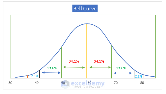
The Bell curve is a normal distribution graph with a rounded peak with two gradually declining ends. The Bell curve is an essential representation of a normal distribution. The data is distributed in multiple regions with fixed percentage values:
- 68.2% of the dataset falls within one standard deviation of the mean in the center.
- 95.5% of the dataset falls within two standard deviations of the mean in the center.
- 99.7% of the dataset lies within three standard deviations of the mean in the center.
 Let’s get a quick review of what mean and standard deviation refers to.
Mean: Mean is the mathematical average of two or more numbers. For example, we can get the mean price of multiple TVs by finding out the average of the TV prices.
Standard Deviation: Standard deviation is a quantity that is expressed by how much the members of a dataset differ from the mean value. This is a measurement of the dispersion of the dataset.
When Do We Need to Use Bell Curves?
We need to use the Bell curves to visualize the distribution of a dataset. This dataset can be the test scores of an exam. From the bell curve, we get an overall idea about the dispersion of the dataset with respect to the mean value.
How to Create a Bell Curve in Excel
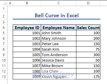
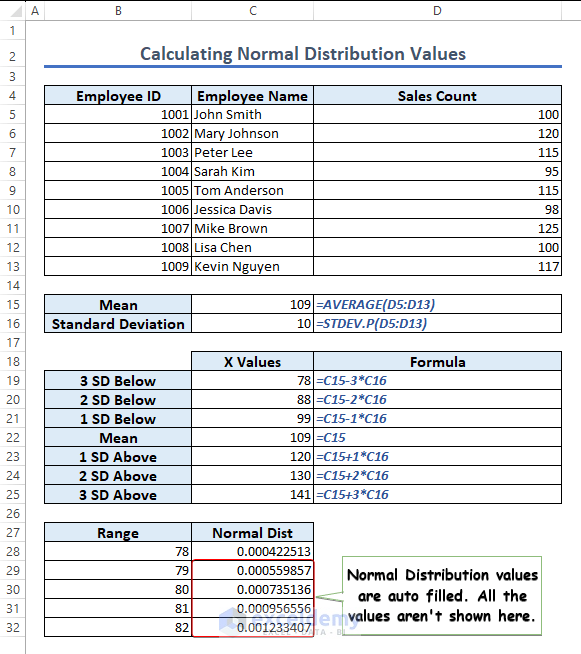
The following image contains the dataset on which we will work throughout this article.
Step 1 – Calculate the Mean
- Use the following formula in cell C15 and hit Enter.
=AVERAGE(D5:D13)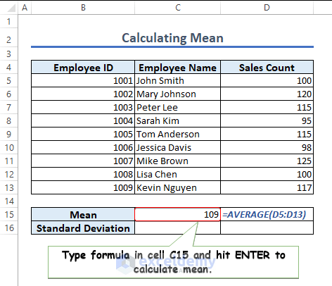
Step 2 – Calculate the Standard Deviation
- Use the following formula in cell C16 and press Enter.
=STDEV.P(D5:D13)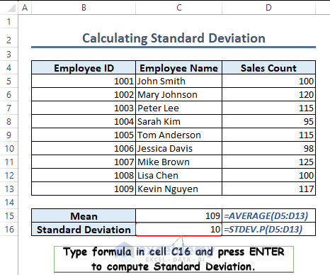
Step 3 – Compute Different SD Values
- Use the following formulas in cells C19, C20, C21, C22, C23, C24, and C25 to get the respective values.
=C15-3*C16=C15-2*C16=C15-1*C16=C15
=C15+1*C16=C15+2*C16=C15+3*C16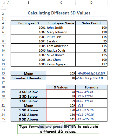
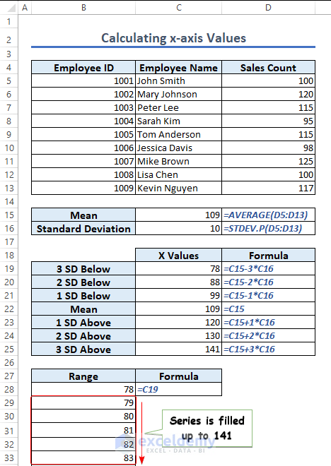
Step 4 – Calculate the X-axis Values of the Bell Curve
- The range is between 3 SD Below (78) and 3 SD Above (141).
- Use the following formula in cell B28 and hit Enter.
=C19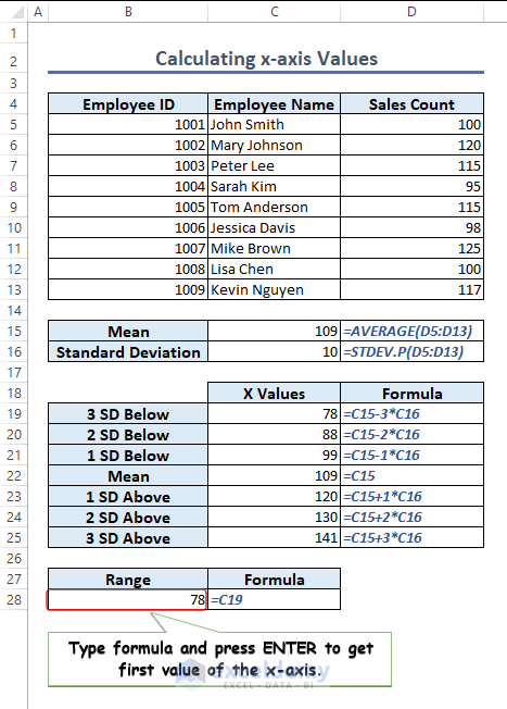
- Click on cell B28, go to Fill, and click on Series.
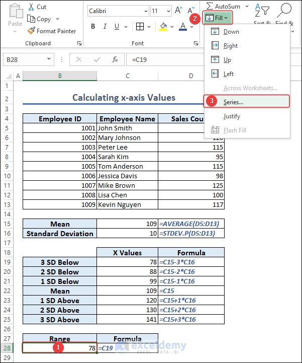
- Fill in the series fields as shown in the following image and click OK.
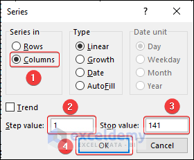
- The series will be filled up to 141.
Step 5 – Compute the Normal Distribution Values (Y-axis Values) of the Bell Curve
- Use the following formula in cell C28 and press Enter to get the normal distribution value of 78.
=NORM.DIST(B28,$C$15,$C$16,FALSE)=EXP(-((B28-$C$15)^2)/(2*$C$16^2))/($C$16*SQRT(2*PI()))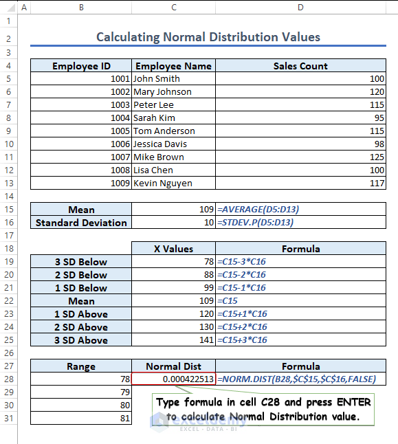
- Autofill the other normal distribution values.
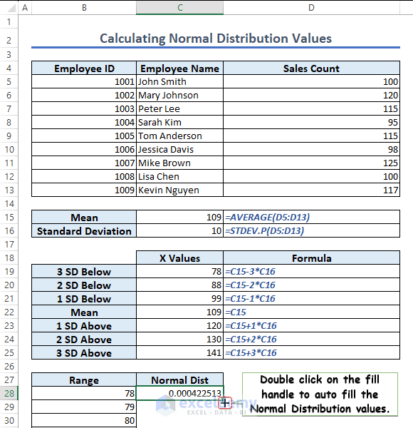
Normal distribution values are calculated and placed in the corresponding cells.
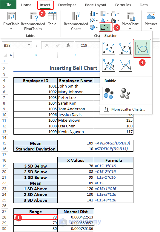
Step 6 – Insert the Chart of a Bell Curve
- Select cell B28.
- Navigate to Insert then choose Insert Scatter (X,Y) or Bubble Chart and pick Scatter with Smooth Lines.
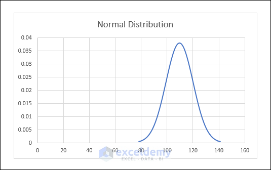
- We will get a Bell curve. This is also known as the normal distribution curve.
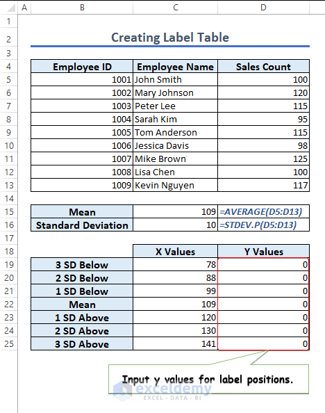
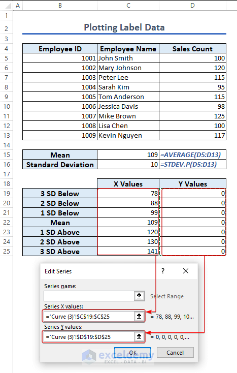
Step 7 – Create a Label Table for the Bell Curve
- We want to label different SD positions.
- Insert 0 in cells D19:D25 as the y-axis values of the labels.
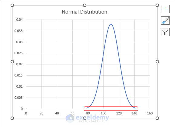
Step 8 – Plot the Label Data
- Right-click on the chart area and choose Select Data.
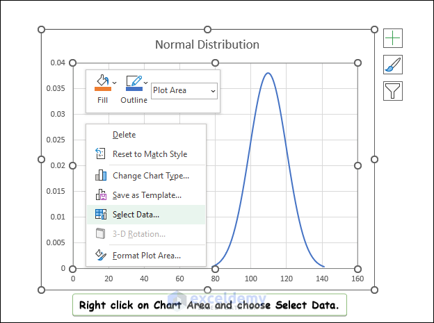
- Click on Add option to insert the data points.
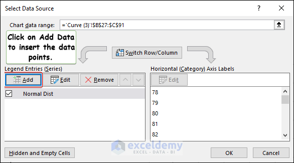
- An Edit Series window will pop up.
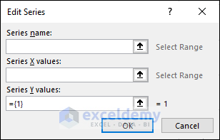
- Fill the fields in the window as shown in the following figure and click OK.
- We will see a line graph in the chart.
Step 9 – Change the Chart Type of the Label Series
- We need the data points representing different SD values.
- Right-click on the chart area and select Change Chart Type.
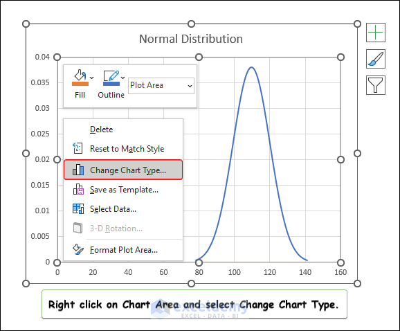
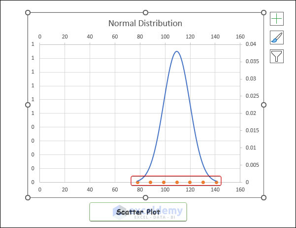
- Go to Combo, click on the drop-down against Series2, click on Scatter, and click OK.
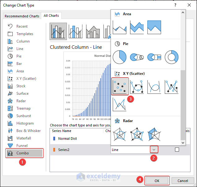
- We will get a scatter plot.
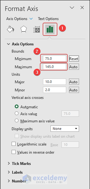
Step 10 – Set the Horizontal Axis Scale
- Right-click on the horizontal axis and select Format Axis.
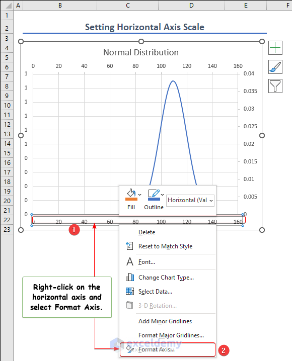
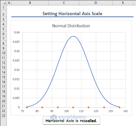
- In the format axis window, fill the data as shown in the following image. This will depend on the dataset.
- The graph will be rescaled accordingly.
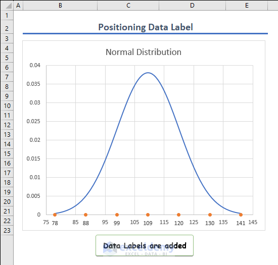
Step 11 – Positioning the Data Labels
- Select any data point of the scatter plot, click on Chart Elements, go to Data Labels, and click on More Options.
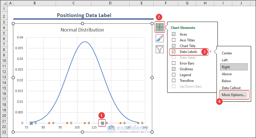
- The Format Data Labels window will appear.
- Select the options as shown in the following image.
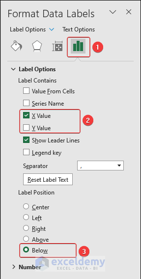
- The data labels will be added to the chart.
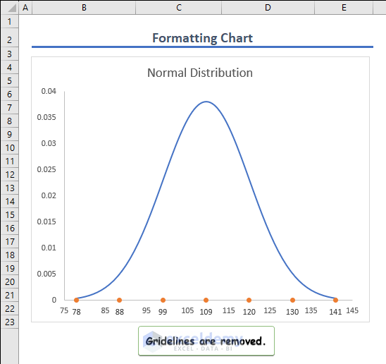
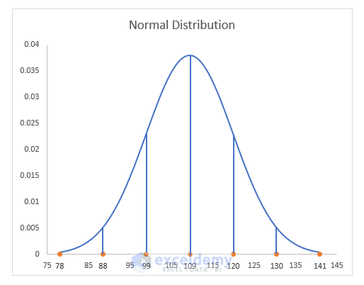
Step 12 – Format the Bell Curve
- Click on Chart Elements and uncheck Gridlines.
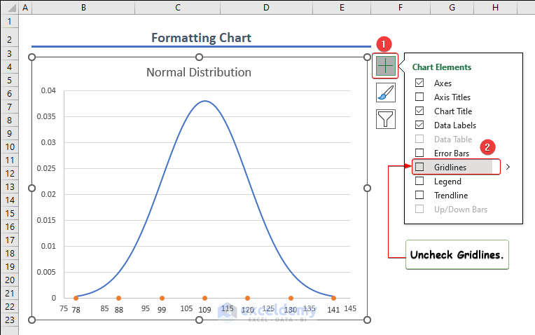
- The gridlines will be removed from the chart.
- Click on the chart area, go to Insert, then to Shapes and Line, and select a line.
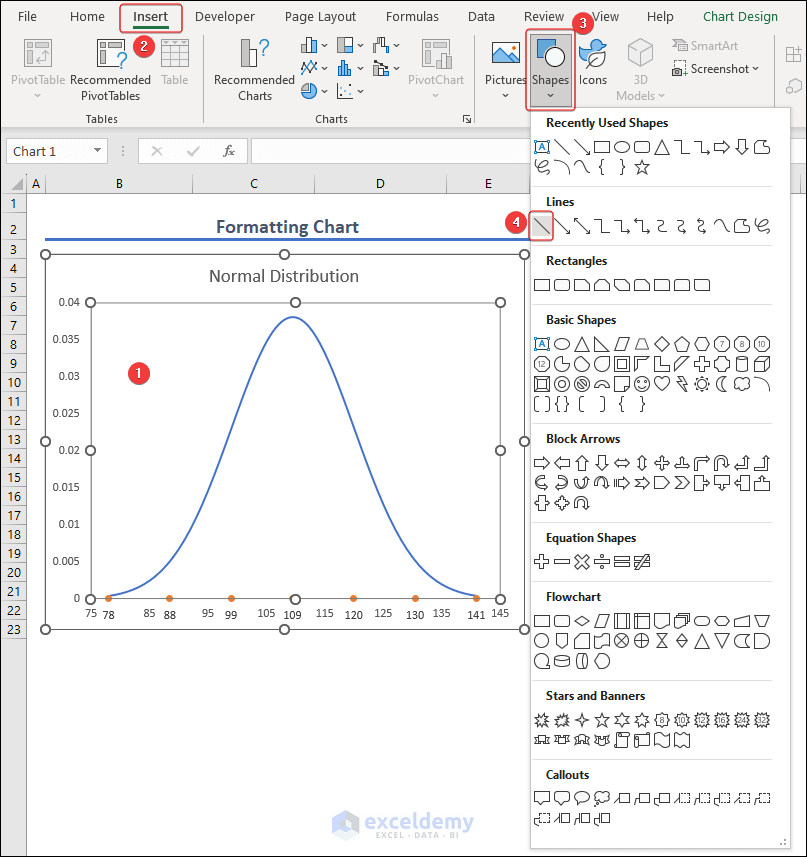
- Place the lines on data labels and adjust the length by dragging the lines while pressing and holding the Shift key.
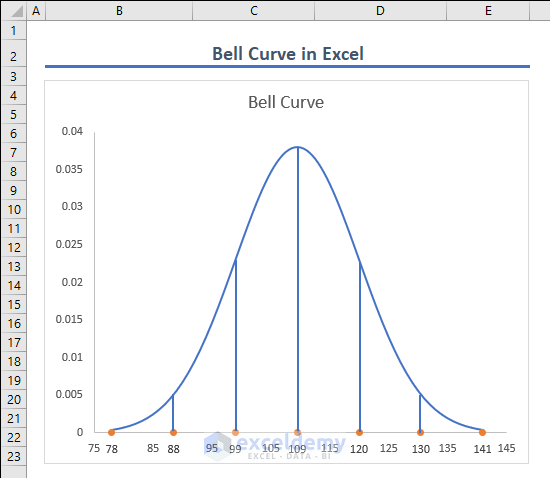
- Our Bell curve or normal distribution curve will look like the following image.
Things to Remember
- The dataset should follow a normal distribution.
- Use the NORM.DIST function properly.
- Make the mean and standard deviation absolute references.
Frequently Asked Questions
How can I generate a Bell curve in Excel without Data Analysis tool?
You can generate a Bell curve in Excel without a Data Analysis tool. In this regard, you need to calculate the mean and standard deviation and the normal distribution values using formulas. Then you can insert a chart to plot a Bell curve.
Can I customize the appearance of the bell curve in Excel?
Yes, you can customize the appearance of the bell curve in Excel. You can apply available regular chart customization.
Can I use the Bell curve in Excel to identify outliers or anomalies in my data?
Yes, the Bell curve in Excel helps to spot outliers or anomalies in your data.
Bell Curve in Excel: Knowledge Hub
- Create a Bell Curve in Excel
- Create a Skewed Bell Curve
- Bell Curve with Mean and Standard Deviation
- Bell Curve for Performance Appraisal
<< Go Back to Excel for Statistics | Learn Excel
Get FREE Advanced Excel Exercises with Solutions!
