What Is a Bell Curve?
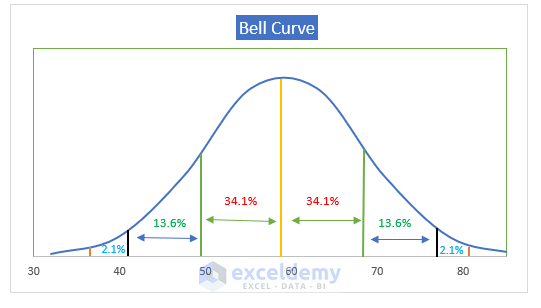
The bell curve, also known as the normal distribution curve, illustrates the typical spread of a variable. It’s a common sight, seen in various aspects of our lives. For instance, when we examine exam scores, we often notice that most scores cluster around the middle. The peak of this curve represents the average score, with diminishing numbers towards both ends. This pattern indicates that extreme values, whether high or low, are less probable.
Key Features of the Bell Curve:
- Within one standard deviation of the mean, approximately 68.2% of the distribution lies.
- Moreover, around 95.5% of the distribution falls within two standard deviations of the mean.
- Finally, a staggering 99.7% of the distribution is contained within three standard deviations of the mean.
What Is Mean and Standard Deviation?
Mean
The mean, or average, of a dataset represents its central tendency. It signifies an equal distribution of values across the dataset, serving as a measure of the probability distribution’s midpoint in statistics.
Standard Deviation
In statistics, standard deviation measures the dispersion or spread of values in a dataset. A low standard deviation indicates values closely clustered around the mean, while a high standard deviation suggests a wider range of distribution.
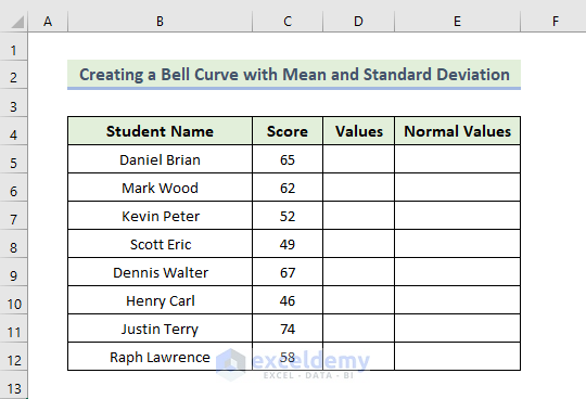
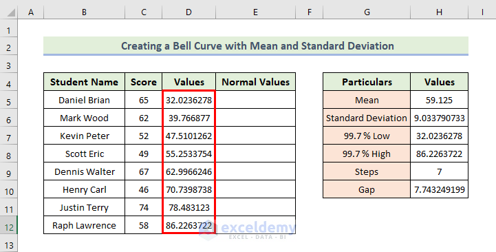
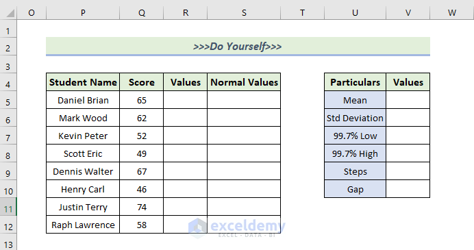
Step 1 – Creating a Dataset in Excel
Here, we have created the basic outlines of creating a bell curve with mean and standard deviation in Excel.
- Creating a Dataset in Excel
- Set up your dataset with columns for Student Name and Score.
- Add two additional columns: Values and Normal Values.
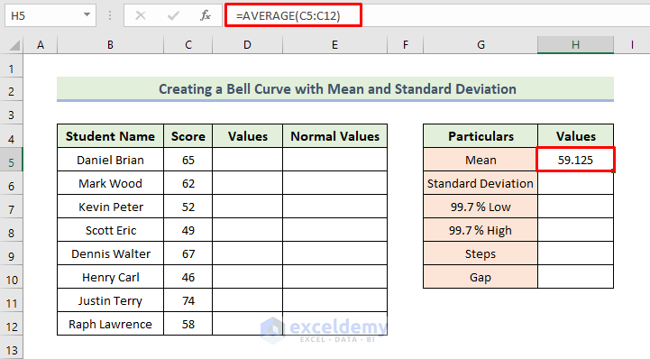
Step 2 – Calculating the Mean (Average)
- In cell H5, enter the formula:
=AVERAGE(C5:C12)
- This will give you the mean value for the range of cells C5:C12.
- Press Enter.
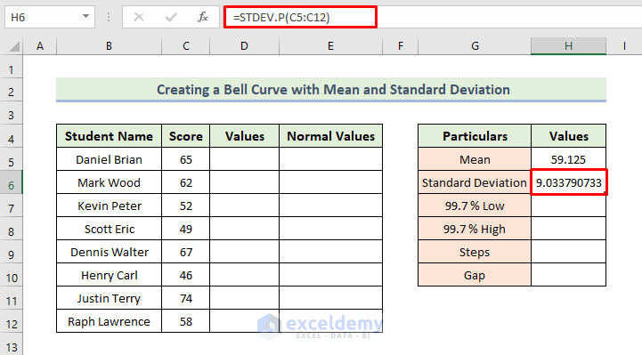
Step 3 – Calculating the Standard Deviation
- In cell H6, enter the formula:
=STDEV.P(C5:C12)
- This calculates the standard deviation for the same range of cells.
- Press Enter.
Step 4 – Calculating Normal Values
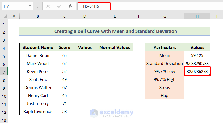
- To find the value corresponding to 99.7% Low:
=H5-3*H6
Here, cell H6 is the standard deviation of the dataset.
- Press Enter.
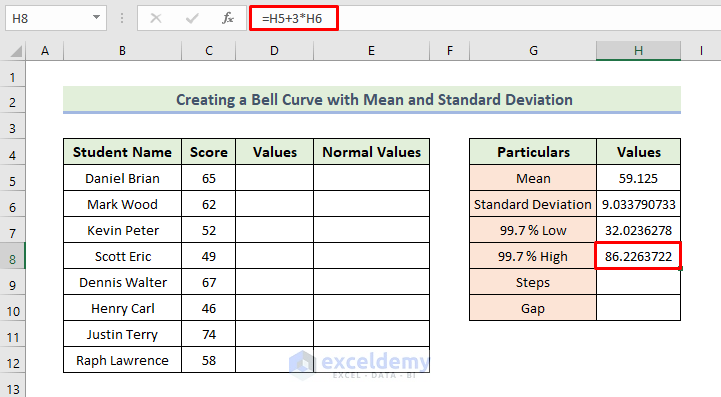
- To find the value corresponding to 99.7% High:
=H5+3*H6
Here, cell H6 is the standard deviation of the dataset.
- Press Enter.
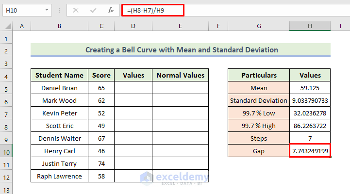
- Put 7 in cell H9 (since we want 8 values).
- Calculate the gap:
=(H8-H7)/H9
- Press Enter.
- Adding Values to the Dataset:
- Start with the first value from cell H7.
- In cell D6, enter the formula:
=D5+$H$10
- Press Enter.
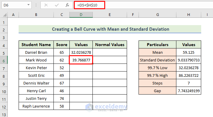
- Drag the Fill Handle to populate the Values column.
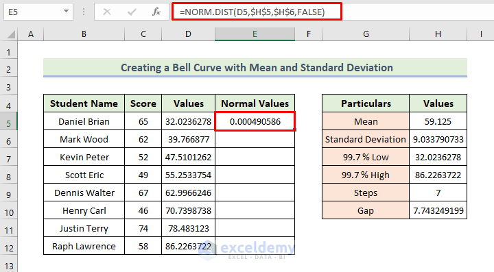
- Determining Normal Values:
- In cell E5, enter the formula:
=NORM.DIST(D5,$H$5,$H$6,FALSE)
-
- This gives you the normal distribution values.
- These values are set in the code.
- We have set cumulative to False to ensure we will get the ‘probability density function’.
- Then, press Enter.
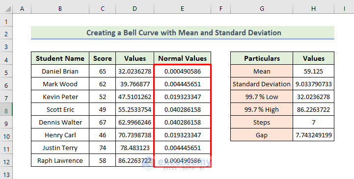
- Drag the Fill Handle icon to get the Normal Values column.
Step 5 – Creating Bell Curve with the Mean and Standard Deviation in Excel
Now, we are going to create the bell curve. We have to follow the following process:
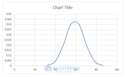
- Highlight the cells from D5 to E12.
- Go to the Insert tab.
- Choose Scatter (X, Y) or Bubble Chart.
- Select Scatter with Smooth Lines.
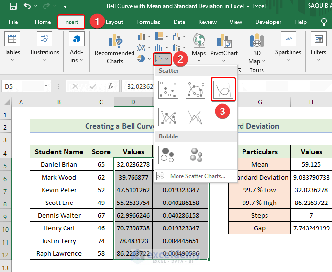
- We are now able to get our basic bell curve.
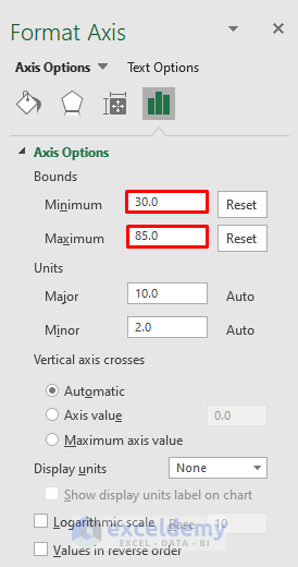
- Double-click the horizontal axis to open the Format Axis dialog.
- Set the Minimum Bounds to 30 and Maximum Bounds to 85.
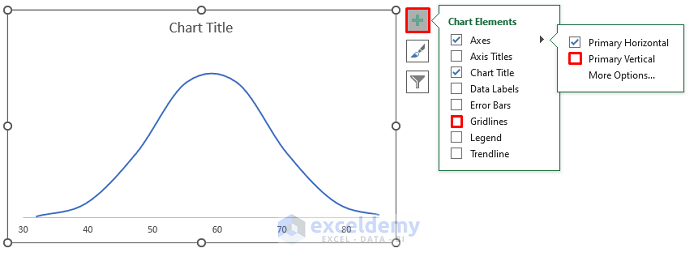
- Uncheck Gridlines and Vertical Axis.
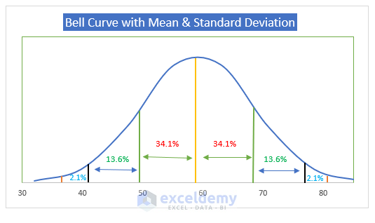
- Add straight lines to represent standard deviations.
- Use the Bell Curve as the chart title.
- The yellow line represents the mean.
- Turn on Gridlines to add these straight lines.
- Finally, turn off the lines.
Read More: How to Create a Bell Curve in Excel
Things to Remember
✎ Remember to use parentheses correctly in your functions and make mean and standard deviation absolute cell references.
✎ Adjust row height as needed.
Practice Section
We have added a practice dataset in the Excel file.
Download Practice Workbook
You can download the practice workbook from here:
Related Articles
- How to Create a Skewed Bell Curve in Excel
- How to Make Bell Curve in Excel for Performance Appraisal
<< Go Back to Bell Curve in Excel | Excel for Statistics | Learn Excel
Get FREE Advanced Excel Exercises with Solutions!
