The Bell Curve is one of the most useful tools used in statistics and financial data analysis, allowing us to visualize the normal probability distribution of a range of data. In this article, we are going to demonstrate how to make a bell curve in Excel for performance appraisal.
What Is Bell Curve?
As the name suggests, the bell curve is a curve that resembles the shape of a bell which depicts the normal distribution. The highest point of the curve indicates the most probable event in the range of data, which can be either the mean, mode, or median of the range. Other data are evenly distributed around this point and so have an evenly distributed probability of occurring, while the standard deviation of the dataset is depicted by the relative width of the curve.
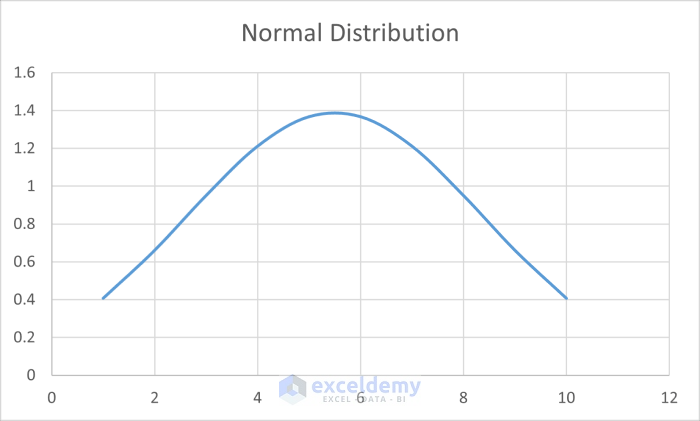
The curve looks something like this.
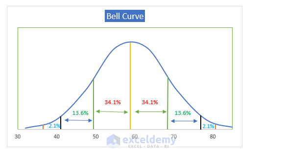
This bell curve indicates that 68.2% of the distribution is within one standard deviation of the mean, 95.5% of the distribution is within two standard deviations of the average, while 99.7% are within three standard deviations of the mean.
The practical application of this curve is huge. It helps us to visualize how the mean, mode, or median is above the rest, and how other values are clustered around them.
Making a Bell Curve in Excel for Performance Appraisal
In this tutorial, we will demonstrate two different approaches to making bell curves in Excel for performance appraisal. The first example will calculate the normal distribution and then make the bell curve out of it. The second example will determine the total percentiles of employees based on their performance and then make a bell curve from it.
Example 1 – Bell Curve of Sales Increase
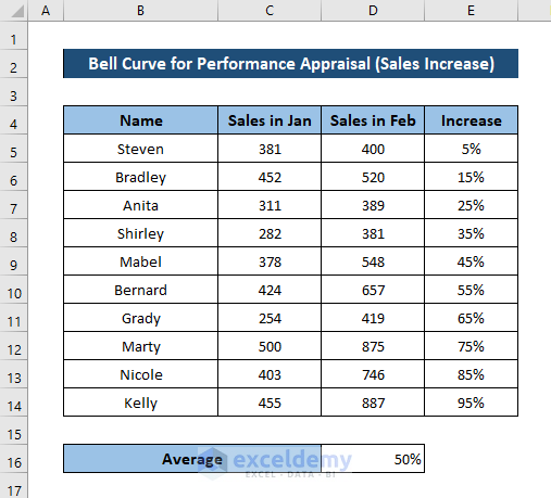
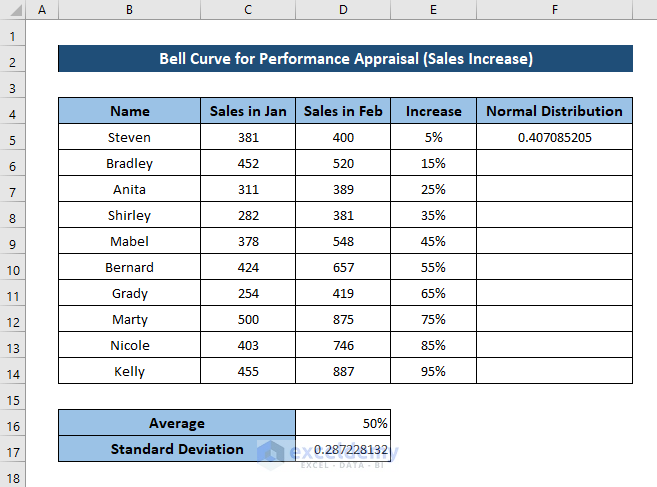
In this example, we will work with the following dataset.
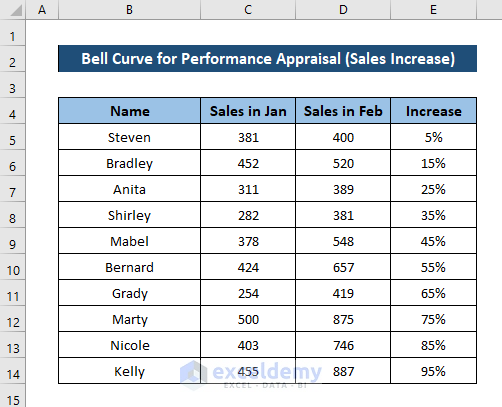
This dataset consists of sales of each employee in two consecutive months and the increase in their sales. We are going to make a bell curve for this increase in sales. In order to do that, we are going to first determine the average, then the standard deviation for all the increases in sales, then find out the normal distribution for each of them. We can then proceed plotting the curves to generate the bell curve for performance appraisal.
To this end, we are going to use the AVERAGE, STDEV.P, and NORM.DIST functions. The AVERAGE function returns the average of the numbers it takes as arguments. The STDEV.P function also takes a series of numbers as arguments and returns the standard deviations. The NORM.DIST function takes (i) a value from a range of data, mean and standard deviation for the dataset and (ii) a boolean value as its arguments, and returns the normal distribution of the number.
Steps:
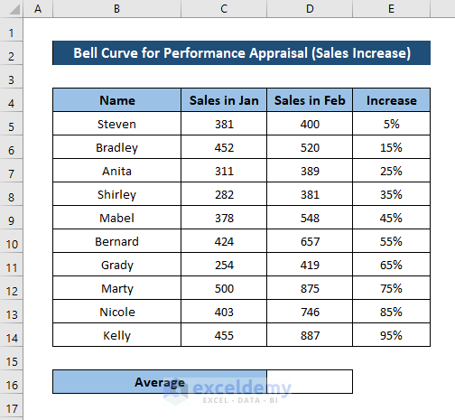
- Select a cell to enter the average value of the range of data. We have selected cell D16.
- Enter the following formula:
=AVERAGE(E5:E14)
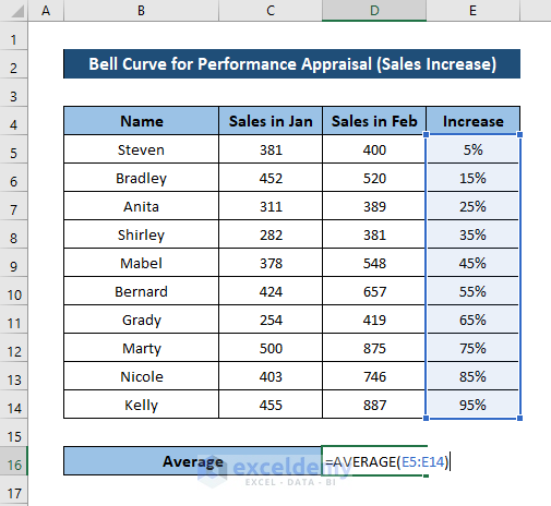
- Press Enter on your keyboard.
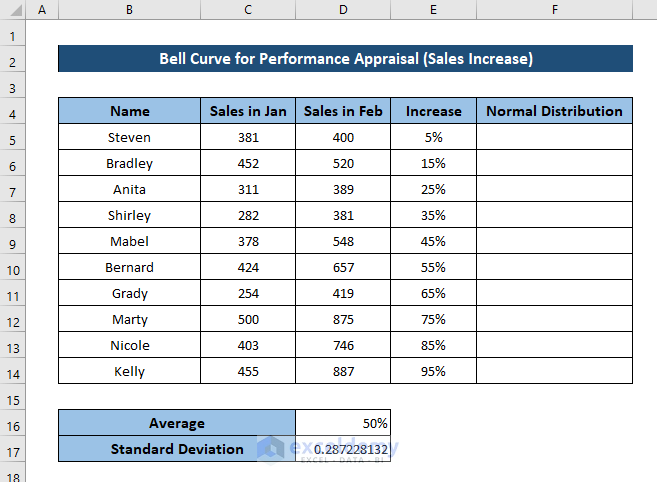
You will have the average for all the data.
- Select a cell for standard deviation (we have selected cell D18) and enter the following formula:
=STDEV.P(E5:E14)
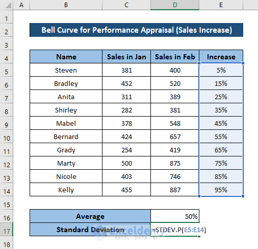
- Press Enter.

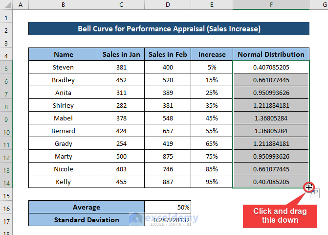
- Make a column for the normal distribution.
- Select cell F5 and enter the following formula:
=NORM.DIST(E5,$D$16,$D$17,FALSE)
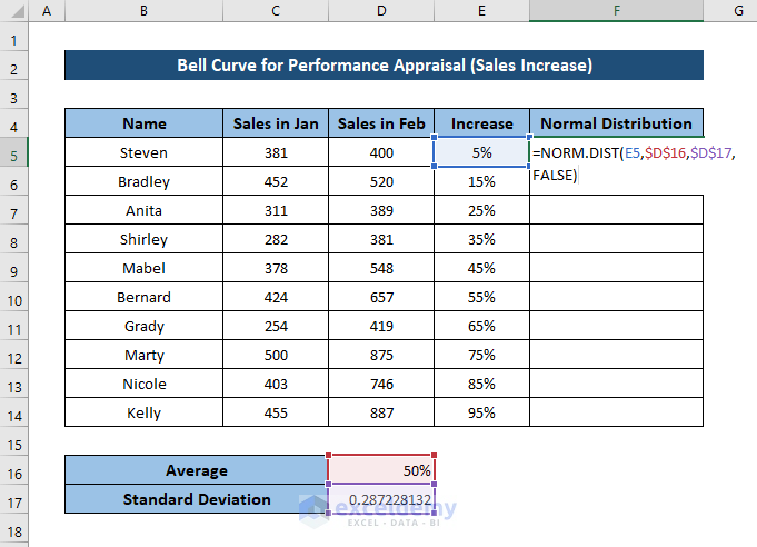
- Press Enter.
- Select the cell again. Then click and drag the fill handle icon to the end of the column to fill up the rest of the cells with this formula.
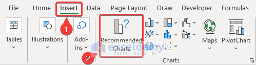
- While the column is selected, go to the Insert tab on your ribbon and select Recommended Charts from Charts
- In the Insert Chart box, select All Charts
- From the left side of the box, select X Y (Scatter), and select Scatter with Smooth Lines from the right side of the box.
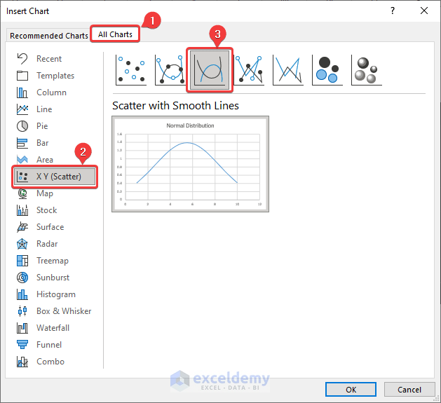
- Click on OK.
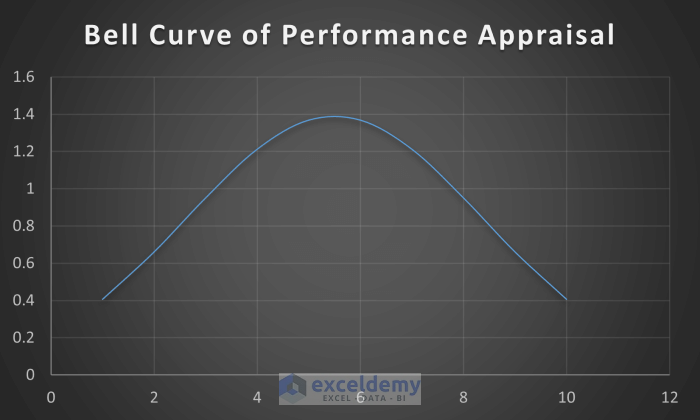
As a result, the bell curve will now be plotted on the spreadsheet.
After some modifications, the bell curve for performance appraisal will look something like this.
Example 2 – Bell Curve for Project Completion Remarks
In our second example, we will use this dataset for demonstration.
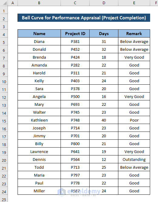
It is another list of employees with the number of days they needed to complete a project and a remark based on how they performed. We are going to use this dataset to plot the bell curve, with the help of the COUNTIF and SUM functions. The COUNTIF function takes a range and a condition as arguments and returns how many times the condition has been met in the range. While the SUM function takes a range as an argument and returns the total of those numbers.
Steps:
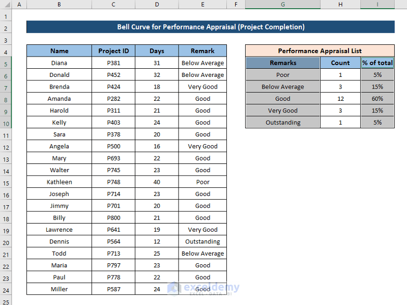
- Make a table for the performance appraisal list as shown in the figure below.
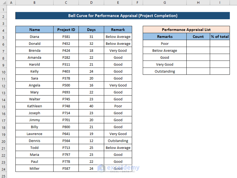
- Go to cell H6 and enter the following formula:
=COUNTIF($E$5:$E$24,G6)
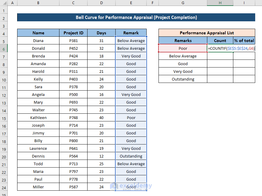
- Press Enter.
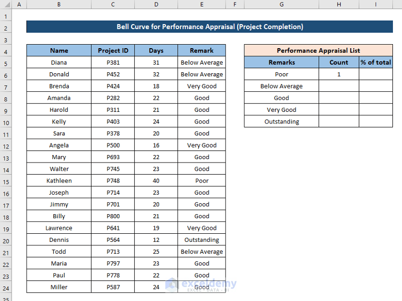
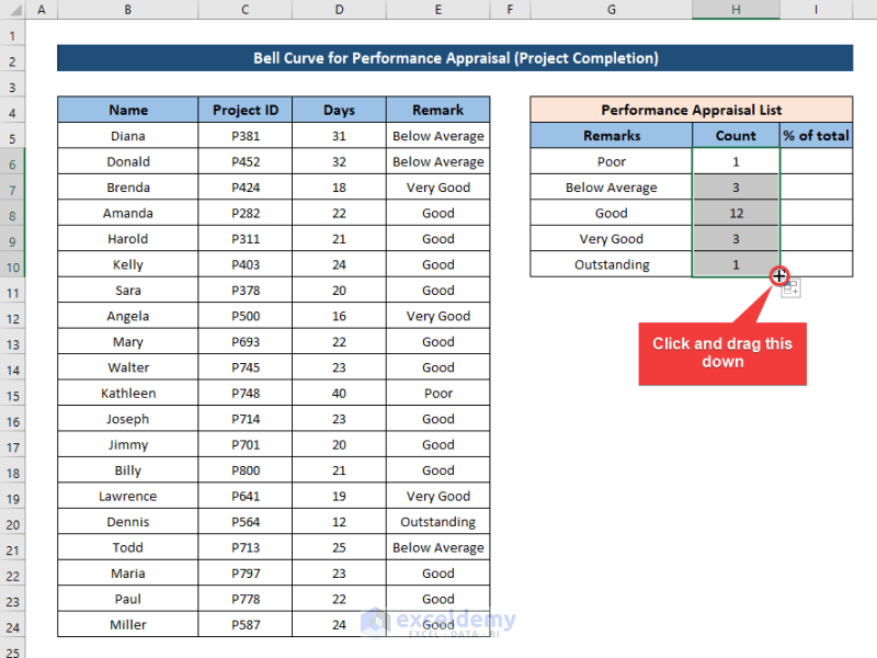
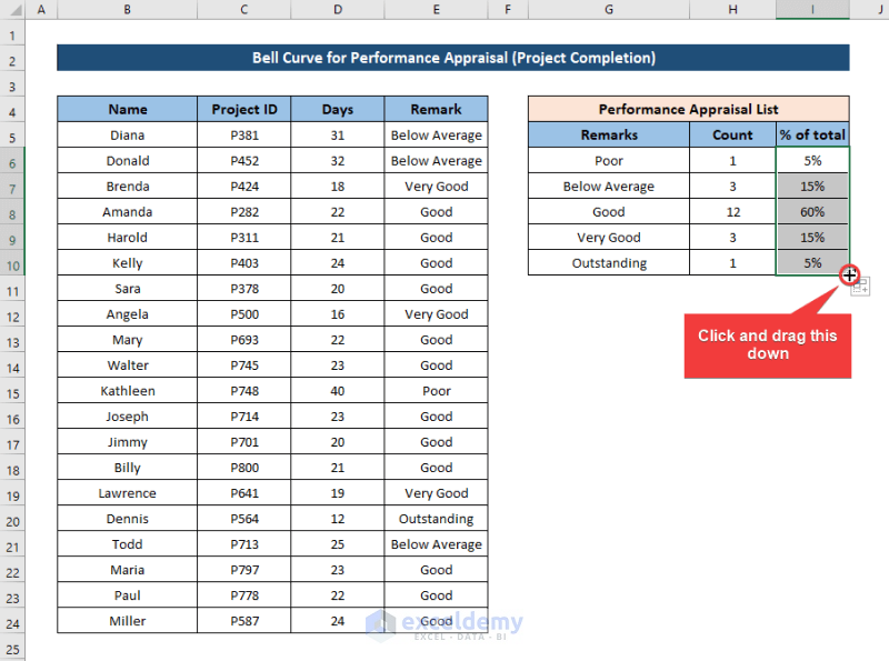
- Select the cell again and click and drag the fill handle icon to the end of the column to fill the rest of the cells with the formula.
- Select cell I6 and enter the following formula:
=H6/SUM($H$6:$H$10)
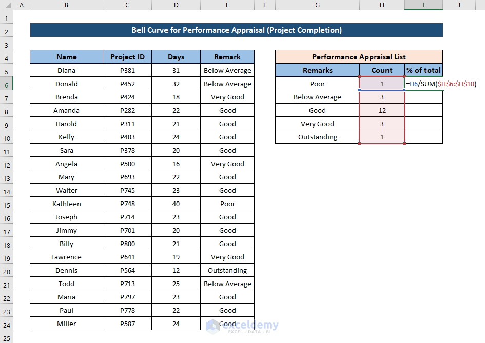
- Press Enter.

- Select the cell again and click and drag the fill handle icon to fill the rest of the column with the formula.
- Select the Remarks and % of total columns.
- Go to the Insert tab on your ribbon and select Recommended Charts from the Charts.
- Select the All Charts tab in the Insert Chart.
- Select the X Y (Scatter) option from the left of the box and select the Scatter with Smooth Lines from the right side.
- Click on OK.
As a result, a bell curve for performance appraisal based on the dataset will be inserted into the spreadsheet.
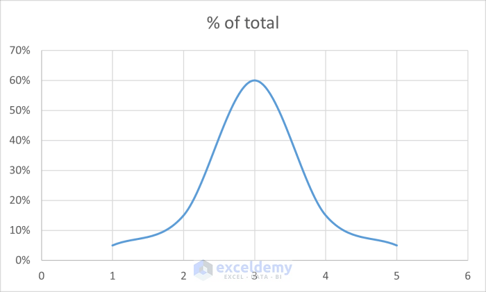
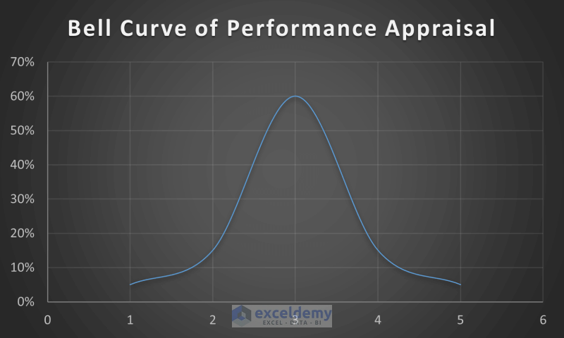
After some modifications, it will look something like this.
Read More: How to Create a Bell Curve in Excel
Download Practice Workbook
Related Articles
- How to Create a Skewed Bell Curve in Excel
- Create a Bell Curve with Mean and Standard Deviation in Excel
<< Go Back to Bell Curve in Excel | Excel for Statistics | Learn Excel
Get FREE Advanced Excel Exercises with Solutions!

Very nicely explained the complicated subject.
Dear SKM,
You are most welcome.
Regards
ExcelDemy