This is an overview.
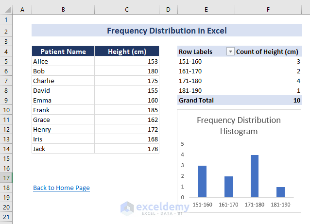
There is a list of 10 patients and their height in cm.
A frequency distribution table was created by grouping the height into 4 classes, from 151 cm to 190 cm, with a 10 cm class interval. A histogram was also created based on the frequency distribution. A PivotTable displays the outputs.
Method 1 – Using a Pivot Table to Create a Frequency Distribution Table in Excel
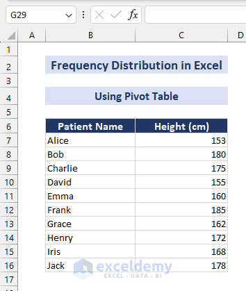
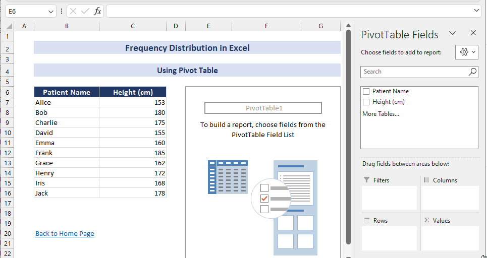
The following dataset showcases the height of a group of patients.
Steps:
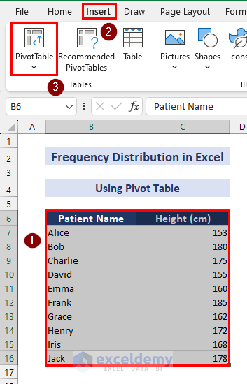
- Select B6:C16 => Go to Insert => Select PivotTable in Tables.
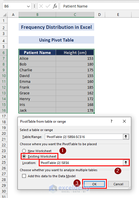
In the PivotTable from Table or Range dialog box:
- Check Existing Worksheet to keep the pivot table in the same worksheet.
- Set the location of the pivot table. Here, E6.
- Click OK.
A pivot table is created.
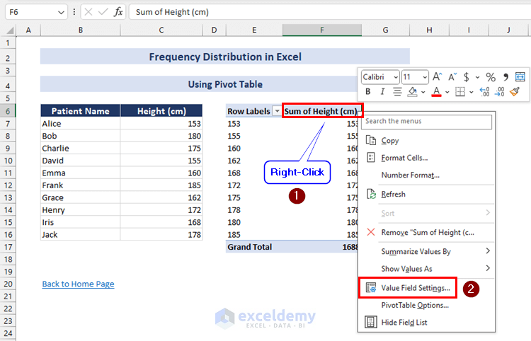
- In PivotTable Fields, enter the Height (cm) both in Rows and Values.
- Right-click any cell in the Sum of Height (cm) column and select Value Field Settings… .
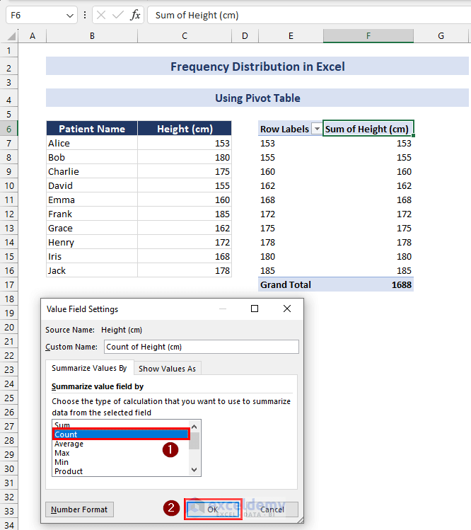
In the Value Field Settings dialog box:
- Select Count.
- Click OK.
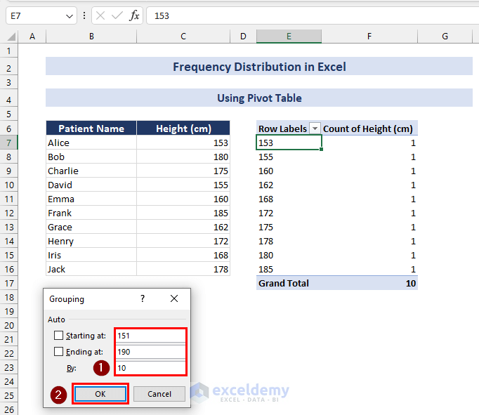
- Right-click any cell in the Row Labels column and select Group…
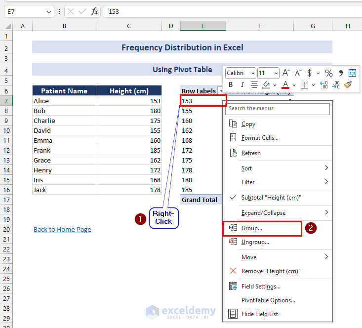
In the Grouping dialog box:
- Set values in Starting at:, Ending at:, and By:. Here, 151, 190, and 10.
- Click OK.
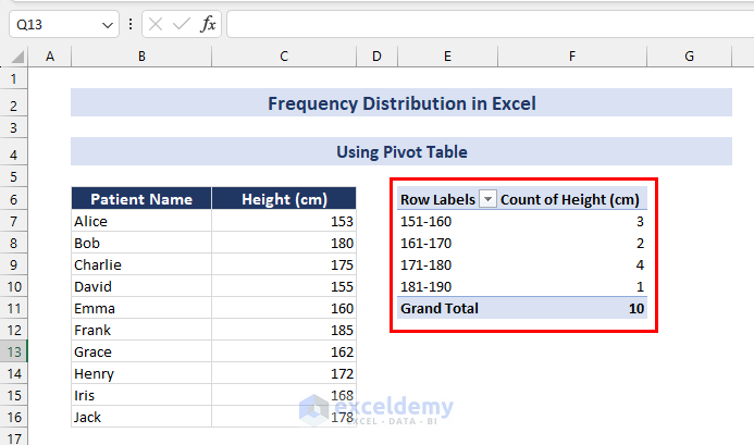
The frequency distribution table is complete: the height of the patients is grouped into 4 classes, from 151 cm to 190 cm, with a 10 cm class interval. The number of height in each of the four groups is determined.
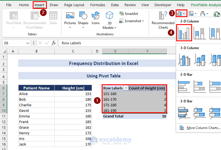
To plot a histogram based on the frequency distribution:
- Select E6:F10 and click Insert => Select Insert Column or Bar Chart in Charts => Click Clustered Column.
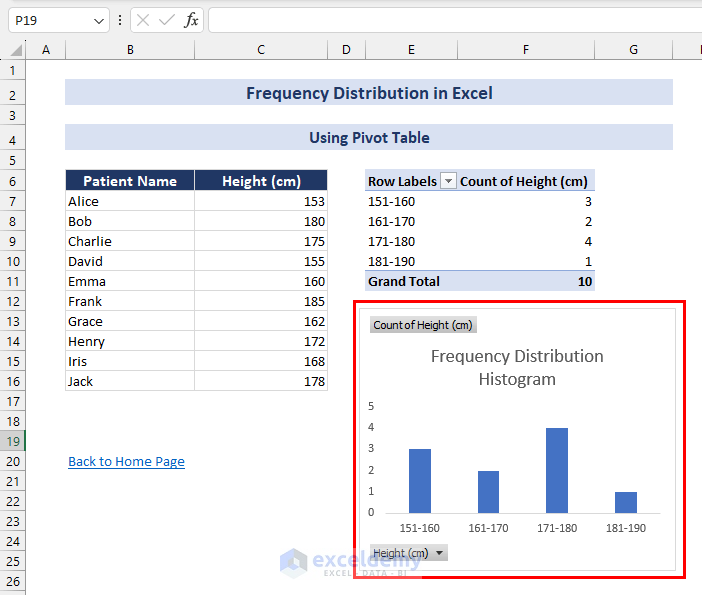
A column chart that represents the histogram will be inserted. (You can change chart titles, axis titles, fill color, etc)
Method 2 – Using the FREQUENCY Function to perform Frequency Distribution in Excel
Steps:
- Calculate the minimum and maximum values of the dataset in C18 and C19, using the following formulas:
=MIN(C7:C16)=MAX(C7:C16)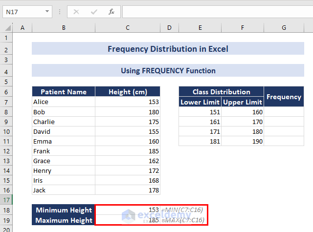
- Create two columns in a separate table based on those values and enter the upper and lower limits of the class distribution manually (see the image below). The class interval is 10.
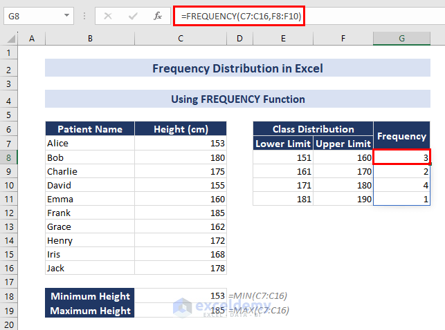
- In G8, use the following formula:
=FREQUENCY(C7:C16,F8:F10)- Press ENTER. As this is an array formula, the rest of the cells will also be automatically populated .
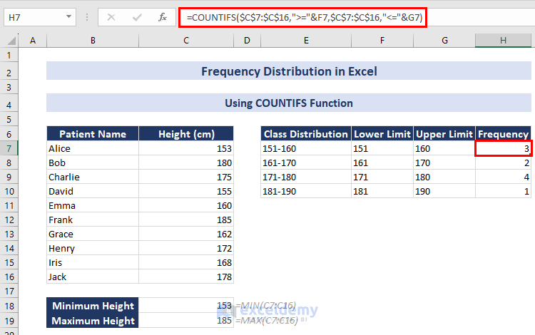
Method 3 – Using the COUNTIFS Function to perform Frequency Distribution in Excel
Steps:
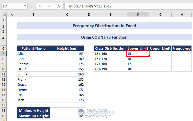
- In F7, enter the following formula:
=MID(E7,1,FIND("-",E7,1)-1)- Press ENTER and use the Fill Handle to copy the formula to the rest of the cells. It’ll return the lower limits.
- In G7, use the following formula:
=MID(E7,FIND("-",E7,1)+1,3)- Press ENTER and use the Fill Handle. It’ll return the upper limits.
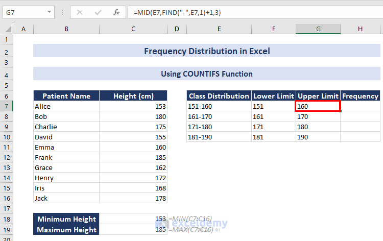
The lower and upper limits are extracted from the class distributions.
- Enter the following formula in H7:
=COUNTIFS($C$7:$C$16,">="&F7,$C$7:$C$16,"<="&G7)- Press ENTER and use the Fill Handle to copy the formula to the rest of the cells.
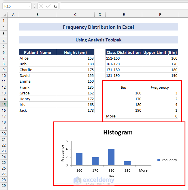
Method 4 – Using the Data Analysis Toolpak to Plot a Frequency Distribution Histogram in Excel
Steps:
- Enter the following formula in F7:
=NUMBERVALUE(MID(E7,FIND("-",E7,1)+1,3))- Press ENTER and use the Fill Handle to copy the formula.
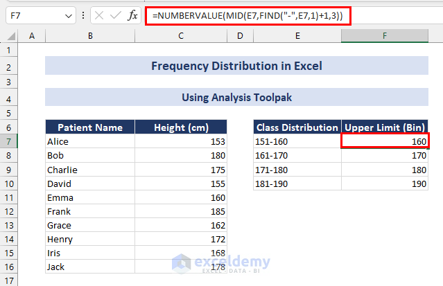
The upper values, or bins, are extracted from the class distribution. The NUMBERVALUE function is used to format the bin range as Number. It is mandatory to use this range in the Data Analysis tool.
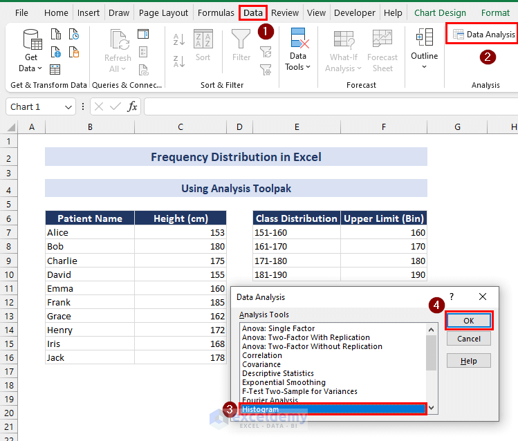
To create the frequency distribution table and histogram:
- Click the Data tab => Data Analysis in Analysis.
- In the Data Analysis dialog box, select Histogram => OK.
In the Histogram dialog box:
- Set the Input Range as $C$7:$C$16.
- Set the Bin Range as $F$7:$F$10.
- Check Output Range and set the output range to $E$12.
- Check Chart Output and click OK.
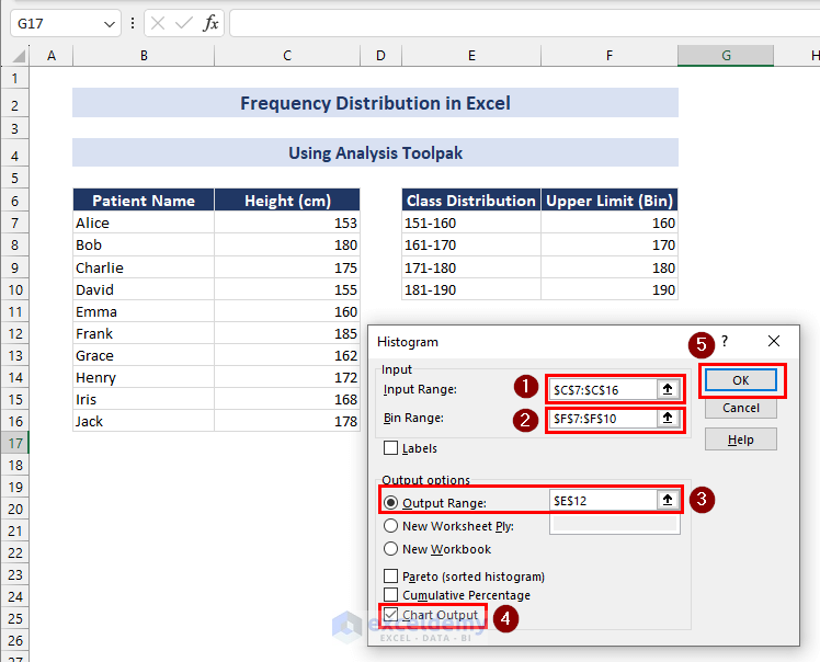
The frequency distribution table and the histogram are displayed.
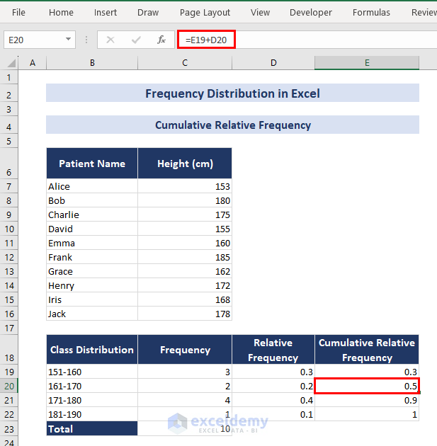
How to Calculate the Cumulative Relative Frequency in Excel
Steps:
- Calculate the total frequency using the following formula in C23:
=SUM(C19:C22)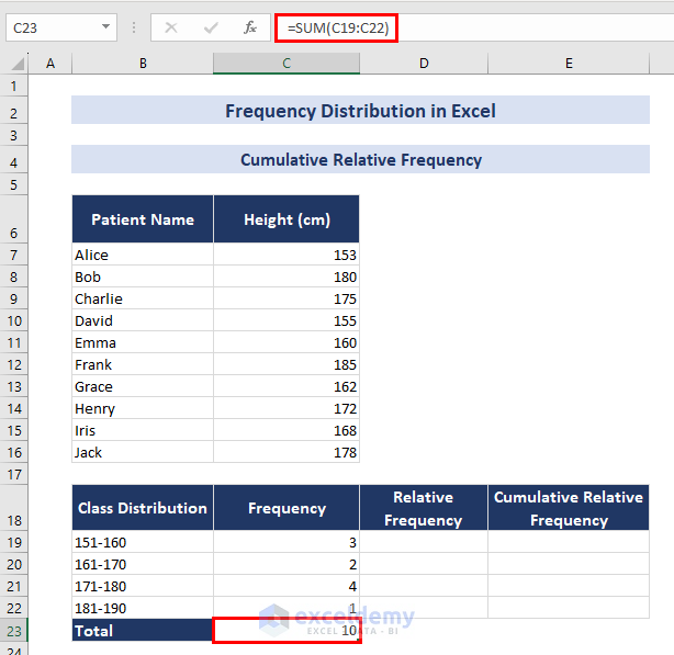
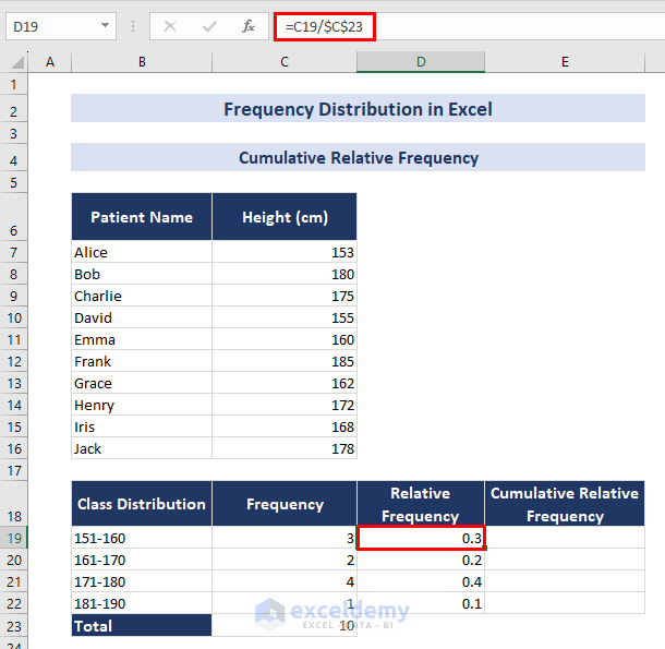
- In D19, enter the following formula:
=C19/$C$23- Press ENTER and use the Fill Handle to copy the formula.
The relative frequencies are calculated.
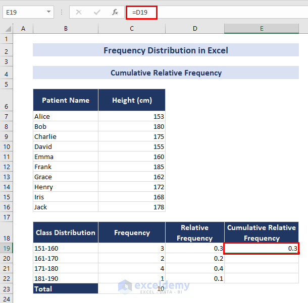
- In E19, use the following formula:
=D19- Press ENTER.
- Go to E20 and enter the following formula:
=E19+D20- Press ENTER and use Fill Handle.
The cumulative relative frequencies are calculated.
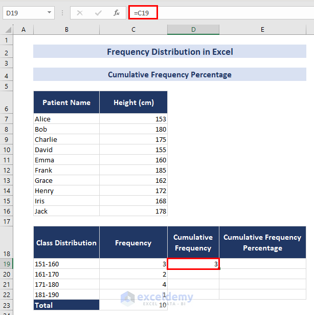
How to Calculate the Cumulative Frequency Percentage in Excel
Steps:
- Calculate the total frequency in C23. (Follow the steps described in the previous section.)
- In D19, use the following formula:
=C19- Press ENTER.
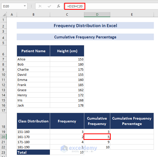
- Enter the following formula in D20:
=D19+C20- Press ENTER and use the Fill Handle to copy the formula.
- Use the following formula in E19:
=D19/$C$23- Press ENTER and use the Fill Handle.
Keep the formatting of E19:E22 in percentage. 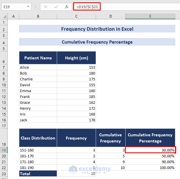
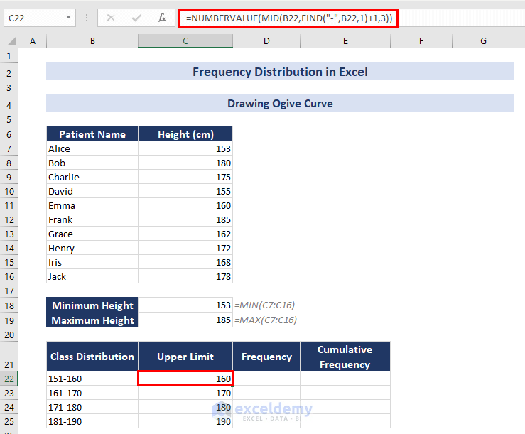
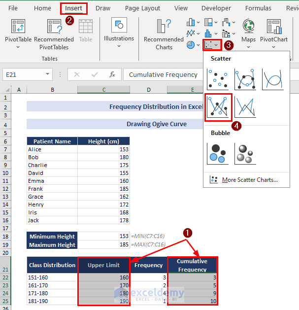
How to Draw an Ogive Graph in Excel
Steps:
- Use the following formula in C22:
=NUMBERVALUE(MID(B22,FIND("-",B22,1)+1,3))- Press ENTER and use the Fill Handle to copy the formula.
The upper limits of the class distribution are extracted: they will be the X-axis values.
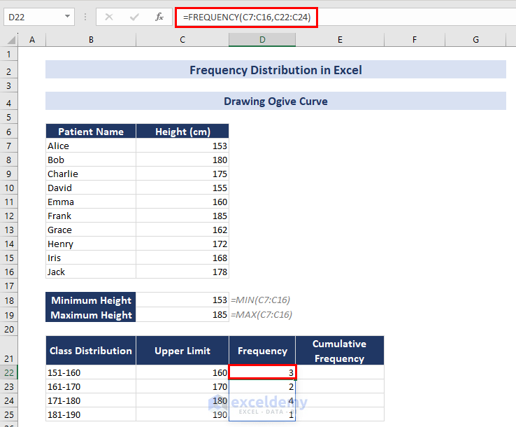
- Calculate the frequencies: in D22, use the following formula:
=FREQUENCY(C7:C16,C22:C24)- Press ENTER. As this is an array formula, the rest of the cells will be automatically populated .
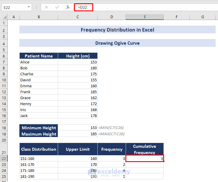
- To calculate the cumulative frequencies, enter the following formula in E22:
=D22- Press ENTER.
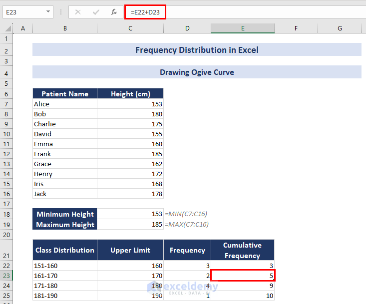
- In E23, enter the following formula:
=E22+D23- Press ENTER and use the Fill Handle.
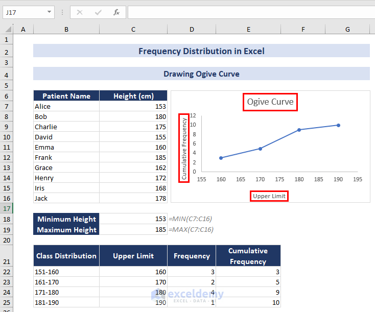
The cumulative frequencies are calculated: they will be the Y-axis values.
- Select C21:C25. Pressing CTRL, select E21:E25.
- Click the Insert tab => Insert Scatter (X, Y) or Bubble Chart => Scatter with Straight Lines and Markers.
A scatter plot (Cumulative Frequency) is displayed.
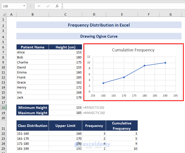
You can change chart titles, axis titles, fill colors, etc.
Download Practice Book
Frequency Distribution in Excel: Knowledge Hub
- How to Calculate Percent Frequency Distribution in Excel
- How to Do Cross Tabulation in Excel
- How to Make a Contingency Table in Excel
- How to Make an Ogive Graph in Excel
- How to Make a Relative Frequency Table in Excel
- How to Make a Categorical Frequency Table in Excel
- How to Calculate Cumulative Frequency Percentage in Excel
- How to Calculate Cumulative Relative Frequency in Excel
- How to Calculate Relative Frequency Distribution in Excel
- How to Create a Grouped Frequency Distribution in Excel
- How to Make a Relative Frequency Histogram in Excel
- How to Find Mean of Frequency Distribution in Excel
- How to Calculate Upper and Lower Limits in Excel
- How to Make Frequency Distribution Table in Excel
<< Go Back to Excel for Statistics | Learn Excel
Get FREE Advanced Excel Exercises with Solutions!
