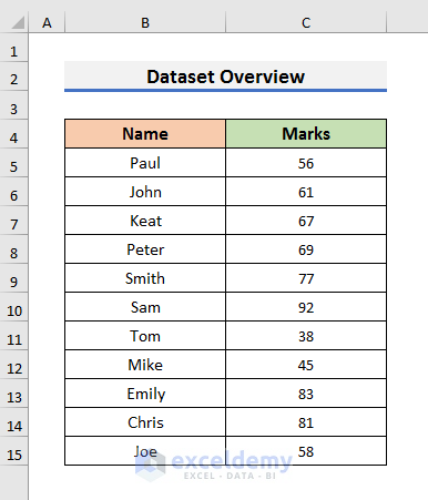
We will use a dataset that contains information about the Marks of some students. We will create a grouped frequency distribution and show it in a chart or graph.
Method 1 – Excel Functions to Get a Grouped Frequency Distribution
Case 1.1 – Apply the FREQUENCY Function
The FREQUENCY function determines how often a value appears in a range. It has two compulsory arguments: the data array and the bins array. You need to enter the dataset in place of the data array and the upper limit in place of the bins array.
STEPS:
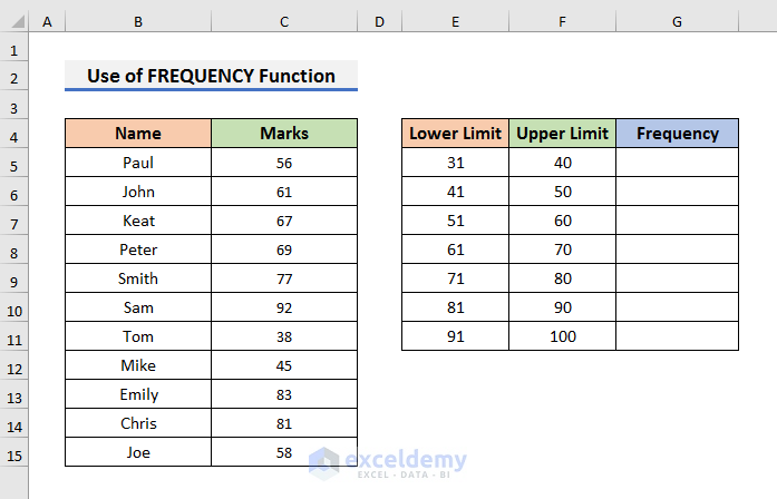
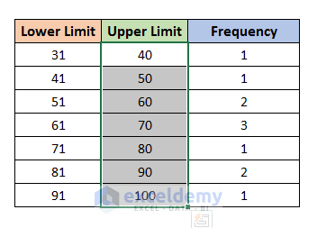
- Choose the upper and lower limits and enter them in your dataset.
- We have grouped the marks by 10. The starting group is 31-40 where the lower limit is 31 and the upper limit is 40. In Excel, these groups are called bins. We have a total of 7 bins here.
- Select Cell G5 and insert this formula:
=FREQUENCY(C5:C15,F5:F10)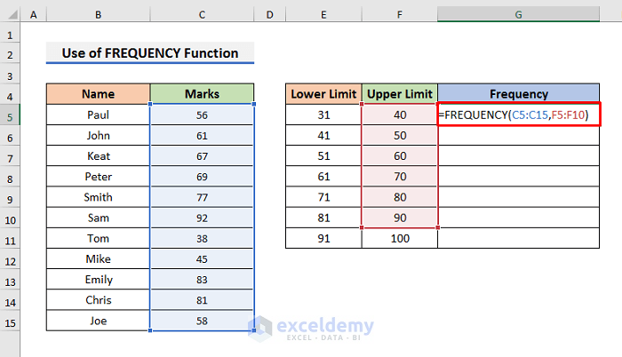
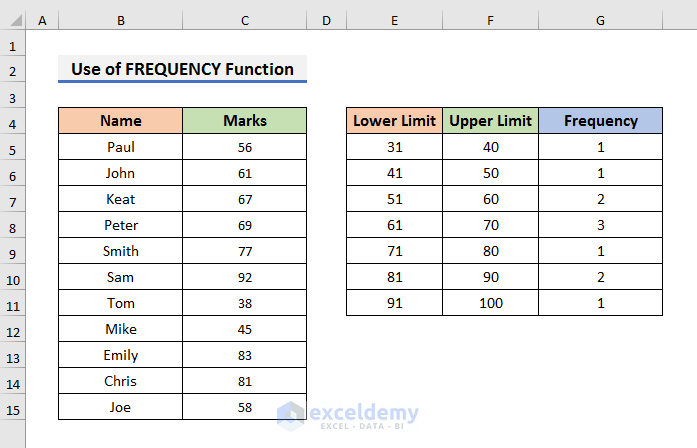
- Press Ctrl + Shift + Enter to see the frequency distribution.
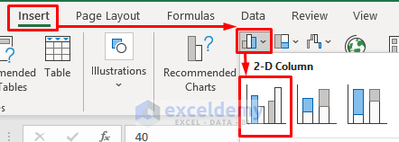
- Select the upper limits.
- Go to the Insert tab and click on the Insert Column icon.
- Select the Clustered Column icon. A chart will appear on the sheet.
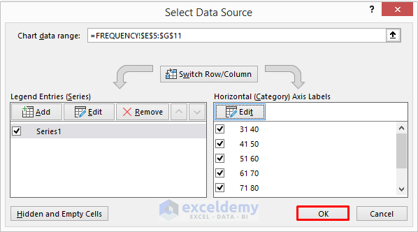
- Right-click on the chart and click on Select Data. It will open the Select Data Source dialog box.
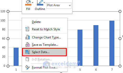
- In the Select Data Source dialog box, enter the Frequency in the Legend Entries section.
- Click on Edit in the Horizontal Axis Labels section.
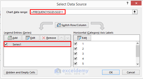
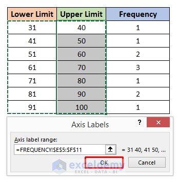
- Select the Lower and Upper limits like the picture below and click OK to proceed.
- The Select Data Source dialog box will look like this.
- Click OK.
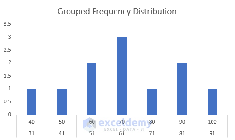
- You will see the frequency on a graph.
Method 1.2 – Insert the COUNTIFS Function
STEPS:
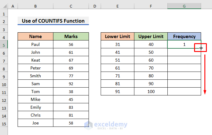
- Select Cell G5 and type the formula:
=COUNTIFS($C$5:$C$15,">="&E5,$C$5:$C$15,"<="&F5)- Press Enter to see the results.
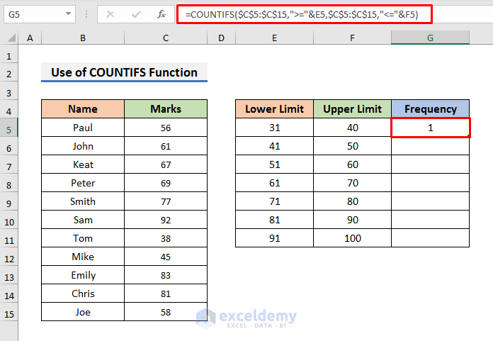
Here, the COUNTIFS function counts the occurrence of marks in the range C5:C15 when it’s greater than E5 and less than F5.
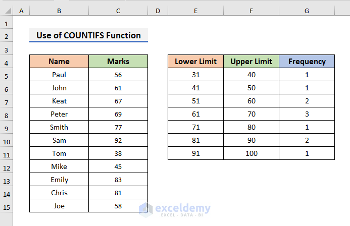
- Use the Fill Handle down to copy the formula.
- You will see results like the picture below.
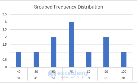
- You can also generate a plot to represent the frequencies by following the previous case.
Read More: How to Make Frequency Distribution Table in Excel
Method 2 – Create a Grouped Frequency Distribution with an Excel Pivot Table
STEPS:
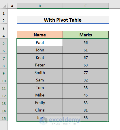
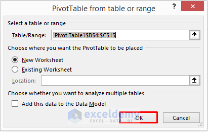
- Select the Name and Marks of the students. We have selected Cell B5 to C15.
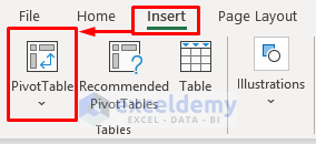
- Go to the Insert tab and select PivotTable. A dialog box will pop up.
- Click OK to proceed. A new worksheet and PivotTable Fields will appear.
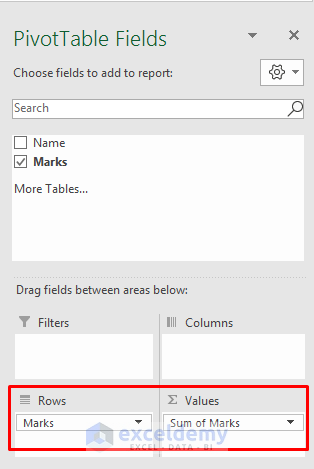
- In the PivotTable Fields section, click on Marks and drag it to the Rows & Values sections.
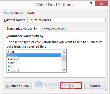
- Click on Sum of Marks and select Value Field Settings.
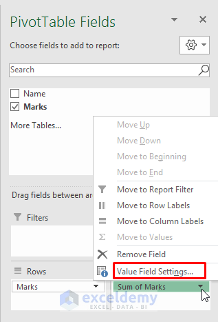
- In the Value Field Settings dialog box, select Count and click on OK.
- Right-click on Cell A4 and select Group from the drop-down menu.
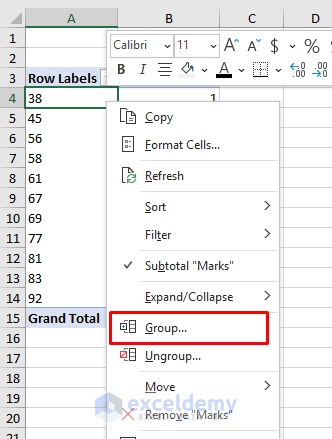
- Input the Starting point, Ending point, and the Group By value. We want to group them by 10.
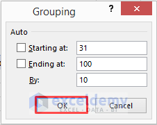
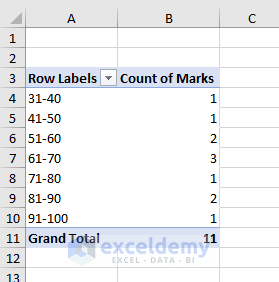
- Click OK to see the groups and frequencies.
- Select the data and go to the Insert tab.
- Select the Insert Column icon and click on the Clustered Column icon.
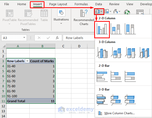
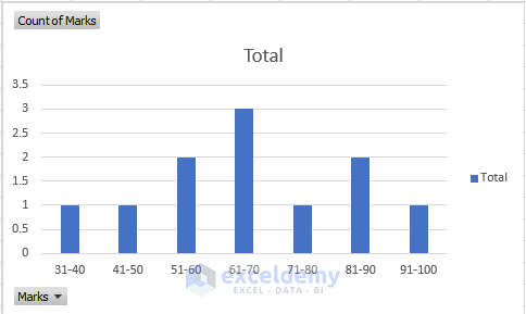
- You will get a chart of the groups and frequencies.
Read More: How to Find Mean of Frequency Distribution in Excel
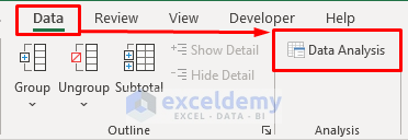
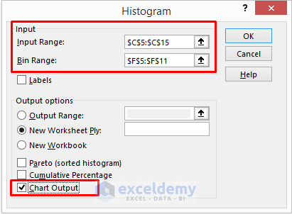
Method 3 – Apply a Histogram to Create a Grouped Frequency Distribution in Excel
STEPS:
- Go to the Data tab and select Data Analysis.
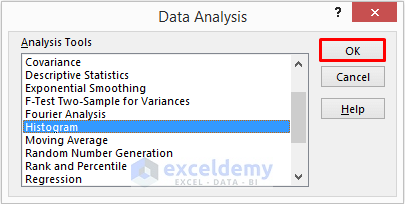
- Select Histogram from the Data Analysis message box and click OK.
- Insert the Input Range and Bin Range and check Chart Output.
- Click OK.
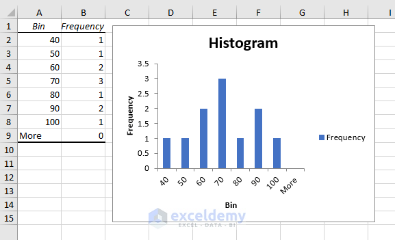
- You will see the Upper Limit of the groups and the Frequencies both in a table and chart.
Read More: How to Make a Relative Frequency Histogram in Excel
Download the Practice Workbook
Related Articles
- How to Calculate Upper and Lower Limits in Excel
- How to Calculate Relative Frequency Distribution in Excel
- How to Calculate Cumulative Relative Frequency in Excel
<< Go Back to Frequency Distribution in Excel | Excel for Statistics | Learn Excel
Get FREE Advanced Excel Exercises with Solutions!
