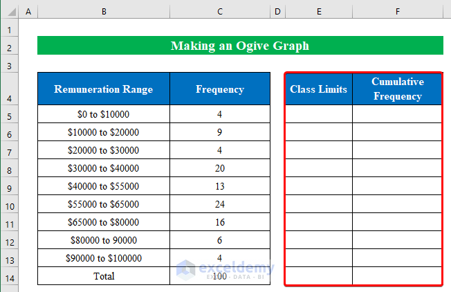
Step 1 – Creating Two Helper Columns
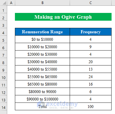
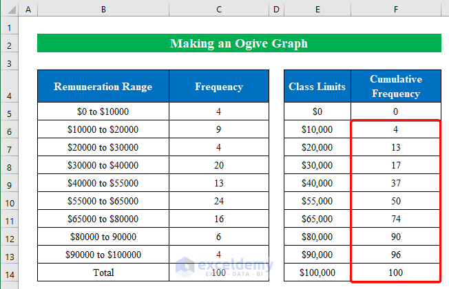
We have a dataset of a company’s Remuneration Range and Frequency.
- Construct two columns named “Class Limits” and “Cumulative Frequency” on the right side of the previous table.
Read More: How to Do Cross Tabulation in Excel
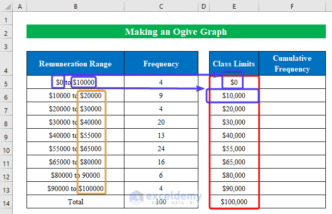
Step 2 – Determining Limits and Cumulative Frequencies
- Fill the Class Limits columns with values starting from $0 and ending with $100,000.
- Apply the following formula in cell F6:
=SUM($C$5:C5)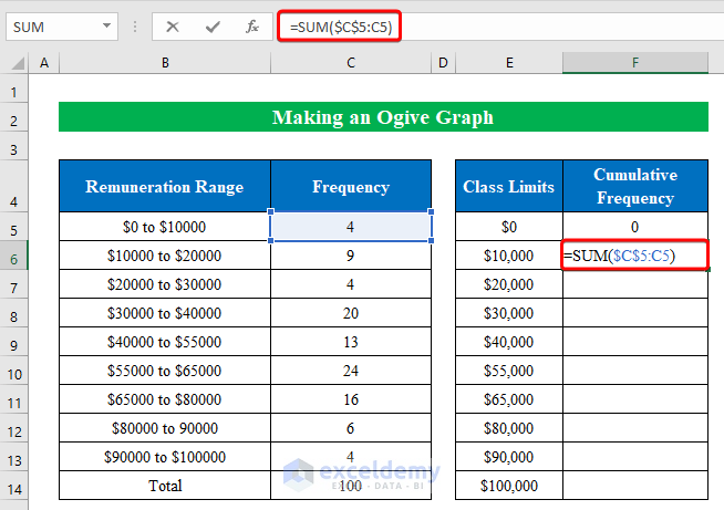
- Hit Enter and drag the Fill Handle down to fill the cells in the column.
Read More: How to Make a Categorical Frequency Table in Excel
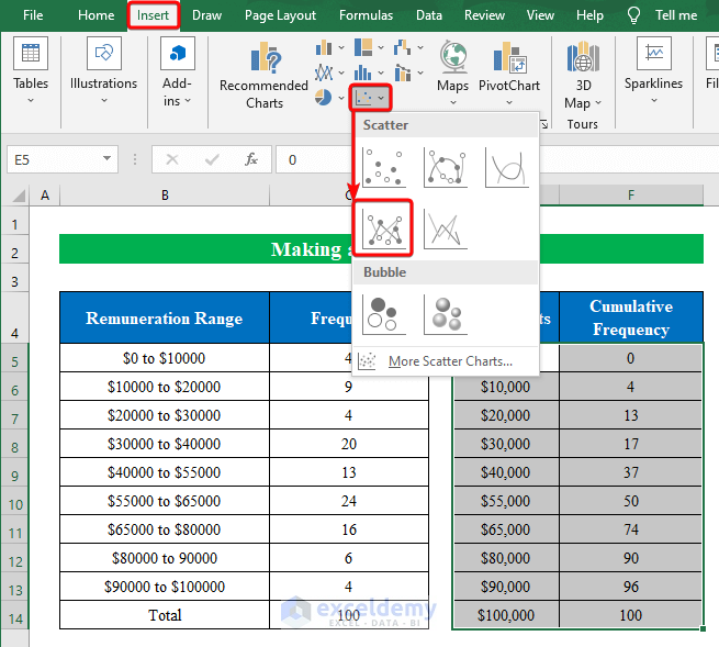
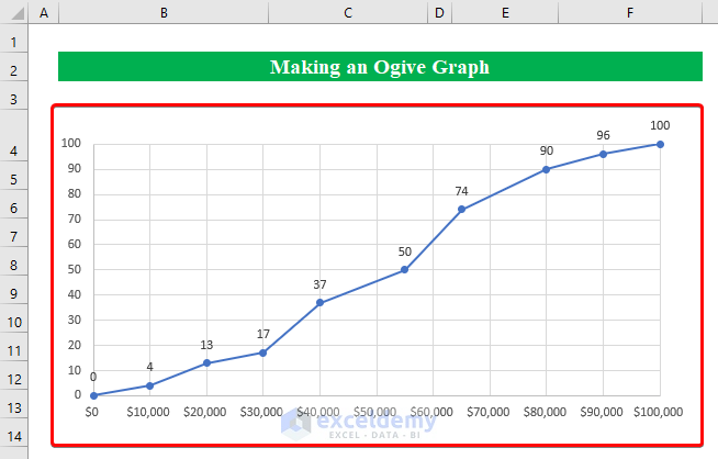
Step 3 – Plotting the Ogive Graph
- Choose the data from the second table and click Scatter Chart from the Insert option.
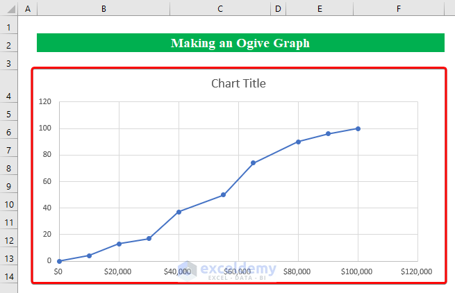
- We will get the ogive graph.
Read More: How to Calculate Percent Frequency Distribution in Excel
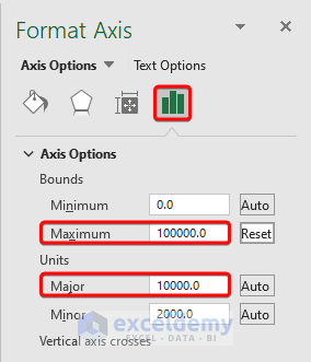
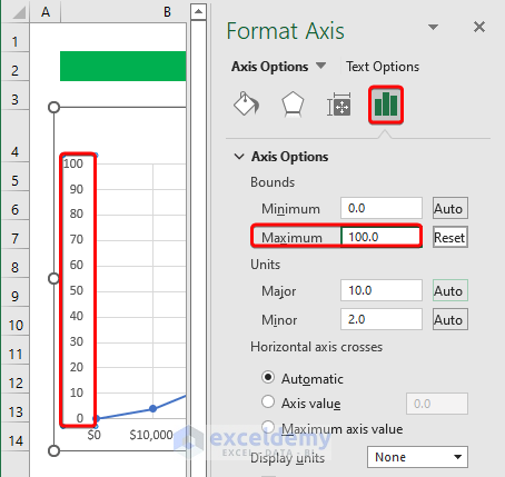
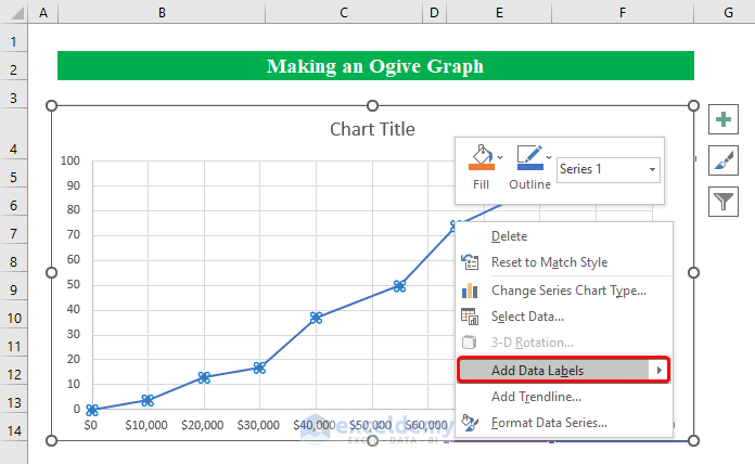
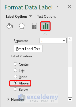
Step 4 – Modifying Axes and Data Labels
- Select the graph.
- Right-click and select Format Axis.
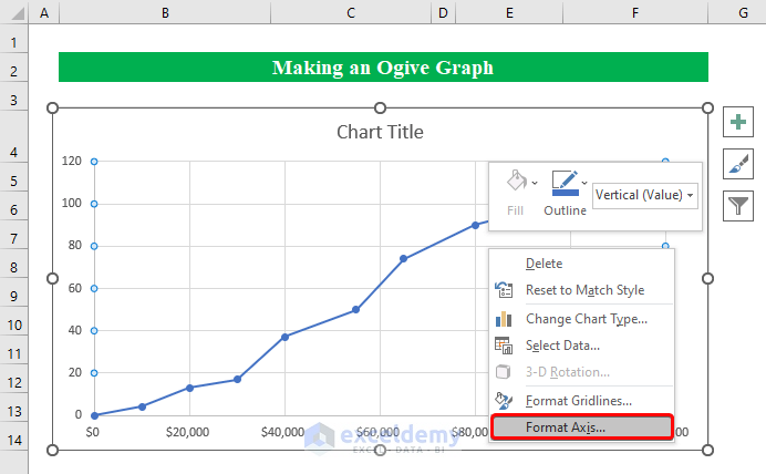
- Change the value of the maximum bound to “0” and the unit Major value to “10000.0”.
- Change the vertical axis value to “0” in the “Maximum” box.
- Select any data point from the graph and right-click on it, then choose Add Data Labels.
- From the right pane, change the format of the Data Labels by switching to Above.
- Here’s the result.
Read More: How to Make a Relative Frequency Table in Excel
Things to Remember
- An ogive graph is made using a scatter chart but you can create it with a line chart if you want.
Download the Practice Workbook
Related Articles
<< Go Back to Frequency Distribution in Excel | Excel for Statistics | Learn Excel
Get FREE Advanced Excel Exercises with Solutions!
