Method 1 – Using Pivot Table to Make Frequency Distribution Table in Excel
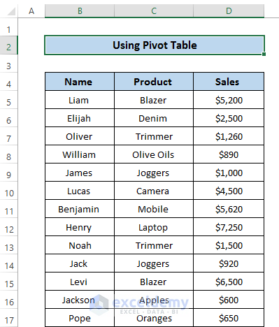
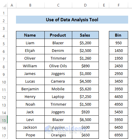
Let’s take a dataset that includes some salesman’s name, product, and sales amount. We want to find out the frequency between a given amount.
Steps:
- Select the whole dataset.
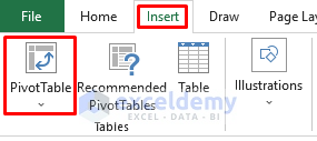
- Go to the Insert tab in the ribbon.
- From the Tables group, select PivotTable.
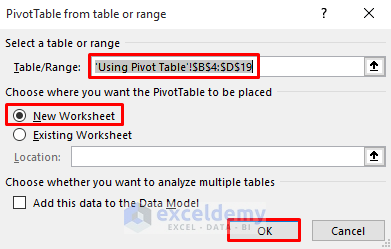
- The PivotTable from table or range dialog box will appear.
- In the Table/Range section, select the range of cells B4 to D19.
- Select New worksheet to place the PivotTable.
- Click on OK.
- Click on the Sales check in the PivotTable Fields.
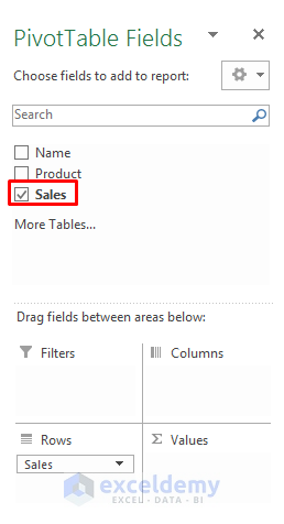
- Drag Sales into the Values section.

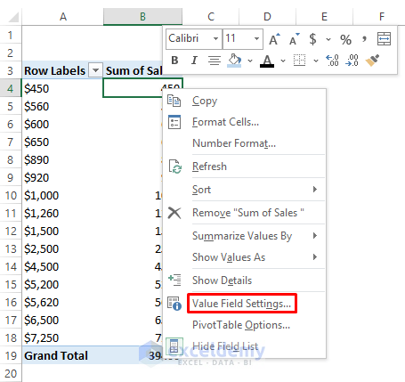
- Change the Sum of Sales into the Count of Sales. To do this, right-click on any cell of the Sum of Sales column.
- In the Context Menu, select Value Field Settings.
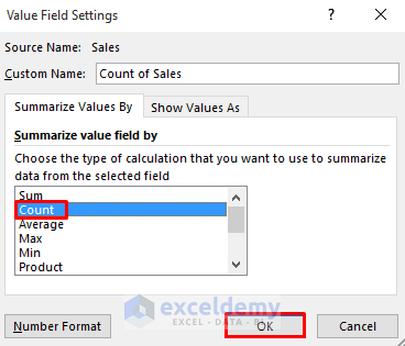
- A Value Field Settings dialog box will appear.
- In the Summarize value field by section, select the Count option.
- Click on OK.
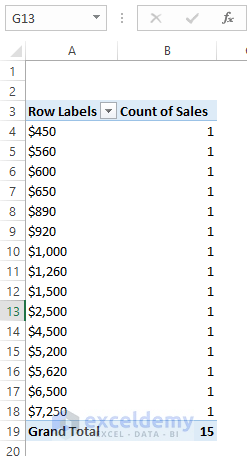
- This will count every sales amount as 1. But when you make a group by using those amounts then the count will change according to that range.
- Right-click on any cell of the sales.
- From the Context Menu, select Group.
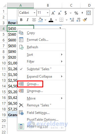
- A Grouping dialog box will appear. It will automatically select the starting and ending by your dataset’s highest and lowest values. You can change it or leave it as is.
- Change the grouping By to 500.
- Click on OK.

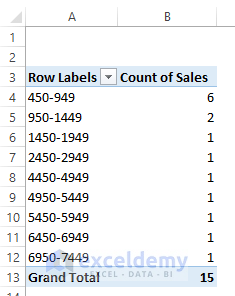
- This will create several groups. The Count of Sales also changes with this.
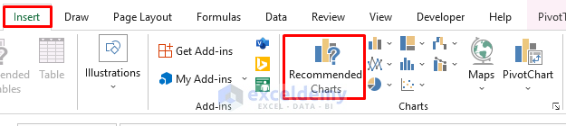
- Go to the Insert tab in the ribbon.
- From the Charts group, select Recommended Charts.
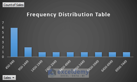
- Use the Column chart for this dataset to show the frequency distribution within a specified range.
Method 2 – Inserting Excel FREQUENCY Function to Make Distribution Table
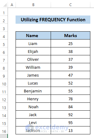
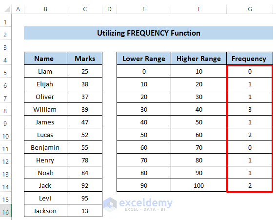
To use the FREQUENCY function, we take a dataset that includes some student name and their exam marks. We want to get the frequency of these marks.
Steps:
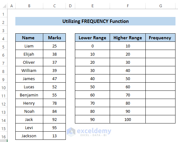
- Create a lower range and an upper range manually by studying your dataset.
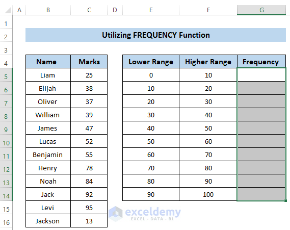
- Select the range of cells G5 to G14.
- Copy the following formula in the formula box.
=FREQUENCY(C5:C16,F5:F14)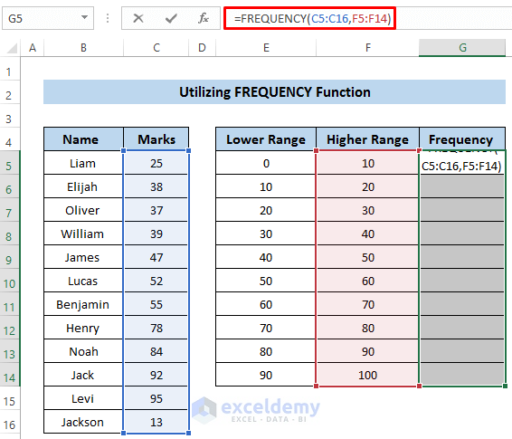
- As this is an array function, we need to press Ctrl + Shift + Enter to apply the formula. Otherwise, it won’t apply the formula.
Note
Here, we take a higher range as bins because the function searches for values lower than the higher range.
Read More: How to Create a Grouped Frequency Distribution in Excel
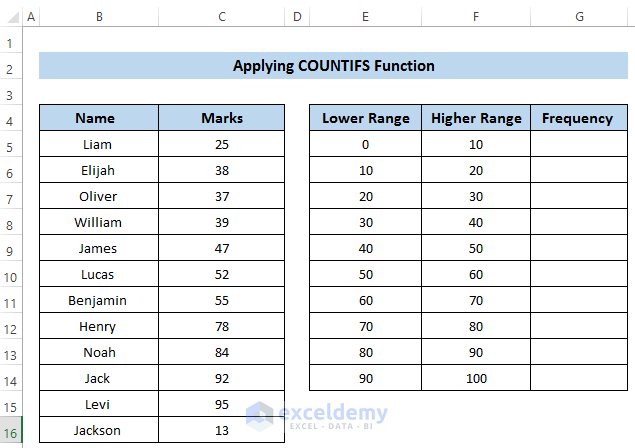
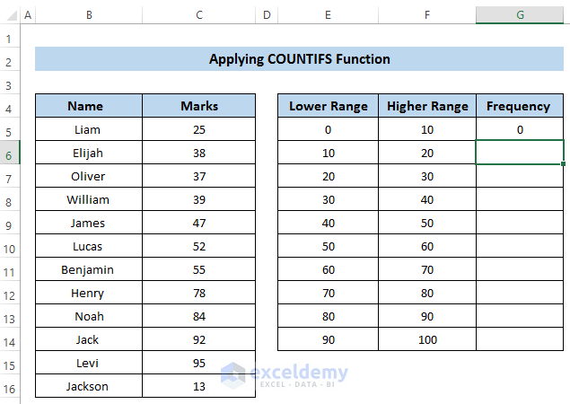
Method 3 – Applying COUNTIFS Function to Create Frequency Distribution Table
Steps
- Take your dataset and create a lower and upper ranges for bins manually.
- Select cell G5.
- Insert the following formula in the formula box:
=COUNTIFS(C5:C16,"<="&10)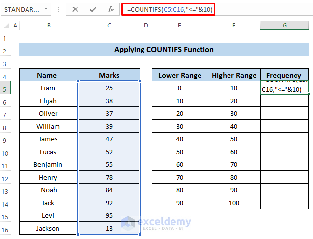
Breakdown of the Formula
COUNTIFS(C5:C16,”<=”&10)
Here, the range of cells is C5 to C16. The condition is less or equal to 10. The COUNTIFS function returns the total number of occurrences that is less than or equal to 10.
- Press Enter to apply the formula.

- Select cell G6.
- Copy the following formula in the formula box:
=COUNTIFS($C$5:$C$16,">"&10,$C$5:$C$16,"<="&20)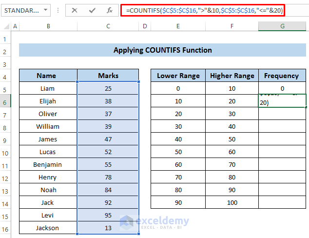
Breakdown of the Formula
COUNTIFS($C$5:$C$16,”>”&10,$C$5:$C$16,”<=”&20)
- For more than one condition, we use the COUNTIFS function. First of all, we set the range of cells from C5 to C16. As our range is between 10 and 20, we set our first condition to greater than 10.
- In the next case, we also take the same range of cells. But this time the condition is less than or equal to 20.
- Finally, the COUNTIFS function returns the frequency of the marks between 10 and 20.
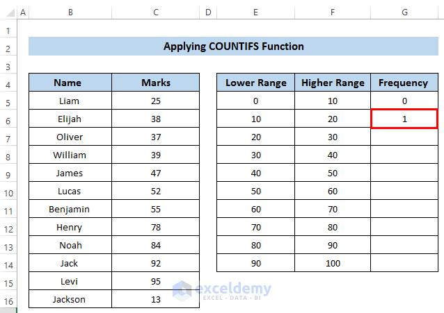
- Press Enter to apply the formula.
- Select cell G7.
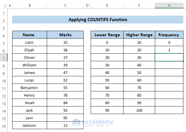
- Insert the following formula in the formula box.
=COUNTIFS($C$5:$C$16,">"&20,$C$5:$C$16,"<="&30)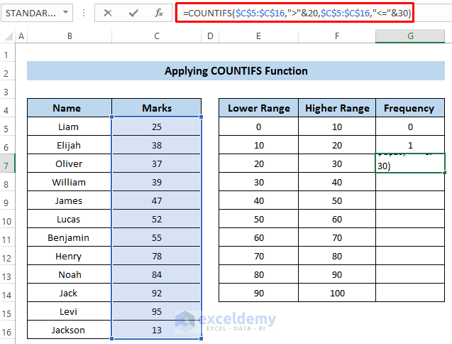
- Next, press Enter to apply the formula.

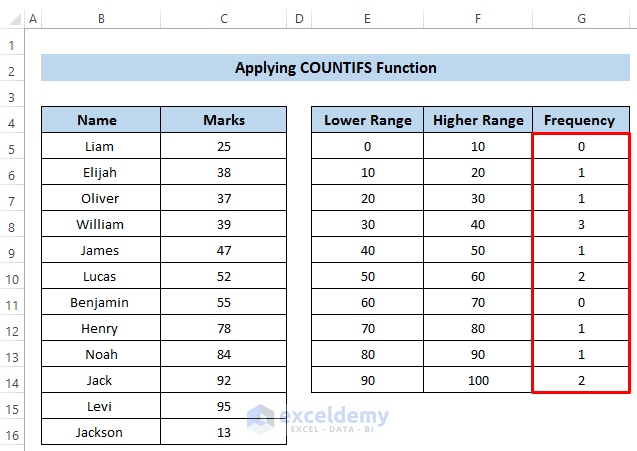
- Do the same for other cells to get the desired frequencies. You can modify the formula to reference cells in columns E and F instead of using fixed values, which we’ll leave up to you to practice.
Read More: How to Find Mean of Frequency Distribution in Excel
Method 4 – Using Excel Data Analysis Tool to Develop Frequency Table
Steps
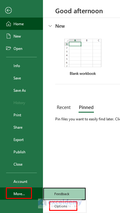
- Go to the File tab in the ribbon.
- Select More then Options or pick Options (depends on the Excel version and window size).
- An Excel Options dialog box will appear.
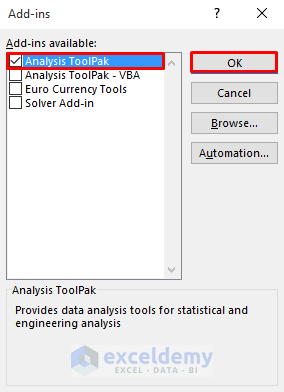
- Click on Add-ins.
- Click on Go.
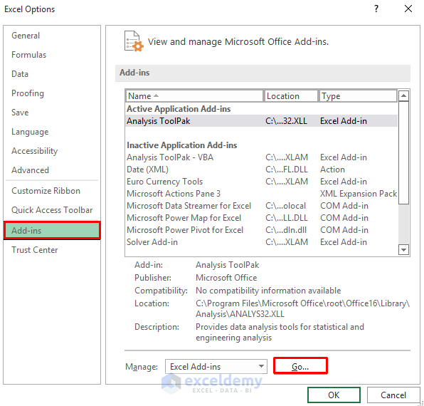
- From the Add-ins available section, select Analysis ToolPak.
- Click on OK.
- To use the Data Analysis Tool, you need to have a Bin range.
- Set a bin range by studying the dataset’s lowest and highest values.
- We take the interval 500.
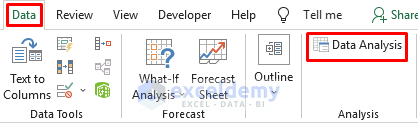
- Go to the Data tab in the ribbon.
- Select Data Analysis from the Analysis group.
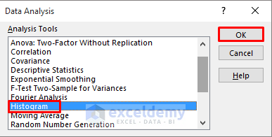
- A Data Analysis dialog box will appear.
- From the Analysis Tools section, select Histogram.
- Click on OK.
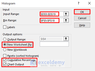
- In the Histogram dialog box, select the Input Range.
- We put the Sales column as the Input Range.
- Select the Bin Range that we created above.
- Set the Output options in the New Worksheet.
- Check Cumulative Percentage and Chart Output.
- Click on OK.
- It will express the frequencies and cumulative percentage.
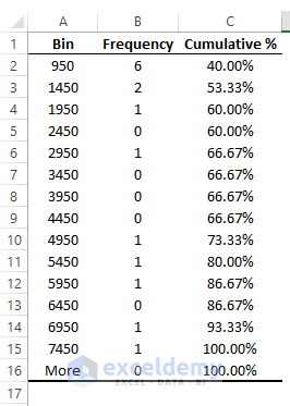
- When we represent this in the chart, we will get the following result.
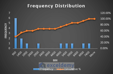
Read More: How to Make a Relative Frequency Histogram in Excel
Download Practice Workbook
Related Articles
- How to Calculate Upper and Lower Limits in Excel
- How to Calculate Relative Frequency Distribution in Excel
- How to Calculate Cumulative Relative Frequency in Excel
<< Go Back to Frequency Distribution in Excel | Excel for Statistics | Learn Excel
Get FREE Advanced Excel Exercises with Solutions!
