A relative frequency histogram is a special type of chart, which shows us the rate of any event’s occurrence. This type of graph also provides us with the probability of that event. In this context, we will demonstrate to you, how to make a relative frequency histogram in Excel with three easy examples. If you are curious to know the procedure, download our practice workbook and follow us.
What Is Relative Frequency?
A relative frequency is a special type of graph or chart that illustrates the probability of the occurrence of any event. So, the sum of all relative frequencies for any dataset will be one. The mathematical expression of relative frequency is:

How to Make a Relative Frequency Histogram in Excel: 3 Practical Examples
In this article, we will consider three simple examples to demonstrate the job of making a relative frequency histogram. These example datasets are:
- Daily income histogram of an industry.
- Examination marks of a class.
- Covid-19 infected people’s histogram.
1. Relative Frequency Histogram for Daily Income Data of Industry
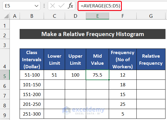
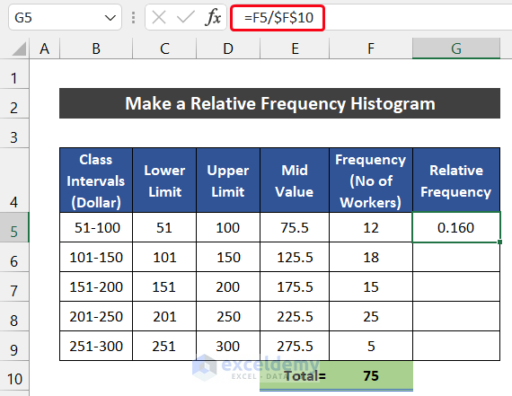
In this example, we consider a dataset of five class intervals of daily income for 75 workers. The Class Intervals (Dollar) are in column B and the Frequency (No. of workers) is in column C.

The steps to make the relative frequency histogram of this dataset are given below:
📌 Steps:
- First of all, insert three columns between the Class Intervals and the Frequency. You can add the columns in several ways.
- Then, input the following entities into the range of cells C4:E4 and G4 as shown in the image.

- After that, manually input the upper limit ‘51’ and lower limit ‘100’ in cells C5 and D5 respectively.

- Now, select cell E5 and write down the following formula to get the average of these two limits. We are using the AVERAGE function to estimate the mid valve.
=AVERAGE(C5:D5)
- Press Enter.
- Similarly, follow the same process for row 6.
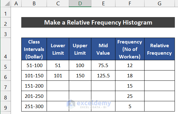
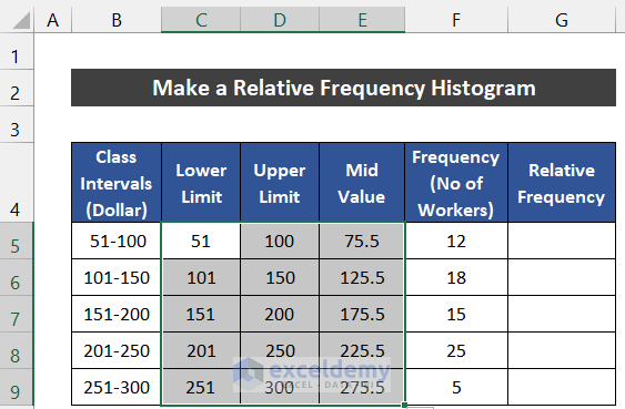
- After that, select the range of cells B5:E6 and drag the Fill Handle icon to copy the data pattern up to cell E9.
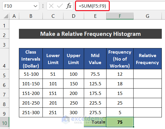
- Next, we use the SUM function to sum the total number of workers. For that, write down the following formula into cell F10.
=SUM(F5:F9)
- Press the Enter key.
- Then, write down the following formula into cell G5 to get the value of relative frequency. Make sure that, you input the Absolute Cell Reference sign with cell F10 before using the Fill Handle icon.
=F5/$F$10
- Press Enter.
- Double-click on the Fill Handle icon to copy the formula up to cell G9.

- Now, we will plot the histogram chart for the value of relative frequency.
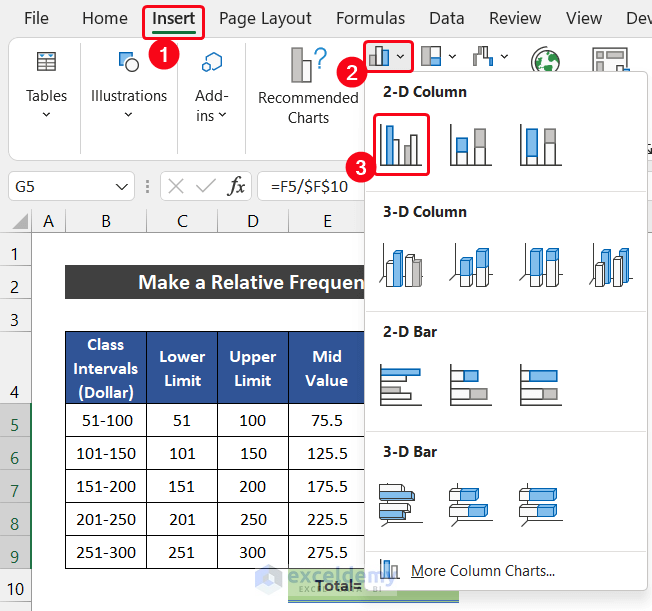
- For that, select the range of cells G5:G9.
- After that, in the Insert tab, select the drop-down arrow of Insert Column or Bar Charts from the Charts group and choose the Clustered Column option from the 2-D Column section.
- If you look carefully at the chart, you will notice that our chart doesn’t have the value on the X-axis.
- To fix this issue, in the Chart Design tab, click on the Select Data option from the Data group.

- As a result, a dialog box called Select Data Source will appear.
- In the Horizontal (Category) Axis Labels section, there will be a random number set of 1-5. To modify it, click on the Edit option.
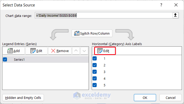
- Another small dialog box titled Axis Labels will appear. Now, select the range of cells E5:E9 and click OK.

- Again, click OK to close the Select Data Source dialog box.
- Finally, you will see the X-axis gets the mid-value of our class intervals.
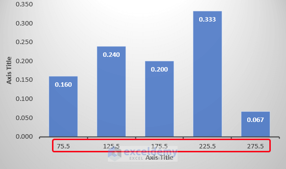
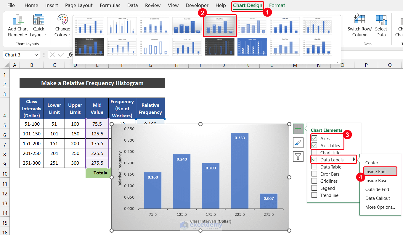
- You can also modify your chart design from this tab. In our case, we choose Style 5 from the Chart Styles group.
- Besides it, we keep three Chart Elements which are the Axes, Axis Titles, and Data Labels. Write down suitable axis titles according to your desire and choose the position of Data Labels at the Inside End.
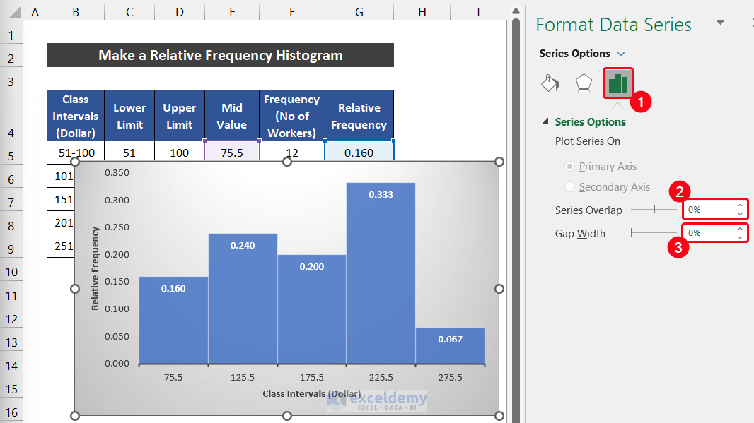
- Now, we all know that in a histogram, there will be no gap between the vertical columns.
- To eliminate this void space, double-click on the columns on the chart.
- As a result, a side window entitled Format Series Window will appear.
- Then, in the Series Options tab, set the Series overlap as 0% and the Gap Width as 0%. The gap will disappear.
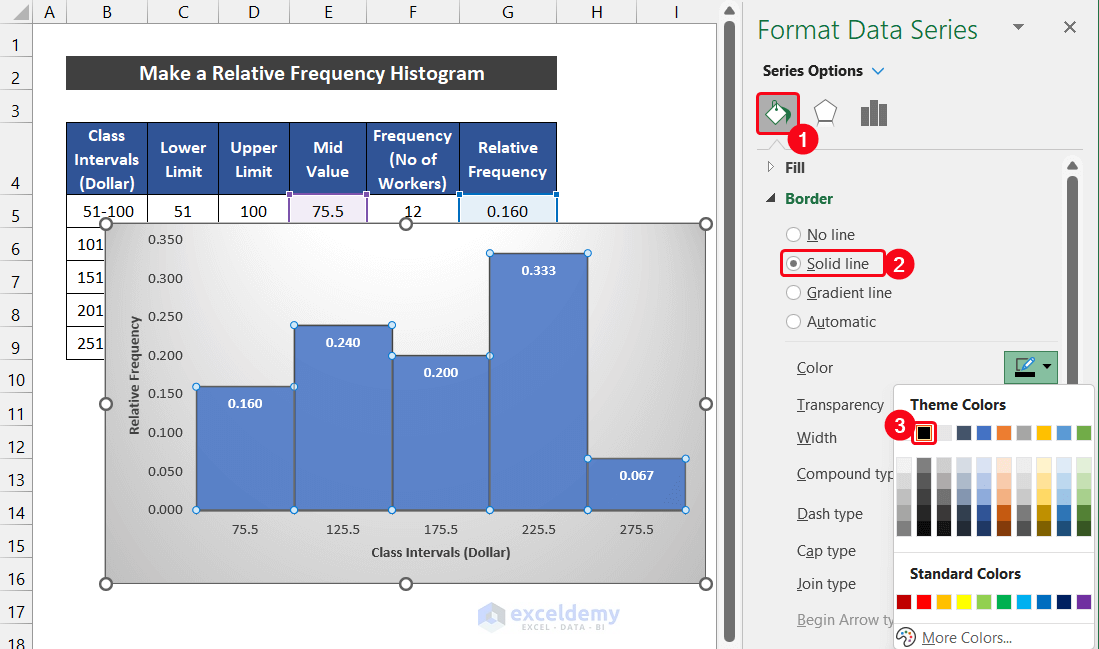
- After that, to distinguish the column border, select the Fill & Line > Border option.
- Now, select the Solid line option and choose a visible color contrast with your column color.
- Our relative frequency histogram is ready.
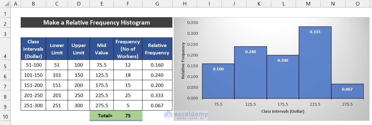
Finally, we can say that we are able to make a relative frequency histogram in Excel.
Read More: How to Make Frequency Distribution Table in Excel
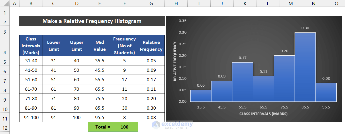
2. Relative Frequency Histogram for Examination Marks
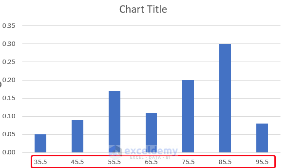
In this following example, we consider a dataset of seven class intervals of examination marks for 100 students. The Class Intervals (Marks) are in column B and the Frequency (No of Students) in column C.

The procedure to make the relative frequency histogram of this dataset is given as follows:
📌 Steps:
- First, insert three columns between the Class Intervals and the Frequency. You can add the columns in several ways.
- After that, input the following entities into the range of cells C4:E4 and G4 as shown in the image.

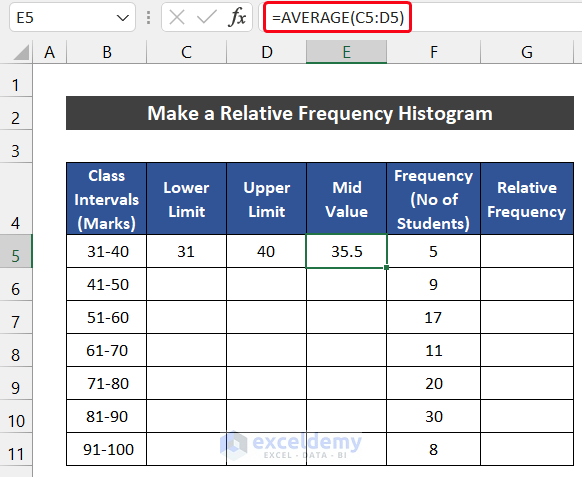
- Now, manually input the upper limit ‘31’ and lower limit ‘40’ in cells C5 and D5 respectively.

- After that, select cell E5 and write down the following formula to get the average of these two limits. We are using the AVERAGE function to estimate the mid valve.
=AVERAGE(C5:D5)
- Then, press Enter.
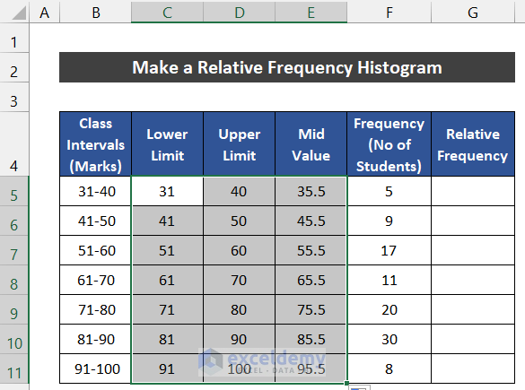
- Similarly, follow the same process for row 6.
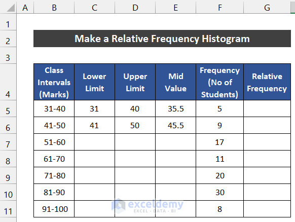
- Next, select the range of cells B5:E11 and drag the Fill Handle icon to copy the data pattern up to cell E11.
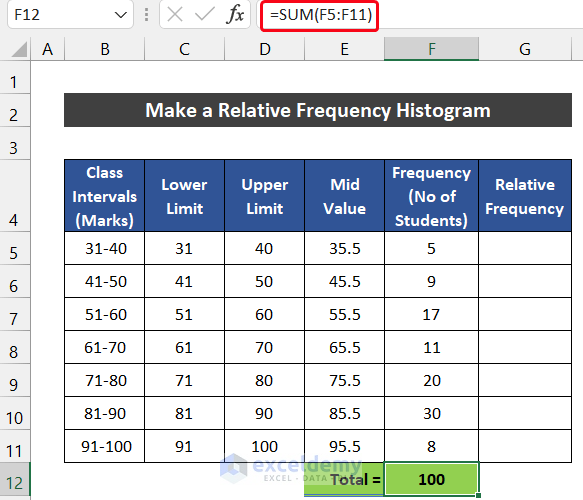
- Now, we use the SUM function to sum the total number of workers. For that, write down the following formula into cell F12.
=SUM(F5:F11)
- Press the Enter key.
- Then, write down the following formula into cell G5 to get the value of relative frequency. Make sure that, you input the Absolute Cell Reference sign with cell F12 before using the Fill Handle icon.
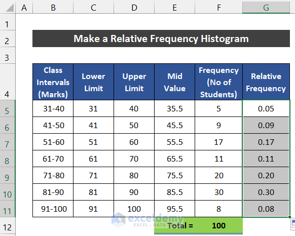
=F5/$F$12
- Similarly, press Enter.
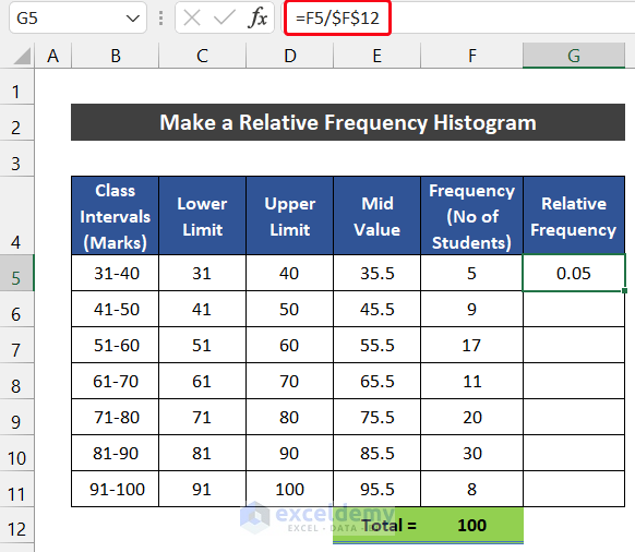
- Double-click on the Fill Handle icon to copy the formula up to cell G11.
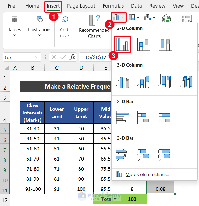
- Now, we will plot the histogram chart for the value of relative frequency.
- For that, select the range of cells G5:G11.
- Then, in the Insert tab, select the drop-down arrow of Insert Column or Bar Charts from the Charts group and choose the Clustered Column option from the 2-D Column section.
- If you carefully check the chart, you will notice that our chart doesn’t have the value on the X-axis.
- For fixing this issue, in the Chart Design tab, click on the Select Data option from the Data group.
- A dialog box called Select Data Source will appear.
- In the Horizontal (Category) Axis Labels section, there will be a random number set of 1-7. To modify it, click on the Edit option.
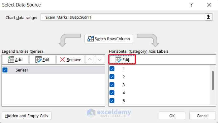
- Another small dialog box called Axis Labels will appear. Now, select the range of cells E5:E11 and click OK.

- Again, click OK to close the Select Data Source dialog box.
- At last, you will see the X-axis gets the mid-value of our class intervals.
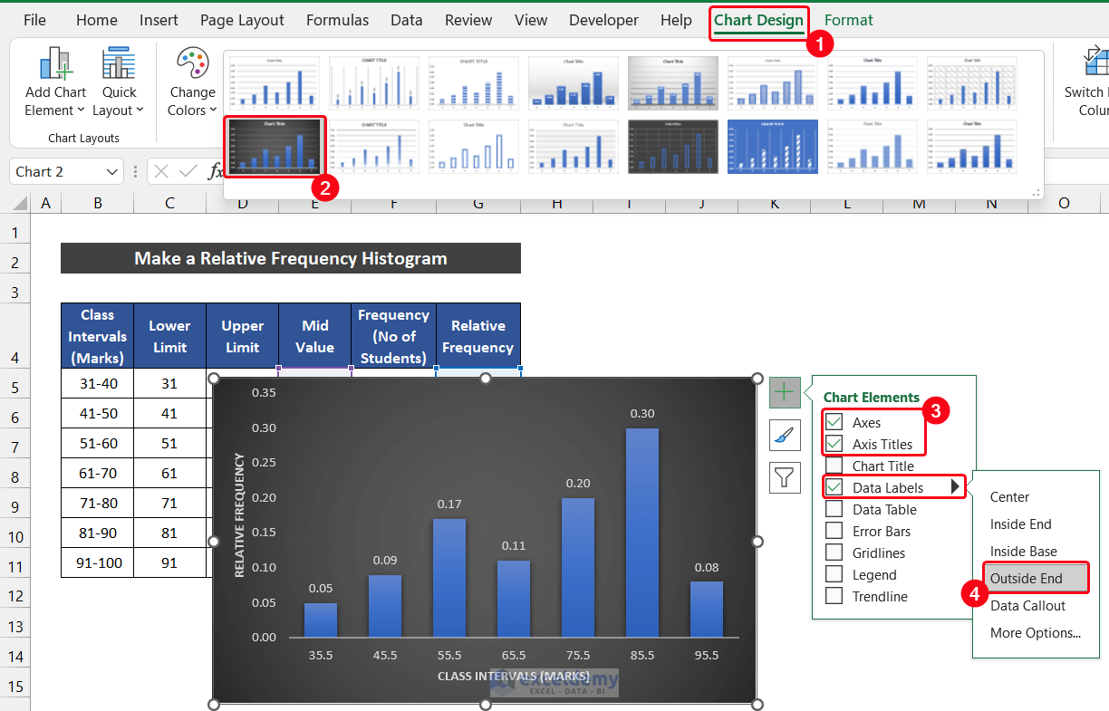
- You can also modify your chart design from this tab. In our case, we choose Style 9 from the Chart Styles group.
- Moreover, we keep three Chart Elements which are the Axes, Axis Titles, and Data Labels. Write down the suitable axis titles according to your desire and choose the position of Data Labels at the Outside End.
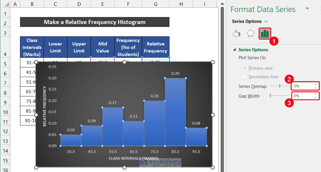
- We all know that in a histogram, there should be no gap between the vertical columns.
- For eliminating this void space, double-click on the vertical columns on the chart.
- As a result, a side window titled Format Series Window will appear.
- After that, in the Series Options tab, set the Series overlap as 0% and the Gap Width as 0%. The gap will vanish.
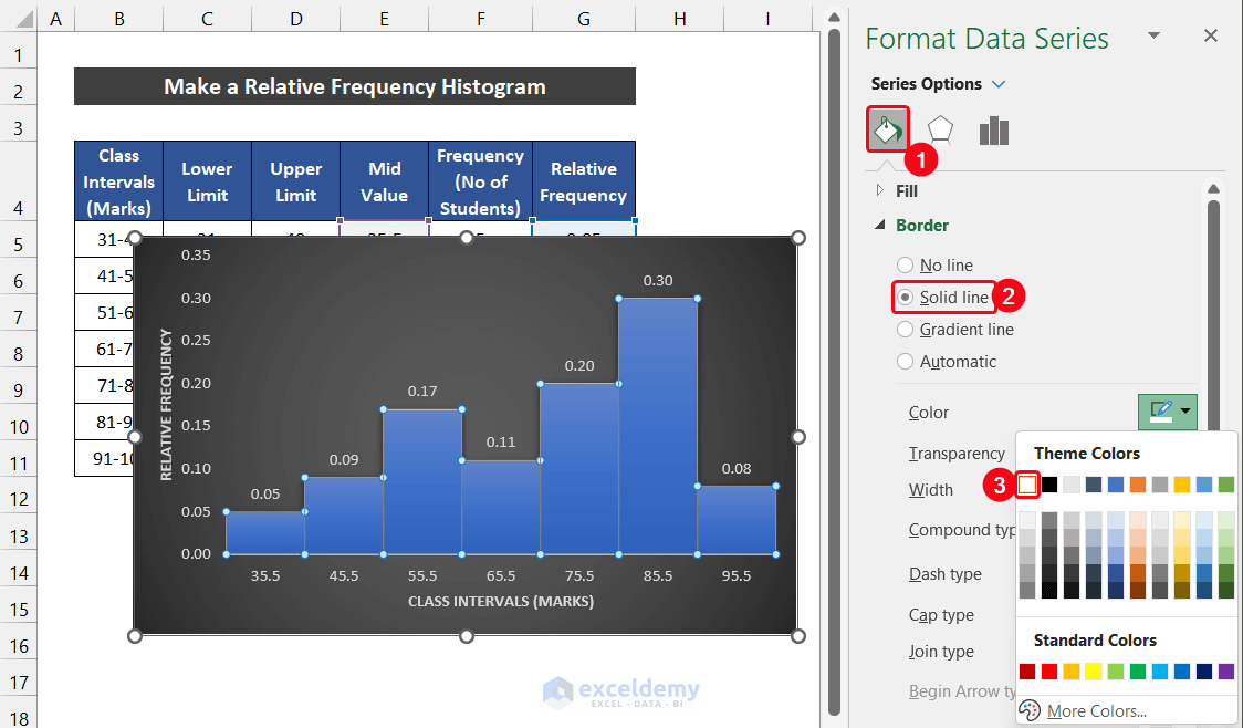
- To distinguish the column border, select the Fill & Line > Border option.
- Then, select the Solid line option and choose a visible color contrast with your column color.
- Finally, our relative frequency histogram is ready.
Thus, we can say that we are able to make a relative frequency histogram in Excel.
Read More: How to Do a Frequency Distribution on Excel
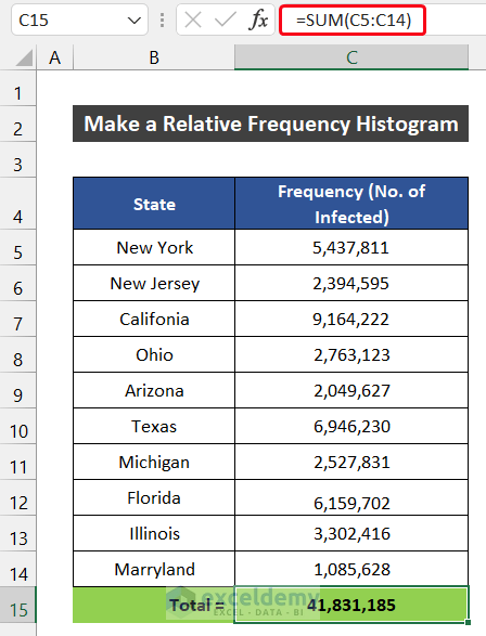
3. Relative Frequency Histogram for Covid-19 Infected People
Now, we try a different type of example. We are going to consider the dataset of 10 major states of the United States and the number of Covid-19 infected people. Our dataset is in the range of cell B5:C14.

The process to make the relative frequency histogram of this dataset is given below:
📌 Steps:
- At first, we use the SUM function to sum the total number of workers. For that, write down the following formula into cell C15.
=SUM(C5:C14)
- Now, press Enter.
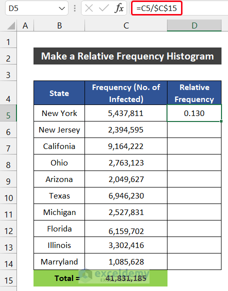
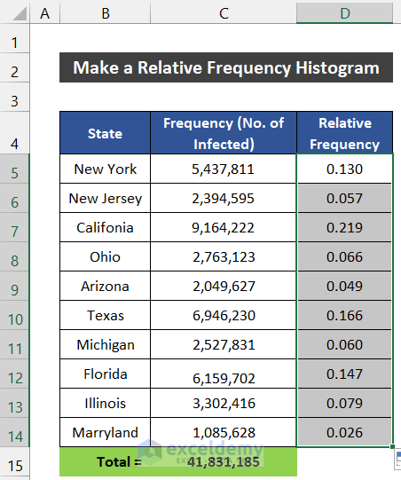
- After that, write down the following formula into cell D5 to get the value of relative frequency. Make sure that, you input the Absolute Cell Reference sign with cell C15 before using the Fill Handle icon.
=C5/$C$15
- Similarly, press Enter.
- Then, double-click on the Fill Handle icon to copy the formula up to cell D14.
- Now, we will plot the histogram chart for the value of relative frequency.
- To plot the graph, select the range of cells D5:D15.
- After that, in the Insert tab, select the drop-down arrow of Insert Column or Bar Charts from the Charts group and choose the Clustered Column option from the 2-D Column section.

- Now, if you carefully take a look at the chart, you will notice that our chart doesn’t have the value on the X-axis.
- To fix this issue, in the Chart Design tab, click on the Select Data option from the Data option.
- A dialog box entitled Select Data Source will appear.
- Then, in the Horizontal (Category) Axis Labels section, there will be a random number set of 1-10. To modify it, click on the Edit option.
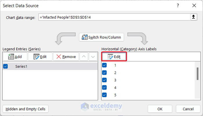
- Another small dialog box called Axis Labels will appear. Now, select the range of cells B5:B14 and click OK.

- Again, click OK to close the Select Data Source dialog box.
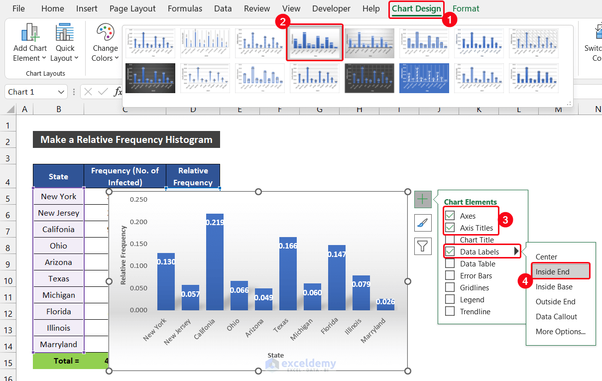
- In the end, you will see the X-axis gets the name of the states.
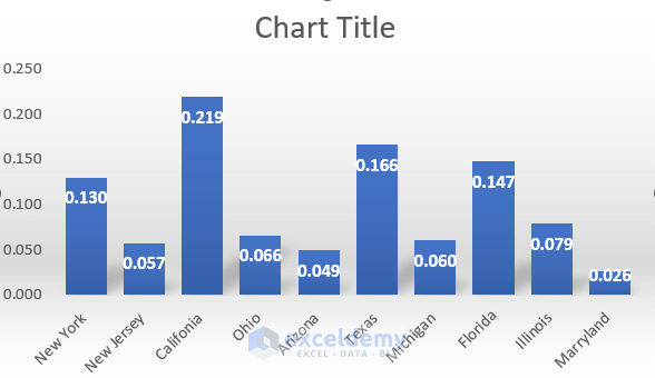
- You can also modify your chart design from this tab. In this case, we choose Style 4 from the Chart Styles group.
- Moreover, we keep three Chart Elements which are the Axes, Axis Titles, and Data Labels. Write down the suitable axis titles according to your desire and choose the position of Data Labels at the Inside End.
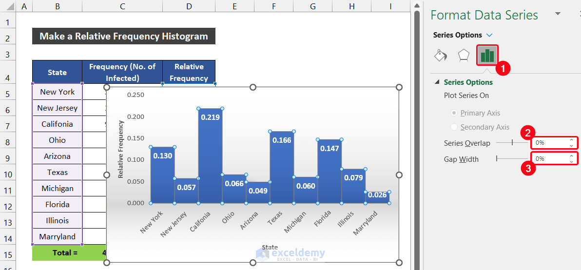
- In addition, we all know that in a histogram, there should be no gap between the vertical columns.
- To remove this space, double-click on the vertical columns on the chart.
- As a result, a side window titled Format Series Window will appear.
- Then, in the Series Options tab, set the Series overlap as 0% and the Gap Width as 0%. The gap will vanish.
- To make visible the column border, select the Fill & Line > Border option.
- Next, select the Solid line option and choose a visible color contrast with your column color.
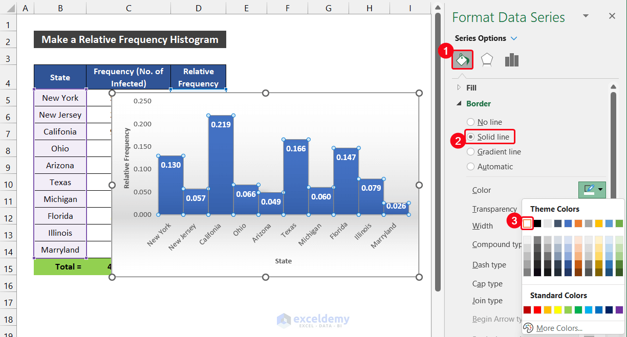
- Additionally, use the resize icon at the edge of the chat to get a better visualization of the data.
- At last, our relative frequency histogram is ready.
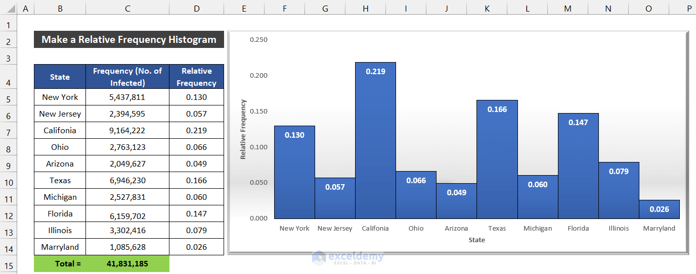
So, we can say that we are able to make a relative frequency histogram in Excel.
Read More: How to Create a Grouped Frequency Distribution in Excel
Download Practice Workbook
Conclusion
That’s the end of this article. I hope that this article will be helpful for you and you will be able to make a relative frequency histogram in Excel. Please share any further queries or recommendations with us in the comments section below if you have any further questions or recommendations.
Keep learning new methods and keep growing!
Related Articles
- How to Calculate Upper and Lower Limits in Excel
- How to Find Mean of Frequency Distribution in Excel
- How to Calculate Relative Frequency Distribution in Excel
- How to Calculate Cumulative Relative Frequency in Excel
- How to Calculate Cumulative Frequency Percentage in Excel
<< Go Back to Frequency Distribution in Excel | Excel for Statistics | Learn Excel
Get FREE Advanced Excel Exercises with Solutions!
