Frequency Distribution in Excel
Jun 16, 2024
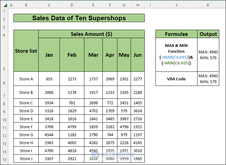
In this article, we will learn how to calculate upper and lower limits in Excel using 2 different methods.
We will use the sales data of ten ...
Jul 23, 2024
Step 1 - Creating Two Helper Columns
We have a dataset of a company’s Remuneration Range and Frequency.
Construct two columns named “Class ...
Jul 22, 2024
What Is a Contingency Table?
Contingency Tables are a summary of various categorical variables. Contingency Tables are also known as Cross Tabs and ...
May 27, 2024
Method 1 - Cross-Tabulation of Player Positions by Teams
This dataset contains a list of players, their teams, and their positions. We will ...
Aug 12, 2024
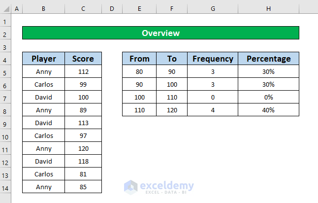
Relative Frequency
Relative frequency is the ratio of a frequency within a specific range to the total number of frequencies. The percentage or ...
Jun 15, 2024
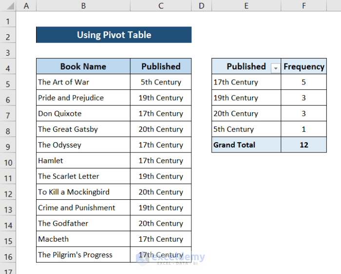
Method 1 - Using Pivot Table to Make Frequency Distribution Table in Excel
Let's take a dataset that includes some salesman's name, product, ...
Aug 4, 2024
In Statistics, Frequency means the number of occurrences in a particular range or interval, and the Frequency Distribution displays the frequency ...
Nov 11, 2025
Frequently, we work with numerical data in our Excel worksheet. And so, we may need to Calculate the Cumulative Frequency Percentage. The Cumulative ...
Aug 2, 2024
Method 1 - Using Conventional Formula to Calculate Relative Frequency Distribution
We can efficiently calculate the relative frequency distribution ...
Aug 4, 2024
What Is Cumulative Relative Frequency?
The relative frequency is expressed as a percentage of the overall number of data. By dividing the frequency ...
Jun 28, 2024
To make a categorical frequency table, we need a dataset to gather data from. We will be using the following sample dataset for illustration.
...
Nov 11, 2025
A relative frequency histogram is a special type of chart, which shows us the rate of any event’s occurrence. This type of graph also provides us ...
Aug 4, 2024
We will use a dataset that contains information about the Marks of some students. We will create a grouped frequency distribution and show it in a ...
Nov 11, 2025
A frequency distribution can help you figure out what proportion of distribution is made up of specific values. By grouping values together, a ...
Nov 11, 2025
A percent frequency distribution can help you figure out what proportion of the distribution is made up of specific values. By grouping values ...