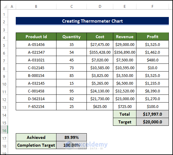
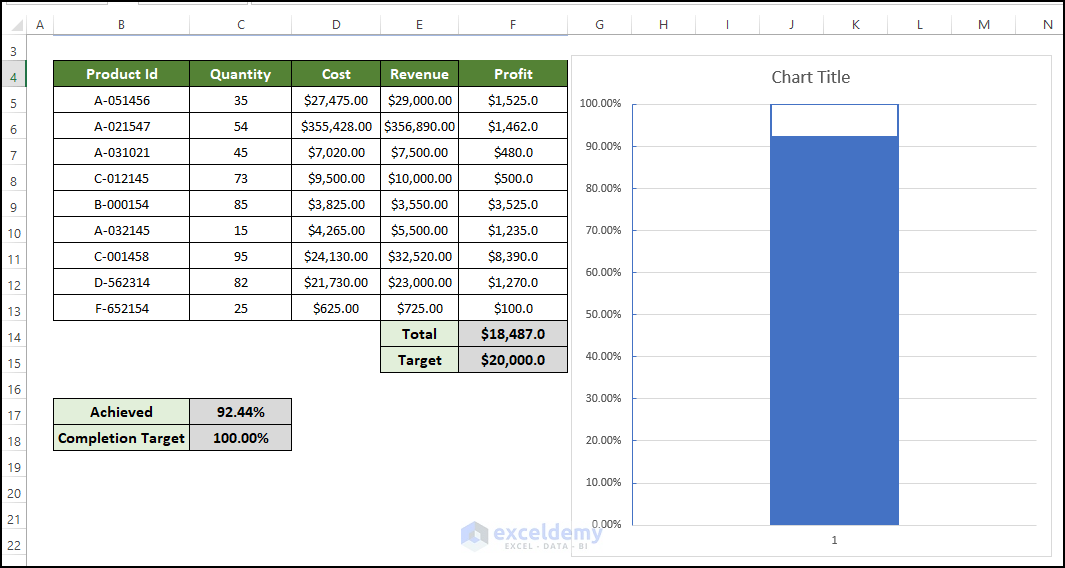
Step 1 – Prepare the Dataset
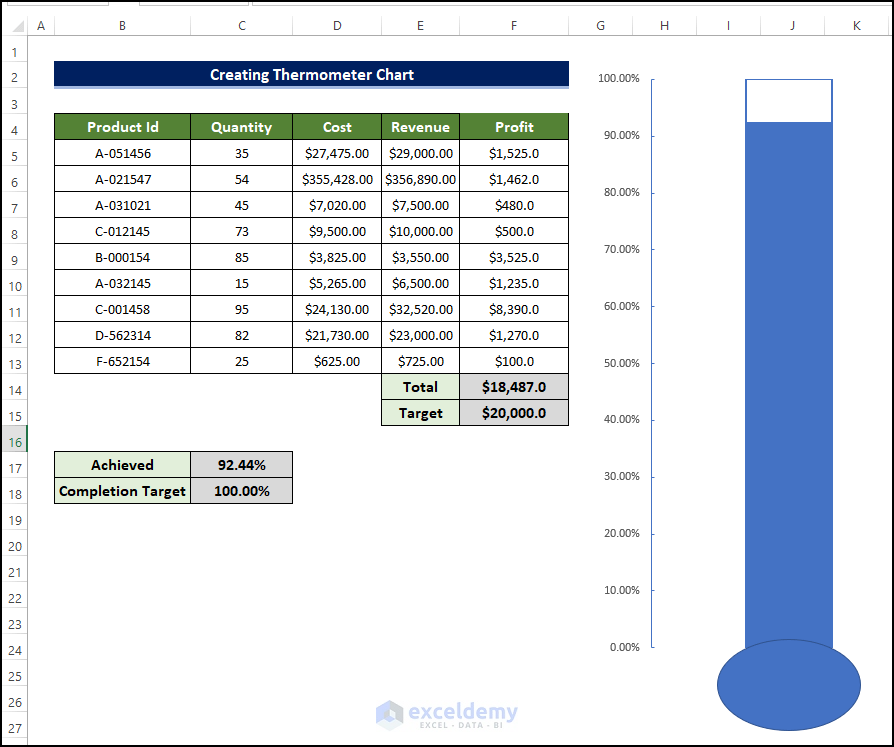
We’ll use the information about the cost of total product development and the revenue earned after selling the products. We will calculate the profit and then create the thermometer chart to understand the impact of changing various values.
- Consider the values in columns B, C, D, and E as static values that need to be input.
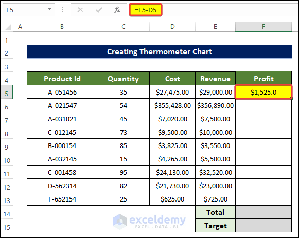
- To calculate the profit, select cell F5 and enter the following formula:
=E5-D5
Entering this formula will calculate the profit for the product in the range of cells B5:B13.
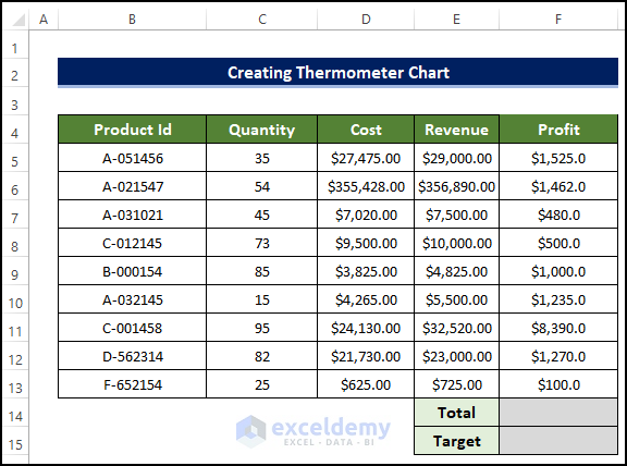
- Drag the Fill Handle to cell F13.
- Select cell F14 and enter the following formula:
=SUM(F5:F13)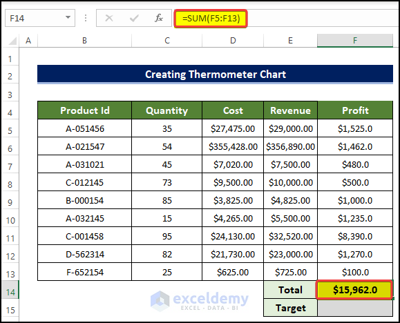
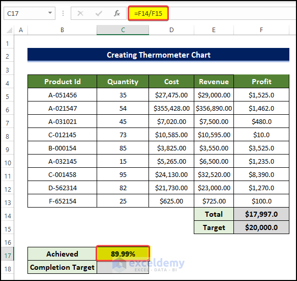
- Insert a target value in F15.
- Select cell C17 and enter the following formula:
=F14/F15
Entering this formula will help us determine how much progress we made in profit making in percentage.
- We have the dataset that we needed in order to add the thermometer in Excel.
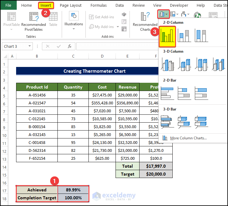
Step 2 – Create and Merge a Stacked Column Chart
- Select the range of cells B17:C18.
- Go to the Insert tab, then click on the Insert Column or Bar Chart.
- Click on the Clustered Column from the 2D Chart option.
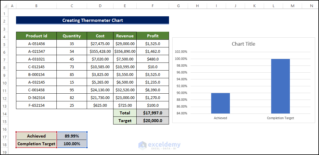
- We will have the chart right next to the table.
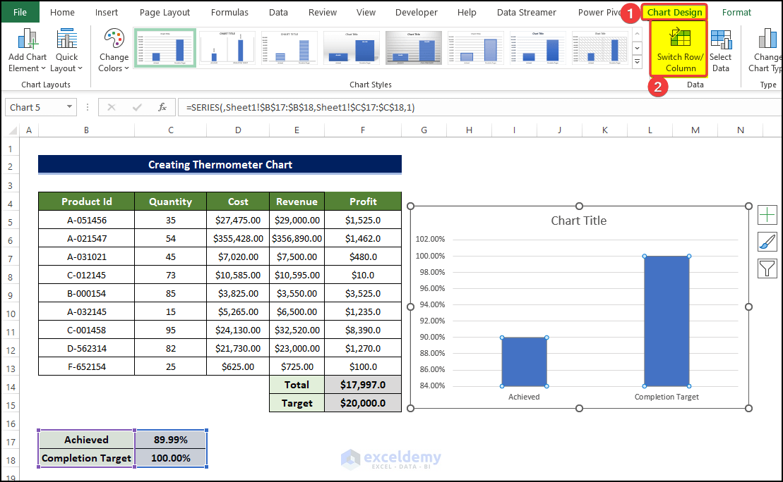
Step 3 – Modify the Data Series
- Select any of the data columns and, from the Chart Design tab, click on the Switch Row/Column.
- The axes will now be transposed.
- One of the column’s colors is changed to orange.
- Select any of the columns and right-click on it.
- Click on Format Data Series.
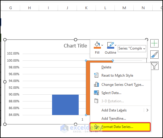
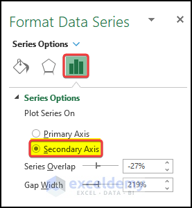
- From the right-side panel, click on the Secondary Axis on the Series Options.
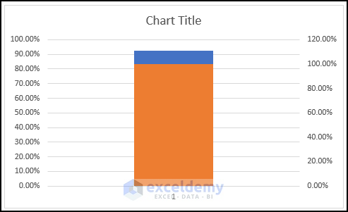
- The chart will look like the below image, as the columns are basically stacked now.
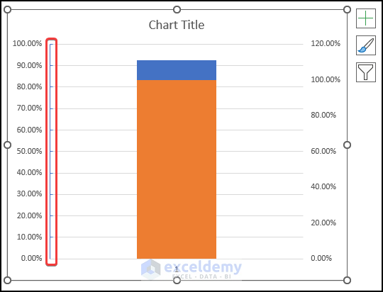
Step 4 – Modify Chart Axis
- Select the right axis and then press Delete to delete it.
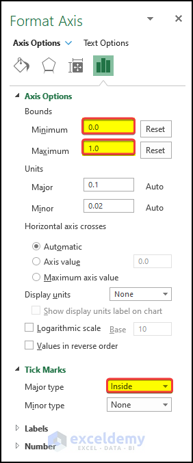
- Select the left axis and right-click on it.
- Click on Format Axis.

- In the right-side panel, input the Minimum bound as 0.0 and press Enter.
- Input 1.0 in the Maximum bound option and press Enter.
- This will fix the visible limit of the axis. However, when the chart changes, the chart axis value will begin at 0.0 and end at 1.0.
- Click on the tick and, from the Major type, select Inside.
- This will make the tick appear on the inside part of the chart.
- The modified chart will look like the below image.
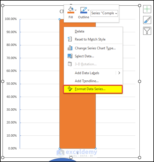
Step 5 -Modify Data Series Again
- Select any of the columns and right-click on it.
- From the context menu, click on Format Data Series.
- In the right-side panel menu, go to Fill and Line.
- In the Fill option, select No Fill.
- In the Border option, click on Solid line. Make sure the color of the border matches the column color.
- Set the Width to 1.25 pt from 0.75 pt.
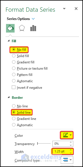
- Our chart will finally have a distinctive thermometer shape.
- The shape will change dynamically according to the input data.
Step 6 – Modify the Chart Area
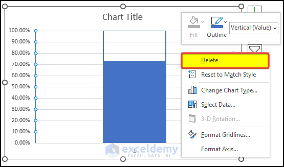
- Select the gridlines of the chart and then right-click on them.
- From the context menu, click Delete.
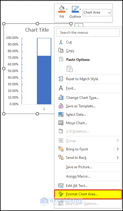
- Click anywhere in the chart except the plot area and right-click.
- Click on Format Chart Area.
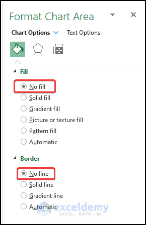
- On the right-side panel, click on No Fill in Fill option and No Line in the Border option.
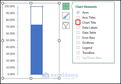
- Click on the right plus sign on the chart. Go to the Axes option.
- Uncheck the Primary Horizontal checkbox.
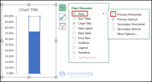
- Remove the tick from the Chart Title checkbox.
Step 7 – Add a Thermometer Bulb
- After we have the Thermometer-shaped Chart, we can now add the bulb shape below it.
- Go to the Insert tab.
- Click on the Shapes and click on the oval shape icon.
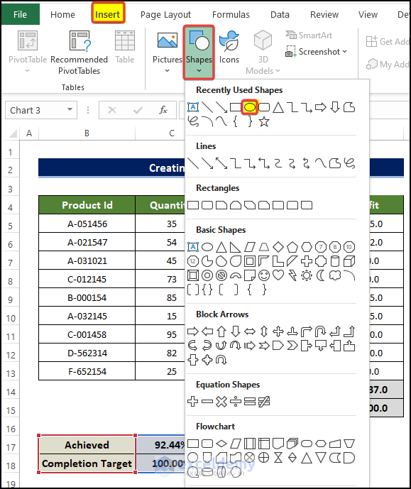
- Place the oval at the bottom of the chart.
- The final form of the thermometer will look like the below image.
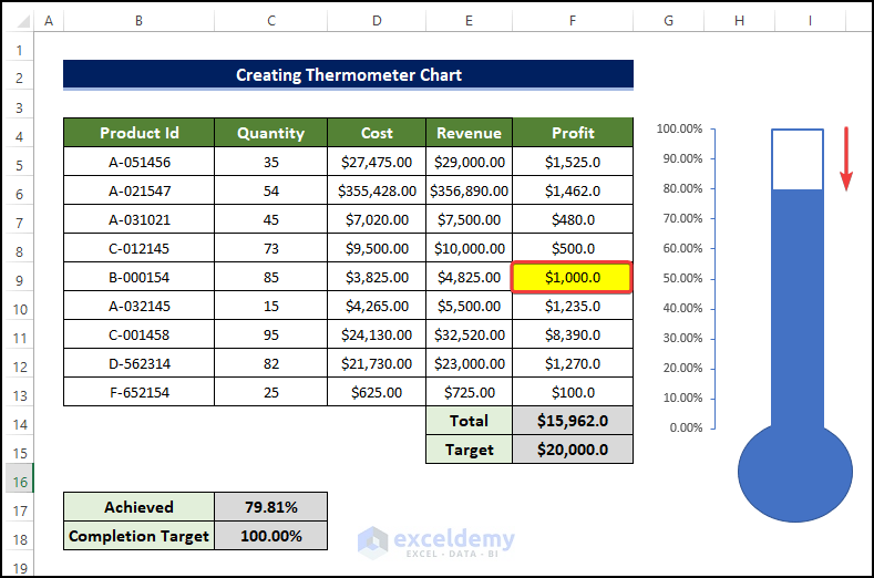
- If is there any change in value in the dataset, then the thermometer chart level will also change.
- For example, there is a change of value in the revenue in cell F9.
- The revenue fell from $3,525 to just $1,000, which resulted in the drop level in the chart.
- This demonstrates that the chart is truly a dynamic thermometer chart.
Download the Practice Workbook
Related Articles
- How to Create Goal Thermometer Excel
- How to Create Fundraising Thermometer Excel
- How to Create Debt Thermometer Excel
<< Go Back To Excel Charts | Learn Excel
Get FREE Advanced Excel Exercises with Solutions!
