For analyzing and comparing data, the Goal Thermometer is a wonderful tool. It helps to get a clear visualization of risk and achievement. In this article, we will describe 3 effective ways to create a goal thermometer in Excel.
How to Create Goal Thermometer in Excel (3 Effective Ways)
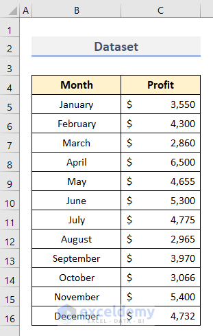
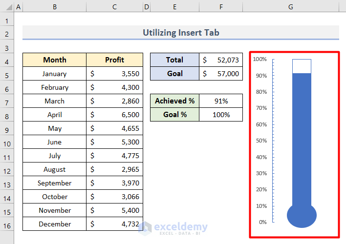
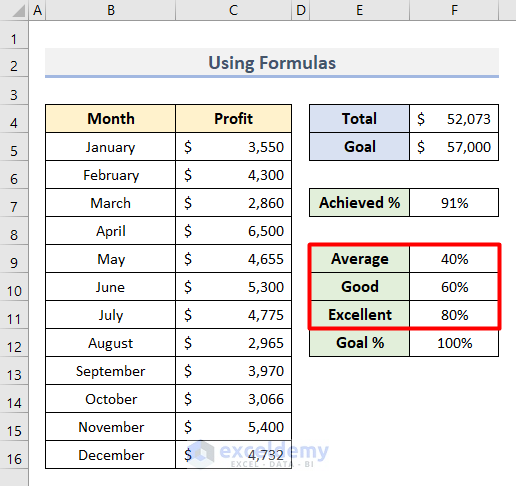
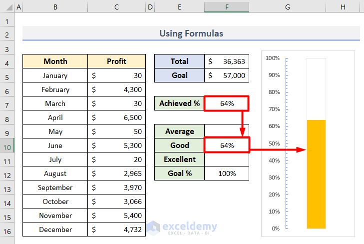
To illustrate the process, here is a sample dataset. It shows the profit for each month of the year.
- To get the total profit, insert this formula in Cell F4.
- Along with this, also insert your required goal in Cell F5.
=SUM(C5:C16)
- Lastly, apply this formula in Cell F7 to get the percentage of achieved profit. For the total goal, we provided 100% in Cell F8.
=F4/F5
So far, we have created our initial dataset. Now, let us follow the methods to create a goal thermometer out of it.
1. Utilize Insert Tab to Create Simple Goal Thermometer in Excel
We will create a simple goal thermometer in this section. For this, follow the steps below carefully.
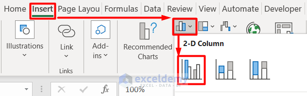
- First, select the Cell range E7:F8.
- Then, select Insert > Insert Column or Bar Chart > Clustered Column.
- Second, select the chart outline and click on Switch Row/Column from the Chart Design tab.

- As a result, the bars will overlap each other.
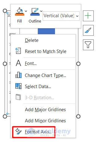
- Third, right-click on the visible bar and select Format Data Series.
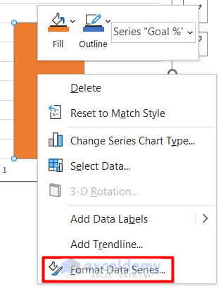
- Here, set it as a Secondary Axis from the Series Options.
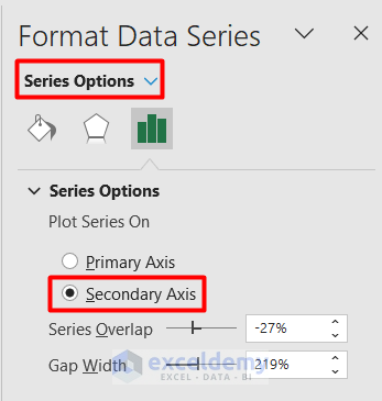
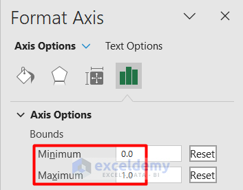
- Now, right-click on the left axis and select Format Axis from its context menu.

- Here, set the Minimum and Maximum Bounds to 0 and 1 respectively.
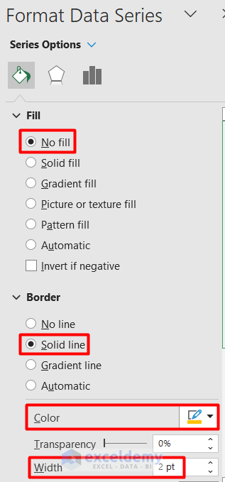
- Up next, right-click the visible bar from the chart again and choose Format Data Series.

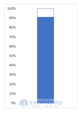
- In the Series Options, change the Fill option to No Fill, Border as Solid line, and choose your preferred Color from the list.

- After this, delete the Chart Title, Gridlines, Horizontal Axis, and Labels from the chart.
- Following this, resize the chart as shown below.
- At this stage, right-click the left vertical axis again and click on Format Axis.
- Here, choose Inside for both Major and Minor type Tick Marks.

- Lastly, select Insert > Shapes > Oval and put it below the bar.

- Finally, the goal thermometer will look like this.
- Now, each time you change any value from the profit column, the achieved value will change, and the bar will increase or decrease according to it.
2. Insert Dynamic Goal Thermometer Using Formulas in Excel
In this section, we will create a dynamic goal thermometer. In this case, the thermometer will change its color based on some conditions and formulas. So, without further delay, let’s jump into the steps.
- First, add 3 conditions-Excellent, Good, and Average with initial values of 80%, 60%, and 40% respectively.
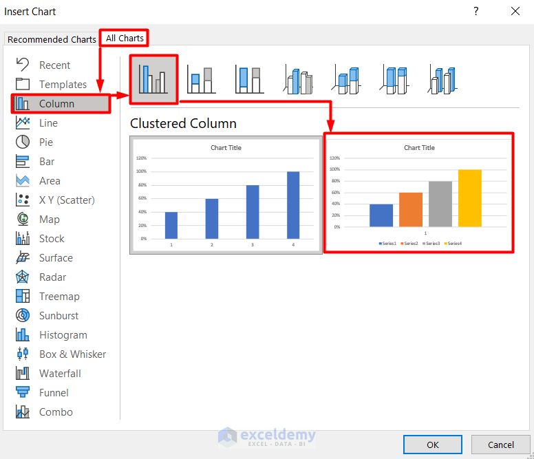
- Then, select Cells E9:F12 and click on Recommended Charts from the Insert tab.

- Afterward, select All Charts > Column > Clustered Column as shown below.
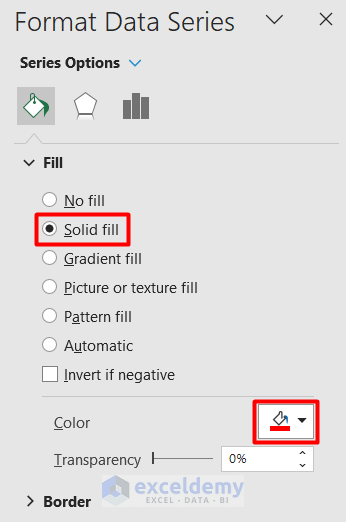
- Next, right-click on the first bar from the chart and choose Format Data Series from its context menu.

- Following this, select Solid Fill from the Fill option.
- Along with it, choose any Color according to your preference.
- Similarly, follow the same procedure for the 2nd and 3rd bars as well.
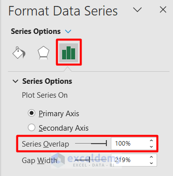
- For the last bar, apply these settings in the Format Data Series panel.

- Afterward, set the Series Overlap as 100% under the Series Options.
- Along with this, select the left vertical axis and set the Minimum and Maximum Bounds to 0 and 1 respectively.

Note: Although the Bounds are set at 0 and 1 initially, you are advised to set it manually to turn the Reset button on to avoid any error.
- Lastly, remove the Horizontal Axis, Gridlines, Chart Title, and Labels from the graph.
- Alongside, right-click on the vertical axis and choose Format Axis > Axis Options > Tick Marks > Major & Minor Type > Inside.
- As a result, you will get the following goal thermometer.

- Now, we will connect it with some formulas to make it dynamic.
- For this, insert the following formulas for Average, Good, and Excellent status respectively.
- In Cell F9, insert this formula.
=IF(F7<=40%,F7,"")
- In Cell F10, apply this formula.
=IF(AND(F7>40%,F7<=70%),F7,"")
- In Cell F11, type the following formula.
=IF(F7>70%,F7,"")

- Finally, when you change any values in your main dataset, the percentage achieved will change and will determine the status.
- As a result, the goal thermometer will change its color.
3. Use Helper Table to Create Goal Thermometer
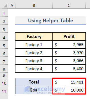
In this third method, we will create a helper table to support the original data and create a goal thermometer. For this, here is a sample dataset. It shows the profit of 4 factories of a company. It also shows the total profit and the company’s expected profit goal.
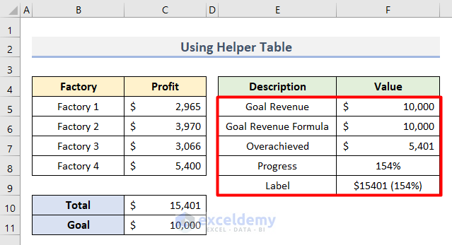
Now, let us create a helper table and based on that, generate a goal thermometer following the steps below.
- First, create the helper table with the following formulas in the Cell range E5:F9.
- In Cell F5, type the formula below for goal revenue:
=C11
- In Cell F6, insert the formula below for the goal revenue formula:
=IF(C10<=C11,C10,C11)
- In Cell F7, apply this formula for overachieved:
=IF(C11<=C10,C10-C11,0)
- In Cell F8, insert this formula below for progress:
=C10/C11
- In Cell F9, type this formula for Label:
=CONCATENATE(TEXT(C10,"$#0"),"(", TEXT(F8, "#0%"),")")
- Then, select the dataset of the new table and choose Insert > Charts > Stacked Column.

- Now, choose the first bar and select Chart Design > Data > Switch Row/Column.
- As a result, it will combine the bars into one column.
- Then, right-click on the bottom column and choose Format Data Series from its Context Menu.
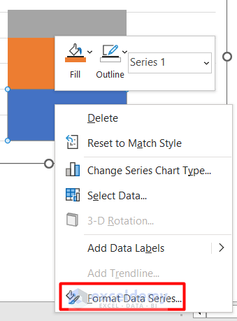
- Now, apply the following settings under the Series Options.
- Following this, apply these changes in the middle column.

- Lastly, provide these settings for the upper column.

- Next, right-click on the middle column and choose Add Data Labels.
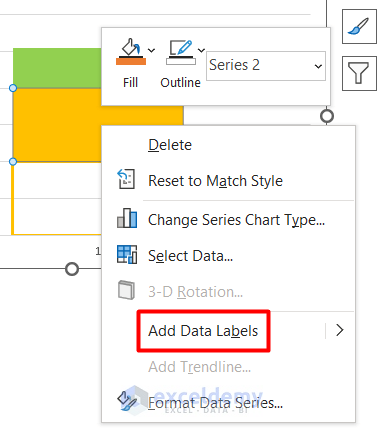
- As a result, you will get a Text Box inside the column.
- In this box, insert this formula to connect the Label value from the helper table.
='Using Helper Table'!$F$9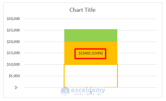
Note: In this formula, ‘Using Helper Table’ is the worksheet name we are working on. You can give any other name according to your workbook.
- Next, right-click on the bottom column again and choose Format Data Series.

- Then, set it as a Secondary Axis from the Series Options.

- Next, right-click on the vertical axis and select Format Axis.

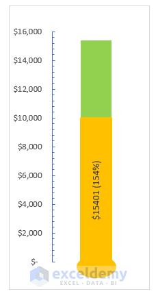
- Here, set the Minimum and Maximum Bounds as 0 and 16000 respectively.
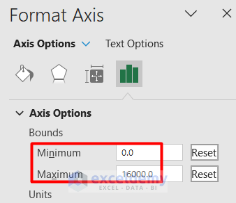
Note: It is advised to set the Maximum Bound to more than the Total value of the main dataset. Otherwise, if the Total value exceeds the Maximum Bound, the Goal Thermometer will not show any changes.
- Along with it, set the Major and Minor type of Tick Marks as Inside in the Axis Options.

- Lastly, insert the Oval shape from the Insert > Shapes command.
- Finally, we have got our desired Goal Thermometer.
Read More: How to Create Progress Thermometer in Excel
Download Practice Workbook
Get this practice file and try the process by yourself.
Conclusion
Henceforth, I hope this article on how to create a goal thermometer in Excel was helpful to you. We tried to illustrate the process in 3 effective ways. Let us know your feedback in the comment box.
Related Articles
- How to Create a Thermometer Chart in Excel
- How to Create Fundraising Thermometer Excel
- How to Create Debt Thermometer Excel
<< Go Back To Thermometer Chart in Excel | Excel Charts | Learn Excel
Get FREE Advanced Excel Exercises with Solutions!
