This tutorial will demonstrate how to create a debt thermometer chart in Excel. A debt thermometer chart is very useful when you want to represent work progress or the percentage of a fraction of work. If you have a certain target and you want to show or record a tract how much the work is done, in this case, a debt thermometer chart is the best way to represent it. It not only helps to track the record of your work but also gives you direction on where you are having problems and where you need to change your line of work. So, it is essential to learn how to create a debt thermometer chart in Excel.
How to Create Debt Thermometer in Excel ((With Easy Steps))
We’ll use a sample dataset overview as an example in Excel to understand easily. If you follow the steps correctly, you should learn how to create a debt thermometer chart in Excel on your own. The steps are described as follows.
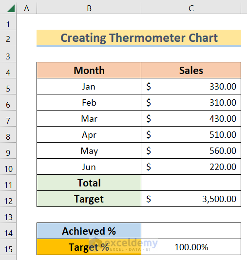
Step 1: Creating a Dataset to Create Debt Thermometer Excel
In this case, we aim to create a debt thermometer chart in Excel using a proper dataset. For instance, we have Month in column B and Sales in column C. At the very beginning, we have to determine the total sales and percentage of it by using this dataset.
- Then, insert the following SUM function in the C11 cell.
=SUM(C5:C10)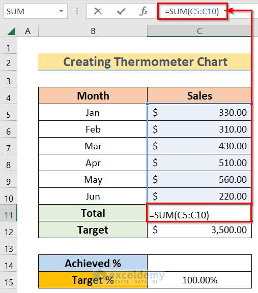
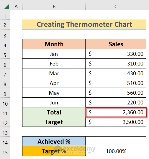
- After that, you will get the result by using the SUM function.
- Moreover, insert the following SUM function in the C12 cell.
=C11/C12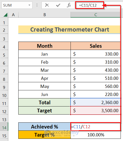
- Finally, you will get the result using the division.
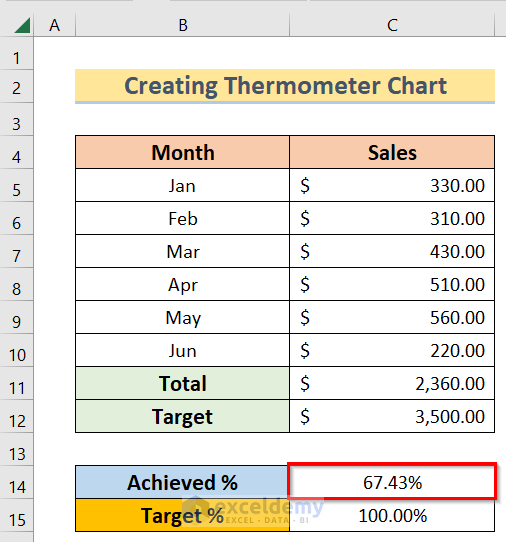
Hence, your dataset is ready to use for inserting a chart with its help.
Step 2: Inserting 2-D Column Chart
Now, our goal is to create a debt thermometer chart in Excel by inserting a 2-D column chart. A 2-D column chart is mainly used to represent certain data within the proper visual range. The steps of this process are below.
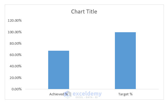
- First, select the table >> Insert >> Chart >> 2-D Column options.

- Then, you will get the chart accordingly.
- Afterward, click on the chart and you will see a Chart Design option in the Menu Bar. Then in the Chart Design option, click on the Switch Row/Column options.
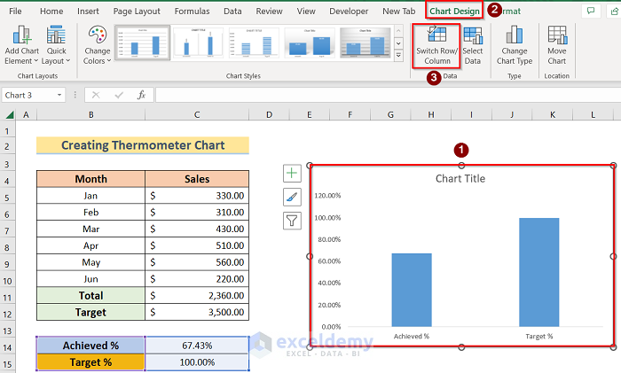
- Moreover, you will get the final chart according to your wish.

Therefore, we have got the chart accordingly but now we want to format it for better representation.
Step 3: Formatting the Chart
Furthermore, we want to create a debt thermometer chart in Excel by formatting the chart. We can achieve this goal by following the below steps.
- To begin with, click on the chart and right-click on the chart to select the Format Data Series feature.
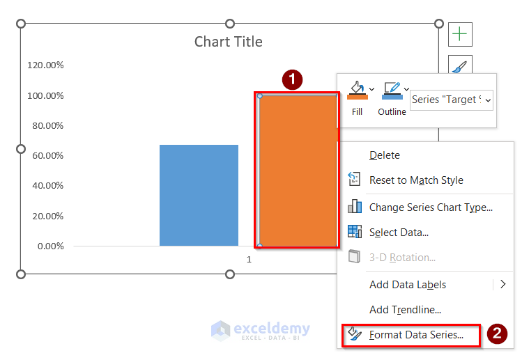
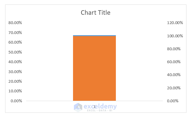
- In addition, in the Format Data Series window, select the Secondary Axis option.

- Furthermore, you will get a chart similar to the below image.
- Therefore, right-click on the axis of the chart and select the Format Axis option.
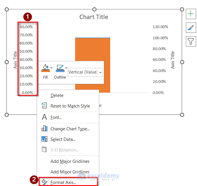
- After that, in the Format Axis window, choose the Maximum and Minimum options.
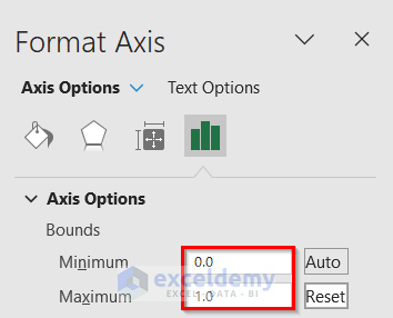
- Therefore, you will get a chart with min to max range percentage. Then, select the chart again and right-click on the chart, and choose the Format Data Series option.

- Subsequently, in the Format Data Series window, select No Fill in the Fill portion, choose Solid line in the Border portion, and select the color as you wish.

- Finally, you will get the chart like the below image.

- Next, right-click on the title options and select the Format Axis option.

- Hence, in the Format Axis window, select the Inside option in the Major type.

- Now, you will get the final result as below.

So, we have got the first of the chart to create a debt thermometer in Excel.
Step 4: Showing Final Result to Create Debt Thermometer Excel
Finally, we can create a debt thermometer chart in Excel by the following steps.
- First, go to Insert >> Shapes options.

- Secondly, you will get the circle shape accordingly.

- Thirdly, select the new shape, then right-click on it, and select the Format Shape option.

- Fourthly, in the Format Shape window, select the No line option.

- Lastly, you will get the final result.

Download Practice Workbook
You can download the practice workbook from here.
Conclusion
Henceforth, follow the above-described methods. Hopefully, these methods will help you to learn how to create a debt thermometer chart in Excel. We will be glad to know if you can execute the task in any other way. Please feel free to add comments, suggestions, or questions in the section below if you have any confusion or face any problems. We will try our best to solve the problem or work with your suggestions.
Related Articles
- How to Create a Thermometer Chart in Excel
- How to Create Progress Thermometer in Excel
- How to Create Goal Thermometer Excel
- How to Create Fundraising Thermometer Excel
<< Go Back To Thermometer Chart in Excel | Excel Charts | Learn Excel
Get FREE Advanced Excel Exercises with Solutions!
