Download Practice Workbook
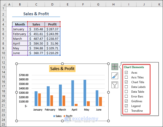
Chart Elements in Excel
There are 9 different chart elements available in Excel:
- Axes
- Axis titles
- Chart titles
- Data labels
- Data table
- Error bars
- Gridlines
- Legend
- Trendline
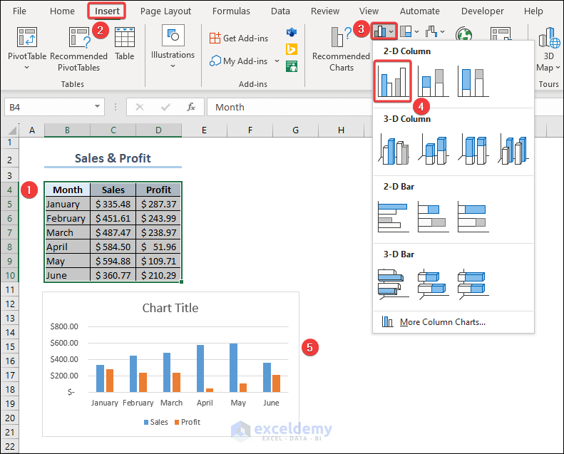
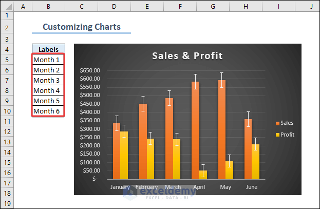
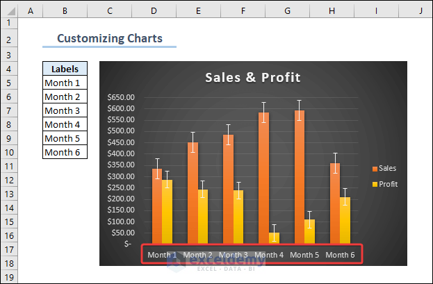
This is a sales and profit column chart. To create it:
- Select the whole dataset and go to Insert >> Insert Column or Bar Chart >> 2-D Column Chart.
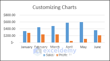
To customize the chart:
Example 1 – Adding the Chart Title
There’s a box on top of the chart area which contains the text ‘Chart Title’. Enter the name of your chart. Here, ‘Customize Charts’.
You can make the chart title dynamic by referring to another cell in it. See the image below.
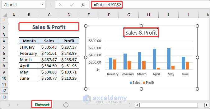
The chart title was selected and the formula was entered in the Formula Bar. (Do not enter the formula in the text box). To create the formula, select the chart title box, enter = (Equal symbol) in the formula bar, and select the cell containing the chart title.
If you change data in B2, the chart title will update.
You can find more options for the Chart Title by clicking the Plus (+) icon beside the chart. See the picture below.
You can modify the position of the title box, apply a fill color, change font style, etc.
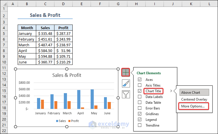
- Select More Options… .
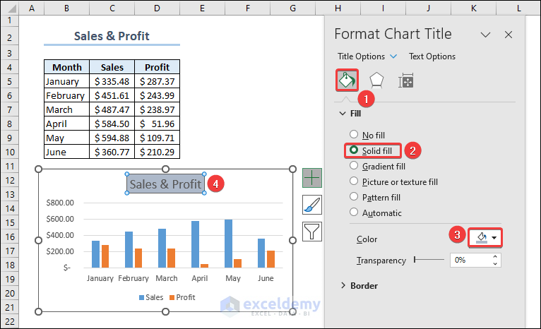
- In Format Chart Title, choose Title Options.
- Select Fill and choose Solid fill.
- Choose a color.
The title box displays a background color.
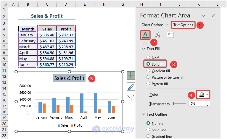
You can explore Text Options, as shown above and edit the text color and style in the Chart Title box.
To set a color for the text:
- Select Text Options >> Text Fill & Outline (marked 2 in the image below) >> Solid Fill >> Fill Color.
The text color will change.
- To apply text effects to the chart title, observe the image below.
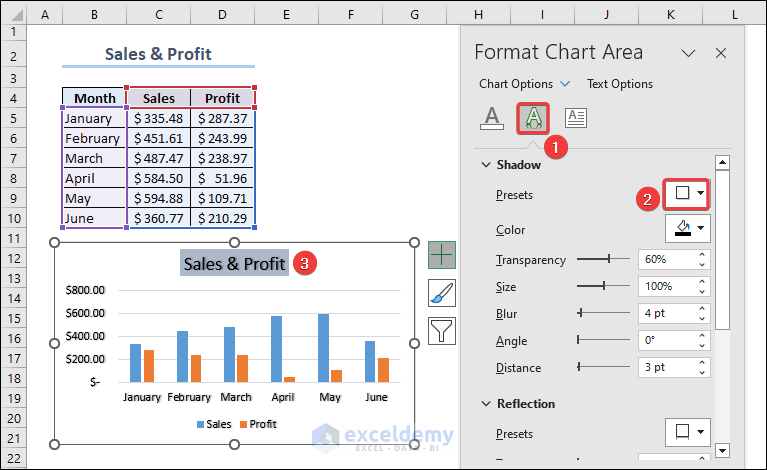
- Text Effect was selected.
- A style was chosen in Presets.
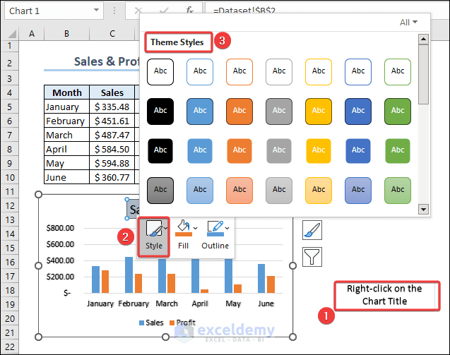
To apply other text styles to the Chart Title, right-click the box and select a Theme Style.
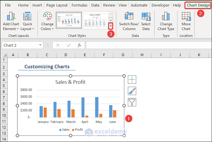
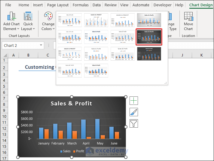
Example 2 – Changing the Appearance of the Chart
- Select the chart and select Chart Design.
- Click the drop-down icon marked 3 in the image below.
- Select a style.
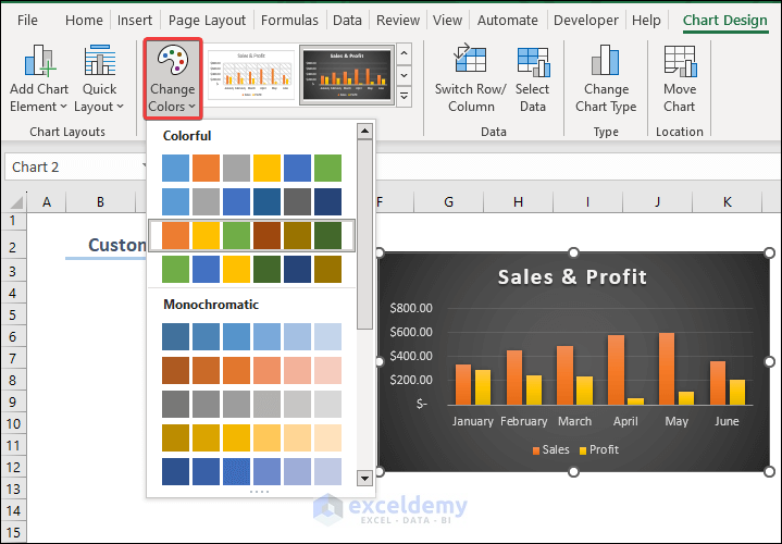
- You can also choose custom colors for the vertical bars: click Change Colors and choose a color.
In Quick Layout, you’ll find default layouts.
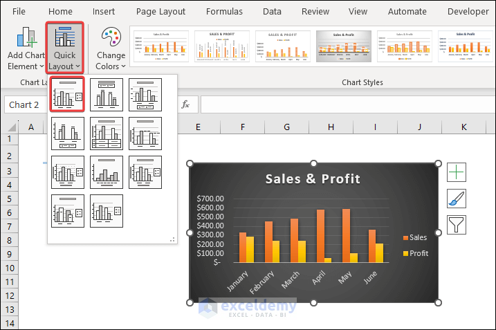
Here, Layout 1 was chosen: it rearranges the Axis Labels and Legends.
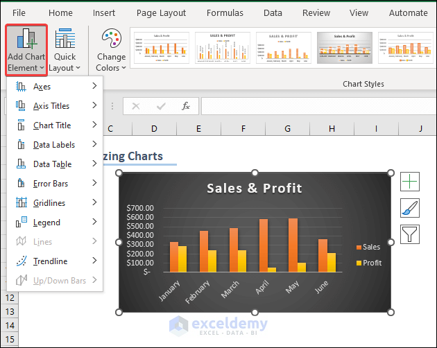
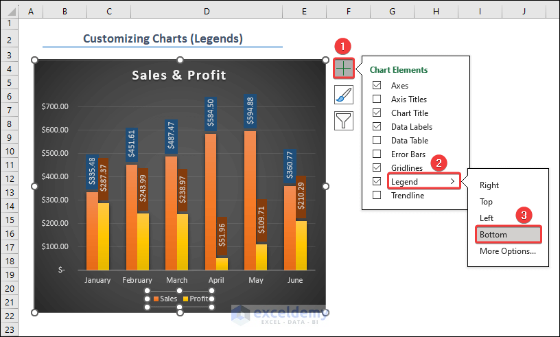
- Explore more options in Add Chart Elements. See the image below.
To add error bars to the chart:
- Select Error Bars in Add Chart Element.
- Choose an option. Here, Percentage Error Bar.
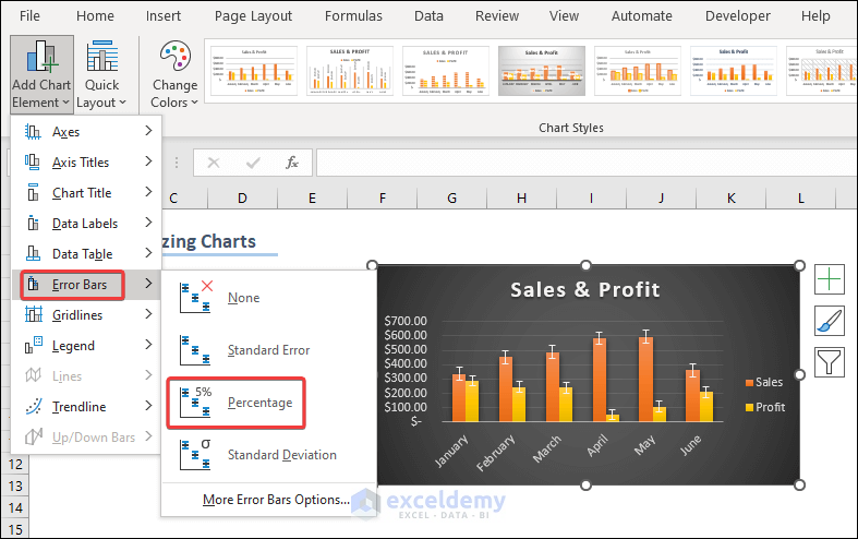
In More Error Bar Options… , you can customize the Error Bars.
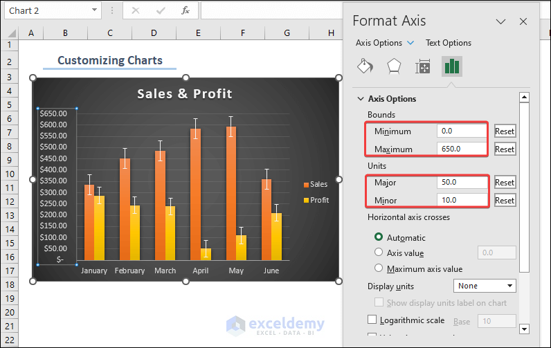
Example 3 – Customizing the Chart Axis
Format the vertical axis.
- Right-click the Axis box and select Format Axis: you’ll find default values for Bounds and Units.
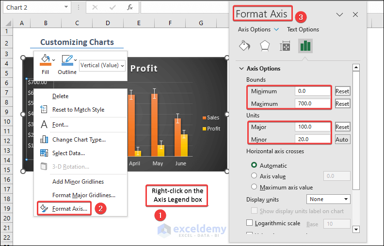
- Change them to edit the chart.
- The maximum value in the dataset is $600.00, so set the Maximum Bound to 650.
- Change Major Unit from 100 to 50 to see more gridlines.
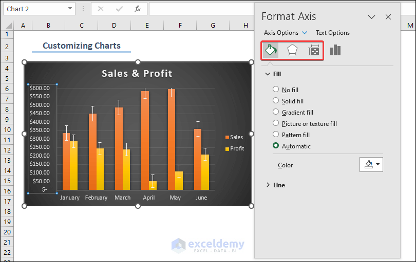
You can apply fill colors, effects and modify the position of the axis using the options shown below:
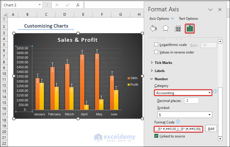
You can change the number format of the vertical axis. Find different number formats in Category. You can also modify the number code in Format Code.
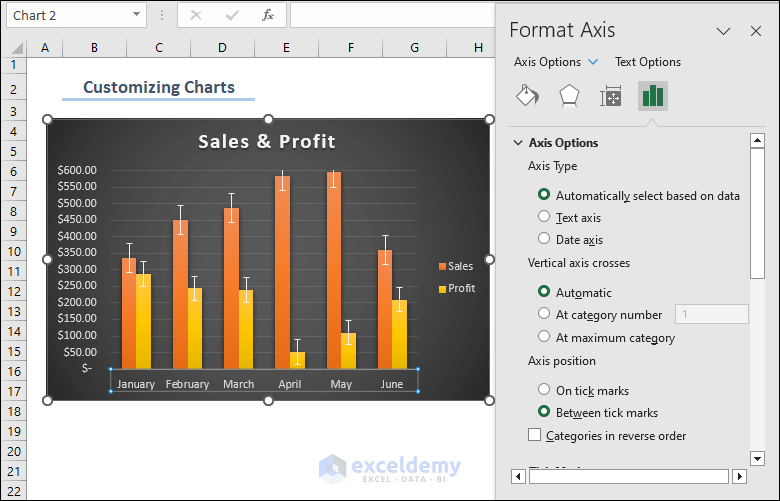
The horizontal axis contains texts or dates rather than numeric values. Observe the following picture.
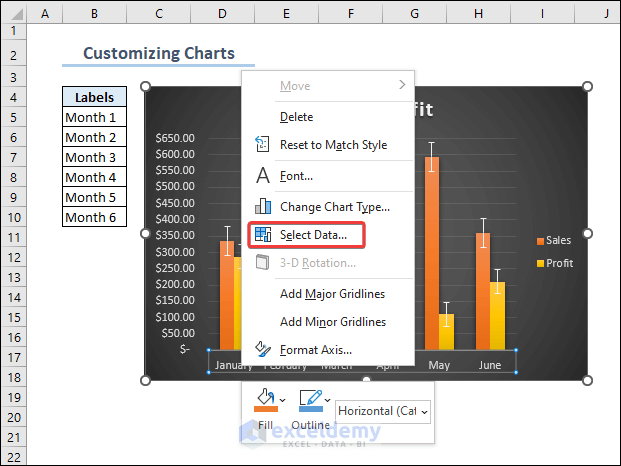
You can also change the text data of the axis labels to different data range:
- Place the cursor on the horizontal axis box and right-click it.
- Click Select Data.
- In the Select Data Source dialog, click Edit.
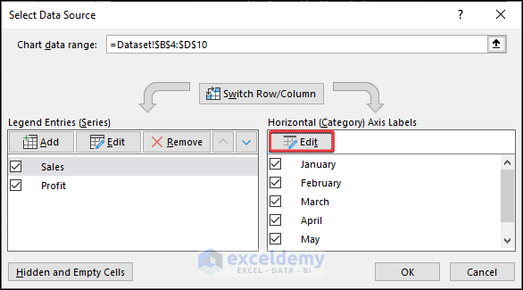
- In the Axis Labels dialog box, place the cursor and select the Labels range (B5:B10).
- Click OK.
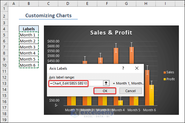
This is the output.
Note: To insert a Data Table in a chart, check Data Table in Data Labels.
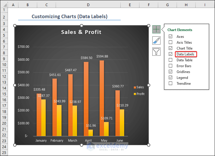
Example 4 – Editing Data Labels
To insert Data Labels:
- Select the Plus Icon (+) beside the chart and check Data Labels. Data Labels will be added by default.
- Select More Options.
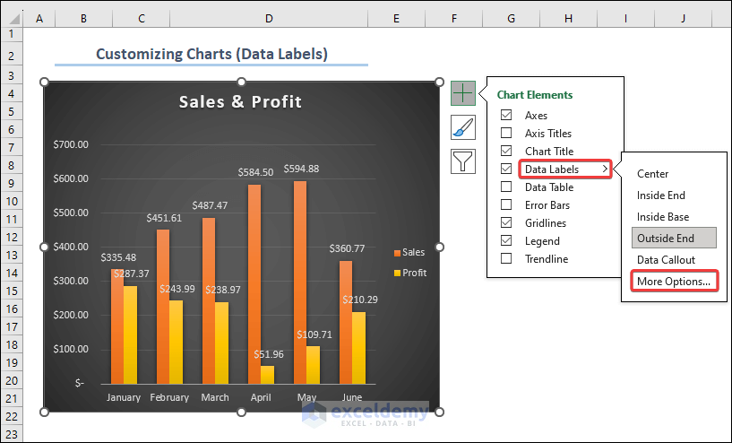
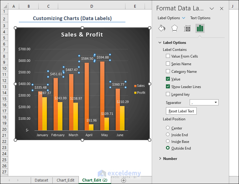
- In Label Options, you can find different features to customize the data labels (show additional data, change position or number format).
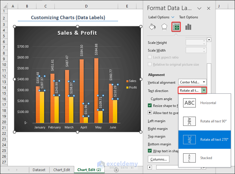
Here, Data Labels are blocking the view of the chart:
- Select Size & Properties and choose Rotate All Text 2700 in Text direction.
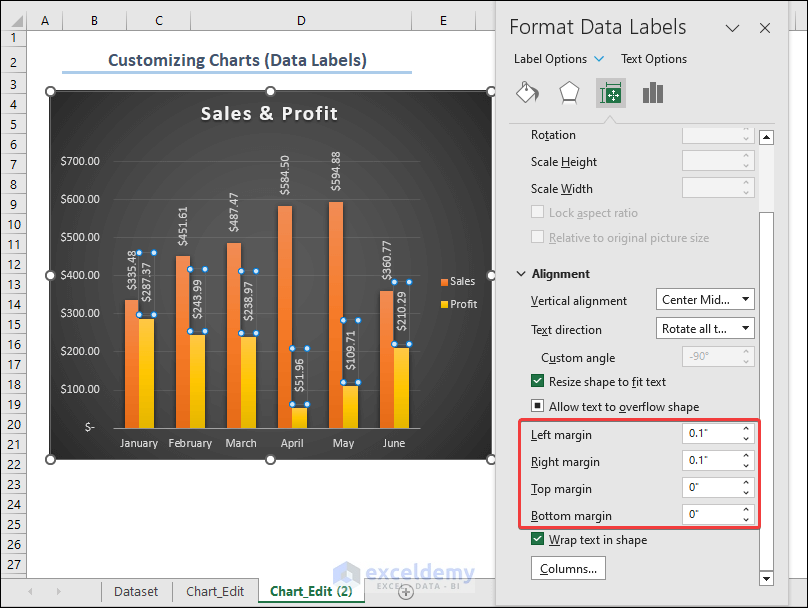
- To customize the margins of the data labels, so they don’t overlap the bars, change the values of the margins.
Fill color can also be used to differentiate data labels:
- Select the Data Labels and choose Fill & Line.
- Choose either Solid or Automatic.
- Choose a color.
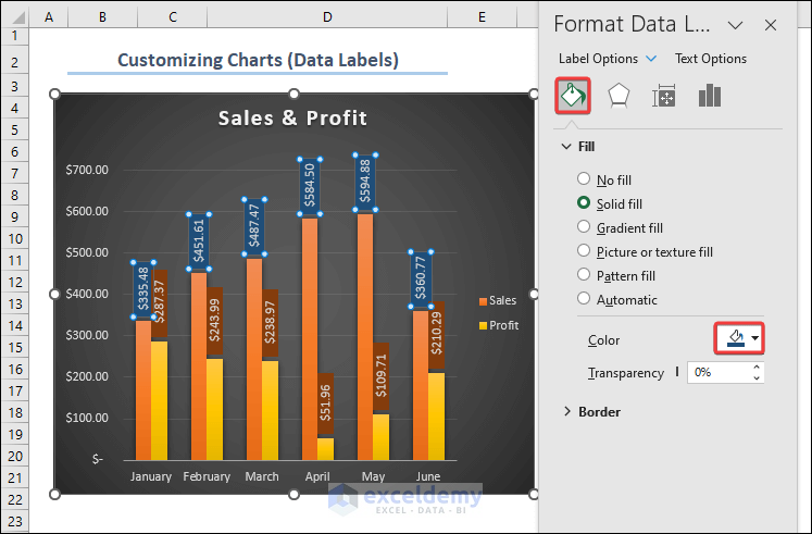
- Apply fill color to the two parameters of the data labels (Sales & Profit) separately.
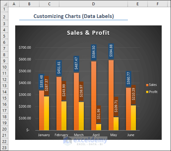
This is the output.
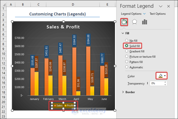
Example 5 – Customizing and Formatting the Legends
Here, the Legends (Sales and Profit) are at the Bottom of the chart.
Apply fill color to the Legends:
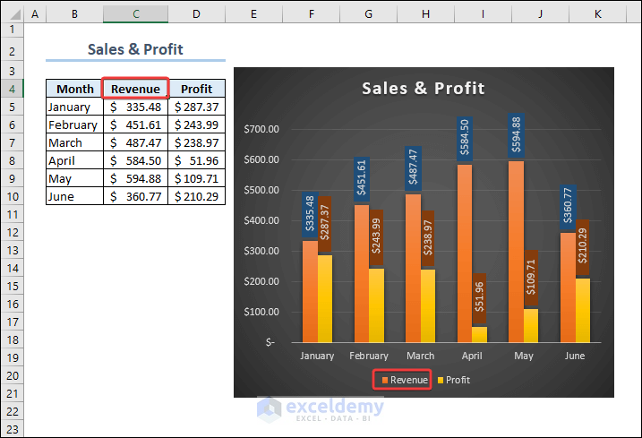
The texts in the Legends are linked to the column headings containing numeric data. If you change the Sales header to Revenue, the Legend will automatically be updated. See the image below.
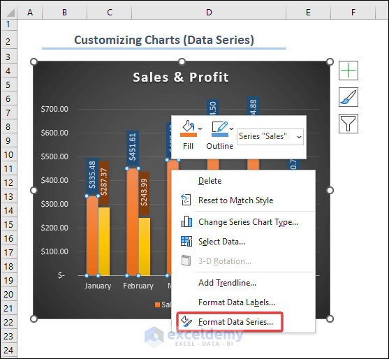
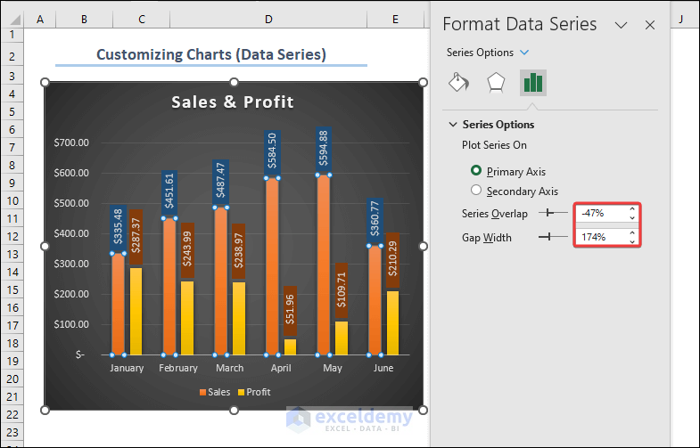
Example 6 – Formatting Data Series
Modify the gap width between bars or change the bar/line colors by using the options in Format Data Series.
- Click any of the bars to select them all.
- Right-click a bar and select Format Data Series.
- Enter your values in Series Overlap and Gap Width. Select Primary Axis in Plot Series On.
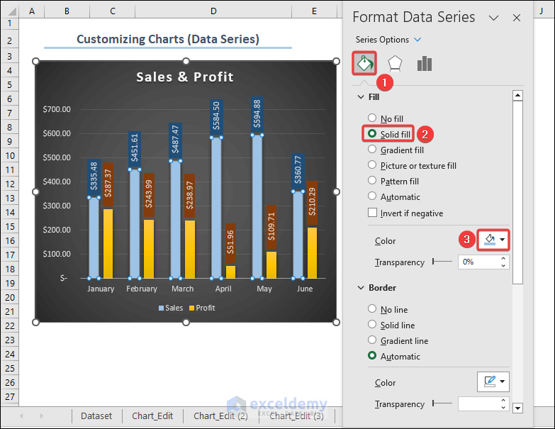
You can also add effects or add a fill color in Fill & Line.
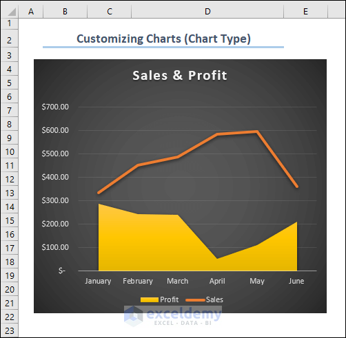
Example 7 – Changing the Chart Type
To change this chart to a 3-D Column Bar or Line or Scatter chart.
- Click Change Chart Type.
- Select the bars and right-click.
- The Change Series Chart Type will be displayed. You can also access it in the Chart Design tab.
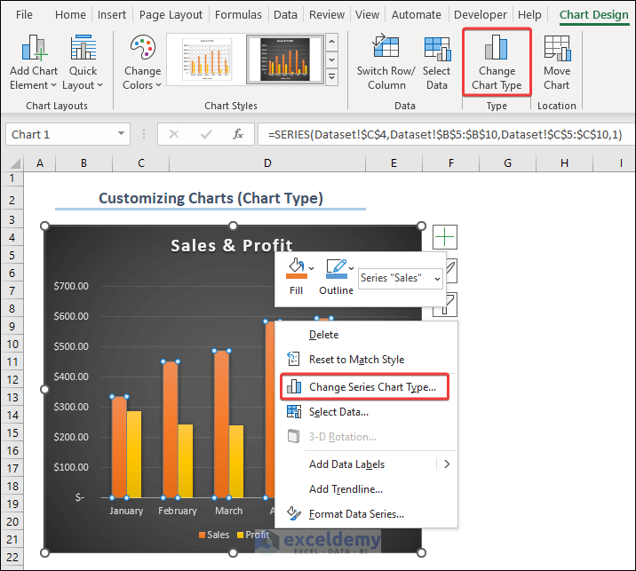
- Choose a chart type. Here, Line for the Sales data and 2-D Area for the Profit data.
- Click OK.
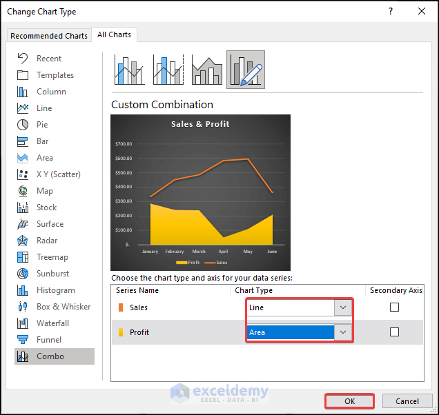
This is the output.
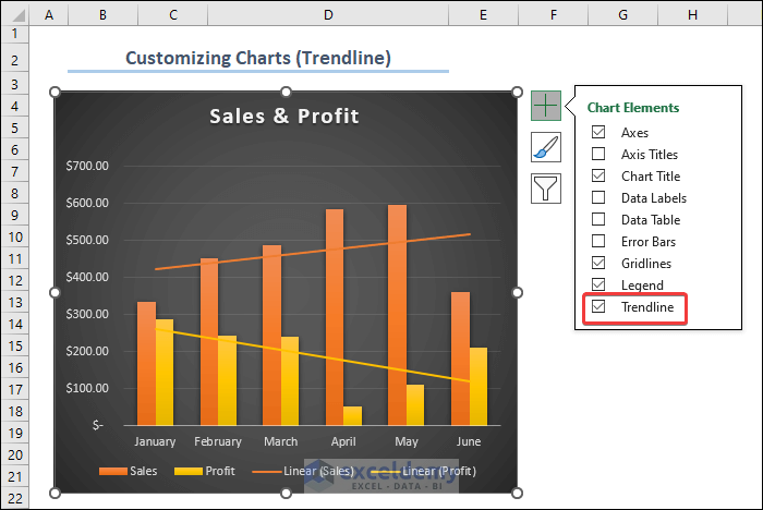
Example 8 – Adding a Trendline to the Chart
Observe the image below to add a trendline to the chart.
Frequently Asked Questions
1. How do I resize and position my chart on the worksheet?
Click the chart and drag the sizing handles or transfer it to a different area in the worksheet.
2. How do I format an individual data series in a chart?
Right-click the data series, select “Format Data Series,” and choose color, marker style, and line style.
3. How can I create a 3D chart?
Go to the “Insert” tab and select a 3D chart type.
Customize Excel Charts: Knowledge Hub
- How to Use Mirror Chart in Excel
- How to Resize Chart Area Without Resizing Plot Area in Excel
- How to Change Decimal Places in Excel Graph
- How to Hide Zero Values in Excel
<< Go Back to Excel Charts | Learn Excel
Get FREE Advanced Excel Exercises with Solutions!
