Example 1 – Mirror a Bar Chart in Excel
Steps:
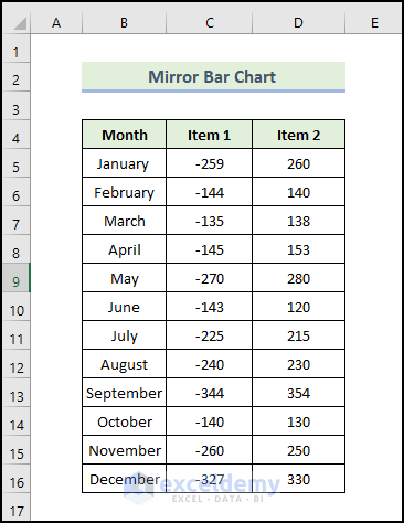
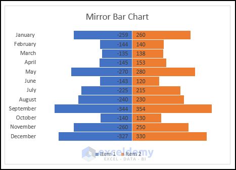
- Input the months in the range of cells B5:B16 and sales of different products of the corresponding date in the range of cells C5:D16. Variables on the X-axis are represented by row headers, while variables on the Y-axis are represented by column headers.
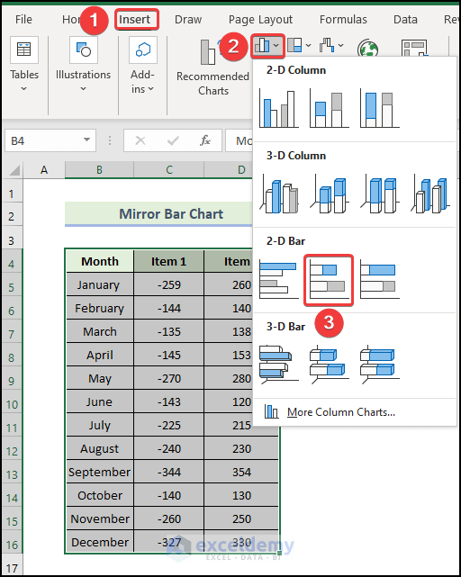
- Select the range of the cells B4:D16.
- In the Insert tab, click on the drop-down arrow of the Insert Column or Bar Chart from the Charts group.
- Choose the Stacked Bar Chart.
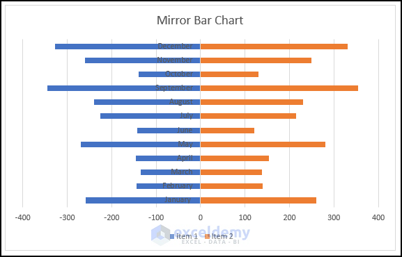
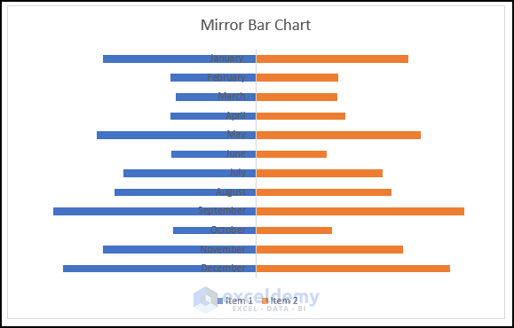
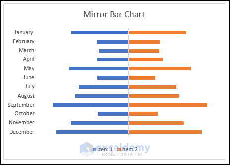
- You will get the following bar chart. We added a title for the graph named Mirror Bar Chart.
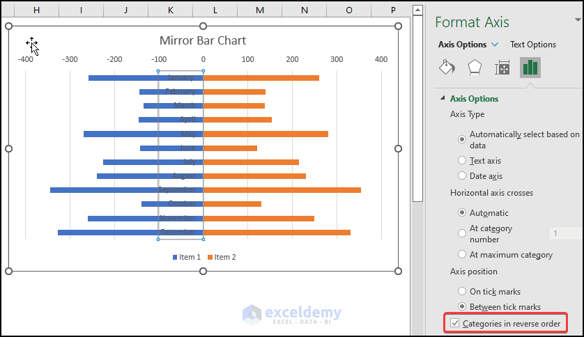
- Right-click on the Months in the Bar chart and select Format Axis.
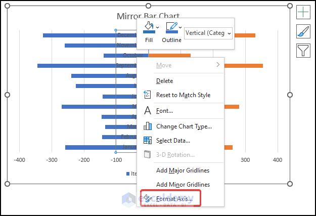
- The Format Axis pane will appear on the right.
- Check Categories in reverse order to reverse the order of the months so January is on top.
- Delete the gridlines and axes by pressing Delete from your keyboard or unchecking Gridlines and Axes from the Chart Elements icon.
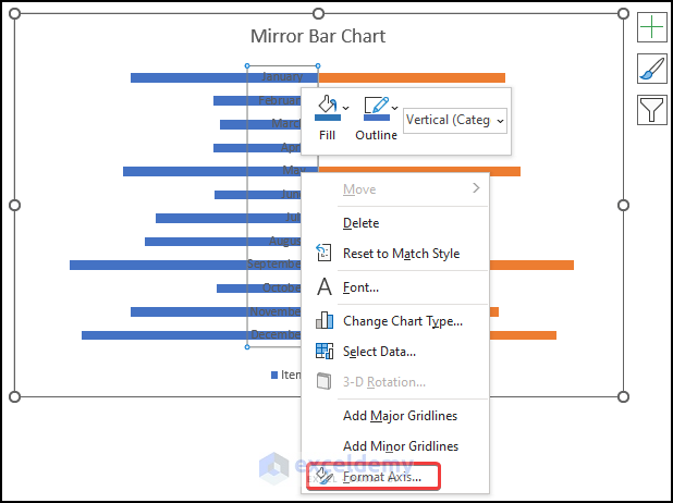
- You can format the axis by right-clicking the Months in the Bar chart and selecting Format Axis.
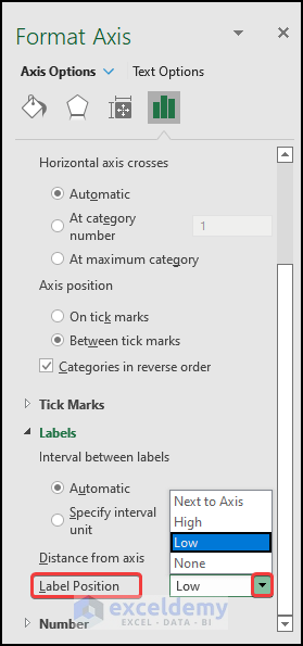
- The Format Axis pane will appear on the right.
- Select Label Position, and from the drop-down menu, select Low.
- You will get the following bar chart.
- Right-click on the Bar chart and select Format Data Series.
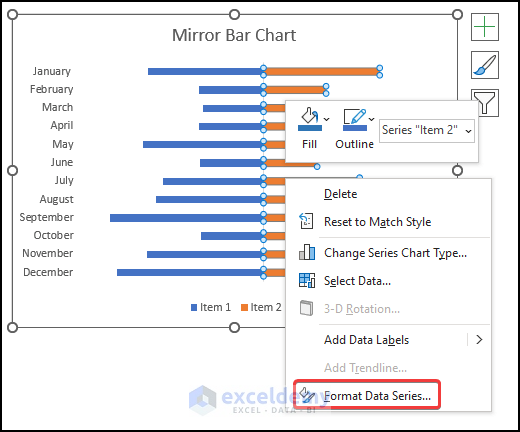
- The Format Data Series pane will appear.
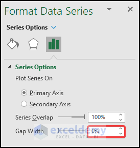
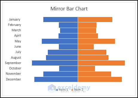
- Reduce the Gap Width by 0%.
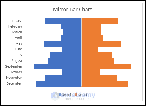
- The Bar chart will look like this.
- Select the bar chart and select the Format tab.
- Select the Shape Outline option.
- Select the White color as Theme Color.
- Click on the Weight option and, from the drop-down menu, select 1 pt.
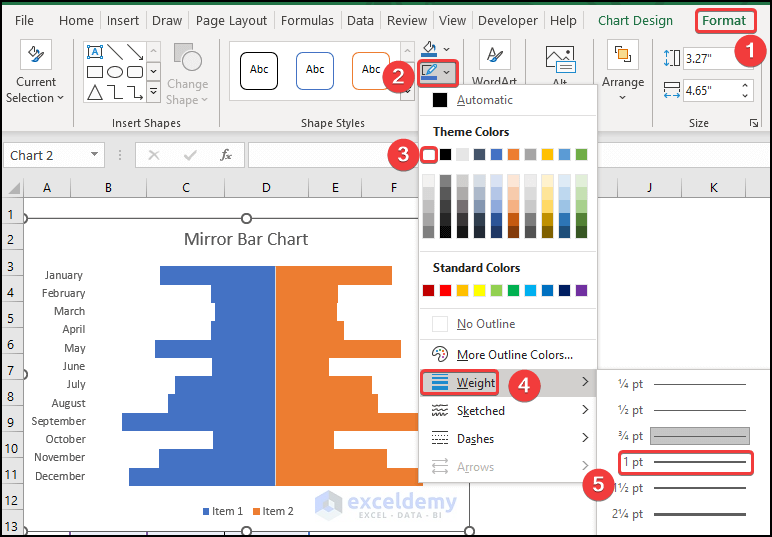
- The Bar chart will look like this.
- We are going to add graph elements. In Quick Elements, some elements are already added or removed. You can manually edit the graph to add or remove any elements of the chart by using the Add Chart Element option. After clicking on the Add Chart Element, you will see a list of elements.
- Click on them one by one to add, remove or edit.
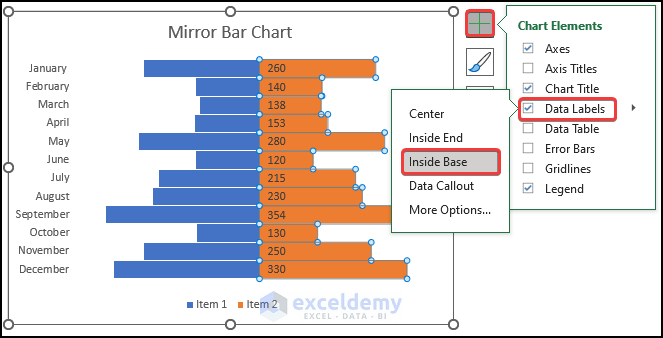
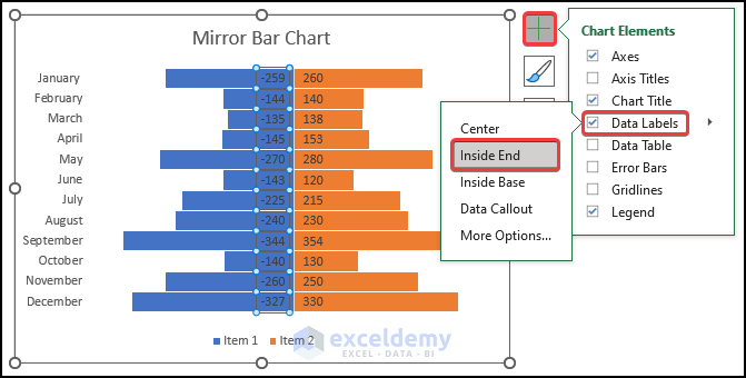
- You can find the list of chart elements by clicking the Plus (+) icon from the right corner of the chart as shown below.
- Mark the elements to add or unmark the elements to remove.
- Click on the right bar chart and select Data Labels and select the Inside Base option as shown below.
- Click on the left bar chart and select Data Labels and select the Inside End option as shown below.
- The Bar chart will look like this.
- Right-click on the left Bar chart and select Format Data Labels.
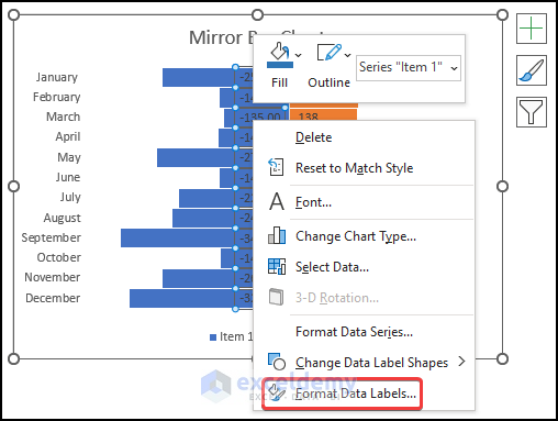
- The Format Data Labels pane will appear.
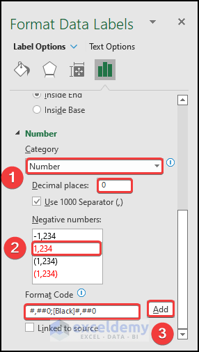
- Select Number in the Category option.
- Enter 0 in the Decimal places.
- Select the Red color number format in the Negative numbers option.
- Insert the Format Code shown in the image.
- Click on Add.
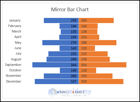
- Here’s the result.
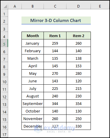
Example 2 – Mirror a 3-D Column Chart in Excel
Steps:
- Input the months in the range of cells B5:B16 and sales of different products of the corresponding date in the range of cells C5:D16. Variables on the X-axis are represented by row headers, while variables on the Y-axis are represented by column headers.
- We are going to insert a 3-D Column chart for our dataset.
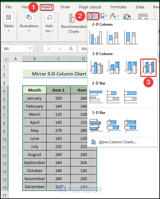
- Select the range of the cells B4:D16.
- In the Insert tab, click on the drop-down arrow of the Insert Column or Bar Chart from the Charts group.
- Choose 3-D Column.
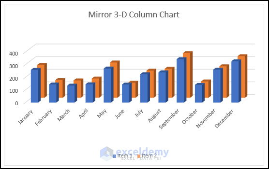
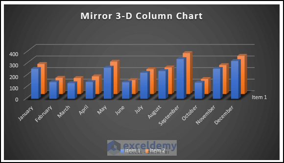
- You will get the following 3-D Column chart.
- Select the Chart Styles icon and then select your desired style option from the Chart Styles group.
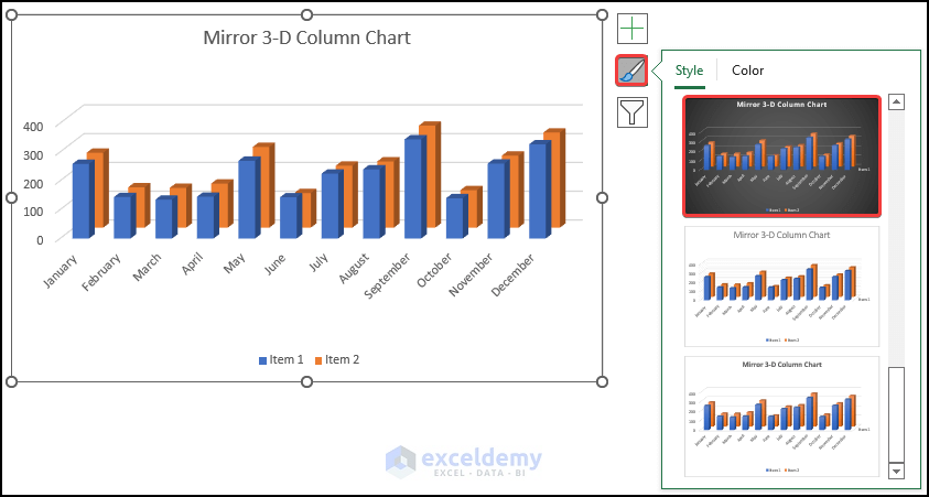
- Here’s the result.
Things to Remember
- Before inserting a bar chart, you must select anywhere in the dataset. The rows and columns will need to be manually added otherwise.
- In the Negative Numbers option, selecting a Red color will automatically create a format code for the Red color number, but you must type Black instead of Red in the code to convert the numbers to black.
Download the Practice Workbook
Related Articles
- How to Resize Chart Area Without Resizing Plot Area in Excel
- How to Change Decimal Places in Excel Graph
- How to Hide Zero Values in Excel Chart
<< Go Back to Customize Excel Charts | Excel Charts | Learn Excel
Get FREE Advanced Excel Exercises with Solutions!
