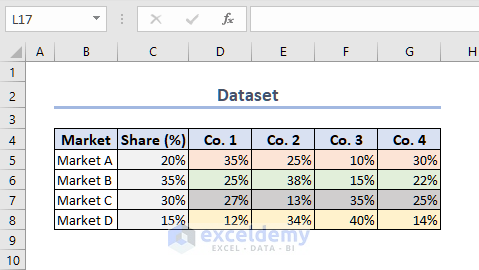
To generate the Mekko chart, we have taken the following dataset of different Markets and corresponding Company shares.
Step 1 – Create Helper Table
To create the Mekko chart, we need to create a helper table so that we can input data into a chart and make a Mekko chart.
- The blank column before Co. 1 will be later filled with Horizontal Axis Values.
- Leave the first row (Row 5) within the Helper Table blank.
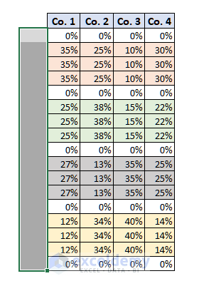
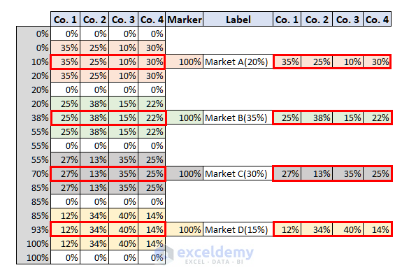
- Copy the Market A share of 4 companies (D5:G5) and paste it 3 times in the table as shown in the following image.
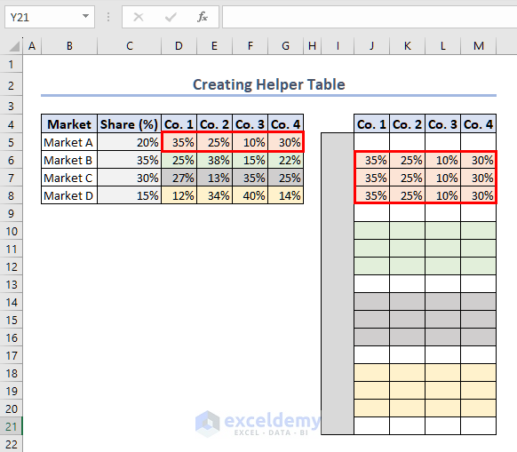
- Leave a row blank and copy all the Company Shares of Market B and Paste it 3 times.
- Repeat the procedure for Market C and Market D.
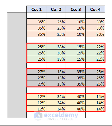
- The following image shows how it should look.
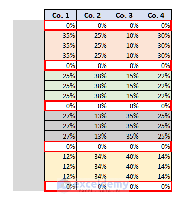
- Enter 0% in each of these blank cells.
Step 2 – Find Horizontal Axis Values for Buffer Rows
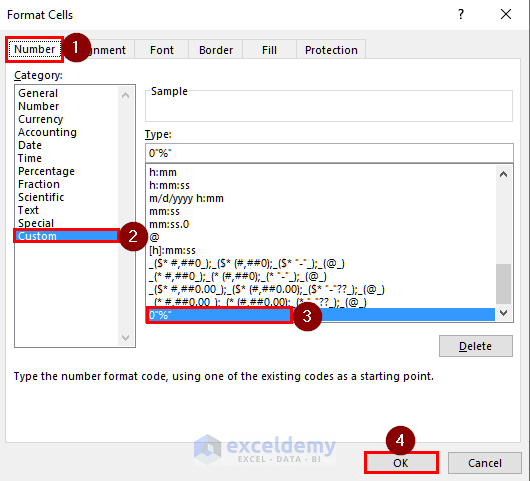
- To insert the Horizontal axis values in the left blank column, we need to set a custom format for the column.
- Select the column area as shown in the following image.
- Press ‘Ctrl + 1’.
- The Format Cells window will open.
- From the Number tab, select Custom.
- Set the custom format to 0“%”.
- Press OK.
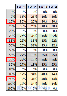
- Set the upper and lower Axis values for each Market.
- The share of Market A is 20%. So, the upper and lower values of Market A will be 20% and 0%.
- The share of Market B is 35%. So, the upper and lower values for Market B will be 55% and 20%.
- Fill in the upper and lower values of Market C and Market D in the same way.
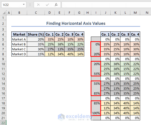
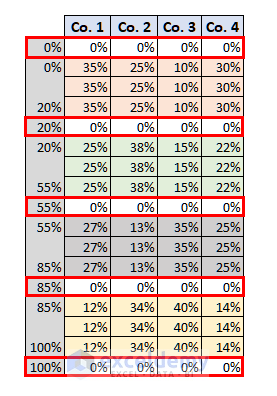
- Fill the axis values adjacent to the buffer rows.
- The value in these cells will be the same as the previous and the following axis values.
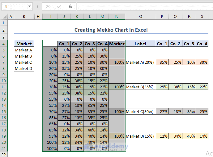
To find the midpoint values of each market.
- Add the following formula in I7 to find the midpoint for Market A.
=(I6+I8)/2- This will give you the first midpoint which is 10%.
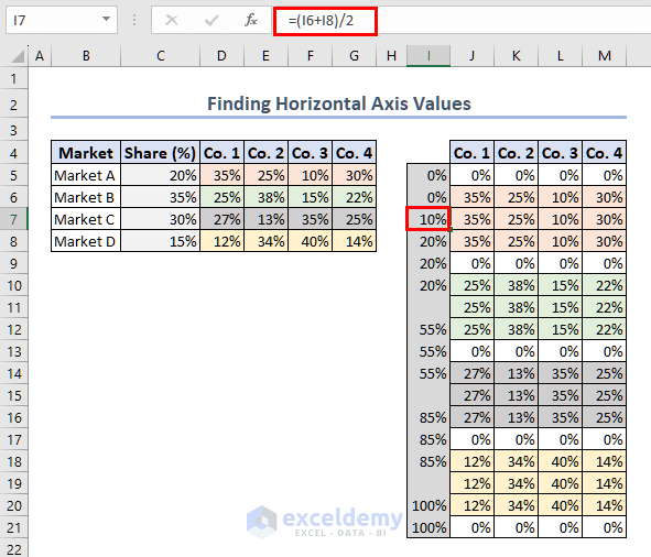
- Follow the same procedure to find the midpoints for the other markets.
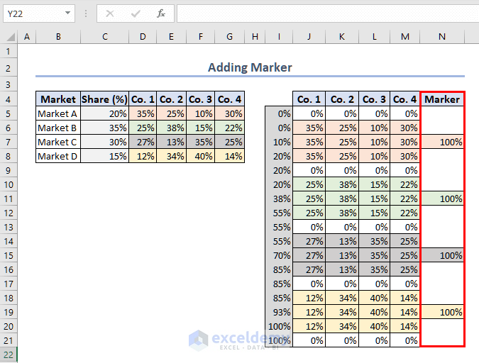
Step 3 – Add Label Marker and Label
- We now need to add Marker and Label in our helper table.
- In the Marker column, fill 100% in the midpoint rows.
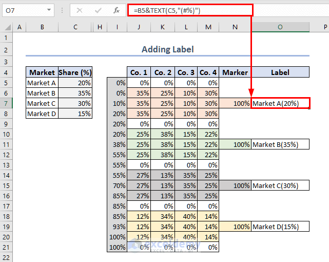
- Add another blank column Label.
- You can add the Labels manually or use the following formula in O7 to get the Label.
=B5&TEXT(C5,"(#%)")- Modify the cell references to add Labels for other midpoints.
- Add the company shares as shown in the following image.
- We can use this table to create a Mekko chart.
Step 4 – Insert Stacked Area Chart
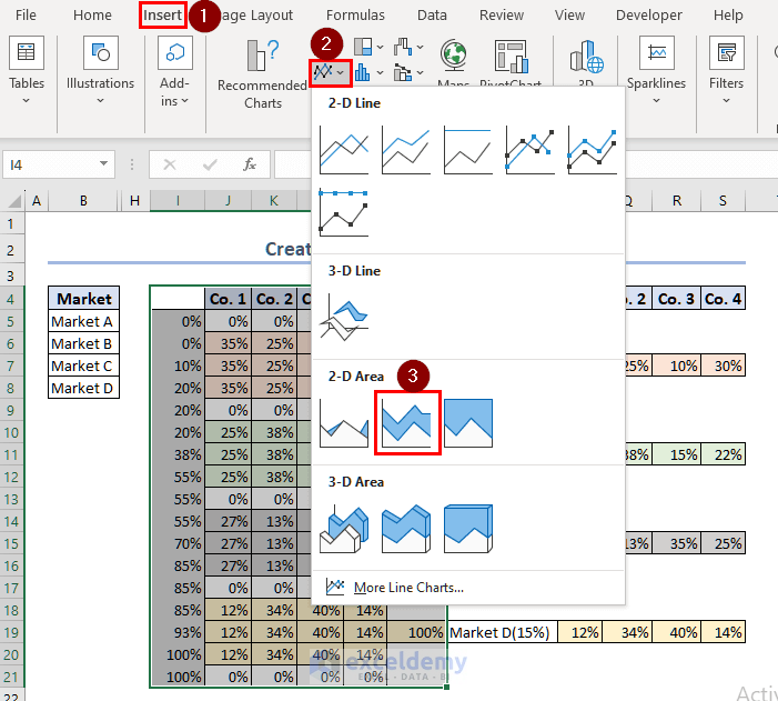
- To create a Mekko chart, we have to insert the data range I4:N21 in a Stacked Area Chart.
- Select the data range I4:N21.
- Go to the Insert tab.
- From the Insert Line or Area Chart group, select the Stacked Area chart.
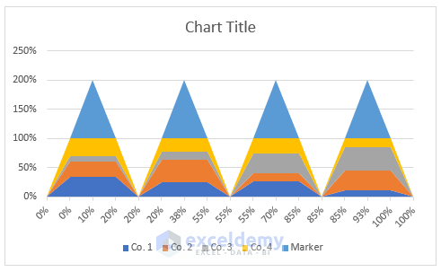
- The stacked area chart should look like this one.
Step 5 – Change Chart Type of Marker Series
To modify the Stacked Area chart,
- Select any of the upper triangle sections.
- Right-click on your mouse.
- Select Change Series Chart Type.
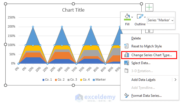
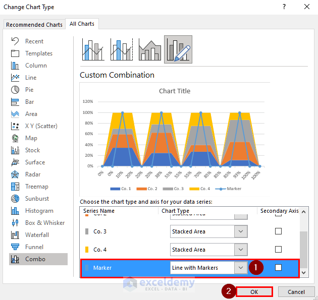
- A new window named Change Chart Type will appear.
- Change the chart type of the Marker series to Line with Markers and press the OK button.
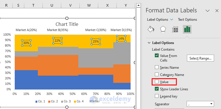
Step 6 – Add and Format Data Labels
- Right-click on the Marker series.
- Select Add Data Labels.
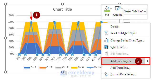
- You can see all the data labels of the Marker column.
- Right-click on any of the Data Labels.
- Select Format Data Labels.
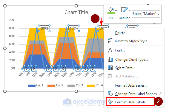
- The Format Data Labels window will open.
- From the Label Options, select Value from Cells.
- A new window named Data Label Range will appear where you have to select the Label range.
- Select the data range O5:O21 and press OK.
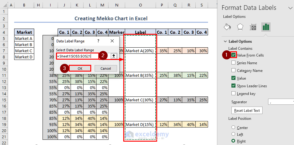
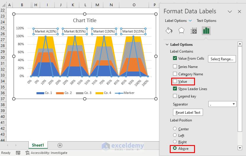
- Uncheck the Value and set Label Position to Above.
- The data labels are aligned above the chart with proper labels.
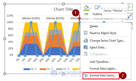
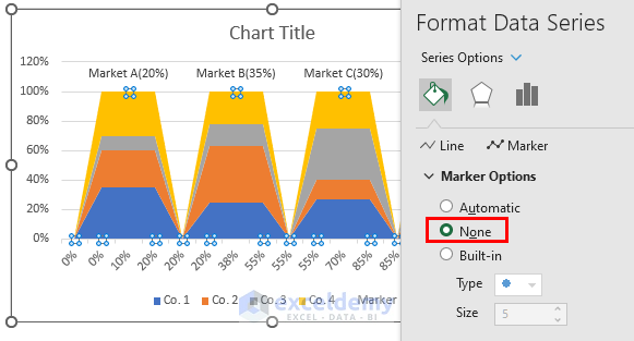
- We can hide the Marker lines.
- Select the Marker series and Right-click.
- Select Format Data Series.
- From the Fill & Line section select No line.
- Go to the Marker section.
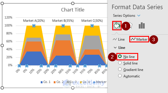
- Select None from the Marker Options.
Step 7 – Format Horizontal and Vertical Axes
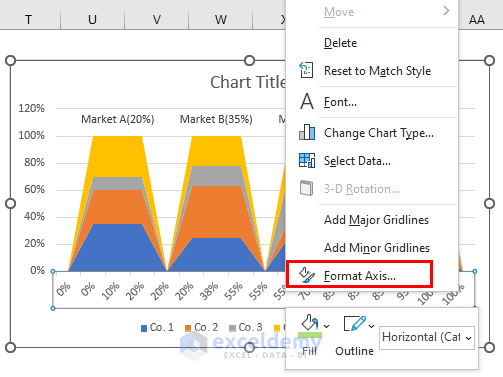
- Right-click on the Horizontal axis.
- Select Format Axis.
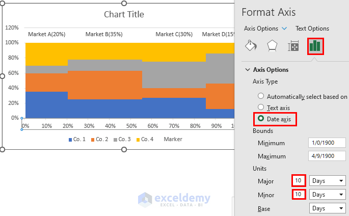
- Go to Axis Options and select Date Axis.
- As soon as you select the Date Axis, the chart will change into a Mekko shape.
- Change the Major and Minor Units to 10.
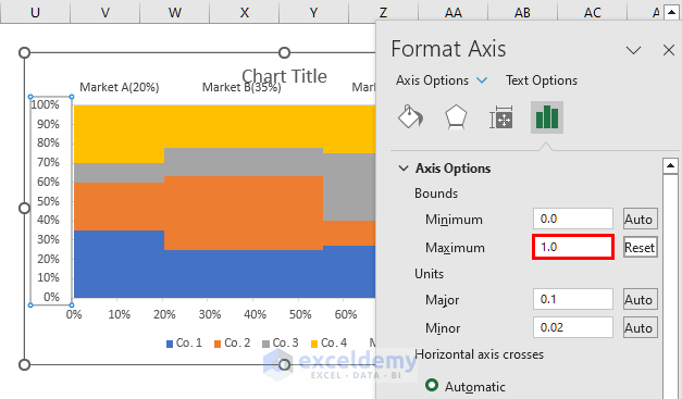
- Right-click on the Vertical axis and select Format Axis.
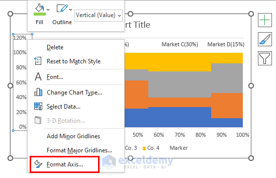
- From the Axis Options, set the Maximum as 1.
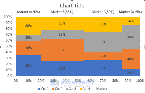
Step 8 – Insert Chart Data Labels
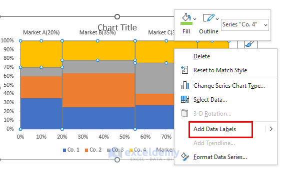
- All the different colors represent series for different companies.
- Right-click on the yellow color series (Co. 1).
- Select Add Data Labels.
- This will show all the data labels for Co. 1.
- Right-Click on any of these data labels.
- Select Format Data Labels.
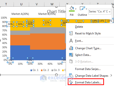
- The Format Data Labels window will open.
- From the Label Options, select Value from Cells.
- A new window named Data Label Range will appear where you have to select the Label range.
- Select the data range S5:S21 and press OK.
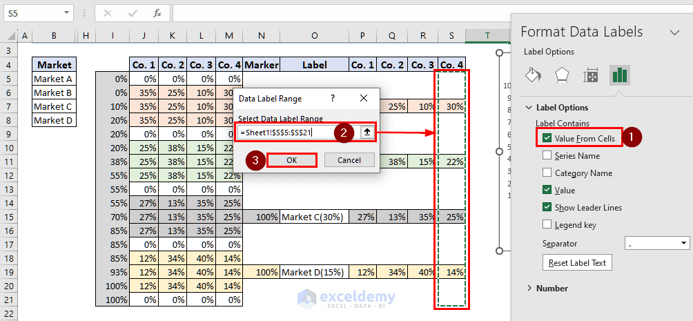
- Uncheck the Value.
- You can see the data labels for Co. 1 are shown within the yellow chart area.
- Add the data labels for all other companies and it will look like the following image.
- Right-click on the chart area.
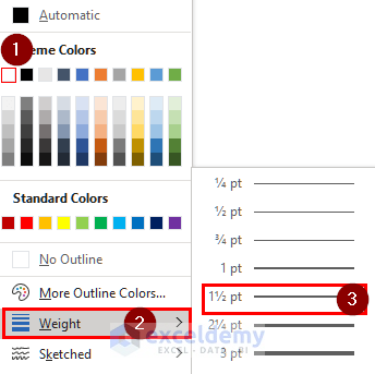
- Select Outline.
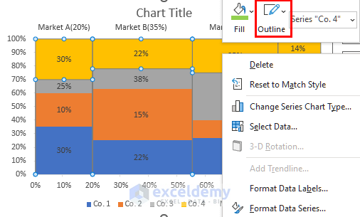
- Choose a suitable outline color.
- Choose a preferable outline Weight.
- Press OK.
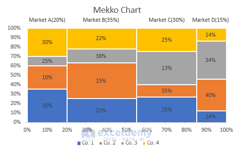
The final Mekko Chart will look like the image below.
Read More: How to Create Activity Relationship Chart in Excel
Things to Remember
- Make sure to create a proper helper table. The values and formatting in the helper table are important.
- Keep a backup file of your original dataset before starting the helper table.
- You can fill in different colors and make other changes in your Mekko/Marimekko chart in Excel.
Frequently Asked Questions
1. What types of data are suitable for Mekko charts?
Mekko charts are useful for visualizing data distribution between two categories. Typically, market shares and market sales are represented in a Mekko chart.
2. What is the purpose of a Mekko chart?
The purpose of the Mekko chart is to show categorical data. It comprises of different stacked bars with varying widths. It is also known as a mosaic plot. This chart type is important for showing data distribution for different categories.
Download Practice Workbook
Related Articles
- How to Make a Budget Constraint Graph on Excel
- How to Create a Weight Loss Graph in Excel
- How to Find Intersection of Two Curves in Excel
- How to Show Intersection Point in Excel Graph
<< Go Back to Excel Charts | Learn Excel
Get FREE Advanced Excel Exercises with Solutions!

I have used this process and looks like it is largely pulling through what I expected.
One issue is that my first Market is very small (0.45%) and doesn’t look like it is visible. Also as I have 10 columns and 10 markets this might be causing some data issues as have tried using a single midpoint and 8 incremental midpoints and neither are coming out exactly as expected
Hello Raymond Martin,
Thanks for your comment! It sounds like the small size of your first market (0.45%) could be causing visibility issues in the chart. One suggestion is to adjust the axis scaling or perhaps consider combining smaller markets into a grouped category for better clarity.
Regarding the issue with the midpoints, it could be worth reviewing the data format and ensuring that all columns and markets align correctly. With 10 columns and markets, it’s important to ensure there aren’t any data inconsistencies that might affect the outcome.
Feel free to share more details if you need further assistance!
Regards
ExcelDemy
Hi I am struggling a little bit, everything works great until I format the horizontal axis. Once I do that, instead of it forming a mekko chart, everything gets lumped together into what looks like 1 column
Hello Alex,
This usually happens when the horizontal axis values are entered as actual percentages instead of whole-number axis values.
For this Mekko chart method, please enter the horizontal axis values as numbers such as `0`, `20`, `55`, `100`, etc. Then apply the custom number format:
`0″%”`
Do not enter them as `0%`, `20%`, `55%`, etc., because Excel stores those as decimal values like `0`, `0.2`, and `0.55`. When you later change the horizontal axis to a Date Axis, those very small values can make the chart sections collapse together and appear like one column.
After correcting the helper axis values, format the horizontal axis again as a Date Axis and set the Major and Minor Units to 10.
Regards,
ExcelDemy