Step 1 – Make a Dataset
- We’ll include the values for Date, Measured Weight (lbs), Target Weight (lbs), Target Weight Low (lbs), and Target Weight High (lbs).
- Input values in rows, like below.
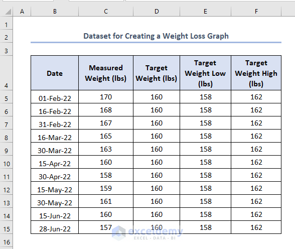
Suppose you need to lose weight to 160 lbs, which is your Target Weight (lbs). Target Weight Low (lbs) and Target Weight High (lbs) are minimum and maximum weight goals. These will remain static throughout the table.
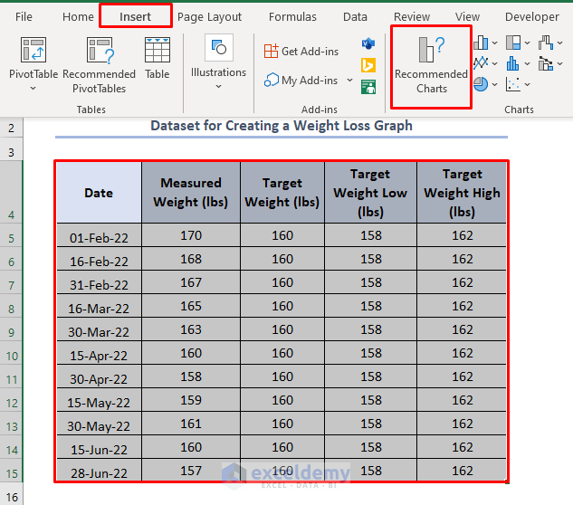
Step 2 – Select the Dataset and Create a Weight Loss Graph in Excel
- Select the whole dataset.
- Go to the Insert tab and select the Recommended Charts option.
An Insert Chart bar will appear.
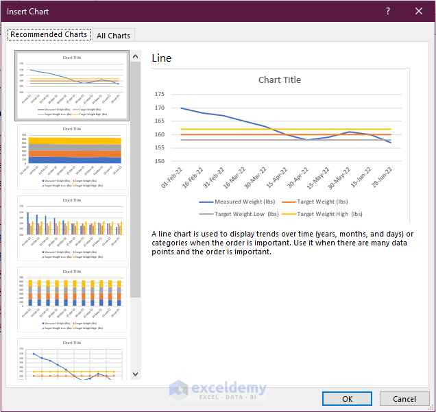
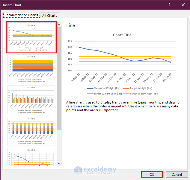
- Select any of the chart types you want to use for creating a graph. We have selected the first chart shown in the red below.
- Click OK.
- You’ll get a stock Graph.
Read More: How to Create Mekko/Marimekko Chart in Excel
Step 3 – Customize the Graph
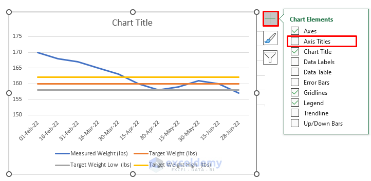
- Add an Axis Title. To do this, click on the “+” sign and check the Axis Title with a tick mark.
- Add any of the elements in the Chart Elements bar according to your requirements.
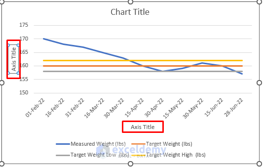
A space for Axis Titles will appear.
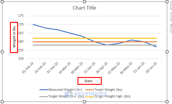
- Write Weight in lbs in the vertical Axis Title box and Date in the horizontal Axis Title.
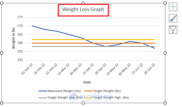
- Add your graph title to the Chart Title. You can type Weight Loss Graph in the Chart Title box.
Download the Practice Workbook
Creating Weight Loss Graph.xlsx
Related Articles
- How to Make a Budget Constraint Graph on Excel
- How to Create Activity Relationship Chart in Excel
- How to Find Intersection of Two Curves in Excel
- How to Show Intersection Point in Excel Graph
<< Go Back to Excel Charts | Learn Excel
Get FREE Advanced Excel Exercises with Solutions!

I can’t seem to make one like yours. My values range from 250 to 0 in 50lbs increments….so it’s all basically one straight line. How do you make one with the values from 230 – 150?
Hello KRISTY,
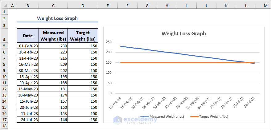
If you want to create a weight loss graph with values from 230 to 150, you’ll need to adjust the scale of the vertical (y-axis) to accommodate the new range. If you want to set your target weight as 150, you can create the weight loss graph in Excel like below:
Regards
Rafiul Hasan
Team ExcelDemy